Sanctions Compliance Landing Page Template
Clearance is a split-screen landing page template built for sanctions and export control compliance platforms. It pairs live metric counters, an animated world map, and a Stats-First visual cadence to communicate regulatory precision at a glance. The layout drives B2B partnership actions through two purpose-built conversion paths: a primary integration brief request and a gated API documentation download.
by Rocket studio
Quick summary
Clearance is a single-page compliance platform template designed for the sanctions screening and export control market. It uses a 50/50 split-screen layout and a Data Command visual theme to make technical credibility visible before a single word is read. Every section leads with a number, not a claim, and two focused conversion paths move qualified buyers toward partnership.
Who this template is for
This template is built for compliance technology companies that serve high-stakes regulatory audiences. The design language and conversion flow are calibrated for vendors whose buyers need to trust the product before they engage.
- Trade compliance officers at defense contractors managing ITAR classifications and denied-party screening
- Bank BSA (Bank Secrecy Act) analysts who run SDN (Specially Designated Nationals) hit reviews around the clock
- Freight forwarders and logistics operators who need fast, scalable screening across high-volume shipment queues
What problem this template solves
Compliance platforms face a credibility gap at first contact. A generic landing page cannot convey the speed, depth, and consequence-awareness that sophisticated buyers expect. This template closes that gap by letting performance data speak first.
- Buyers in regulated industries distrust marketing language and respond to verified metrics instead
- Technical evaluators need to assess integration feasibility before they can advocate internally for a purchase
- Compliance teams operating under regulatory pressure need to feel control-room confidence, not sales-page optimism
What you get with this template
You get a fully structured, section-led landing page that sequences proof, coverage, and speed into a single persuasive scroll. The layout is designed to handle two distinct buyer types in one page flow.
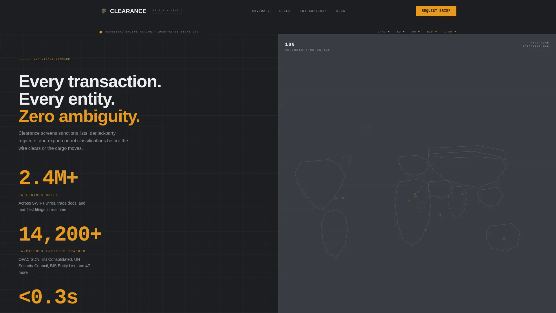
- A live stats header with three amber metric counters and an animated global screening map that sets immediate authority
- A Stats-First Impact scroll cadence where every section opens with one undeniable number before context follows
- Two conversion paths: a primary "Request Integration Brief" form and a secondary gated "Download API Documentation" path for technical evaluators
Feature list
A brief overview of what makes this template function as a precision compliance sales tool, not just a layout.
Animated Metric Header Wall
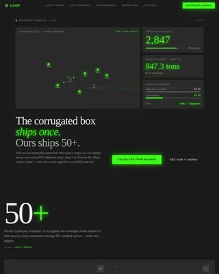
The header splits into two panels. The left holds three large amber-on-charcoal counters showing daily screening volume, tracked sanctioned entities, and average API response time. Each number animates with a mechanical odometer effect to signal live operational data.
Real-Time Global Screening Map
The right header panel displays a world map with amber pulse-dots that mark active screening events across jurisdictions. Shipping lanes light briefly and fade, creating the visual impression of a live operations floor without using any stock photography or human imagery.
Stats-First Split-Screen Scroll
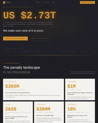
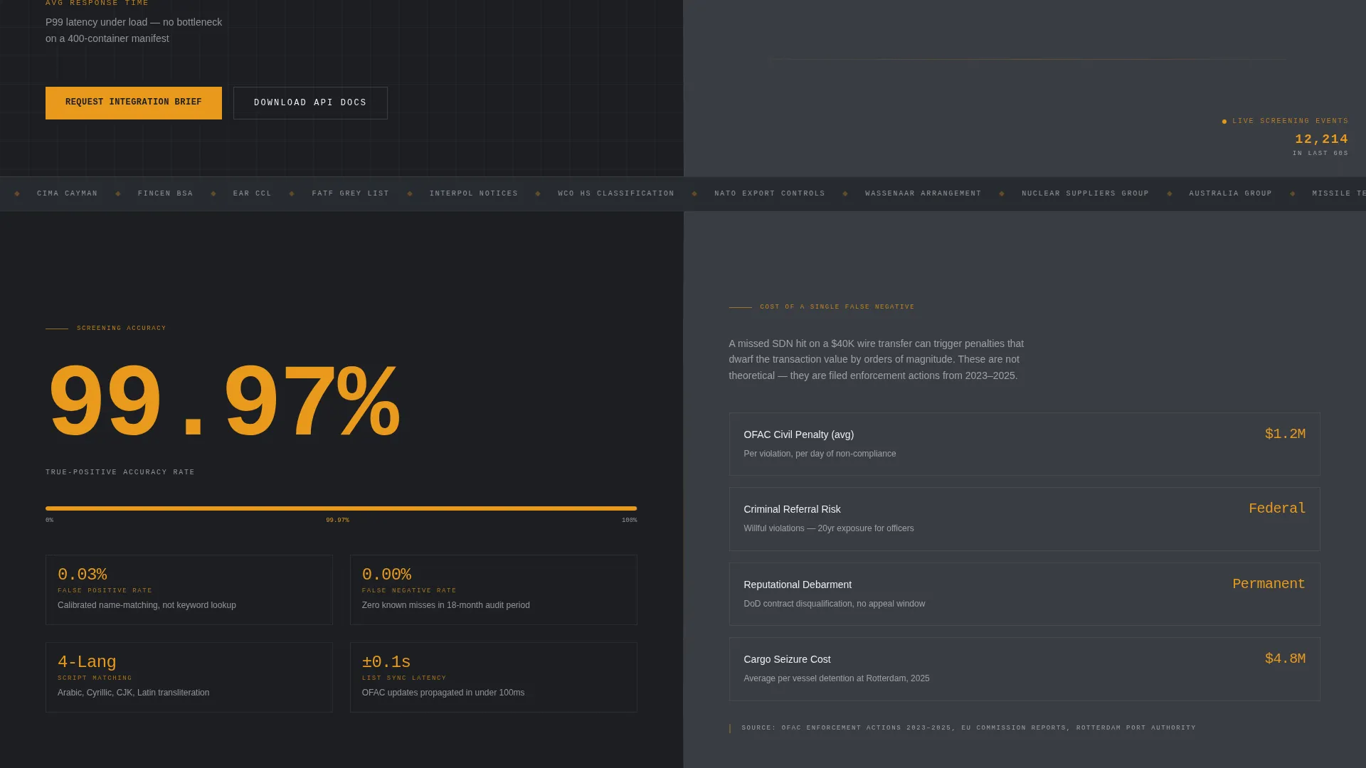
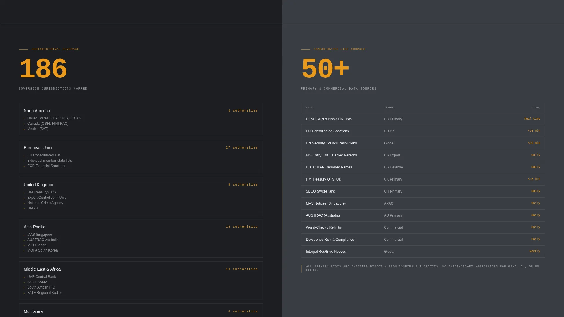
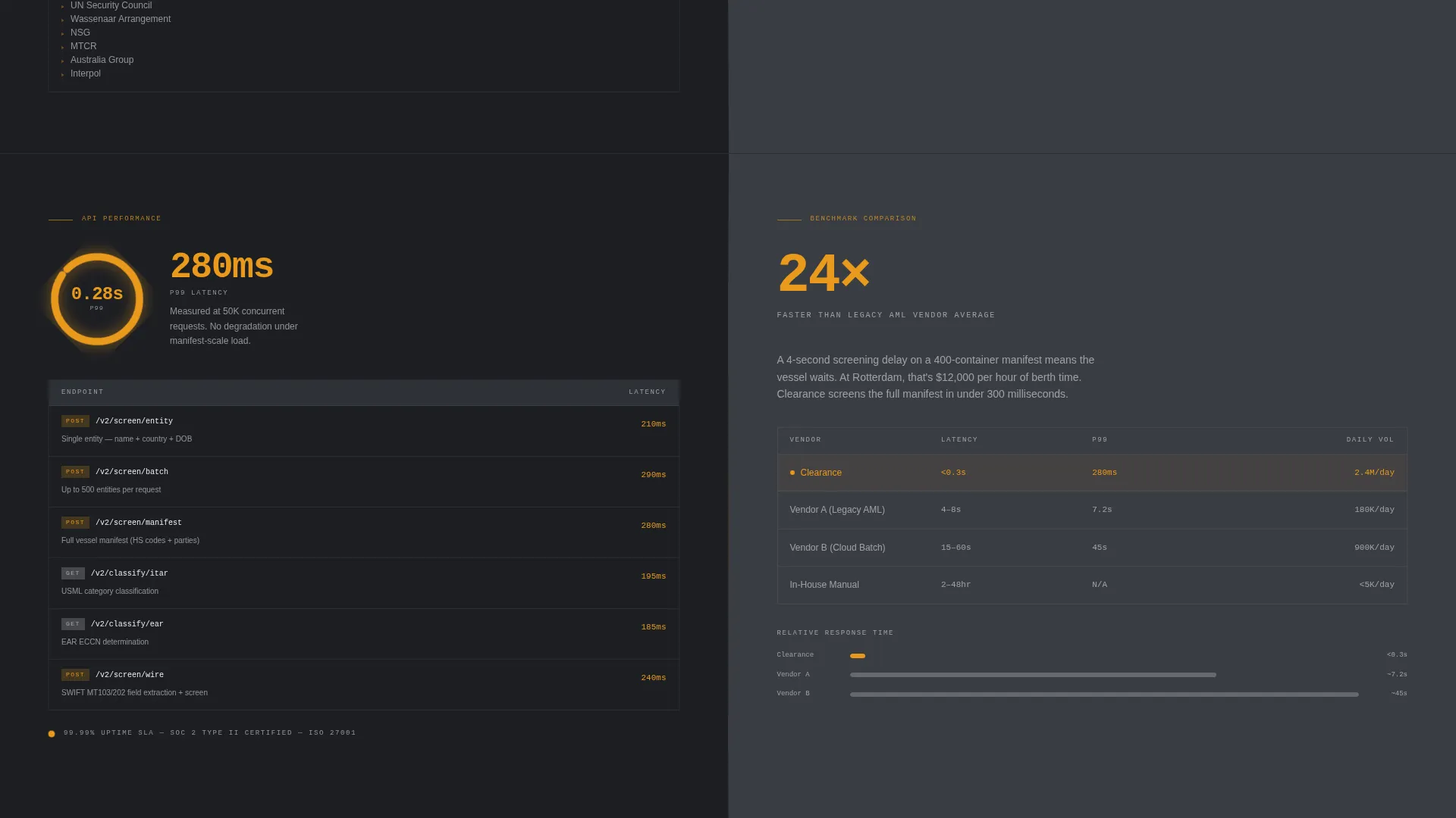
Every content section uses a 50/50 horizontal split. The left panel leads with a single large metric; the right panel provides the regulatory or competitive context that makes that number meaningful. The cadence builds a case through comparison, not adjectives.
Dual Conversion Path Layout
The primary call to action, "Request Integration Brief," captures company name, compliance team size, primary use case, and current screening volume. A secondary path offers gated API documentation access behind a business email field, targeting technical evaluators who need to validate feasibility first.
Data Command Color System
The template uses a four-value color system: deep charcoal for backgrounds, gunmetal for mid-tone surfaces, warm amber reserved exclusively for metrics and active conversion elements, and document-white for typography. Amber accents function as visual runway lights pulling attention down the page.
No-Imagery Data-Hero Design
The template deliberately excludes stock photography and human faces. All visual authority comes from the data itself: counters, maps, benchmarks, and comparison panels. This design choice aligns with the classified-briefing aesthetic described in the brief.
Page sections overview
| Section | Purpose |
|---|---|
| Live Stats Header | Opens with three metric counters and an animated world map to establish immediate operational authority |
| Screening Accuracy Panel | Left panel shows accuracy percentage; right panel quantifies the regulatory cost of a false negative |
| Coverage Depth Section | Left maps jurisdictions covered; right itemizes consolidated sanctions list sources |
| Speed Benchmark Section | Left displays API latency data; right presents a side-by-side competitor comparison |
| Integration Brief Form | Primary call to action captures company name, team size, use case, and screening volume |
| API Documentation Gate | Secondary call to action captures business email to deliver gated API documentation for technical evaluators |
Design & branding system
The visual identity follows a Data Command theme built on a four-value Charcoal and Amber color system. The overall feel is a classified briefing folder: matte, precise, and stripped of anything decorative.
- Background and surface colors use deep operations-floor charcoal (#1C1E22) and gunmetal mid-tone (#3A3D44) to keep the interface grounded and serious
- Warm amber (#E8991C) appears only on metrics, active states, and conversion elements, preserving its visual weight for the moments that matter most
- Cool document-white (#EDEEF0) handles all typography and data surface text, maintaining contrast and readability across dark panels
Mobile & speed optimization
The split-screen layout is structured to adapt cleanly across screen sizes while preserving the Stats-First visual hierarchy. The design avoids heavy image assets by design, which keeps the page lean.
- The 50/50 split panels reflow for smaller viewports so metric counters and context panels remain readable without horizontal scrolling
- Animation elements such as the odometer counters and pulse-dot map are scoped to the header, limiting motion to where it creates maximum impact
- The dual-call to action structure keeps both conversion paths accessible on mobile without requiring deep scrolling to reach the secondary documentation gate
How this template helps you convert
The conversion logic is embedded in the page structure itself. Credibility is built section by section before any ask is made.
- The animated header delivers three quantified proof points within the first viewport, establishing authority before a buyer reads a single paragraph or clicks anything.
- The Stats-First scroll cadence uses split-panel comparisons to build a silent argument from accuracy, coverage, and speed data, so the "Request Integration Brief" call to action arrives at the moment technical credibility peaks.
- The secondary gated documentation path catches technical evaluators who are not yet authorized to initiate a partnership, converting them into qualified leads through a lower-commitment action.
Other information about this template
This template is purpose-built for the sanctions screening and export control compliance niche within the broader customs and trade category. It is a strong fit for vendors whose buyers operate under real regulatory consequence.
- The template sits within the Logistics and Supply Chain category, specifically targeting the Customs and Trade subcategory and the Sanctions and Export Control Compliance niche
- The intersection match score for this template's niche, theme, and conversion direction is rated at 13, indicating strong alignment between the Data Command visual theme and the Partnership/B2B landing page direction
- The Stats/Metrics header concept and Stats-First Impact creative direction are matched intentionally to buyers like BSA analysts, ITAR compliance officers, and denied-party screening operators who evaluate platforms on data, not design language
Theme
Data Command
Creative direction
Stats-First Impact
Color system
Charcoal & Amber
Style
Split Screen (50/50)
Direction
Partnership/B2B
Page Sections
Animated Metric Counter Header
Pulse-dot Global Screening Map
Stats-first Split-screen Sections
Dual Conversion Path Structure
Data Command Color System
No-stock Data-hero Design
Related questions
Who is this template designed for?
What makes the layout different from a standard landing page?
Can I update the metric counters and map with my own data?
How do the two conversion paths work?
Does the template use any stock photography?