Pharmacy Digital Presence Pricing & Packages Website Template
Clearrx is a bold brutalist bento grid landing page built for a transparent pharmacy membership service. It leads with real prescription price comparisons, a live drug cost calculator, and a stark spec-sheet layout that replaces marketing fluff with raw numbers. Every tile builds a financial case that turns the membership fee into an obvious, personal decision.
by Rocket studio
Quick summary
Clearrx is a single-page bento grid landing page for a pharmacy membership site that trades marketing polish for blunt financial clarity. The layout uses hard-cut monochrome panels, oversized data typography, and a persistent drug price comparison tool to show each visitor their personal savings before any signup is requested.
Who this template is for
This template is built for pharmacy membership businesses that compete on price transparency rather than brand trust. It speaks directly to audiences who are already skeptical of retail pharmacy pricing and need hard numbers, not reassurance.
- Uninsured gig workers and freelancers filling recurring prescription scripts
- Small-business owners and retirees caught between group plan costs and out-of-pocket pricing
What problem this template solves
Traditional pharmacy and healthcare landing pages lead with lifestyle photography and vague benefit statements. That approach fails visitors who already know they are overpaying and simply need proof that an alternative is cheaper.
- No clear side-by-side price comparison leaves visitors guessing about real savings
- Buried fee structures and abstract benefit claims erode trust before a visitor ever clicks
What you get with this template
You get a complete single-page layout designed to do one job: show a visitor their personal drug cost savings before asking them to commit. Every section is purpose-built and pre-wired to the spec-sheet content philosophy.
- A bento grid layout with alternating slab charcoal and clinical white panels, no gradients
- A persistent floating price comparison tool docked at the bottom of the viewport
- Pre-built content tiles covering generic pricing tables, a fee-versus-savings equation block, and a fulfillment pipeline display
Feature list
This section walks through each functional component included in the template.
Hero Dashboard Mockup
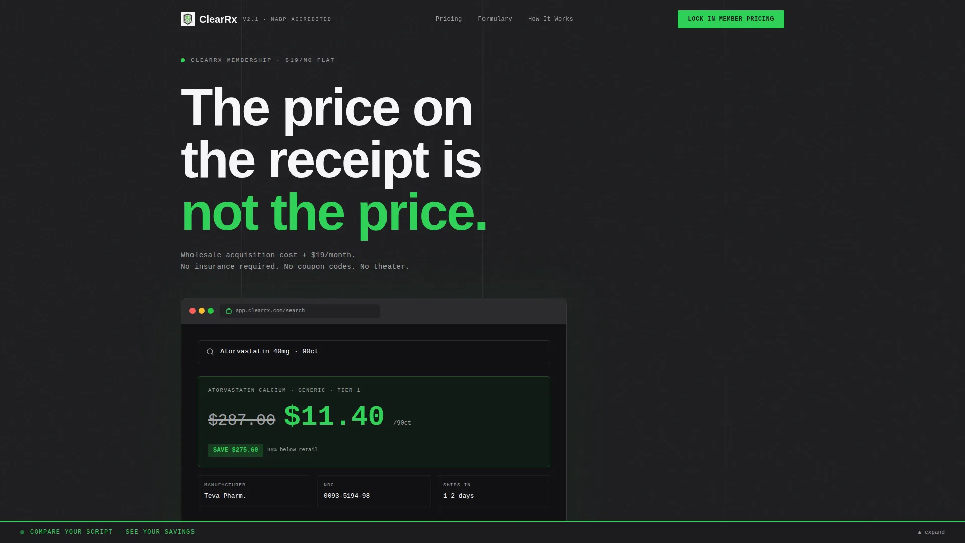
The header opens with a browser-frame product screenshot showing a live prescription search. Atorvastatin 40mg at 90 count is displayed with the retail price struck through in aluminum gray and the member price rendered in oversized signal green. No lifestyle imagery is used. The numbers serve as the visual anchor.
Persistent Price Comparison Tool
A floating input bar stays fixed at the bottom of the viewport throughout the entire scroll. Visitors enter a drug name and dosage and receive an immediate retail-versus-member price delta. The primary call to action, "Lock In Member Pricing," appears directly after the result, so the visitor acts on their own number rather than a generic average.
Generic Drug Pricing Table Tile
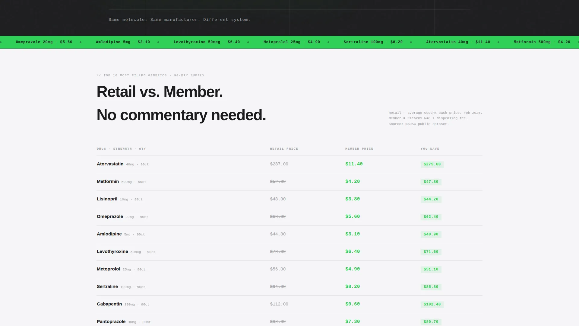
One dedicated bento tile displays the top ten most-filled generic medications in a two-column table. Retail price and member price appear side by side with no commentary needed. The layout uses monospaced typography so the numeric columns align cleanly and the savings gap is visually undeniable.
Fee Versus Savings Equation Block
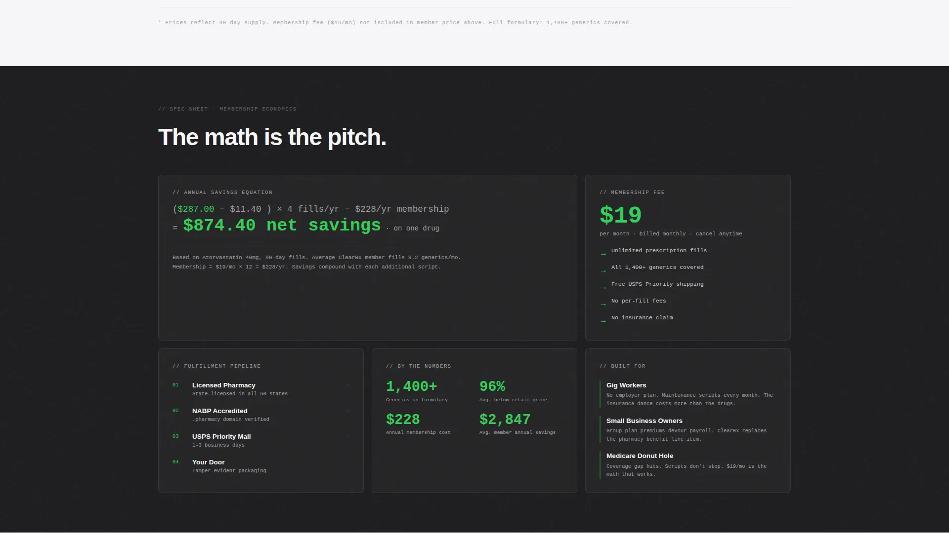
A single tile presents the membership fee against projected annual savings as a plain arithmetic equation. There are no charts, no callout badges, and no percentage claims. Just the math, set in oversized type, letting the arithmetic close the case.
Fulfillment Pipeline Display
A sequential tile maps the dispensing process in four labeled steps: licensed pharmacy, NABP-accredited fulfillment, USPS Priority shipping, and home delivery. Each step is a discrete cell. No decorative icons, no narrative copy.
Email-Gated Formulary Download
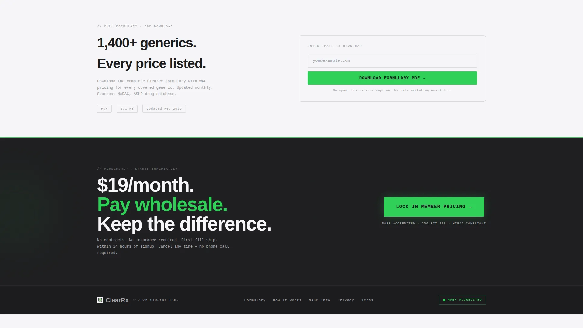
A secondary conversion path offers the full drug formulary as a downloadable PDF. Access is gated behind a single email field, giving the business a lead capture option for visitors who want to verify their specific medications before joining.
Page sections overview
| Section | Purpose |
|---|---|
| Hero Dashboard Header | Anchor visitor attention with real price data |
| Tagline Text Strip | Deliver the core value in one monospaced line |
| Generic Pricing Table | Compare retail versus. member costs side by side |
| Savings Math Tile | Show the membership fee arithmetic plainly |
| Fulfillment Pipeline Tile | Establish credibility through the dispensing steps |
| Formulary PDF Gate | Capture email leads via secondary download path |
| Persistent Comparison Tool | Return personal savings delta before signup |
| Primary call to action Block | Close with "Lock In Member Pricing" in signal green |
Design & branding system
The visual identity uses a Bold Brutalist theme built around a Monochrome Steel color palette. Every design decision reinforces the feeling of a pharmaceutical warehouse: functional, lit for efficiency, and stripped of decoration.
- Colors: slab charcoal (#1C1C1E) for dark panels, cold rolled aluminum (#A1A1A6) for secondary text and strikethroughs, clinical white (#F5F5F7) for light panels, and signal green (#30D158) reserved exclusively for savings figures and call-to-action elements
- Typography: grotesque-bold for all headlines and body copy; monospaced typefaces for all data cells and numeric displays so pricing columns align with precision
Mobile & speed optimization
The bento grid is designed so individual tiles reflow cleanly as screen width narrows. The layout is built to remain scannable at mobile breakpoints without losing the density that makes the spec-sheet aesthetic work.
- Tiles compress and stack vertically on smaller screens, preserving the data-first reading order
- The floating comparison tool remains pinned to the bottom of the viewport on mobile, keeping the core conversion action always within reach
How this template helps you convert
The template builds its conversion case incrementally. Each scroll step adds a new data point until the visitor's own savings number makes the membership fee feel like an obvious financial decision.
- The hero price comparison creates immediate personal relevance by showing actual drug cost savings in the first viewport, before any benefit copy appears
- The persistent comparison tool removes the final hesitation point by letting every visitor verify their own prescription savings on demand, so the primary call to action lands after the visitor has already done the math themselves
Other information about this template
This template is categorized under Technology with a subcategory of Pharmacy Digital Presence. It is purpose-built for the pharmacy membership site niche and is a strong fit for operators who want their landing page to function more like a pricing calculator than a brochure.
- Template style: Bento Grid with a Spec Sheet creative direction
- Header concept: Product Screenshot using a browser-frame dashboard mockup
- Landing-page direction: Comparison/Versus with a persistent real-time input tool
- Theme: Bold Brutalist with a Monochrome Steel color system
- The NABP (National Association of Boards of Pharmacy) accreditation reference is included in the fulfillment pipeline tile as a credibility signal, not a verified claim about the buyer's own business
Theme
Bold Brutalist
Creative direction
Spec Sheet
Color system
Monochrome Steel
Style
Bento Grid
Direction
Comparison/Versus
Page Sections
Hero Dashboard Price Mockup
Persistent Floating Comparison Tool
Generic Drug Pricing Table
Membership Fee Math Tile
Fulfillment Pipeline Display
Email-gated Formulary Download
Related questions
Can I replace the placeholder drug prices with my own membership pricing?
Does the comparison tool connect to a live pricing database automatically?
What are the two conversion paths included in this template?
Is this template designed for a single-page layout or a multi-page site?
Who is the intended audience for this pharmacy membership landing page?



