Optometry Client Portal Landing Page Template
Clearvision is a dashboard-style optometry client portal landing page built for eye care practices ready to modernise their front desk. It features a tab-switching interface preview, a filterable patient directory grid, an animated workflow diagram, and a co-management toggle, all wrapped in a focused midnight blue palette designed for long clinic days.
by Rocket studio
Quick summary
Clearvision is a single-page optometry client portal landing page template. It combines an interactive dashboard mockup, a filterable patient directory, and a co-management toggle to show visitors exactly how the platform works before they sign up. The design runs on a deep navy palette built for eye strain-free browsing during full clinic days.
Who this template is for
This template is built for eye care businesses that need a polished digital front door, not a generic software page. It speaks directly to the people running busy practices and managing complex patient flows every day.
- Independent optometrists (ODs) operating solo or with a small front-desk team
- Multi-location group practices juggling patient data across several systems
- Ophthalmology and optometry co-management teams sharing refractions and referrals
What problem this template solves
Most optometry software pages describe features in abstract terms. Visitors read bullet points but never feel how the product actually works. This template solves that trust gap by letting visitors interact with a ghost version of the platform before they commit.
- Phone-based recall sheets and manual chart pulls feel outdated but replacing them requires trust
- Referring and specialist providers struggle to show co-management workflows in a single view
- Generic software landing pages fail to reflect real clinical data, making them feel distant
What you get with this template
You get a fully structured, interactive landing page that teaches the product through hands-on exploration. Every section is built around a specific stage of the visitor's decision journey.
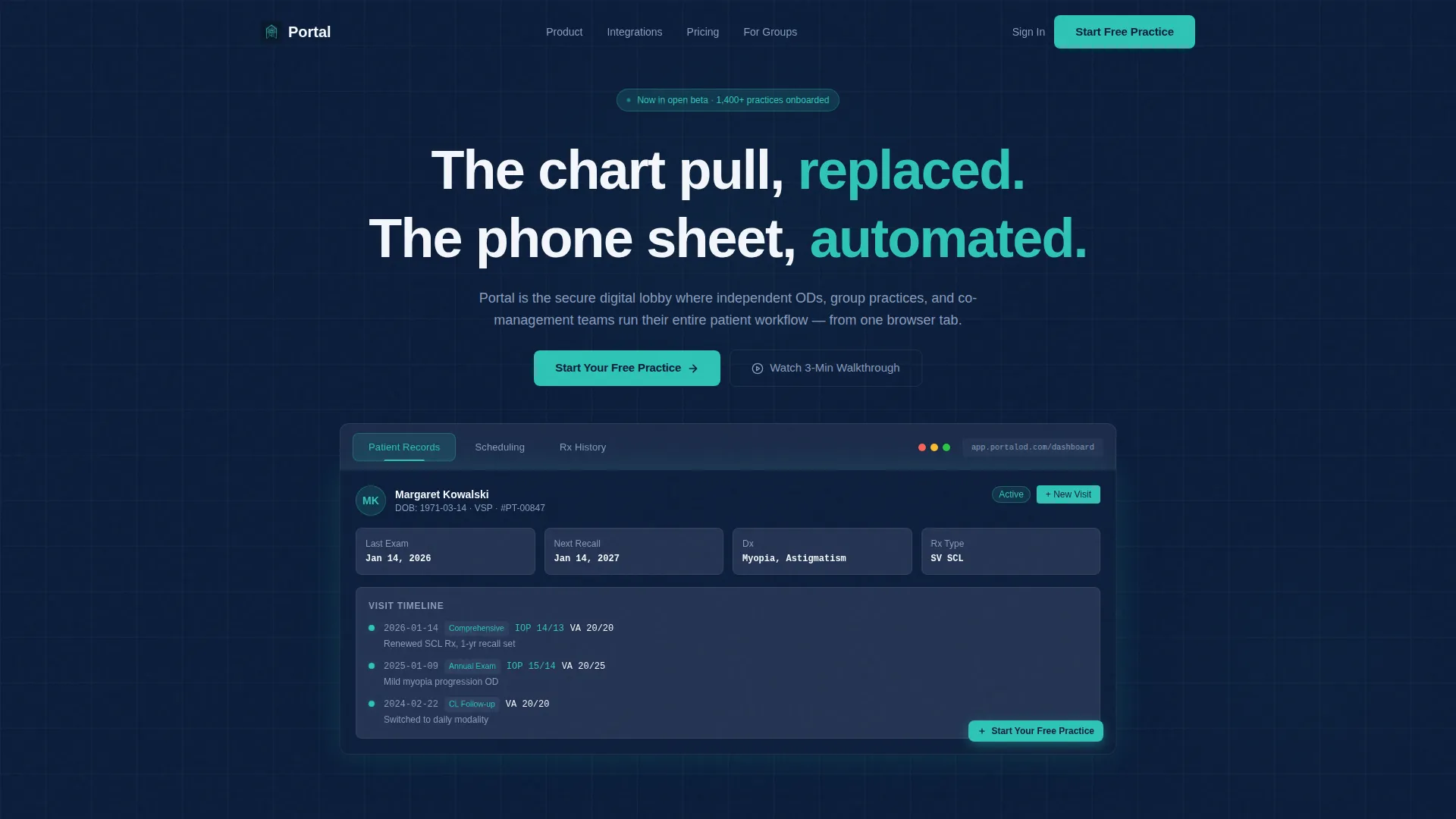
- A Feature Tab Switcher header with three live-swapping dashboard previews: Patient Records, Scheduling, and Rx History
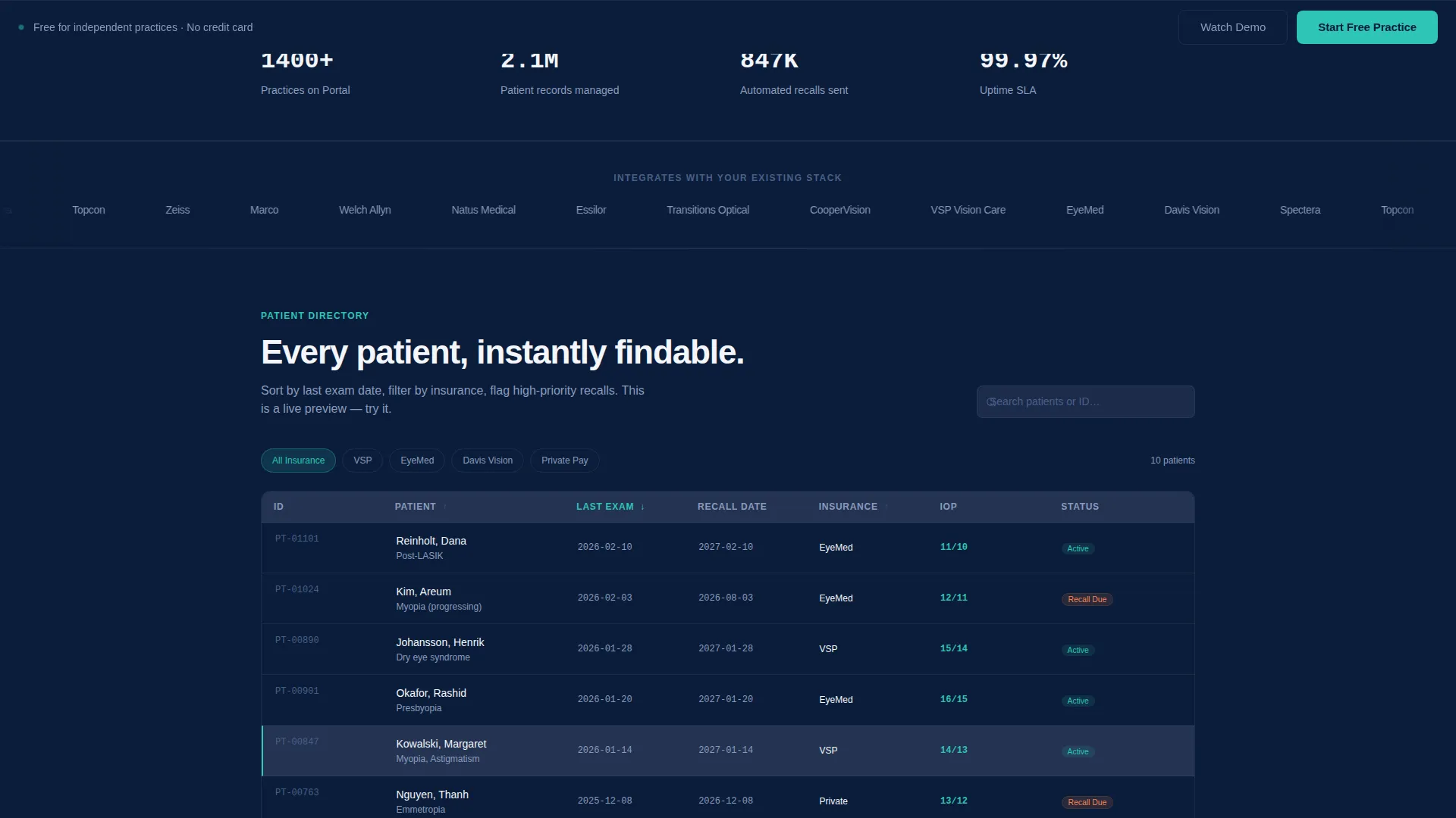
- A filterable patient directory grid sortable by last exam date or insurance type
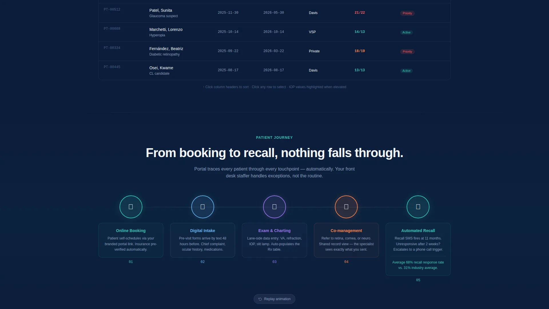
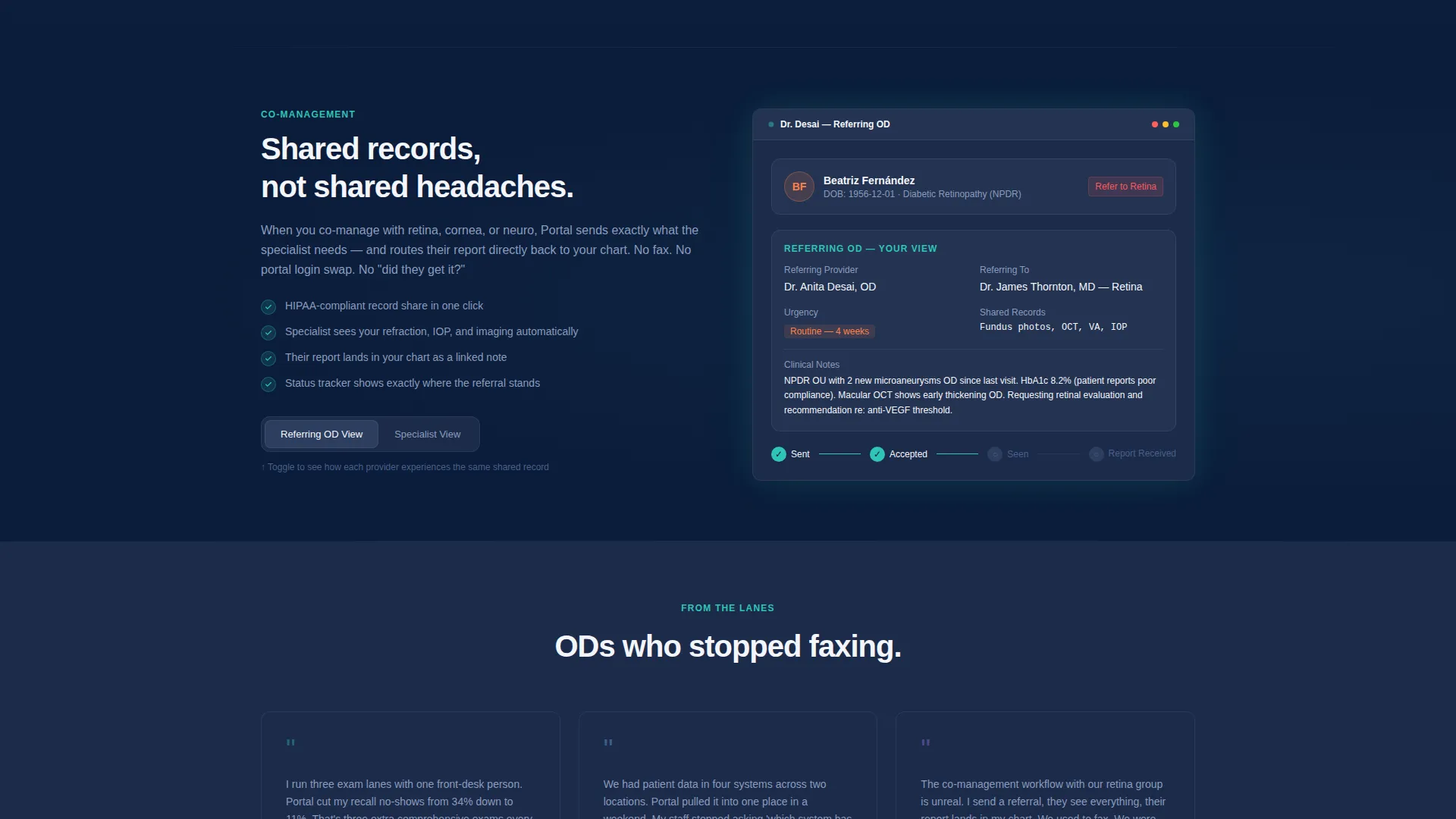
- An animated patient journey workflow and a co-management toggle showing referring OD and specialist views side by side
Feature list
This template ships with six purpose-built interactive components, each designed to reflect real optometric workflows and build visitor confidence before the call to action.
Tab-Switching Dashboard Header
Three clickable tabs sit above a live-rendered dashboard mockup. Each tab swaps the entire preview below: Records shows a patient card with visit timeline and intraocular pressure (IOP) readings; Scheduling reveals a color-coded weekly grid with appointment types; Rx History displays a prescription comparison table with sphere, cylinder, axis, and add columns across multiple exam dates.
Filterable Patient Directory Grid
Below the header, visitors encounter a sortable patient directory they can interact with directly. The grid filters by last exam date or insurance type, giving the impression of a real populated system rather than a static screenshot.
Animated Workflow Diagram
A step-by-step animation traces a patient's full journey from online booking through intake forms to post-visit recall. Each stage is visible and clickable, making the platform's logic easy to follow without reading a manual.
Co-Management Toggle View
A dedicated section lets visitors switch between the referring OD view and the specialist view. It shows how shared records appear on each side of a co-management relationship, which is a key trust signal for practices passing referrals across locations.
Freemium Signup Form
The primary call to action (call to action) appears inside the mock dashboard user interface and again as a sticky bottom bar after the second scroll section. The form asks for practice name, number of providers (solo, 2 to 4, or 5 or more), and a work email, three fields and no credit card required.
Secondary Video Capture Path
Visitors not ready to sign up can choose "Watch a 3-Minute Walkthrough." This path captures an email address in exchange for the video, giving a lower-commitment entry point that keeps the practice in the funnel.
Page sections overview
| Section | Purpose |
|---|---|
| Tab Switcher Header | Previews Records, Scheduling, Rx History via clickable tabs |
| Patient Directory Grid | Lets visitors sort and filter a populated patient list |
| Workflow Journey Diagram | Animates the full patient lifecycle from booking to recall |
| Co-Management Toggle | Shows shared records from both OD and specialist sides |
| Primary call to action Bar | Sticky signup prompt with three-field freemium form |
| Video Walkthrough Capture | Secondary email capture for the guided product video |
Design & branding system
The visual identity follows a Directory and Discovery theme using a Midnight Blue color system. Every color choice is calibrated for zero eye strain during an eight-hour clinic day, the same environment where this portal would actually be used.
- Deep clinical navy (#0B1D3A) as the primary background, instrument-panel charcoal (#1C2B4A) for card surfaces, and bright acuity-chart white (#F4F6FB) for text and data values
- Diagnostic teal (#2EC4B6) fires on hover states, active tabs, and notification badges to draw attention without visual noise
- The overall mood recalls a darkened slit-lamp room: calm, controlled, and built for focused clinical work
Mobile & speed optimization
The template is structured as a single-page layout with lightweight interactive components. The design prioritizes clean rendering across device sizes so the dashboard mockup remains readable on smaller screens.
- The tab-switching header and directory grid are designed to reflow cleanly on tablet and mobile viewports
- Sticky call to action bar and form elements remain accessible without obscuring content on smaller displays
How this template helps you convert
This template earns conversions by letting visitors experience the product before asking them to sign up. Every interaction builds confidence and reduces hesitation.
- The interactive dashboard mockup populated with real optometric data (such as "-2.25 +0.75 x 180") makes the product feel immediately familiar to practicing clinicians, shortening the trust-building phase.
- The two-path call to action structure captures both ready buyers through the freemium signup form and hesitant visitors through the video walkthrough email capture, so no qualified lead leaves without an entry point.
Other information about this template
This template is part of the Clearvision series, designed specifically for the optometry digital presence niche within the broader technology category. It suits practices at multiple growth stages and can reflect a range of operational setups.
- The Dashboard and Data Grid template style makes it well suited for portal and directory-first product pages
- The Interactive Explorer creative direction means each scroll layer reveals a new functional component rather than a static content block
- The Freemium and Trial landing page direction aligns with practices that prefer to test before committing to a subscription
Theme
Directory & Discovery
Creative direction
Interactive Explorer
Color system
Midnight Blue
Style
Dashboard/Data Grid
Direction
Freemium/Trial
Page Sections
Tab-switching Dashboard Header
Filterable Patient Directory Grid
Animated Patient Workflow Diagram
Co-management Toggle View
Dual-path Call to Action Structure
Realistic Clinical Data Mockup
Related questions
Is this template suitable for a solo OD practice?
Can the co-management toggle show both referring and specialist views?
What information does the signup form collect?
Does the template include a secondary path for undecided visitors?
What kind of data is shown in the dashboard mockup?



