Medical Clinic Blog Website Template
The Clinic Data Command medical blog landing page template is a hub-and-spoke, single-page medical landing page built for clinics that publish clinical intelligence. Designed for referring physicians, health-tech founders, and informed patients, it combines dark glass panels, iridescent data highlights, a sticky anchor nav, and a freemium gate to convert visitors into subscribers.
by Rocket studio
Quick summary
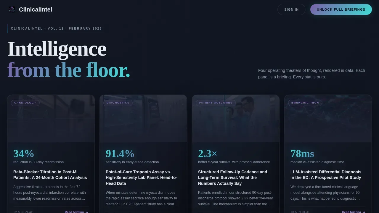
This is a striking, dark-themed medical landing page designed for a clinic that turns its own patient data into public-facing editorial. Four cursor-reactive glass panels open the page. A sticky anchor nav guides visitors through spoke sections covering cardiology, diagnostics, and patient outcomes. Freemium gates and email capture convert readers into registered subscribers.
Who this template is for
This template is ideal for clinics, medical practices, and health-focused organizations that publish evidence-based content. It is designed for teams who want to reach a professional, data-literate audience and convert them through a structured freemium model.
- Referring physicians scanning for evidence-based clinical updates between appointments
- Health-tech founders who need to validate product ideas against real clinical workflows
- Informed patients and researchers who engage deeply with methodology and outcome data
What problem this template solves
Most medical landing page designs treat content as secondary to branding. This template flips that model. It is built for clinics whose content IS the product, and whose visitors expect the same rigor in the page design as in the research itself.
- Generic clinic landing page templates do not support editorial depth or gated content flows
- Doctors and researchers leave pages that fail to establish clinical credentials quickly
- Standard medical website templates lack the data-visualization context that specialist audiences demand
What you get with this template
This landing page is a fully designed, single-page template ready to customize and launch. No coding required beyond your standard setup. Every section is pre-structured to provide professional clarity for a medical audience.
- Four Dark Glass Panel hero cards with cursor parallax, teal stat callouts, and violet category tags
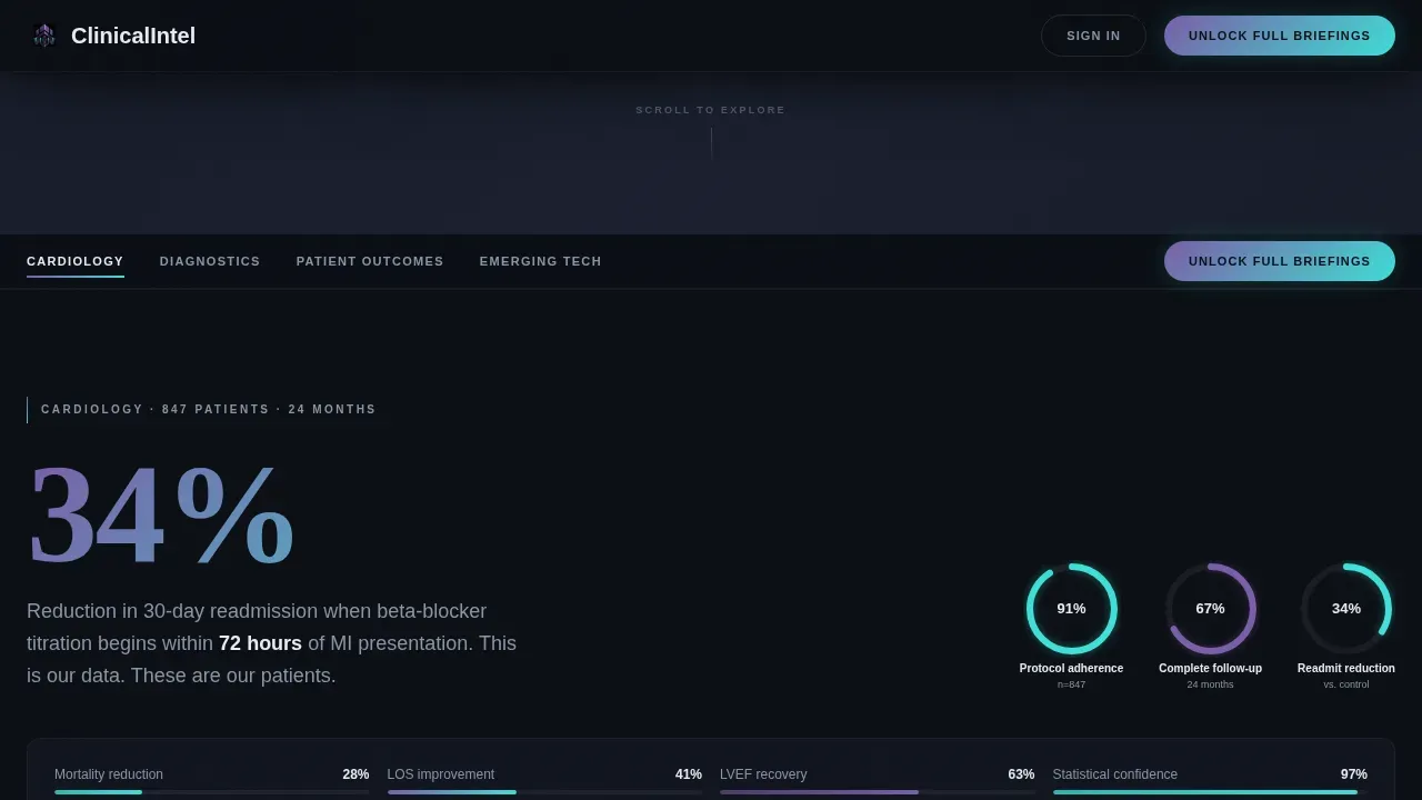
- Sticky anchor nav with spoke links, a persistent "Unlock Full Briefings" call-to-action button, and scroll-spy behavior
- Three editorial spoke sections (Cardiology, Diagnostics, Patient Outcomes) each with inline data visuals and freemium blur gates
- A footer with a single-field "Get the Weekly Signal" email capture for low-commitment visitors
Feature list
This template is built around a small set of carefully designed, high-impact components. Each one serves a specific role in guiding visitors from curiosity to conversion.
Dark Glass Panel Hero
Four frosted-glass floating cards open the page. Each card displays a featured article with a blurred data visualization behind it, a bold stat in iridescent teal, and a glowing violet category tag. The panels react to cursor movement with a subtle parallax shift. Content is the hero, no stock photography needed.
Sticky Hub-and-Spoke Navigation
The anchor nav locks to the top of the page on scroll. Spoke links, Cardiology, Diagnostics, Patient Outcomes, Emerging Tech, let visitors jump directly to their area of interest. A persistent "Unlock Full Briefings" button stays visible throughout, giving doctors and researchers a clear conversion path at every scroll depth.
Editorial Spoke Sections with Inline Data Visuals
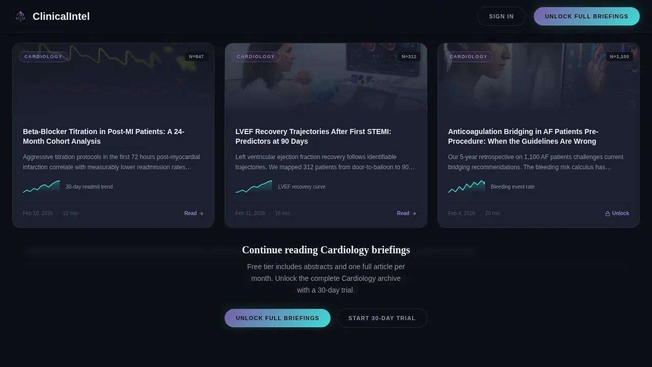
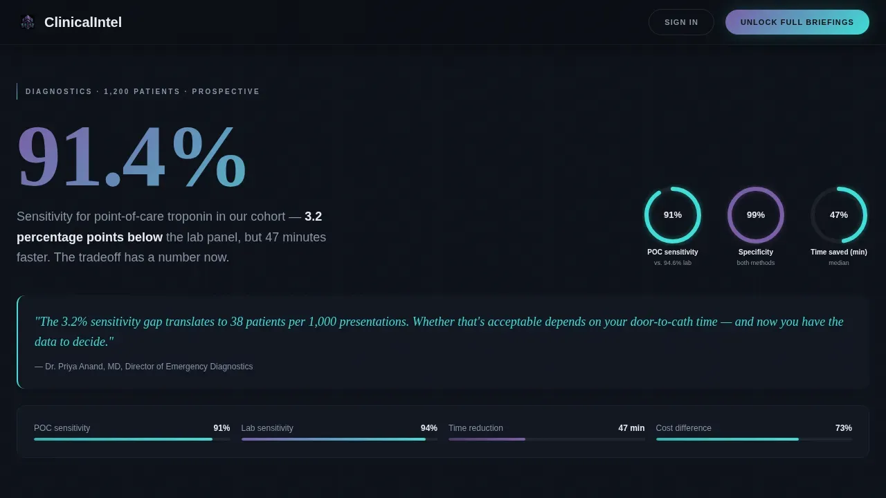
Each spoke opens with a commanding oversized statistic rendered in iridescent type. Article cards follow in editorial grids. Sparkline charts appear inline on cards, animated ring graphs show study populations, and confidence-interval bars fill on scroll. The structure rewards visitors who read deeply and naturally guides them toward the freemium gate.
Freemium Blur Gate
After the second article preview in each spoke, body text blurs behind a frosted-glass overlay. Visitors are invited to register with a professional email, select a role (Physician, Researcher, Health-Tech, or Patient), and choose their areas of interest using selectable pills. Free tier delivers abstracts and one full article per month. A 30-day trial unlocks the full archive and weekly data digests.
Footer Email Capture
A clean, minimal single-field input sits in the footer, positioned as the secondary conversion path. "Get the Weekly Signal" targets visitors not ready to register but unwilling to leave without something. It captures email-only leads with minimal friction.
Scroll-Triggered Animation System
Stat reveals, ring graph animations, and confidence bar fills trigger as the user scrolls. The page feels alive and responsive to reading pace. These interactive elements help explain complex clinical data in an easy-to-digest format, keeping visitors engaged longer without requiring external video or illustration assets.
Page sections overview
| Section | Purpose |
|---|---|
| Dark Glass Hero | Four parallax panel cards with stat callouts and category tags |
| Sticky Anchor Nav | Locks on scroll, links to spokes, hosts persistent call to action |
| Cardiology Spoke | Stat opener, article grid, freemium blur gate |
| Diagnostics Spoke | Ring graph, article cards, inline sparkline charts |
| Patient Outcomes Spoke | Confidence interval bars, case outcome data display |
| Footer Email Capture | Single-field "Get the Weekly Signal" subscription input |
Design & branding system
The visual identity follows a Data Command theme with an AI Iridescent color system. Backgrounds stay deep and dark; interactive elements pulse with a violet-to-teal gradient. Typography pairs Fraunces serif headlines with DM Sans body text, creating a clean contrast between editorial weight and clinical readability.
- Color palette: deep black (#0B0E14) base, surgical charcoal (#1A1F2E) surface, holographic violet (#7B5EA7) for hover states, iridescent teal (#3EDFD7) for data highlights, and cool clinical white (#E8ECF1) for body text
- Typography: Fraunces for commanding headlines and oversized statistics; DM Sans for navigation, body copy, and user interface labels
- Interactive states: anchor links, category pills, and progress bars use a violet-to-teal gradient shift on hover and active
Mobile & speed optimization
The template is designed desktop-first to match its primary audience of researchers and physicians working across multiple screens late at night. It is fully responsive, ensuring the page remains functional and visually clear on every device, including phones and tablets.
- Fully responsive layout adapts all editorial grids and spoke sections for smaller screens
- Tap targets on mobile are sized for easy navigation through category pills and anchor links
- Static sections use server-side rendering patterns; interactive panels and the anchor nav use client-side components for smooth performance
How this template helps you convert
An effective medical landing page balances clinical authority with a clear conversion path. This template is built with that balance at its center. Every design decision, from the hero panels to the footer input, is oriented toward moving visitors from reading to registering.
- The freemium blur gate appears naturally after the second article preview in each spoke, converting engaged readers at peak interest rather than interrupting them early
- The persistent "Unlock Full Briefings" button in the sticky nav keeps the primary call-to-action visible throughout the entire page without requiring the visitor to scroll back to the top
- The low-commitment footer email capture reaches visitors who are not ready to register, turning a potential exit into a qualified lead for future nurture
Other information about this template
This template is part of a broader family of medical website templates designed to give clinics, medical practices, dentists, and specialist centers a professional online presence without requiring deep coding knowledge. It is a strong fit for any practice looking to build credentials, engage a specialist audience, and grow a subscriber base through content.
- Medical website templates like this one provide a professional appearance for clinics and medical centers that want to take their practice online quickly
- No coding required: the template is easy to customize, allowing teams to change colors, swap content, and set up their own brand identity without technical help
- Patient testimonials, patient forms, services overview blocks, and appointment booking sections can be incorporated as the content strategy grows
- The design supports telehealth services context, treatment options listings, and insurance coverage information where clinics choose to add those details
- Dentists, specialty clinics, and multi-specialty centers will find the hub-and-spoke structure ideal for organizing multiple areas of expertise under one polished landing page
- The free medical landing page tier available on some platforms makes templates like this accessible to smaller practices that are just starting to build their digital presence
- This is the clinic data command medical blog landing page template, designed for clinics whose mission is to publish clinical intelligence as a primary service, not an afterthought
Theme
Data Command
Creative direction
Industry Report
Color system
AI Iridescent
Style
Hub & Spoke (Anchor Nav)
Direction
Freemium/Trial
Page Sections
Dark Glass Panel Hero with Cursor Parallax
Sticky Anchor Navigation with Persistent Call to Action
Editorial Spoke Sections with Inline Data Visuals
Freemium Blur Gate with Role Selector
Footer Email Capture for Low-commitment Leads
Scroll-triggered Animation System
Related questions
Who is this landing page template best suited for?
Is any coding required to set up this template?
Can this template support appointment booking or patient forms?
How does the freemium conversion model work in this template?
Is this template fully responsive for mobile visitors?



