Clinic Pro — Veterinary Landing Page Template
Triage is a bold brutalist landing page template built for veterinary digital menu systems. It uses a live-updating dashboard layout to show vaccination pricing, wellness packages, and wait times on clinic lobby screens. The design pairs void black backgrounds with iridescent teal data accents and chrome typography, making every stat feel immediate and authoritative.
by Rocket studio
Quick summary
Triage is a dashboard-style landing page template for a veterinary digital menu system. It replaces whiteboards and laminated price sheets with a glowing, live-updating service board. The design follows a bold brutalist aesthetic, pairing heavy chrome type with iridescent teal and violet accents. Every section reads like a data brief that builds a clear, undeniable case.
Who this template is for
This template is designed for veterinary professionals who manage client-facing service information every day. It speaks directly to the people who feel the friction of outdated, static menus most acutely.
- Practice managers juggling multiple exam rooms who need lobby displays to stay current without manual updates
- Solo large-animal veterinarians still relying on handwritten invoices who want a faster, cleaner client experience
- Multi-location clinic owners who need every lobby showing the same services and pricing by a set deadline
What problem this template solves
Veterinary waiting rooms still run on laminated sheets and dry-erase boards. Staff answer the same pricing questions dozens of times a day. That friction costs clinics real revenue and real time.
- Clients leave without knowing about wellness packages or dental cleanings because no one pointed them to a menu
- Staff spend significant time fielding questions like "how much does a nail trim cost?" instead of focusing on patient care
- Multi-location clinics struggle to keep every lobby aligned on current offerings and accurate pricing
What you get with this template
This template delivers a complete, single-page landing experience that sells the value of a veterinary digital menu system. Every section is purposefully structured to move a skeptical clinic owner from curious to convinced.
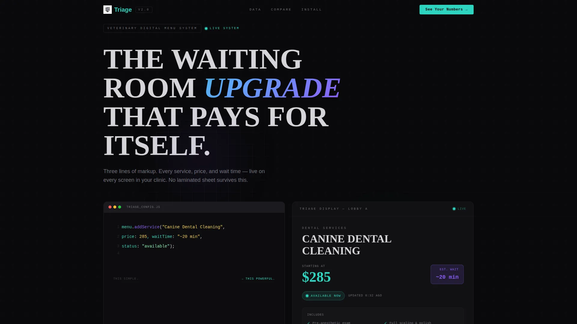
- A terminal-style header block showing live API markup rendering into a brutalist service card in real time
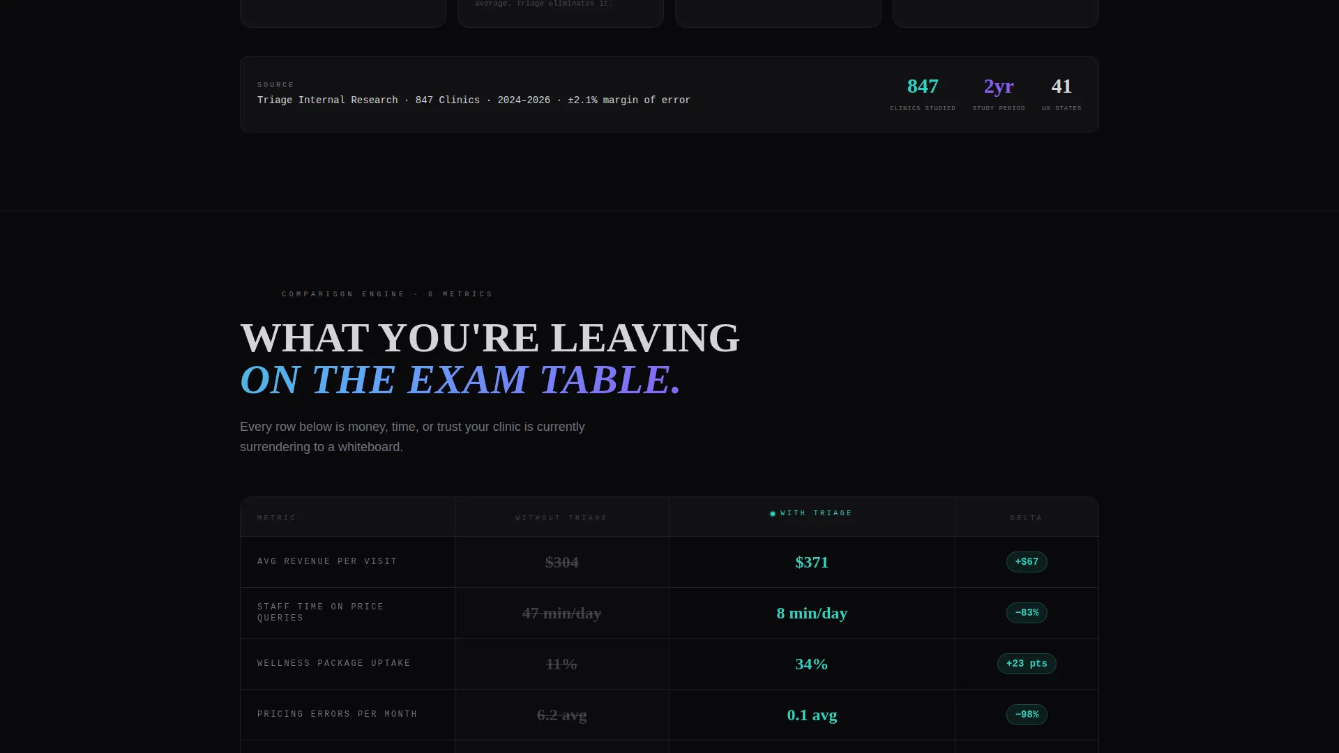
- A persistent side-by-side comparison grid tracking six clinic metrics across "Without Triage" and "With Triage" columns
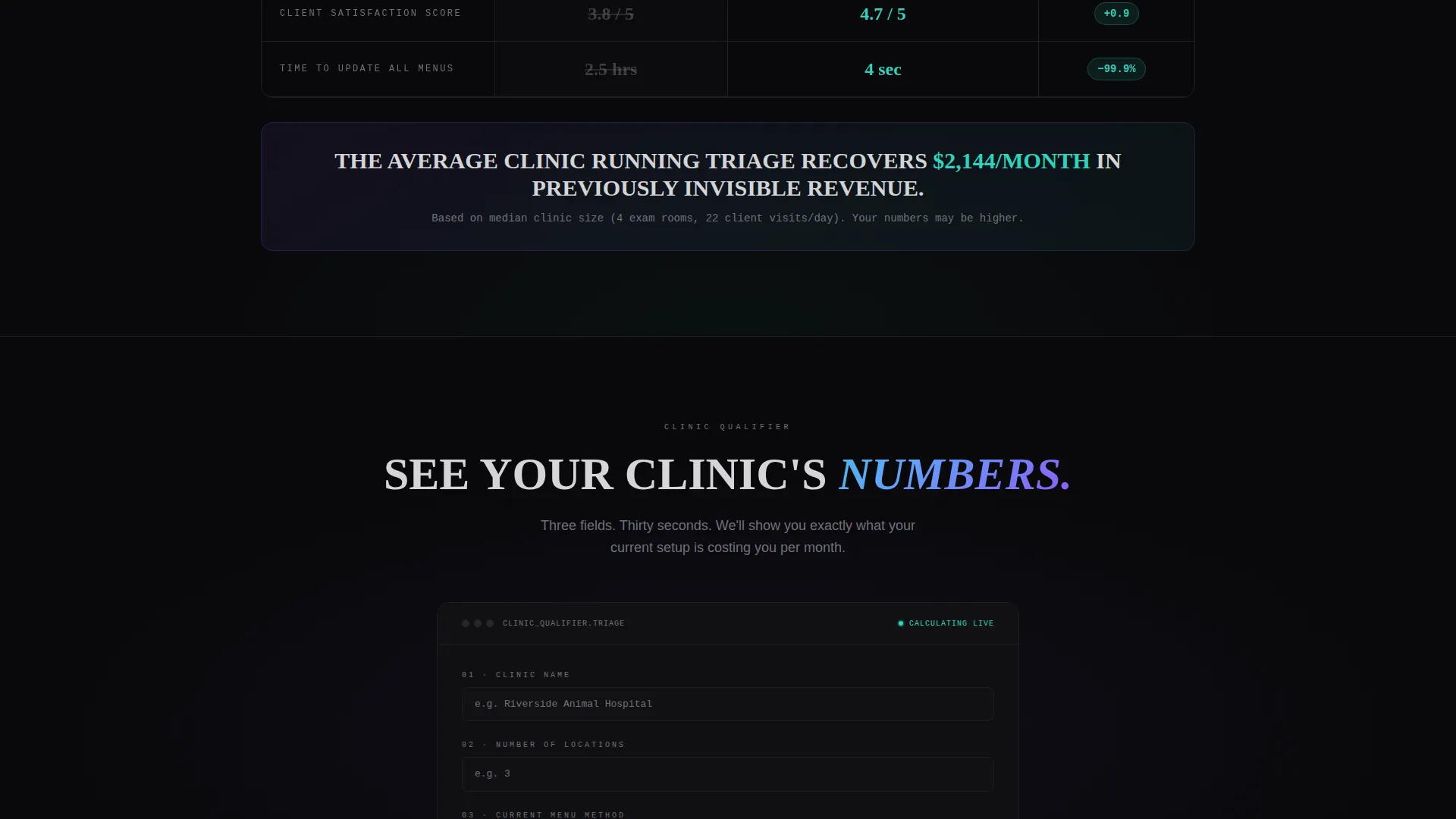
- A three-field qualifier form triggering on the primary call to action, plus a ghost-button secondary path capturing email on click
Feature list
This template is built around a specific visual and functional system. Each component earns its place by reinforcing the core message: simple input, powerful output.
Live Code-to-Card Header
The header opens with a dark-mode terminal block showing three lines of API markup. The screen splits, and the right half instantly renders that code as a formatted brutalist menu card. Service name, price in iridescent teal, and a pulsing violet wait-time badge all appear together. The message lands in under two seconds.
Comparison Data Grid Engine
A two-column grid pins "Without Triage" against "With Triage" across six clinic metrics. Each row animates its delta value as it enters the viewport. The layout stays persistent during scroll so the contrast never leaves the visitor's eye.
Industry Report Data Modules
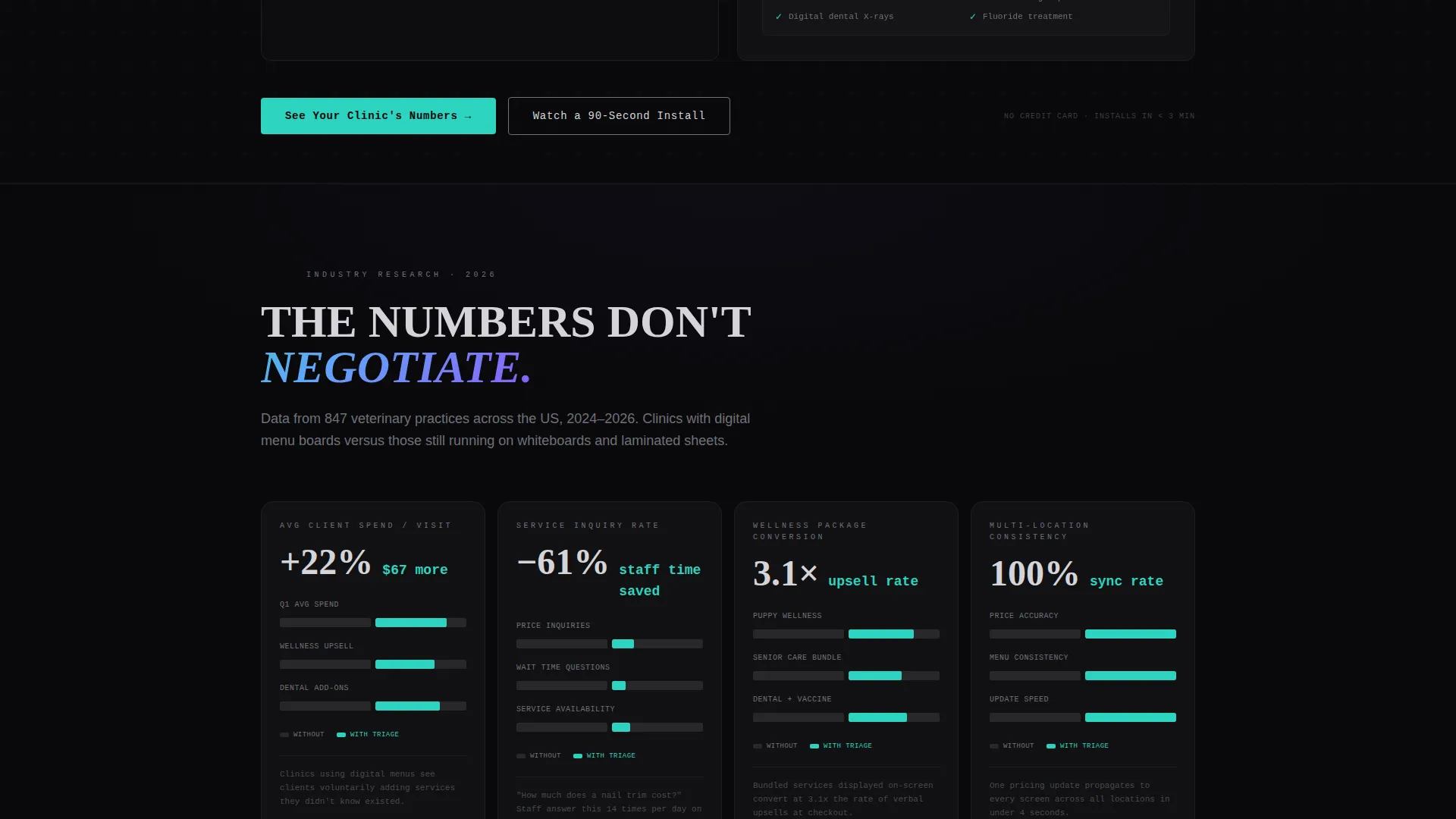
Each scroll section presents a data module with bold stat callouts, mini bar charts in teal and violet, and a single-sentence brutalist caption. Stats include average client spend increases, service inquiry rates, and upsell conversion on wellness packages. The cadence feels like a research brief that keeps adding weight.
Qualifier Form with call to action Logic
The primary call to action, "See Your Clinic's Numbers," triggers a focused three-field form. Visitors enter clinic name, number of locations, and current menu method from a dropdown. The secondary path, "Watch a 90-Second Install," floats as a ghost button in chrome and captures email on click.
Bold Brutalist Visual System
Heavy slab typography anchors every data point. Void black backgrounds keep the layout dense and focused. Iridescent teal and holographic violet appear only on live-data elements, so visitors immediately learn which parts of the screen are static and which are actively updating.
Live-Data Accent Hierarchy
Price tickers, status badges, and active toggles pulse in teal and violet while all static text stays in surgical chrome. This creates a clear visual grammar. Visitors scan the page and instinctively know where the live information lives.
Page sections overview
| Section | Purpose |
|---|---|
| Terminal Header Block | Show code rendering into a live menu card |
| Metrics Comparison Grid | Compare six clinic metrics side by side |
| Client Spend Module | Highlight 22% average spend increase stat |
| Service Inquiry Data | Show inquiry rate lift with bar charts |
| Upsell Conversion Panel | Quantify wellness package conversion gains |
| Staff Time Savings | Visualize time recovered from pricing questions |
| Primary call to action Form | Capture clinic name, locations, menu method |
| Ghost Button Path | Collect email for 90-second install video |
Design & branding system
The visual identity runs on a bold brutalist framework using an iridescent color system. The palette was built to feel like a matte-black tablet catching overhead light, with color signaling intelligence rather than decoration.
- Core palette: void black (#09090B) backgrounds, surgical chrome (#D4D4D8) for heavy typography, holographic violet (#8B5CF6) for pulsing status elements, and iridescent teal (#2DD4BF) reserved for live price and wait-time accents
- Typography is oversized and heavy, anchored in slab-style weight to make every data point feel authoritative at a glance
- Color is used functionally: static information stays chrome, live data breathes in teal and violet, so the visual hierarchy teaches the visitor's eye before they read a single word
Mobile & speed optimization
The template is designed to stay readable and impactful on smaller screens. The data-grid layout adapts so clinic owners reviewing the page on a phone still feel the weight of the comparison metrics.
- The two-column comparison grid collapses cleanly for narrow viewports without losing the row-by-row delta animation effect
- Oversized type and high-contrast void black backgrounds keep data legible even on small clinic-lobby tablets or personal devices
- The terminal header block and brutalist card split are structured to reflow without breaking the core code-to-card demonstration
How this template helps you convert
The page is engineered to create a specific feeling: the visitor realizes they are already behind, and that every day without a digital menu is leaving revenue on the exam table. Conversion follows naturally from that clarity.
- The comparison grid makes the cost of inaction visible. Six live-animating metric rows show the exact delta between clinics using digital menus and those that are not, removing abstract doubt and replacing it with specific numbers.
- The qualifier form lowers commitment. Asking for clinic name, location count, and current menu method feels like a diagnostic, not a sales form. Visitors feel they are getting something tailored rather than being pushed into a funnel.
- The ghost button secondary path captures visitors who are not ready to fill out the form. A single email address gets them into the install video flow, keeping them engaged without forcing a full commitment.
Other information about this template
This template fits within a broader category of veterinary digital presence tools designed for the technology-forward practice. The layout style, dashboard and data grid, is particularly effective for any clinic-facing product that needs to prove ROI before asking for a decision.
- The template style is classified as Dashboard and Data Grid, making it adaptable for other data-heavy veterinary technology pitches beyond digital menus
- The creative direction follows an Industry Report cadence, which builds credibility through structured data presentation rather than emotional storytelling
- The header concept, Code Snippet, positions the product as both accessible and technically capable, appealing to practice managers and clinic owners who want simplicity without sacrificing control
- The landing page was designed for the veterinary digital menu niche within the broader veterinary digital presence subcategory, keeping every data point and use case tightly aligned to that specific buyer context
Theme
Bold Brutalist
Creative direction
Industry Report
Color system
AI Iridescent
Style
Dashboard/Data Grid
Direction
Comparison/Versus
Page Sections
Live Code-to-card Header Block
Persistent Comparison Data Grid
Industry Report Data Modules
Three-field Qualifier Form
Ghost Button Secondary Path
Functional Live-data Color Hierarchy
Related questions
Who is this landing page template built for?
Can I customize the comparison metrics and stat callouts?
What does the qualifier form collect?
Does the ghost button path work separately from the main form?
What makes the bold brutalist design appropriate for a veterinary technology audience?



