Precision B2B Sales Training Landing Page Template
The Close Precision B2B Sales Training landing page template is a modular, card-grid layout built for sales training programs targeting VP Sales leaders, startup founders, and revenue operations managers. It showcases a twelve-week curriculum through scroll-triggered module cards, a gated syllabus download form, and a Corporate Precision visual identity that feels as organized as a well-run pipeline review.
by Rocket studio
Quick summary
This landing page template is purpose-built for B2B sales training programs. It uses a modular card-grid layout to walk website visitors through a twelve-week curriculum, week by week. The design follows a Corporate Precision theme with a Soft Mist color system. Every section is structured to educate visitors, build trust quickly, and guide them toward downloading a full program syllabus.
Who this template is for
This template speaks directly to the people running revenue teams or building them from scratch. It is designed for program creators and training providers who serve a professional B2B audience and need a landing page that feels as credible as the content behind it.
- VP Sales leaders watching their teams miss quota and needing a structured, repeatable fix they can present to leadership
- Startup founders who have just hired their first sales reps and need a twelve-week playbook to ramp them faster
- Revenue operations managers tasked with cutting rep ramp time and improving quota attainment across the team
What problem this template solves
Most sales training landing pages fail to communicate depth. They list bullet points, drop a testimonial, and ask for a purchase before the visitor has any reason to trust the program. That approach raises the bounce rate and loses warm leads who needed just a little more detail before deciding.
This template solves that problem by making the curriculum itself the conversion engine.
- Lack of visible structure makes visitors doubt the program has real depth; this template shows every module, numbered and labeled, so the course feels real before the form appears
- Weak social proof loses potential customers mid-scroll; the template includes a dedicated proof and outcomes section with metrics and testimonials that build trust with specific results
- Friction-heavy lead capture kills conversions; the three-field download form keeps the ask short while delivering all the essential information visitors want before they commit
What you get with this template
You get a fully designed, section-complete landing page that is ready to customize with your program's content. Every section is thought through and placed in a deliberate order so the page tells the right story to the right buyer at the right moment.
- A five-section page layout covering the hero, persona targeting, module grid, proof and outcomes, and syllabus download call to action, plus a single-row footer
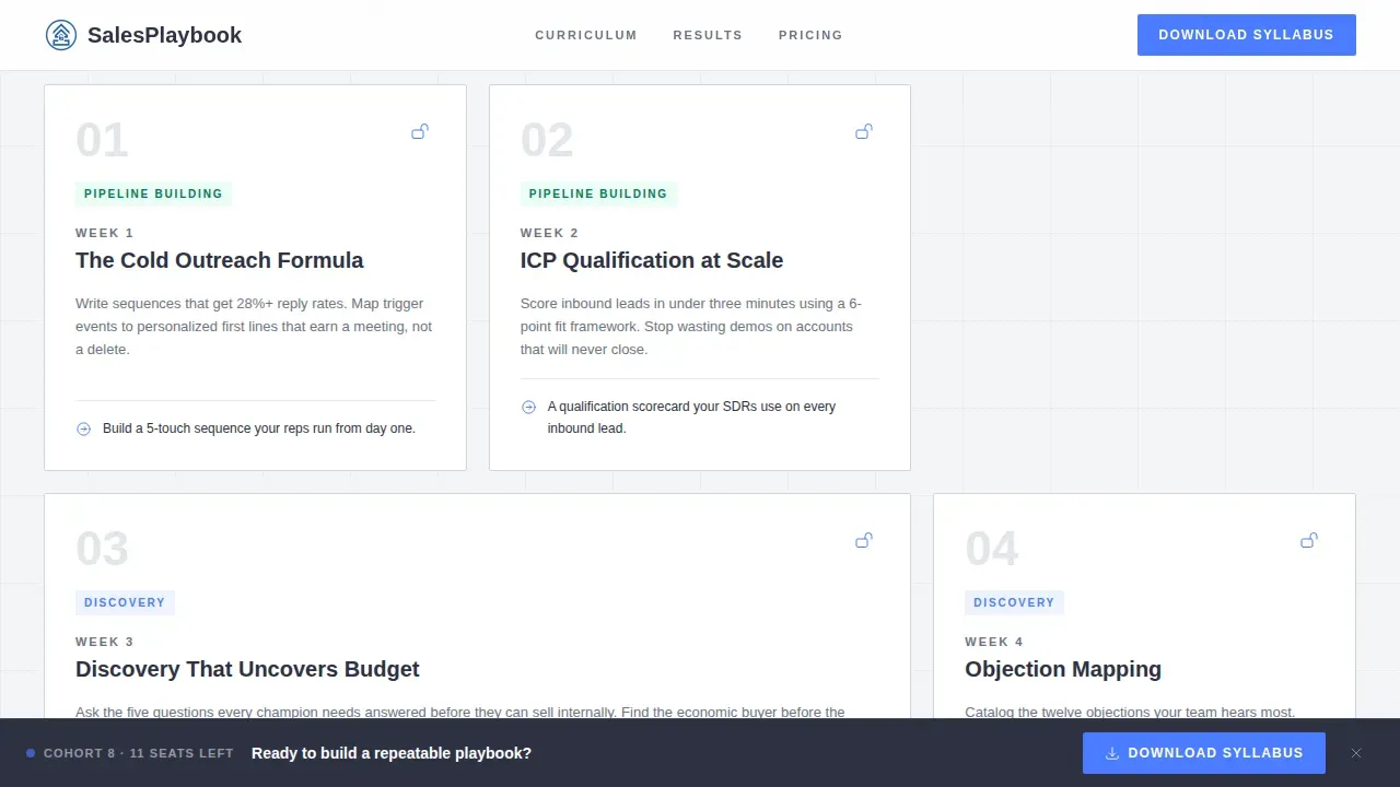
- Twelve numbered module cards with week labels, skill outcome descriptions, and scroll-triggered lock icons that reveal progressively as visitors scroll down the page
- A lead capture form with three fields covering work email, company size, and an optional free-text challenge field, placed in the header and reinforced by a sticky bar after the third card row
Feature list
This template packs in a focused set of features drawn directly from its design brief. Each one serves a clear purpose on the landing page.
Half-Page Photo and Text Hero
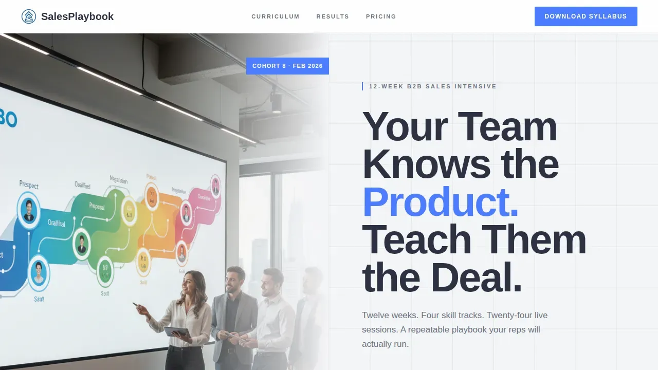
The hero section splits the page into two equal halves. The left side holds a candid, shallow-depth-of-field photograph of a sales rep mid-whiteboard session. The right side delivers a bold headline, a single supporting subline naming the twelve-week structure and module count, and a clear call to action button that starts the download flow immediately. This hero shot grabs attention without relying on generic stock photography.
Twelve-Card Modular Curriculum Grid
Each of the twelve module cards is numbered boldly in the corner and carries a short title such as "Week 4: Objection Mapping," a two-sentence skill description, and a subtle lock icon on advanced modules. As visitors scroll, the lock icons unlock visually, simulating the feeling of earning access to each stage of the course. This clever way of presenting a curriculum turns the page itself into a product demo of the program's progression.
Progressive Scroll Unlock Animation
Scroll-triggered card reveals with a staggered entrance give the page rhythm and momentum. Each card appears slightly later than the one before it, reinforcing the sense of advancement through the course. The animation is medium intensity, meaning it adds energy without slowing down the reading experience or distracting from the supporting copy.
Sticky Syllabus Download Bar
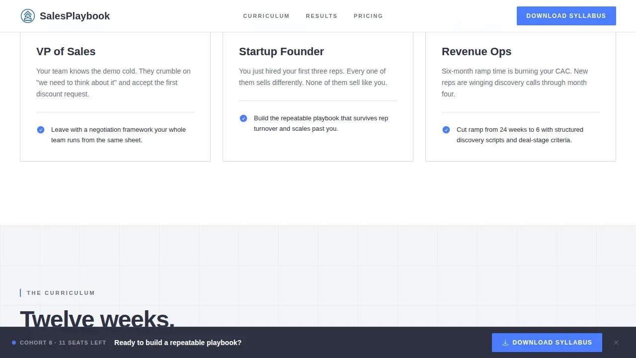
After website visitors scroll past the third card row, a sticky bar appears at the bottom of the viewport. The bar carries a compact clear call to action with one decisive blue call to action button. This sticky bar encourages visitors who are already engaged to take the desired action without scrolling back to the top. It is a great example of guiding visitors toward conversion at the exact moment their interest peaks.
Three-Column Persona Targeting Section
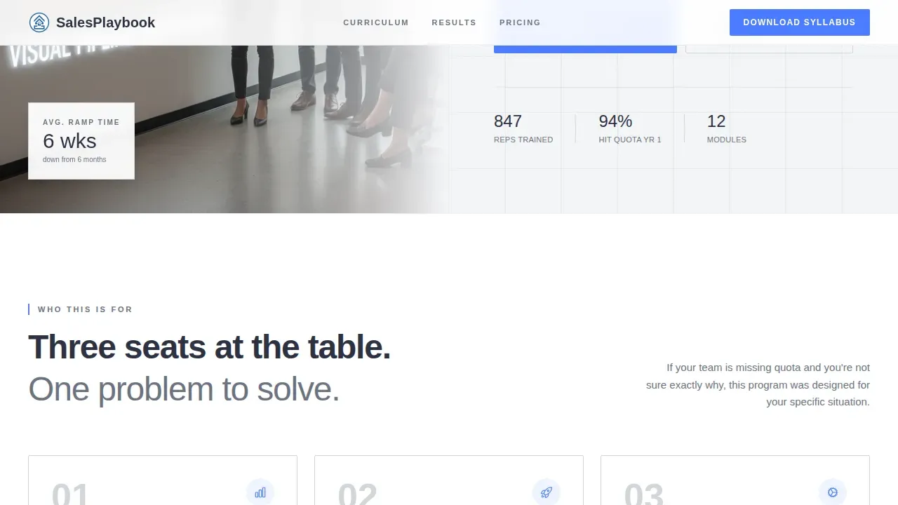
Below the hero, an asymmetric three-column card section identifies each buyer persona by name and pain point. Each card speaks directly to a specific reader: the VP Sales leader, the startup founder, and the revenue operations manager. This section immediately addresses the challenges each visitor faces, making the page feel personal and relevant from the first scroll.
Proof and Outcomes Section
A metrics bar sits above a row of testimonial cards. The testimonials feature named sales leaders with their title and company, and they follow an in-depth before-and-after format that shows measurable results such as ramp time and quota attainment percentages. Social proof at this level of specificity builds trust with potential customers who are still in the decision making process.
Page sections overview
| Section | Purpose |
|---|---|
| Hero split layout | Introduce the program with a headline and hero image that grabs attention and presents the primary call to action button |
| ICP persona cards | Highlight each buyer's specific pain point in a three-column asymmetric card layout |
| Module curriculum grid | Display all twelve numbered course cards with progressive scroll unlock animation |
| Proof and outcomes | Show outcome metrics and named testimonials that include social proof and trust badges |
| Syllabus download form | Capture leads with a short three-field form and reinforce the ask with a sticky bar |
| Single-row footer | Close the page with a clean linear footer pattern |
Design & branding system
The visual identity follows a Corporate Precision theme built on the Soft Mist color system. The palette feels like a well-organized dashboard at seven in the morning: no noise, no clutter, just clean data and clear next steps. The design uses a simple design philosophy where every color has an assigned role and never competes with another.
- Color roles: Fog white (#F4F5F7) dominates all backgrounds; charcoal slate (#2D3142) carries all body text; brushed aluminum (#D1D5DB) draws card borders and dividers; and decisive blue (#4A7CFF) appears only on call to action buttons and progress indicators, functioning as one cta color that is impossible to miss
- Typography: Plus Jakarta Sans handles all headings in bold weight, while DM Sans handles all body text, creating a readable contrast that supports the f pattern reading behavior common among busy B2B users reviewing a sales page on a Monday morning
- Visual elements: Shallow-depth-of-field photography, numbered card corners, subtle lock icons, and a metrics bar make up the core visual elements, all serving the playbook aesthetic without introducing bright colors that would distract from the content
Mobile & speed optimization
The template is built desktop-first to serve VP Sales leaders reviewing a sales landing page during a structured work session, but it includes full mobile support for buyers researching on smaller screens. A well-designed responsive layout ensures that website visitors on any device can read, scroll, and convert without friction.
- Responsive card grid: The twelve-module grid reflows cleanly on mobile, stacking cards vertically so the curriculum remains easy to scan and the course structure stays clear even on a small screen
- Server-component architecture: Static content sections such as the hero, persona cards, and module descriptions use server-rendered components for fast initial load, while scroll animations and the download form use client-side rendering only where interactivity is required
How this template helps you convert
A high-precision B2B sales training landing page must be designed to build trust quickly, demonstrate immediate value, and guide visitors toward a clear, high-value action. This template is structured to do exactly that across every section and interaction.
- Reciprocity through open curriculum access: The template gives away module titles, skill outcomes, and the full week-by-week structure openly, using the psychological principle of reciprocity to persuade users that the program is worth downloading. Giving visitors that level of detail for free makes the syllabus download feel like a natural next step rather than a cold transaction.
- One focused call to action with reinforcement: The page uses one cta path: the syllabus download. That primary desired action is placed in the hero, backed by compelling copy, and then reinforced by the sticky bar after scroll depth confirms engagement. This eliminates the decision paralysis that hurts conversion rates on pages with competing offers.
- Trust built in layers: Social proof appears in three forms: a metrics bar, named testimonial cards with before-and-after results, and trust badges from recognizable outcomes. Each layer of trust signals arrives at a different point in the scroll, so potential customers encounter credibility evidence throughout the entire page rather than only at one point.
Other information about this template
This template belongs to the Education and Training category under the Business and Executive Education subcategory. It is designed specifically for the sales training program niche and can be adapted for related online course programs that follow a modular, week-by-week delivery format. The following additional details are worth knowing before you start building.
- The page uses a Content and Resource landing page direction, meaning it earns conversions by educating visitors openly rather than withholding details behind a hard gate. This approach lowers the bounce rate by giving visitors a reason to keep reading.
- A secondary call to action linking to a gated five-minute product demo video on discovery frameworks is included as a supporting conversion path. This trial version experience lets undecided visitors sample the course quality before downloading the full syllabus.
- The sticky bar uses a compact layout with compelling copy and a clear cta that does not interrupt reading but becomes visible at exactly the right scroll depth. It is one of the better landing page examples of using a sticky bar without harming the user experience.
- Users can connect the download form to their preferred email tool or customer relationship management platform to route new leads automatically. The form covers work email, company size dropdown, and an optional free-text challenge field, making it one of the more practical lead forms among current landing page examples in this niche.
- The template is suited for teams that want to drive visitors from a single traffic source such as a paid search campaign, a LinkedIn ad, or an email nurture sequence. It focuses every element on one goal, which helps turn visitors into download leads efficiently and supports more conversions per session.
- To maximize results, you can run different versions of the hero headline using A/B testing. For example, testing outcome-driven copy against pain-point-led copy helps identify what resonates best with each traffic source.
- The page is also a strong addition to any campaign monitor sequence where a targeted email drives recipients to a landing page built around a specific offer. Its focused single-goal structure fits naturally at the end of a nurture flow.
- Marketers building a swipe file of high-performing B2B training pages will find this template worth studying. It balances the f pattern reading layout, clear call to action placement, open curriculum disclosure, and layered social proof in a way that reflects current best practices for sales landing pages.
- The template supports creating landing pages that feel like a classic example of curriculum-led lead generation: show the full course map, let the value proposition speak for itself, and then make the download feel like the obvious next step.
- The close precision b2b sales training landing page template is available for immediate customization, making it straightforward to start building a professional sales training landing page without starting from scratch.
- Because it is designed to educate visitors and persuade users through visible depth rather than vague claims, it works well for programs that want to attract pre-qualified leads who already understand the scope of what they are buying.
- Sellers and training providers looking to promote their programs across social media platforms can use this landing page as the primary destination, keeping all campaign traffic focused on one high-converting page rather than spreading visitors across a general website.
- Including search engines as a traffic source is also viable. The page structure, with scannable headings, clear description text, and well-organized course details, supports discoverability for buyers actively searching for B2B sales training programs.
- For teams that want to highlight the unique selling proposition of their program clearly, the hero section is the right place to lead with outcomes. The template makes it easy to call out the specific benefits that separate this course from generic sales training content.
Theme
Corporate Precision
Creative direction
Step-by-Step Guide
Color system
Soft Mist
Style
Card Grid (Modular)
Direction
Content/Resource
Page Sections
Half-page Photo and Text Hero Section
Twelve Numbered Module Card Grid
Progressive Scroll Unlock Animation
Sticky Syllabus Download Bar
Three-column Persona Targeting Cards
Proof and Outcomes Section with Testimonials
Related questions
Can I customize the module cards with my own course content?
Does this template include the download form and sticky bar as built-in components?
Is this template suitable for a program shorter than twelve weeks?
What typography and colors does this template use?
Can I use this landing page for a live training program rather than a self-paced online course?



