Corporate Training & L&D Professional Website Template
This sales training landing page template is built for training companies that turn raw reps into consistent closers. It opens with a provocative quiz, then walks visitors through a Month 0 versus Month 12 comparison table that makes the gap feel real. Two lead capture paths convert both ready buyers and cautious researchers, making every scroll count.
by Rocket studio
Quick summary
A single-page lead generation template for B2B sales training companies. It combines an interactive quiz starter, a scroll-driven comparison table, and a dual-path conversion system. Visitors self-diagnose their team's biggest pipeline problems before they ever read a headline, making the diagnostic offer feel like the logical next step.
Who this template is for
This template is built for sales training providers who need to convert skeptical, time-poor buyers. It speaks directly to decision-makers who have tried courses before and are tired of vague promises.
- VP of Sales leaders watching new hires underperform through Q1 and needing pipeline predictability fast
- Startup founders who have been doing founder-led sales and need a structured playbook to hand off to a growing team
- Revenue operations managers trying to standardize a closing methodology across thirty or more reps who all learned differently
What problem this template solves
Most sales training providers lead with credentials. Buyers tune out. The real problem is that decision-makers arrive already skeptical, and a static page full of bullet points and testimonials does nothing to bridge that gap.
- Reps wing demos and discovery calls with no consistent methodology, and no landing page has made the cost of that visible enough to act on
- Sales leaders cannot justify a training investment without first seeing a clear before-and-after picture tied to their specific situation
- Founders and revenue operations teams need a page that earns trust through specificity, not just social proof
What you get with this template
You get a fully structured, single-page layout that guides each visitor from self-aware problem recognition to a qualified lead submission. Every section is designed with a clear job to do.
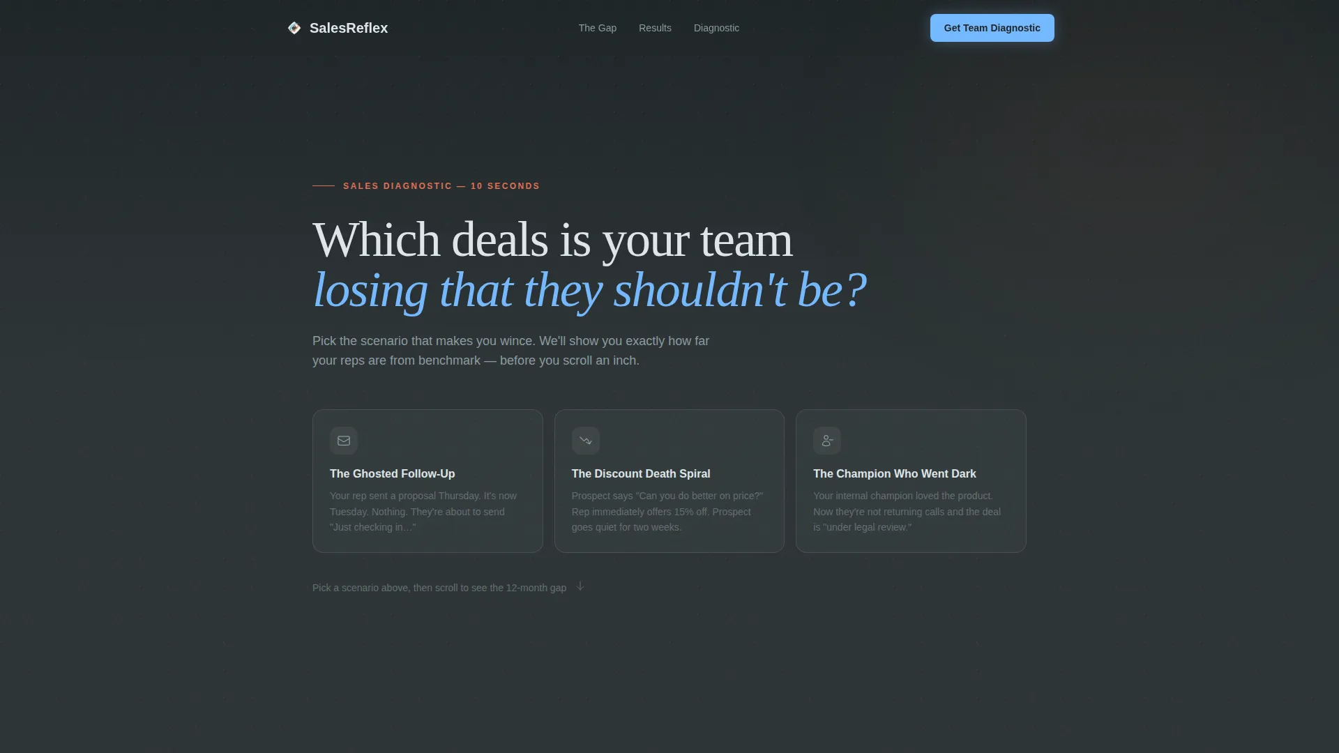
- A hero section with a quiz starter: one bold question, three scenario cards with ember-pulse hover states, and an instant personalized insight score
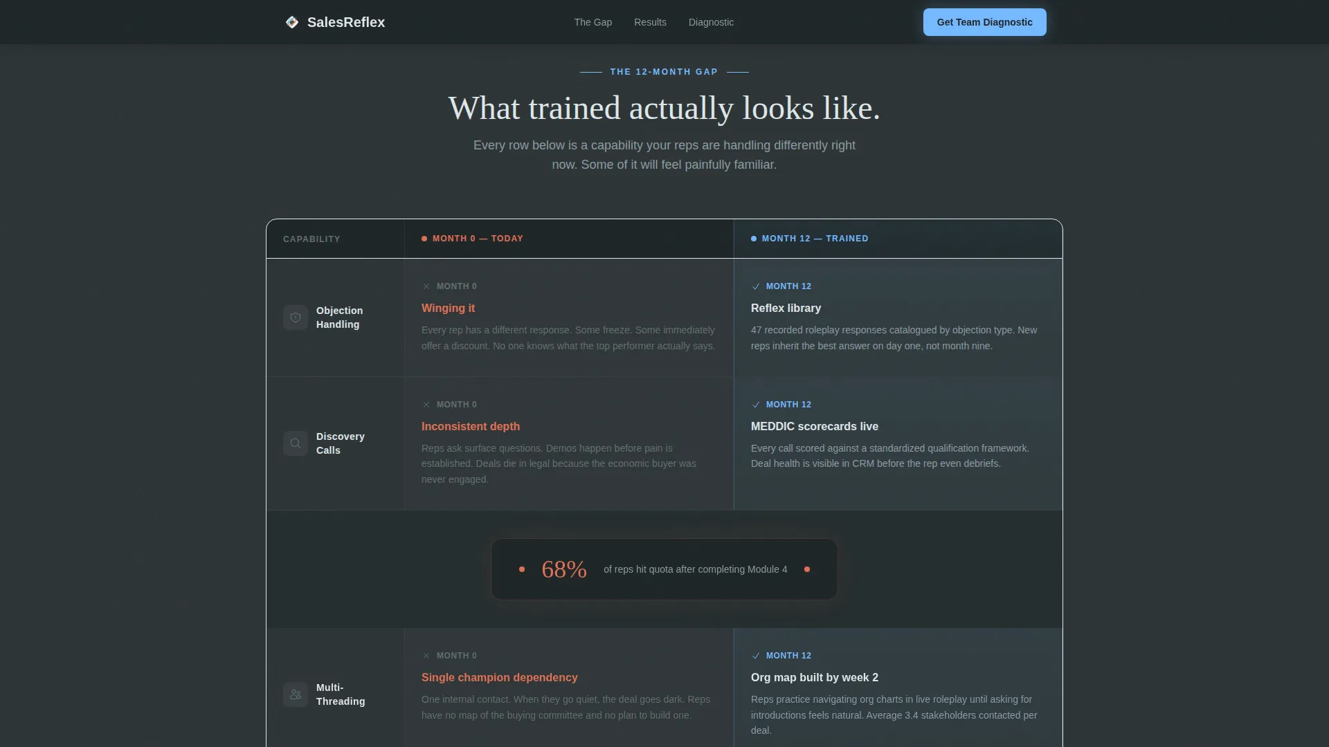
- A twelve-row comparison table showing Month 0 reality against Month 12 capability across objection handling, multi-threading, negotiation, discovery, and more
- Two lead capture paths: a diagnostic form for ready buyers and a gated PDF download for visitors who need more time before they talk
Feature list
This template includes a focused set of interactive and structural components, each grounded in the conversion logic of the brief.
Interactive Quiz Starter Hero
The hero opens with a single oversized serif question designed to stop a VP of Sales mid-scroll. Below it, three clickable scenario cards represent common deal losses: a ghosted follow-up, a discount death spiral, and a champion who went dark. Each card carries a minimal line icon that pulses with an ember orange accent on hover. Selecting one triggers a micro-animation that scores the visitor's instinct against benchmark data and delivers a personalized insight before any further scrolling is needed.
Month 0 versus. Month 12 Comparison Table
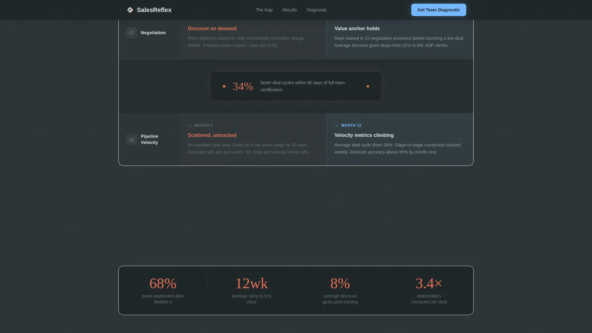
The core of the page is a structured, scroll-driven comparison table. The left column shows the painful Month 0 state: scattered playbooks, inconsistent discovery, reps improvising through demos. The right column builds a precise Month 12 picture: recorded roleplay libraries, standardized MEDDIC scorecards, and climbing pipeline velocity metrics. Each capability row reveals on scroll, and single-stat spark callouts appear between table sections to reinforce momentum with specific numbers.
Dual-Path Lead Capture System
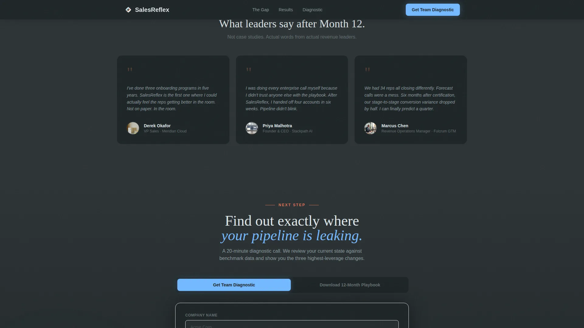
Two conversion paths serve different buyer readiness levels. The primary path is a diagnostic form that asks for company name, team size via a dropdown (5 to 15, 16 to 50, 51 to 200, and 200 or more), and a single free-text field for the team's biggest pipeline problem. The secondary path offers a gated PDF download of the 12-Month Ramp Playbook, capturing email and role title only for visitors who are not yet ready to speak with someone.
Scroll-Triggered Row Reveals
Each row of the comparison table animates into view as the visitor scrolls. The staggered reveal pacing is intentional: it creates a narrative rhythm that lets the "before" column land emotionally before the "after" column earns its specificity. This technique keeps visitors engaged through a long comparison structure without relying on heavy animation libraries.
Social Proof Stats Bar and Testimonials
Between the comparison table and the lead capture section, a stats bar surfaces headline numbers from training outcomes. Three testimonial blocks represent the three primary buyer personas: a VP of Sales, a startup founder, and a revenue operations manager. Each testimonial includes a role title and company logo to anchor credibility at the moment buyers are closest to converting.
Anchored Primary Call to Action
The primary call to action, "Get Your Team's Sales Diagnostic," appears twice: immediately after the quiz delivers its personalized insight, and again anchored below the final comparison table row. This placement ensures that visitors who engage early and those who read through the full table both reach a clear next step without having to search for it.
Page sections overview
| Section | Purpose |
|---|---|
| Quiz Starter Hero | Hook visitors with a self-diagnostic question and instant personalized score |
| Scenario Card Selection | Let visitors identify their deal-loss pattern before reading a word of copy |
| Comparison Table | Show the Month 0 to Month 12 transformation row by row across five capability areas |
| Spark Stat Callouts | Surface specific outcome numbers between table sections to build trust through accumulation |
| Social Proof Bar | Reinforce credibility with role-specific testimonials and recognizable company logos |
| Diagnostic Lead Form | Capture qualified leads with company name, team size, and a free-text pipeline problem field |
| PDF Download Path | Convert not-yet-ready visitors by gating the 12-Month Ramp Playbook behind email and role title |
| Footer | Provide navigation and contact information in a clean linear single-row layout |
Design & branding system
The visual identity follows a Community Hearth theme. The palette evokes a mountain lodge at dawn: cold charcoal from last night's fire against a sky that is just beginning to clear. It feels honest and grounded, which matches the tone of a training company that values straight talk over hype.
- Color system uses deep charcoal slate (#2D3436) for primary backgrounds, weathered stone gray (#636E72) for secondary surfaces, open-sky blue (#74B9FF) on calls to action and progress indicators, chalk white (#DFE6E9) for body text, and warm ember orange (#E17055) reserved exclusively for results, scores, and transformation moments
- Typography pairs Fraunces serif for display headings and DM Sans for body copy and interface elements, creating a contrast between warmth and clarity that suits the campfire-after-an-offsite tone
Mobile & speed optimization
The template is designed desktop-first to match the primary audience of VP of Sales leaders reviewing on a laptop, but it includes a solid mobile fallback so the page works for anyone arriving on a phone.
- Scroll-triggered animations use CSS and the Intersection Observer application programming interface (API), keeping interactions smooth without relying on heavy third-party libraries
- Quiz micro-animations, ember pulse hover states, and comparison table staggered reveals are all handled through lightweight CSS, so the interactive experience stays responsive across device sizes
How this template helps you convert
The conversion logic is built into the page structure itself. Visitors do not arrive at a pitch; they arrive at a question that forces self-reflection. By the time they reach the lead form, they have already diagnosed their own team's gap.
- The quiz creates immediate self-awareness by scoring the visitor's instinct against benchmark data, making the diagnostic form feel like a natural continuation rather than a sales ask
- The comparison table accumulates trust row by row, letting the emotional weight of the Month 0 column do the persuasion work before the Month 12 column makes the transformation feel specific and achievable
- The dual-path capture system ensures that both ready buyers and cautious researchers leave something behind, giving the sales team a warm lead pool at different stages of buying intent
Other information about this template
This template is suited for teams that want a polished, high-interactivity page without building from scratch. A few additional details worth knowing before you adopt it:
- The page is localized for English (United States) audiences, using USD currency format and MM/DD/YYYY date formatting throughout
- The footer follows a Pattern 1 linear single-row layout, keeping the bottom of the page clean and uncluttered
- The ember orange accent (#E17055) is intentionally restrained: it appears only on quiz results, stat callouts, and transformation moments to preserve its impact and avoid visual fatigue
- The Fraunces serif display font is used for the oversized hero question and major section headings, giving the page the warmth of a printed report rather than a typical software-as-a-service marketing page
- The comparison table columns alternate between deep slate and a barely-there sky-wash background, giving each capability row visual rhythm without adding decorative complexity
Theme
Community Hearth
Creative direction
Timeline Progression
Color system
Slate & Sky
Style
Comparison Table
Direction
Lead Generation
Page Sections
Interactive Quiz Starter with Instant Scoring
Month 0 Versus. Month 12 Comparison Table
Spark Stat Callouts Between Table Sections
Dual-path Lead Capture System
Role-specific Social Proof Section
Anchored Dual-placement Primary Call to Action
Related questions
Who is this sales training landing page template designed for?
Can I customize the quiz scenarios and comparison table rows?
What lead capture options does this template include?
Does the template include social proof components?
Is this template suitable for training companies that work with smaller sales teams?



