AI & Machine Learning Local Professional Website Template
Closer is a high-performance AI sales assistant landing page template built for VP Sales leaders at mid-market SaaS companies. It uses a Dashboard Pro theme with an Acid Digital color system to present a comparison table, live KPI counters, and a pipeline revenue simulator. The design reads like a state-of-sales briefing built to drive free trial sign-ups.
by Rocket studio
Quick summary
Closer is a single-page landing page template designed for AI sales assistant products targeting VP Sales at mid-market SaaS companies. It opens with animated KPI counters, escalates through an industry-report narrative, and anchors on a 12-dimension comparison table. The Acid Digital color system makes every section feel like a live intelligence dashboard.
Who this template is for
This template is built for founders, product marketers, and growth teams launching an AI sales assistant product. It speaks directly to sales leaders managing teams of 8 to 30 reps who are frustrated by stale pipeline data and inconsistent outreach.
- Teams launching a freemium or free-trial offer for an AI-powered outreach or pipeline tool
- Marketers targeting VP Sales personas at mid-market SaaS companies
- Builders who want a data-forward, dashboard-style landing page without starting from scratch
What problem this template solves
Sales teams waste time on manual follow-ups, poorly personalized sequences, and cherry-picked leads. A generic landing page cannot communicate the real cost of that problem, and it cannot show the contrast with an AI-driven alternative in a way that feels urgent. This template solves the credibility and urgency gap.
- It gives buyers a comparison they can scan fast and trust on first contact
- It replaces vague product claims with hard numbers and a live revenue simulation
What you get with this template
You get a fully structured, single-page layout built around three escalating narrative sections. Each section pushes the visitor closer to a trial sign-up or a gated content download.
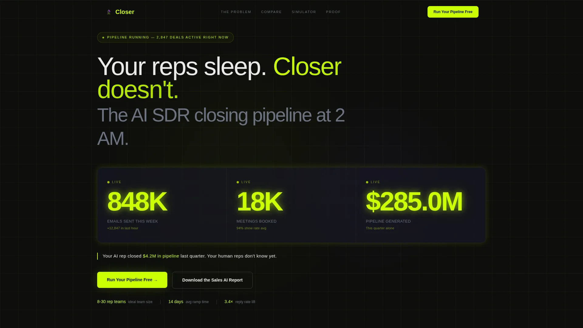
- An animated header stats wall with three live KPI counters and a bold opening claim
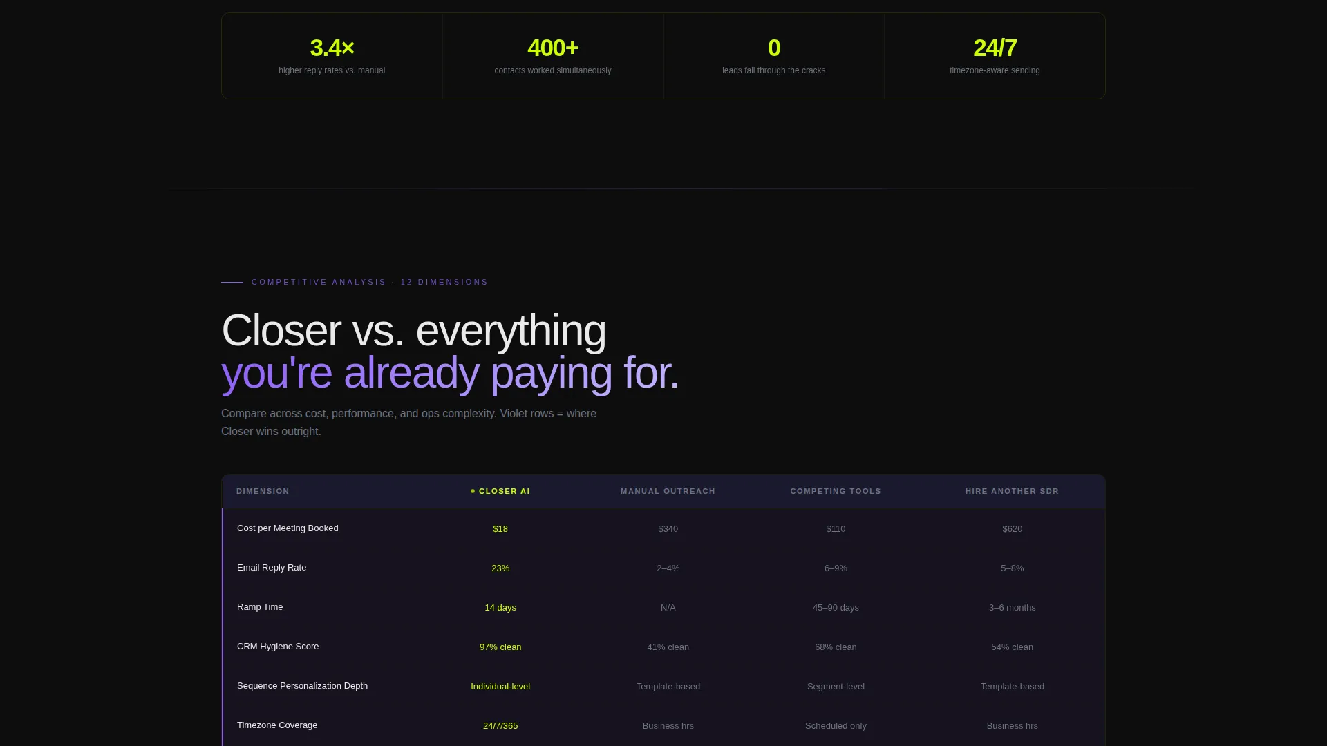
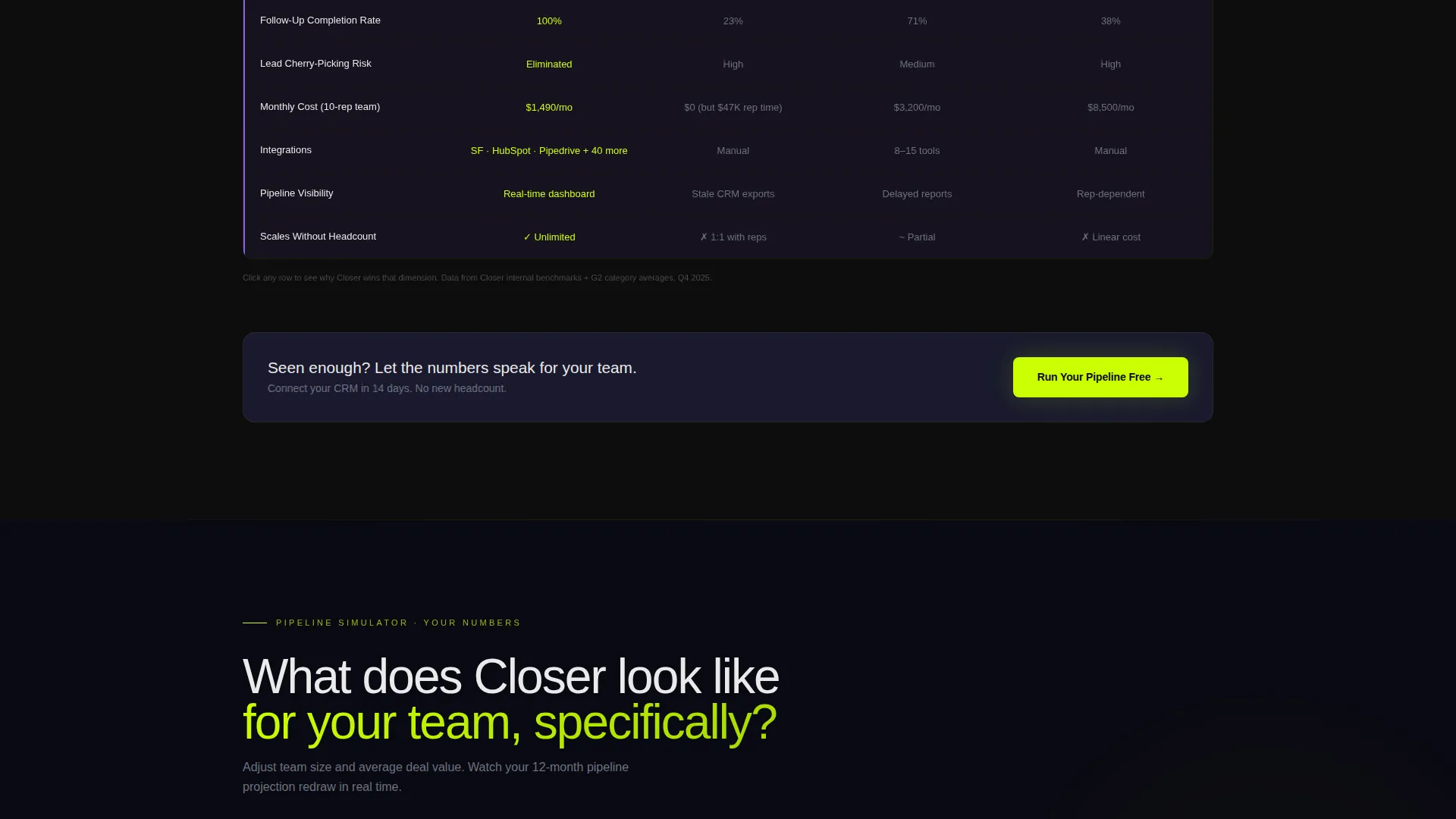
- A 12-dimension interactive comparison table revealing row-by-row on scroll
- A pipeline revenue simulator where visitors enter their team size and deal value to see a projected output chart
Feature list
This template ships with six purpose-built sections and a set of interactive components tied directly to conversion.
Animated KPI Header Wall
Three oversized counters animate upward in real time: emails sent, meetings booked, and pipeline generated. Each number glows with electric chartreuse against void black, making the visitor feel they are reading a live trading floor scoreboard.
12-Dimension Comparison Table
A dense, scroll-triggered grid compares the AI assistant against manual outreach, competing tools, and hiring an additional SDR. Rows cover cost per meeting, response rate, ramp time, CRM hygiene, sequence personalization, and timezone coverage. Violet highlights mark every dimension where the AI wins.
Pipeline Revenue Simulator
Visitors enter their team size and average deal value, then watch a projected revenue chart redraw in chartreuse. This interactive calculator makes the value proposition personal and immediate rather than abstract.
Industry Report Narrative Flow
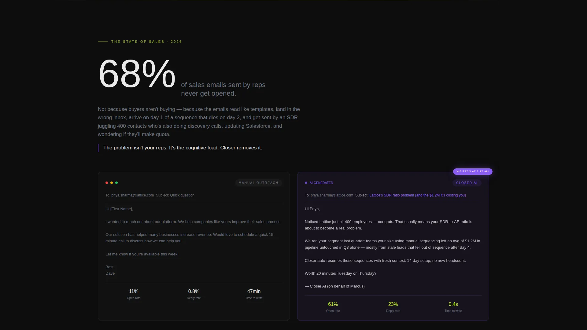
The page opens with a stark industry statistic (68 percent of sales emails never get opened) and immediately shows the AI rewrite. Each scroll section raises the personal stakes, moving from market problem to proof to personalized projection.
Freemium Sign-Up Flow with Progressive Disclosure
The primary call to action, "Run Your Pipeline Free," appears in the header, after the comparison table, and as a sticky bar on mobile. On click, the form asks for a work email first, then reveals follow-on fields for CRM provider, team size, and top pipeline bottleneck.
Gated Report Secondary Path
A secondary conversion path offers a downloadable sales AI report gated behind email only. This captures top-of-funnel visitors who are not ready to connect their CRM but have absorbed enough data to trust the offer.
Page sections overview
| Section | Purpose |
|---|---|
| Live KPI Header | Opens with animated counters to create immediate urgency |
| Industry Stat Block | Drops a hard market stat then shows the AI fix |
| Comparison Table | 12-row grid pitting AI against manual alternatives |
| Pipeline Simulator | Interactive revenue projection personalized by visitor input |
| Primary call to action Block | "Run Your Pipeline Free" sign-up with progressive form |
| Gated Report Offer | Secondary email capture for top-of-funnel lead nurture |
Design & branding system
The template uses the Acid Digital color system on a Dashboard Pro theme. The palette is designed to feel information-dense and high-energy, like a Bloomberg terminal rebuilt by a Berlin techno club. Every bright accent earns its place against deep backgrounds.
- Void black (#0D0D0D) and terminal gray (#1A1A2E) form the base and card surfaces, keeping the page dark and focused
- Electric chartreuse (#CAFF04) owns all calls to action and live metric highlights; synthetic violet (#8B5CF6) marks AI-generated insights and comparison wins
- Data white (#EAEAEA) handles all body text for readable contrast across dark backgrounds
Mobile & speed optimization
The layout is built with a mobile-first sticky call-to-action bar in mind. The "Run Your Pipeline Free" button persists at the bottom of the screen on mobile so the conversion path is never more than one tap away.
- The sticky bottom bar ensures the primary call to action stays visible as visitors scroll through data-heavy sections
- Card-stacked section structure means the comparison table and simulator reflow cleanly on smaller screens
How this template helps you convert
The page is engineered around a single funnel goal: move a skeptical VP Sales from cold scroll to free trial start. Every design and copy decision supports that path.
- The animated KPI header creates instant credibility by leading with outcomes, not features, so visitors feel the product is already working before they read a single line of product copy.
- The comparison table makes the buy-versus-build-versus-hire decision visible in one scroll, removing the mental work of comparing options and shortening the path to a confident "yes."
Other information about this template
This template is built inside the Closer product universe and reflects a Dashboard Pro visual system. The design language and conversion architecture are aligned for the AI and machine learning category within the technology space.
- The template style is a Comparison Table layout, which suits high-consideration SaaS purchases where buyers need to evaluate options before committing
- The creative direction follows an Industry Report format, giving the page the authority of a research brief rather than a sales pitch
- The color system is classified as Acid Digital, a high-contrast dark-mode palette optimized for tech audiences who spend time in software interfaces
- The header concept is Stats and Metrics, making quantified proof the first thing every visitor sees
Theme
Dashboard Pro
Creative direction
Industry Report
Color system
Acid Digital
Style
Comparison Table
Direction
Freemium/Trial
Page Sections
Animated KPI Header Wall
Dimension Comparison Table
Pipeline Revenue Simulator
Industry Report Narrative Scroll
Freemium Flow with Progressive Disclosure
Gated Report Secondary Capture
Related questions
Who is this landing page template designed for?
Can I customize the comparison table dimensions?
How does the pipeline revenue simulator work?
What does the sign-up flow look like on mobile?
Is there a path for visitors who are not ready to sign up?



