Real Estate Training Platform Landing Page Template
Closings is a modular card grid landing page built for a real estate training platform. It uses a dark dashboard aesthetic, stat-forward card modules, and a Feature Tab Switcher header to showcase pipeline drills, negotiation simulations, and market scripts. The design is built to drive free trial clicks from newly licensed agents, solo producers, and team leads.
by Rocket studio
Quick summary
Closings is a single-page landing page template built for a real estate training platform. It uses a card grid layout, a dark charcoal and sky blue color system, and a stats-first content rhythm. Every card leads with an outcome metric, then unpacks the feature behind it. The page ends at one goal: getting the visitor to start a free drill.
Who this template is for
This template is built for real estate training businesses that need to convert visitors quickly. It speaks directly to the agents and team leads who are already feeling the pressure of production.
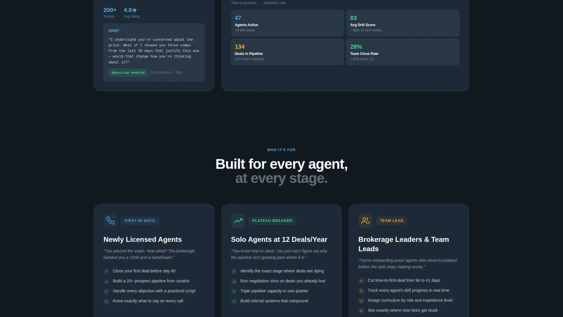
- Newly licensed agents navigating their first ninety days and needing structured skill-building fast
- Solo agents stuck near twelve transactions a year who need a clear path to higher output
- Team leads onboarding junior agents who must produce before the revenue split loses its appeal
What problem this template solves
Most training platform pages bury the proof. They lead with features and make the visitor work to understand the outcome. Closings flips that order. The template puts outcome data first so trust builds before skepticism sets in.
- Visitors leave before they see the value because the page asks them to read before it earns their attention
- Generic layouts fail to reflect the urgency agents feel, making the platform seem optional rather than essential
- No clear click path means interested visitors stall and do not convert to trial signups
What you get with this template
You get a fully structured single-page layout with every section pre-built and positioned to move a visitor toward one action. The design system, content rhythm, and call-to-action placement are all ready to customize.
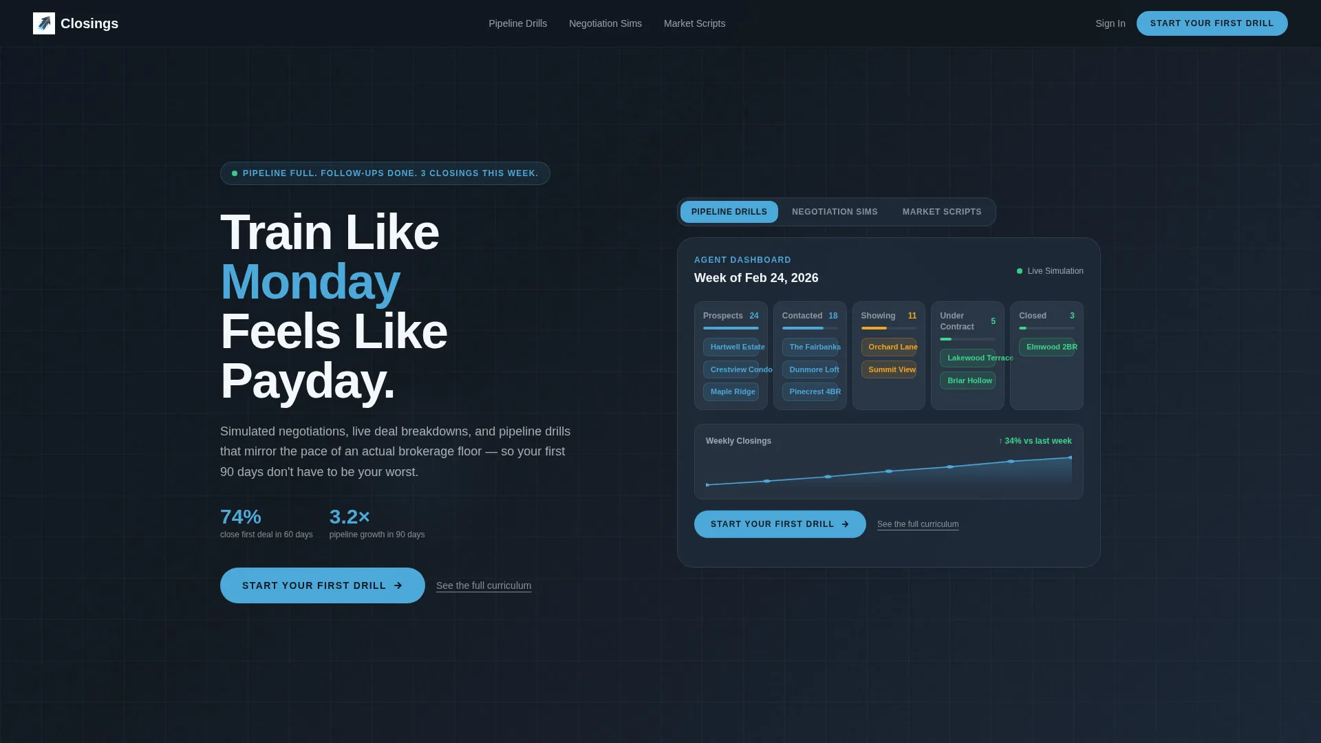
- A Feature Tab Switcher header with three pre-labeled training pillars and a live dashboard mockup area
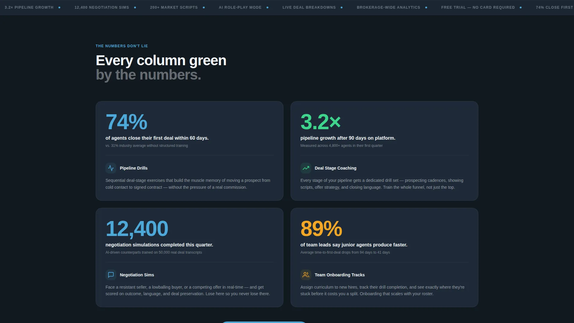
- A stats-first card grid where oversized metrics open every module before the feature explanation follows
- A click-through call-to-action system with a primary button and a secondary curriculum link appearing at defined intervals
Feature list
This section covers the core built-in components that define what this landing page delivers out of the box.
Feature Tab Switcher Header
Three clickable tabs sit above a dashboard mockup. Each tab is labeled with a training pillar: Pipeline Drills, Negotiation Sims, and Market Scripts. The default view shows Pipeline Drills active, with deal stage columns, sky blue conversion percentages, and a weekly closings graph. Each tab swap uses a smooth crossfade transition.
Stats-First Card Grid
Every card module opens with an oversized, bold metric set in cloud white against charcoal slate. The stat lands first. A compact feature card beneath it explains the capability behind the number. The rhythm repeats row by row, building cumulative confidence as the visitor scrolls.
Escalating Module Rows
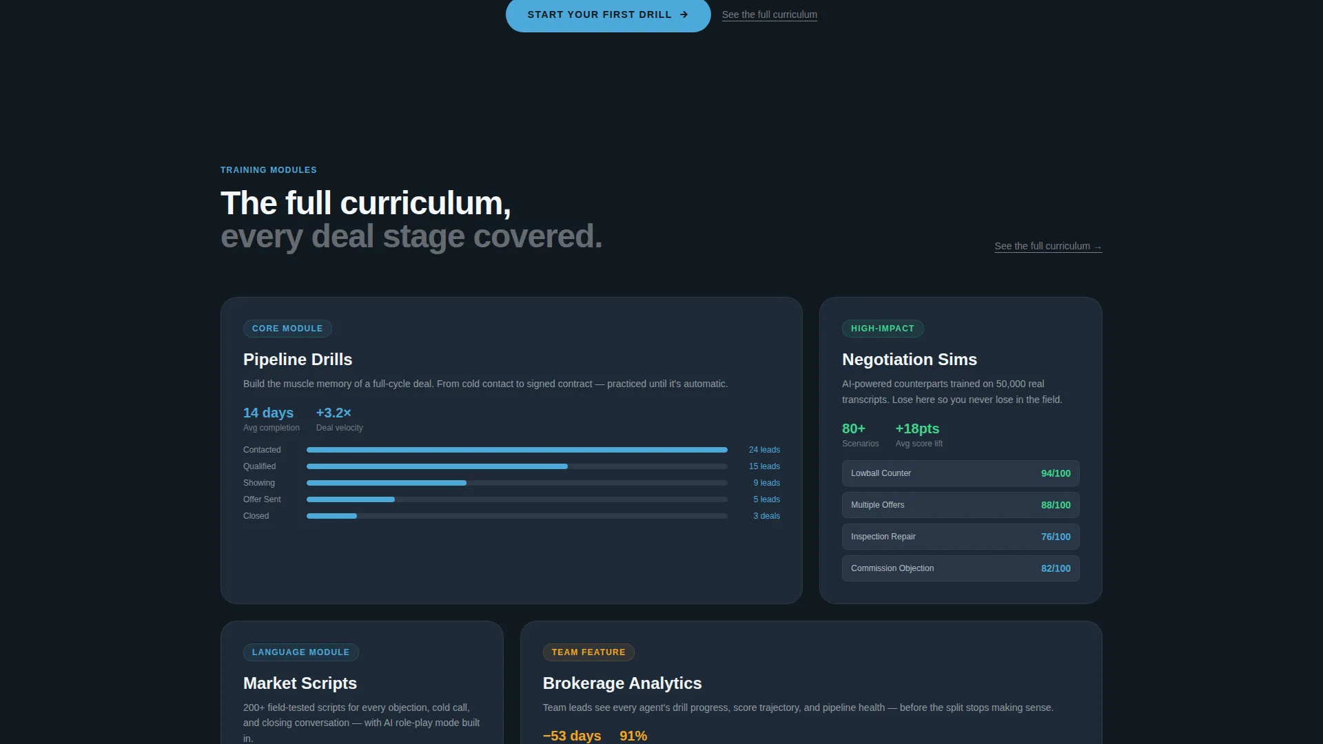
The card rows are structured to escalate in scope. Early rows cover individual skill modules. Middle rows introduce team dashboards. Later rows reach brokerage-wide analytics. This progression makes the platform feel comprehensive without overwhelming any single section.
Click-Through Call-to-Action System
The primary call to action reads "Start Your First Drill" and appears first inside the header dashboard mockup as a sky blue button. It resurfaces at the close of every second card row. No form fields appear on this page. A secondary text link reading "See the full curriculum" sits beneath each primary button for visitors who need one more layer of context.
Slate and Sky Color System
Card backgrounds use deep charcoal slate. Secondary containers use mid-tone graphite. Progress bars and active-state accents use open-sky blue. Typography and negative space use clean cloud white. The palette is designed to feel like a brokerage analytics dashboard, where every bright element is earned by data.
Modular Card Layout
The card grid is modular, meaning individual cards can be rearranged, removed, or added without breaking the layout system. This makes it straightforward to adapt the template for different training offerings or audience segments without redesigning the page from scratch.
Page sections overview
| Section | Purpose |
|---|---|
| Feature Tab Switcher | Introduces three training pillars with a live dashboard mockup and crossfade tab interaction |
| Stats Impact Row | Opens each content block with a bold outcome metric before the feature card follows |
| Skill Module Cards | Covers individual agent training features across pipeline drills and negotiation simulations |
| Team Dashboard Row | Showcases team-level tracking and onboarding tools for leads managing junior agents |
| Brokerage Analytics Row | Expands scope to platform-wide data, reinforcing enterprise and team-lead relevance |
| Primary call to action Block | Places the "Start Your First Drill" button with the secondary curriculum link beneath it |
| Recurring call to action Rows | Resurfaces the call to action at the close of every second card row throughout the page |
Design & branding system
The visual identity follows a Dashboard Pro theme built on the Slate and Sky color system. It is designed to feel like a brokerage analytics tool rather than a course catalog, which immediately aligns with how agents already think about their work.
- Deep charcoal slate (#1E2A38) for card backgrounds and primary surfaces, mid-tone graphite (#3B4A5C) for secondary containers
- Open-sky blue (#4DA8DA) reserved for progress bars, active tab states, and call-to-action buttons so bright color always signals action
- Clean cloud white (#F4F7FA) for all body typography and negative space, keeping the dark layout readable and focused
Mobile & speed optimization
The card grid layout is structured to reflow cleanly across screen sizes. Each card module is self-contained, which means the layout adapts without losing the stats-first reading order that makes the page work.
- Modular card units stack vertically on smaller screens while keeping the metric-then-feature rhythm intact
- The Feature Tab Switcher is designed to remain interactive on touch devices, preserving the tab-swap experience on mobile
- No form fields on the page means fewer input elements to manage across viewports, keeping the click path simple on any device
How this template helps you convert
The page is built around one conversion action and every design and content decision supports that single goal. Visitors are not given multiple competing paths.
- The stats-first card rhythm builds trust mathematically row by row, so by the time the visitor reaches the bottom of the page, the free trial feels like confirming a decision already made rather than taking a risk.
- The call-to-action button appears inside the header mockup and then resurfaces every two card rows, meeting the visitor at multiple natural decision points without feeling aggressive.
- The secondary "See the full curriculum" text link gives hesitant visitors a low-commitment next step, reducing drop-off from visitors who need one more layer of proof before clicking.
Other information about this template
This template is part of a broader real estate software and SaaS category and is designed to serve the specific needs of a real estate training platform at the intersection of technology and agent productivity tools.
- The template style is Card Grid (Modular), categorized under the Dashboard Pro theme with the Slate and Sky color system
- The creative direction is Stats-First Impact, and the landing page direction is Click-Through, both reflected in how content and calls to action are structured
- This template is suited for use with real estate training platforms looking to present data-credentialed outcomes to agent audiences who respond to production metrics over feature lists
Theme
Dashboard Pro
Creative direction
Stats-First Impact
Color system
Slate & Sky
Style
Card Grid (Modular)
Direction
Click-Through
Page Sections
Feature Tab Switcher Header
Stats-first Card Modules
Escalating Content Row Structure
Click-through Call to Action System
Slate and Sky Color System
Modular Card Grid Layout
Related questions
Who is this landing page template designed for?
Can I change the stats and metrics shown on the cards?
Does this template include a form or sign-up flow?
How does the Feature Tab Switcher work?
Can I rearrange the card modules for a different audience focus?



