FinOps Technology Booking Website Template
Cloudaudit is a bold, brutalist-styled FinOps landing page template built for managed cloud cost optimization services. It features a draggable split-screen header that simulates a real cloud billing console, a spec-sheet content structure, and two conversion paths: a free spend audit form and a downloadable savings calculator. It is engineered to turn skeptical engineers and finance leads into booked audits.
by Rocket studio
Quick summary
Cloudaudit is a single-page FinOps landing page template designed for managed cloud cost optimization services. It opens with a draggable, live-styled billing console simulation and builds evidence section by section using a spec-sheet structure. Every layout decision targets VP Engineering and platform finance audiences who need proof before they book a call.
Who this template is for
This template is built for FinOps service providers who sell to technical and financial decision-makers at growth-stage and enterprise companies. It speaks directly to buyers who have already seen a shocking cloud bill and need a credible, data-led case to act on.
- Cloud cost optimization consultancies and managed FinOps service teams
- Platform engineers and VP Engineering leads presenting cost overruns internally
- Series C and enterprise finance teams whose infrastructure spend is unaccounted for
What problem this template solves
Cloud bills are complex, political, and easy to defer. Generic agency landing pages do not carry enough technical credibility to convert infrastructure-literate buyers. This template solves the trust gap by front-loading proof and making the cost reduction case before asking for any commitment.
- Visitors leave when they see marketing language instead of data-backed specifics
- Finance and engineering stakeholders need different entry points to the same offer
- Most service pages bury the evidence that would close skeptical, technically literate buyers
What you get with this template
You get a fully structured, single-page layout that escalates evidence from the first scroll to the final call to action. Every section is purpose-built for the FinOps managed service use case, with no filler sections and no generic placeholder content to strip out.
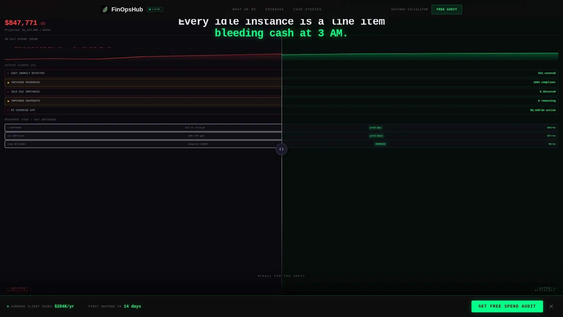
- A draggable split-screen header simulating a before-and-after cloud billing console
- A spec-sheet content flow covering monitoring scope, resource elimination, architecture improvement, and a real case study
- Two conversion paths: a multi-field spend audit form and an email-gated savings calculator download
Feature list
This template includes six purpose-built components. Each one is grounded in the source brief and designed to move a technically literate buyer from skepticism to conversion.
Draggable Split-Screen Header
The header splits the viewport into two live-styled panels. The left side shows a chaotic billing console with red overage alerts and a rising cost graph. The right side shows the same environment post-optimization, with a signal green savings counter ticking upward. Visitors drag the center divider themselves, making the transformation tactile and immediate.
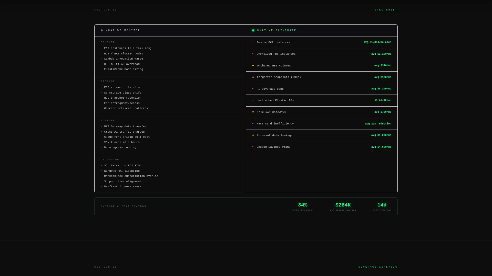
Spec-Sheet Section Architecture
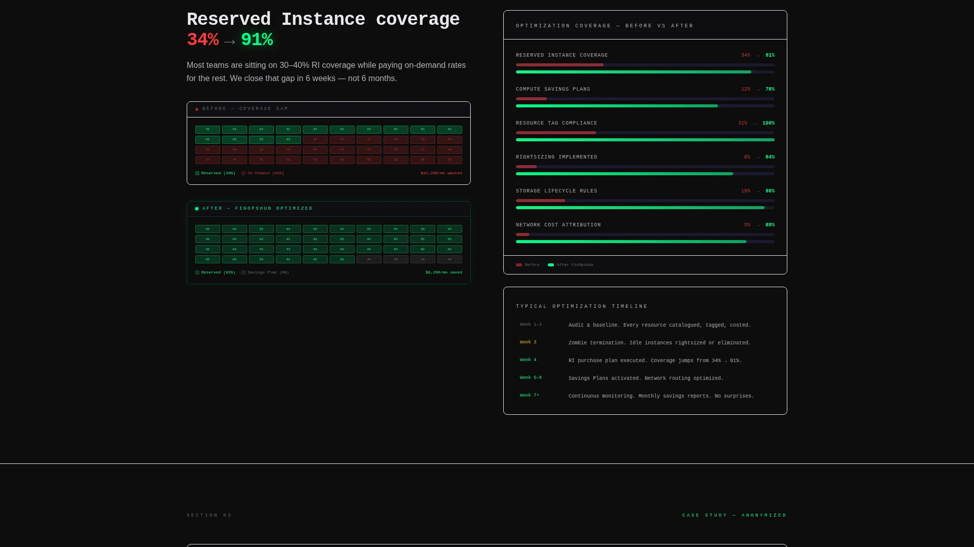
Every section below the fold is structured like a technical teardown, not a brochure. The layout uses hard columns of specifics: what the service monitors against what it eliminates, reserved instance coverage jumping from 34% to 91%, and an anonymized case study with real dollar figures, percentage reductions, and a week-by-week timeline.
Persistent Bottom-Bar Call to Action
A sticky audit request bar activates after the first scroll and stays anchored at the bottom of the page throughout. It includes a monthly cloud spend dropdown, a primary cloud provider selector, and a work email field. The bar stays visible without obstructing content, keeping the conversion path open at every scroll depth.
Email-Gated Savings Calculator
A secondary conversion path offers a downloadable savings calculator gated behind email only. This lower-commitment option supports visitors who are still building internal buy-in before requesting a full audit. It captures demand earlier in the decision cycle without requiring a form-fill commitment.
Bold Brutalist Visual Identity
The Carbon Fiber color system uses deep cockpit black, machined graphite, and brushed titanium as the base palette. Signal green is reserved exclusively for savings metrics and interactive states. The result is a matte, engineered aesthetic with zero ornamental elements, where the only color that draws the eye is the one showing money recovered.
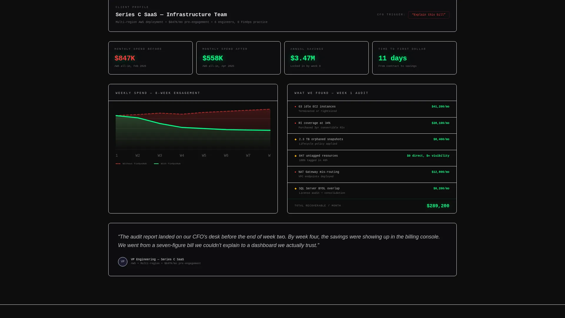
Case Study Evidence Block
A dedicated section presents a real anonymized client result: specific dollar figures, percentage reductions, and a timeline measured in weeks rather than quarters. The evidence block is positioned to be the most granular section on the page, designed to feel like an audit report the visitor did not know they needed.
Page sections overview
| Section | Purpose |
|---|---|
| Interactive header preview | Draggable before/after billing console simulation |
| Monitoring scope split | Lists what the service monitors versus. eliminates |
| Architecture comparison split | Shows reserved instance coverage improvement |
| Case study block | Real anonymized savings data with timeline |
| Savings calculator gate | Email-only download for lower-commitment visitors |
| Persistent audit bar | Anchored lead capture form activated on scroll |
Design & branding system
The template uses a Carbon Fiber color system built around four intentional values. The palette is engineered for credibility and technical authority, not warmth or decoration.
- Base palette: deep cockpit black (#0D0D0D), machined graphite (#1A1A2E), and brushed titanium (#B0B0B8) form the matte structural layer
- Accent rule: signal green (#00FF87) appears only on savings metrics and interactive states, earning its visibility through financial proof
- Visual direction: Bold Brutalist theme with zero ornamentation, raw data user interface styling, and no stock imagery or illustration anywhere on the page
Mobile & speed optimization
The layout is designed with a split-screen structure that adapts to narrower viewports. The draggable interaction and data-heavy sections are structured to remain readable and functional across screen sizes.
- Split-screen panels stack vertically on smaller screens so both before and after states remain fully legible
- The persistent bottom bar is sized to remain usable on mobile without blocking primary content
- Data columns and spec-sheet sections use clear typographic hierarchy to stay scannable at any viewport width
How this template helps you convert
The page earns the click before it asks for one. Every structural decision is sequenced to reduce friction and build conviction progressively, so the audit request feels like a logical next step rather than a cold ask.
- The draggable header delivers the core value proposition in the first five seconds, giving visitors a hands-on sense of what optimization actually looks like before they read a single line of body copy.
- The spec-sheet sections escalate evidence in order of specificity, moving from monitoring scope to architecture data to a timestamped case study, so each scroll deepens the case and reduces the buyer's remaining objections.
- Two conversion paths capture demand at different stages: the spend audit form targets buyers ready to act, while the savings calculator captures visitors still building internal approval, ensuring no qualified lead leaves empty-handed.
Other information about this template
This template is category-matched to the FinOps Technology subcategory and is purpose-built for the FinOps managed service niche. It is a strong fit for service providers who operate in the cloud financial management space and need a landing page that reflects the technical rigor their buyers expect.
- Template style: Split Screen (50/50), single-page layout with a section-led scroll flow
- Theme: Bold Brutalist with a Spec Sheet creative direction and Interactive Preview header concept
- Lead generation direction: dual-path conversion with a primary audit form and a secondary gated asset
- Well suited for FinOps practitioners, cloud cost consultancies, and platform teams presenting optimization proposals to CFO-level stakeholders
Theme
Bold Brutalist
Creative direction
Spec Sheet
Color system
Carbon Fiber
Style
Split Screen (50/50)
Direction
Lead Generation
Page Sections
Draggable Split-screen Header
Spec-sheet Content Structure
Persistent Bottom-bar Audit Form
Email-gated Savings Calculator
Carbon Fiber Visual Identity
Anonymized Case Study Block
Related questions
What kind of service is this template designed for?
Can I use this template for multiple cloud providers?
Do I need to replace the case study content with my own data?
What are the two conversion paths included in this template?
Is this template suitable for startups or only for enterprise providers?


