FinOps Technology Advanced Professional Website Template
Cloudops is a FinOps (Financial Operations) landing page template built for cloud cost management platforms. It uses a stats-first, comparison-driven layout to surface savings gaps before asking for a single click. The modular card grid structure, Data Command color system, and versus-style scorecard rows make complex cloud spend data immediately readable and persuasive.
by Rocket studio
Quick summary
Cloudops is a single-page FinOps landing page template designed around hard numbers and side-by-side comparisons. It leads with oversized metric cards, guides visitors through capability scorecards, and closes with a low-friction cost assessment form. Every section earns trust with data before it asks for action.
Who this template is for
This template is built for teams and founders who sell or market cloud financial management tools. It speaks directly to the people who feel the pain of uncontrolled cloud spend every day.
- Platform engineering leads reconciling six-figure cloud bills and needing a clear cost allocation story
- Chief Financial Officers who have just discovered their infrastructure costs exceed expectations
- FinOps practitioners building showback and chargeback models across multiple business units
What problem this template solves
Cloud cost management platforms often struggle to communicate their value quickly. Visitors land on a page, read three paragraphs, and still cannot tell whether the tool is worth switching to.
- Prospects leave before understanding the savings delta between your tool and their current setup
- Generic hero images and vague benefit statements fail to build urgency for technical buyers
- Long-form pages lose engineers and finance leads who scan, not read
What you get with this template
You get a fully structured, modular card grid landing page that replaces narrative selling with data-driven comparison. Every section is pre-built around a specific conversion role.
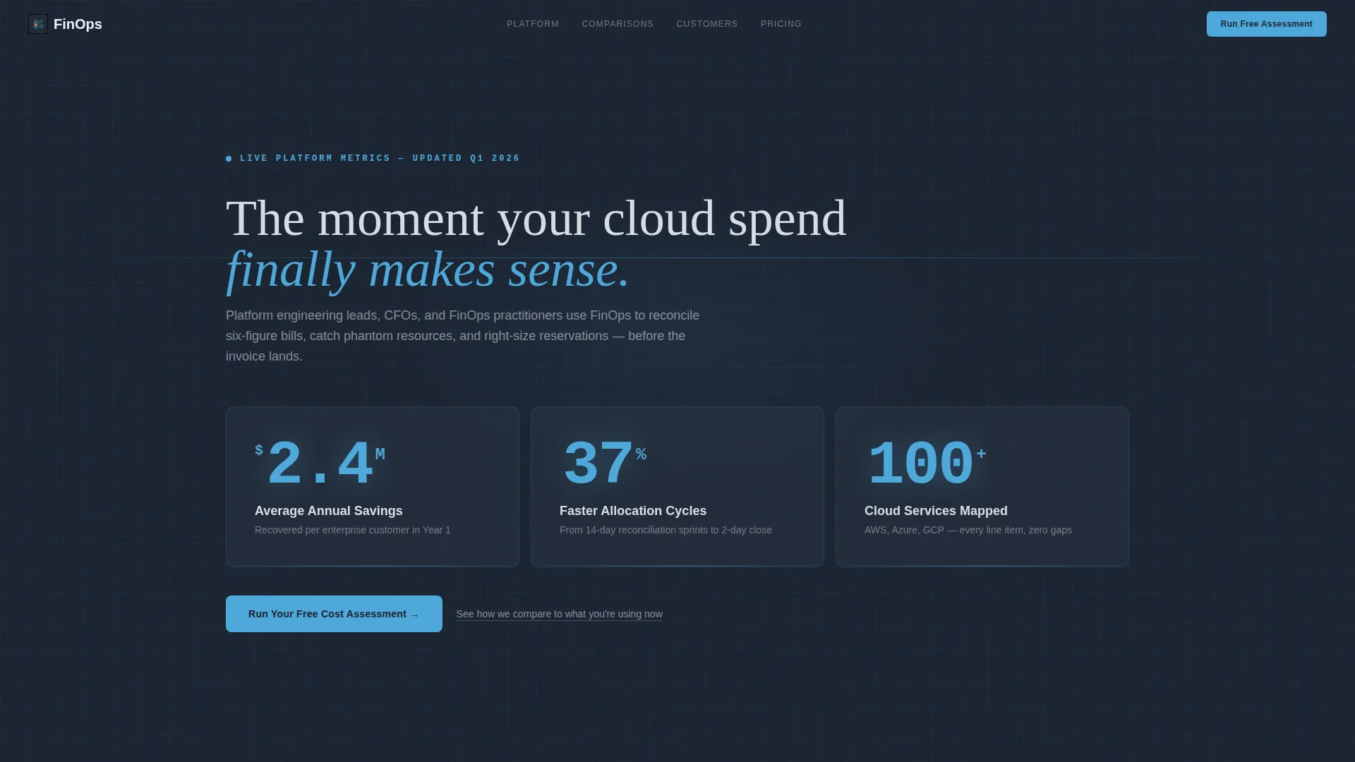
- A stats-first header section with three oversized metric cards showing real savings figures
- Four capability comparison rows, each pairing your tool's metric against an industry baseline
- A primary cost assessment form and a secondary gated PDF download path for mid-funnel visitors
Feature list
This template is built around a focused set of structural and visual decisions. Each one serves the comparison-first conversion goal.
Metrics Wall Header
Three oversized stat cards open the page. Each card renders a key number at 72-pixel weight in altitude blue on deep slate. The figures shown are "$2.4M Average Annual Savings," "37% Faster Allocation Cycles," and "100+ Cloud Services Mapped." No hero image, no illustration. The numbers are the hero.
Versus Scorecard Card Grid
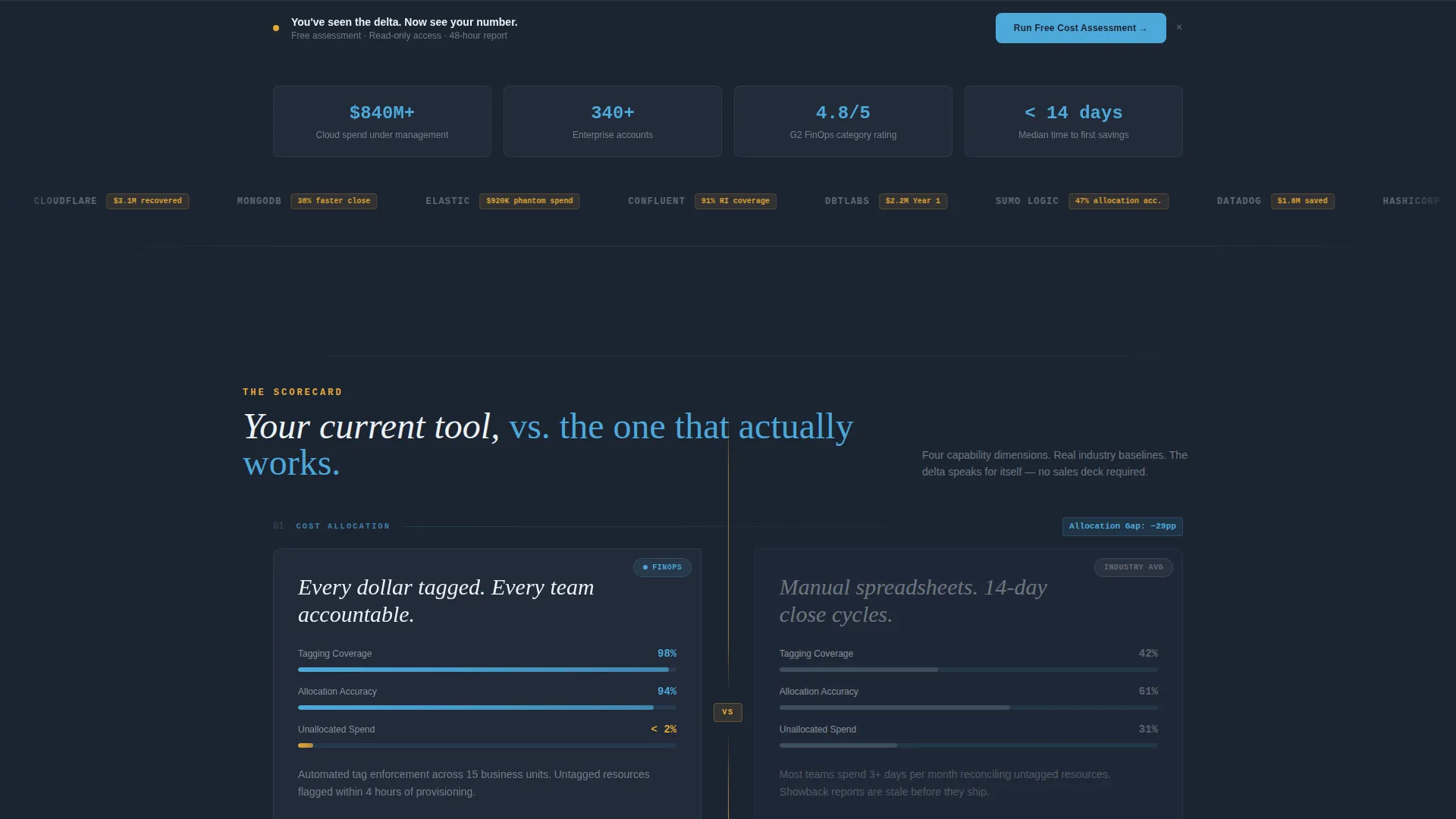
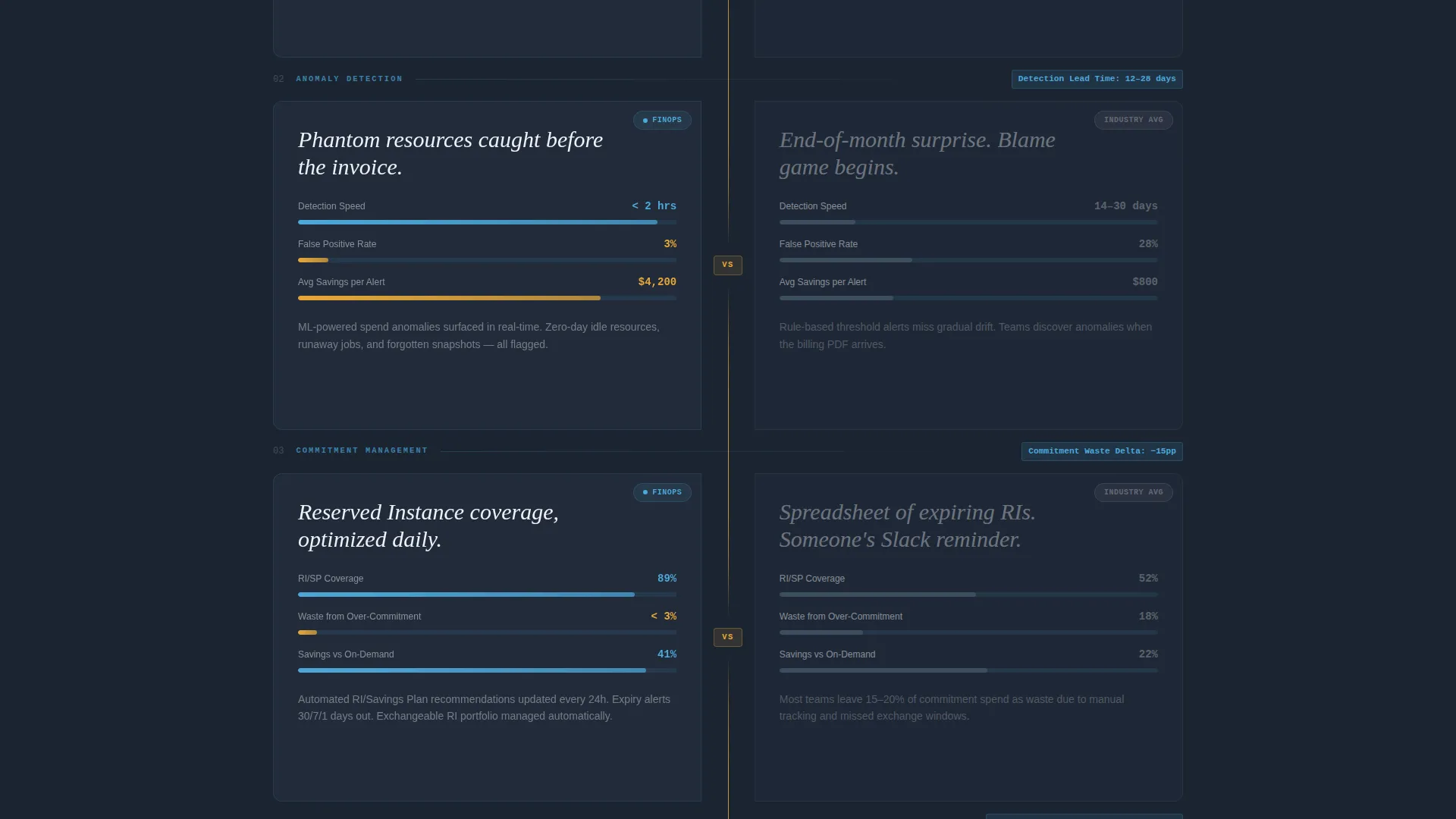
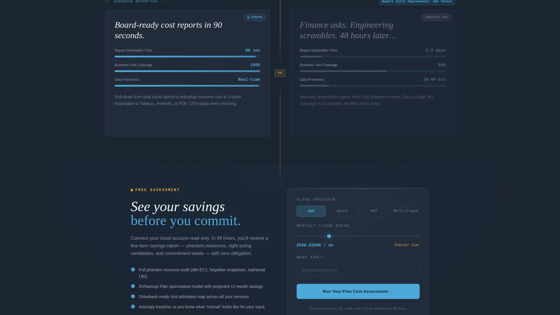
Each capability section presents a two-card row: your tool's metric on the left, the industry or competitor baseline on the right. A thin amber dividing line separates them. The rows cover cost allocation, anomaly detection, commitment management, and showback reporting. Tension builds deliberately as the performance gaps widen with each scroll.
Dual Conversion Paths
The primary call to action, "Run Your Free Cost Assessment," appears beneath the header stats and repeats as a sticky bottom bar after the third comparison row. A secondary path offers a gated "Download the Comparison Matrix" PDF for visitors still benchmarking. Both paths are present without competing.
Low-Friction Assessment Form
The cost assessment form asks for three inputs only: cloud provider selection (covering AWS, Azure, GCP, and multi-cloud), estimated monthly spend via a slider, and a work email address. No long forms, no unnecessary fields.
Amber Anomaly Accent System
Cost-alert amber is used intentionally and sparingly. It marks savings opportunities, anomaly flags, and the dividing lines between comparison cards. It appears only where money is being recovered, giving it immediate visual meaning every time it shows up.
Sticky call to action Bar
After the visitor has scrolled past three comparison rows and absorbed twelve or more data points, a sticky bottom bar surfaces the primary call to action again. The placement is timed to the moment the value case is fully made.
Page sections overview
| Section | Purpose |
|---|---|
| Header Metrics Wall | Opens with three stat cards establishing immediate savings credibility |
| Primary call to action Row | Places the cost assessment form directly below the header stats |
| Cost Allocation Row | First versus scorecard comparing allocation speed and accuracy |
| Anomaly Detection Row | Second comparison row surfacing phantom resource detection capability |
| Commitment Management Row | Third scorecard covering reservation right-sizing performance |
| Showback Reporting Row | Fourth comparison row showing multi-unit reporting breadth |
| Sticky call to action Bar | Persistent bottom bar repeating the primary call to action |
| Secondary Download call to action | Gated PDF offer for visitors still in the benchmarking phase |
Design & branding system
The visual identity follows a Data Command theme. The palette is built to feel like a cockpit instrument panel: dark, precise, and immediately readable.
- Core colors: deep operations slate (#1B2432) for backgrounds, mid-tone gunmetal (#3D4F5F) for panel depth, clear altitude blue (#4DA8DA) for data readouts, and signal white (#EDF2F7) for card surfaces
- Accent usage: cost-alert amber (#E8A838) appears only on savings markers and anomaly flags, preserving its urgency signal
- Typography: key numbers render at 72-pixel weight in altitude blue; cards sit on slate backgrounds with hairline borders; blue data visualizations pulse subtly against matte surfaces
Mobile & speed optimization
The modular card grid layout is structured to restack cleanly on smaller viewports. Comparison rows that sit side by side on desktop collapse into single-column stacks on mobile without losing the versus context.
- Stat cards scale down while preserving the oversized number hierarchy that anchors the header
- The sticky call to action bar remains accessible on mobile scroll without obscuring content
How this template helps you convert
This template is engineered around a specific conversion logic: prove the delta first, then ask for the click.
- The metrics wall creates an immediate credibility anchor. Visitors absorb three concrete savings figures before reading a single line of body copy.
- Each comparison row adds to a cumulative evidence stack. By the time the visitor reaches the fourth scorecard, they have encountered twelve or more data points that make their current tool look expensive.
- The dual-path conversion structure captures both ready buyers via the assessment form and mid-funnel researchers via the gated PDF, reducing the number of visitors who leave without taking any action.
Other information about this template
This template is a strong fit for teams marketing cloud financial management platforms, FinOps-as-a-service offerings, or cost observability tools across any major cloud provider. It is designed as a single landing page, not a multi-page site.
- The card grid structure is modular, meaning individual comparison rows can be reordered or replaced to match your specific capability set
- The amber accent system and slate-and-sky palette are fully documented within the template's design system for straightforward brand customization
- This template is suited for use cases spanning AWS cost optimization, multi-cloud spend governance, Kubernetes cost visibility, and showback or chargeback reporting for enterprise business units
Theme
Data Command
Creative direction
Stats-First Impact
Color system
Slate & Sky
Style
Card Grid (Modular)
Direction
Comparison/Versus
Page Sections
Stats-first Metrics Wall Header
Versus Scorecard Card Grid
Dual Conversion Path Layout
Low-friction Three-field Form
Intentional Amber Accent System
Modular Section Architecture
Related questions
Can I replace the comparison metrics with my own product data?
Does the template include both a primary and a secondary conversion path?
Is this a single landing page or a multi-page site?
How many fields does the cost assessment form use?
Can this template support a multi-cloud product, not just one provider?



