Paint & Coatings Management Software Landing Page
Coat is a hub-and-spoke landing page template built for paint and coatings management software. It pairs a Tech Glass visual identity with an Acid Digital color system to position complex vertical SaaS with precision and confidence. The template guides coatings chemists, plant managers, and procurement leads through a Problem-to-Solution arc that turns hesitation into a free trial signup.
by Rocket studio
Quick summary
Coat is a single-page, anchor-nav landing page template designed for paint and coatings management software. It uses a dark, lab-monitor aesthetic to speak directly to coatings professionals. Five problem-led spokes walk visitors through real operational pain points before presenting the software's answer. The page closes on a freemium conversion model with a minimal signup form.
Who this template is for
This template is built for teams launching or repositioning a vertical SaaS product in the coatings and paint manufacturing space. It communicates technical credibility without sacrificing clarity.
- Coatings chemists managing large formulation libraries and substrate match tables
- Plant managers tracking batch consistency across multiple production shifts
- Procurement leads monitoring raw material allocations such as titanium dioxide in real time
What problem this template solves
Coatings software buyers are a skeptical audience. They live inside spreadsheets, spec binders, and supplier calls every day. A generic SaaS landing page will not earn their trust. This template is built for that exact credibility gap.
- Fragmented workflows across formulation tables, compliance checks, and supplier data feel impossible to unify
- Visitors need to see the software thinking like a chemist before they consider signing up
- Standard freemium pages bury the free tier's value, creating hesitation right before the conversion click
What you get with this template
You get a fully structured, single-page layout with five anchor-navigated spoke sections, a live code-snippet header, and a sticky conversion bar. Every element is mapped to a specific buyer concern in the coatings workflow.
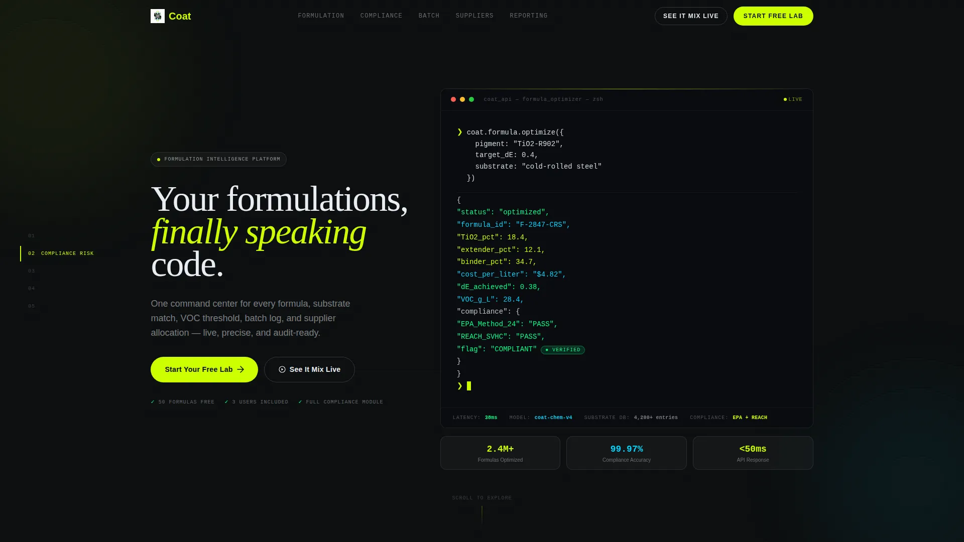
- A terminal-style hero block rendering an API call with an animated JSON response, cost-per-liter output, and a green compliance flag
- Five problem-and-solution spoke sections covering formulation chaos, compliance risk, batch drift, supplier blind spots, and reporting complexity
- A frosted comparison card spelling out the free tier scope (50 formulas, 3 users, full compliance module) directly above the final call to action
Feature list
This template is built around a specific set of components that work together to convert a technically demanding audience.
Terminal Hero Block
The header opens with a monospaced, void-black code block showing a live API call to a formula optimization endpoint. The JSON response animates in line by line, displaying optimized pigment percentages, cost-per-liter, and a glowing green compliance flag. A blinking cursor and a fading headline complete the opening frame.
Anchor Navigation Rail
Five spoke labels pin to the left rail: Formulation Chaos, Compliance Risk, Batch Drift, Supplier Blind Spots, and Reporting Hell. Each label links directly to its corresponding section, letting buyers jump to the pain point most relevant to their role without scrolling blind.
Problem-to-Solution Spoke Sections
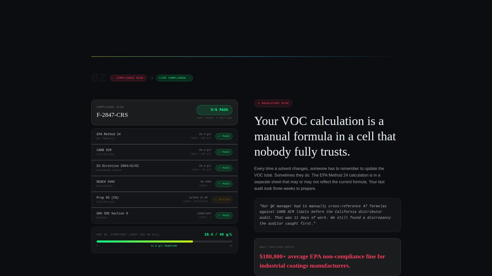
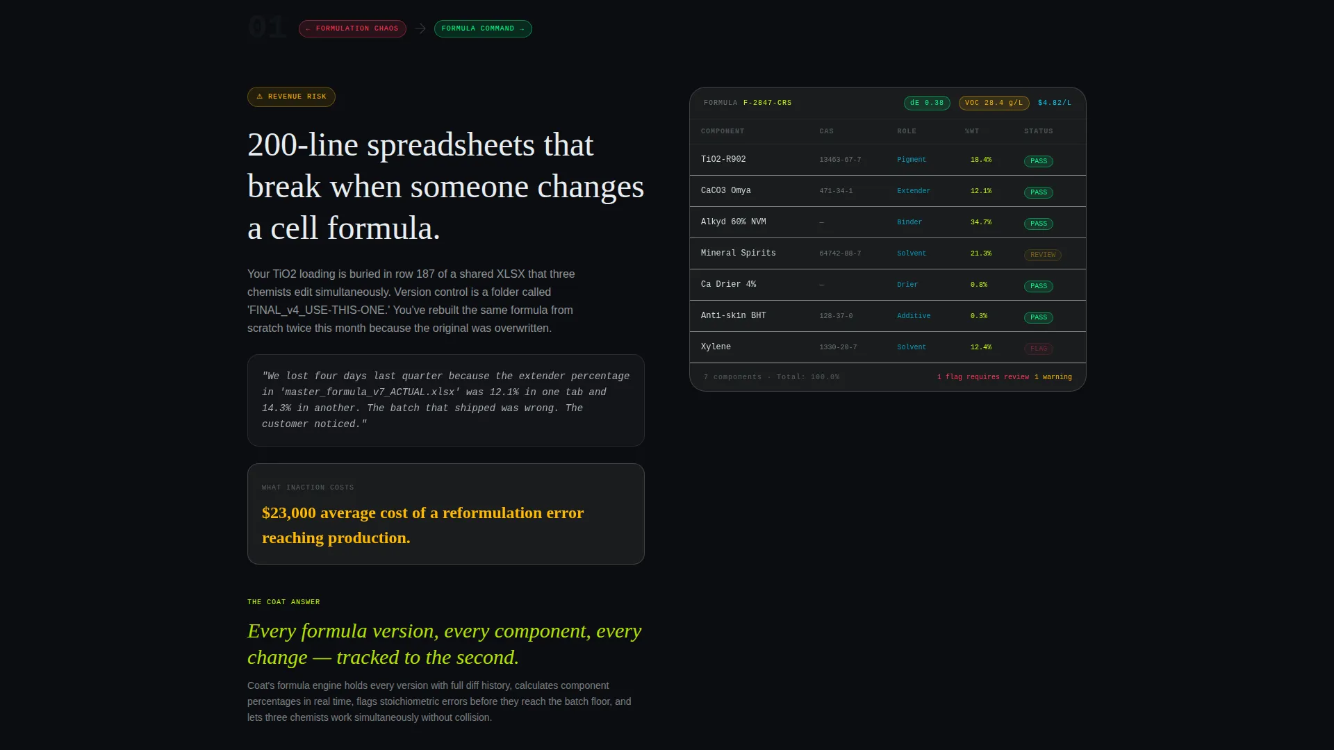
Each of the five spokes opens with a brutally specific pain point, including redlined spreadsheets, failed quality control pulls, and last-minute technical data sheet scrambles. The viewport then slides right to reveal a frosted glass panel with live software interface mockups. Stakes escalate deliberately from workflow inefficiency to regulatory risk to product recall territory.
Sticky Conversion Bar
A bottom bar activates after the visitor scrolls past the second spoke. It carries the primary call to action ("Start Your Free Lab") persistently without blocking content. The bar ensures the signup prompt is always reachable without requiring the visitor to scroll back to the top.
Freemium Comparison Card
A frosted glass card positioned just above the final call to action breaks down the free tier clearly: 50 formulas, 3 users, and a full compliance module. This removes the most common pre-click hesitation by answering "what's the catch" before it forms.
Minimal Signup Form
The conversion form asks only for a work email address and a company size dropdown with three options (1 to 10 chemists, 11 to 50, and 50 and above). All other onboarding details are deferred, keeping friction at the lowest possible point.
Page sections overview
| Section | Purpose |
|---|---|
| Terminal Hero | Establish technical credibility with a live code-snippet API call and animated JSON response |
| Anchor Nav Rail | Pin five spoke labels to the left rail for direct section access |
| Formulation Chaos Spoke | Surface the pain of 200-line spreadsheets; reveal the formulation command center |
| Compliance Risk Spoke | Address VOC threshold failures and regulatory fine exposure |
| Batch Drift Spoke | Show how shift-to-shift inconsistency erodes product quality |
| Supplier Blind Spots Spoke | Tackle real-time material allocation gaps like titanium dioxide shortfalls |
| Reporting Hell Spoke | Resolve the scramble of manual reporting before the stakes become critical |
| Freemium Comparison Card | Spell out the free tier scope to neutralize pre-click hesitation |
| Primary call to action Section | Convert visitors with a minimal two-field signup form |
| Sticky Bottom Bar | Keep the primary call to action persistent after the second spoke |
Design & branding system
The visual identity runs on an Acid Digital color system against a Tech Glass layout framework. Every choice reinforces the impression of precision laboratory software rather than generic business tooling.
- Void black (#0B0D10) forms the primary background, keeping the page deep and matte like a darkened R&D lab environment
- Electric chartreuse (#CCFF00) marks every primary action and critical data highlight, delivering a sharp, bioluminescent sting on buttons and key metrics
- Phosphor blue (#00D4FF) runs across secondary indicators and data visualization graph lines, layered over void black like oscilloscope traces
- Frosted panel white (#E8EDF2) surfaces card backgrounds and body text, providing contrast without breaking the dark-lab mood
- Monospaced typography carries the code-snippet hero and data panels, reinforcing technical precision throughout the reading experience
Mobile & speed optimization
The template is structured to translate its dark-lab, data-dense layout into a clean mobile experience. The anchor navigation and spoke layout adapt naturally to narrower viewports.
- The left-rail anchor nav collapses gracefully so mobile users retain quick access to all five spoke sections
- Frosted glass panels and the terminal hero block are sized to remain legible and impactful on smaller screens
- The sticky bottom conversion bar is designed to stay unobtrusive on mobile while keeping the primary call to action always within reach
How this template helps you convert
Every structural decision in this template pushes a technically skeptical buyer toward the signup form without pressure or over-promise.
- The terminal hero block demonstrates product intelligence immediately, earning trust before any marketing copy appears and reducing early bounce for a high-skepticism audience.
- The five-spoke problem arc escalates stakes deliberately, so by the final section the visitor is not browsing but calculating the real cost of their current workflow.
- The freemium card and minimal two-field form eliminate the two most common conversion blockers: "what will I have to give up?" and "how long will this take?" before the click.
Other information about this template
This template is built specifically for the paint and coatings management software category, where buyer personas span formulation science, plant operations, and supply chain procurement. It is not a general-purpose SaaS template.
- The hub-and-spoke layout with anchor navigation makes it straightforward to adapt spoke content for different software feature sets within the coatings vertical
- The freemium and free trial conversion model is baked into the page structure, so the signup flow does not require additional page builds for the initial acquisition step
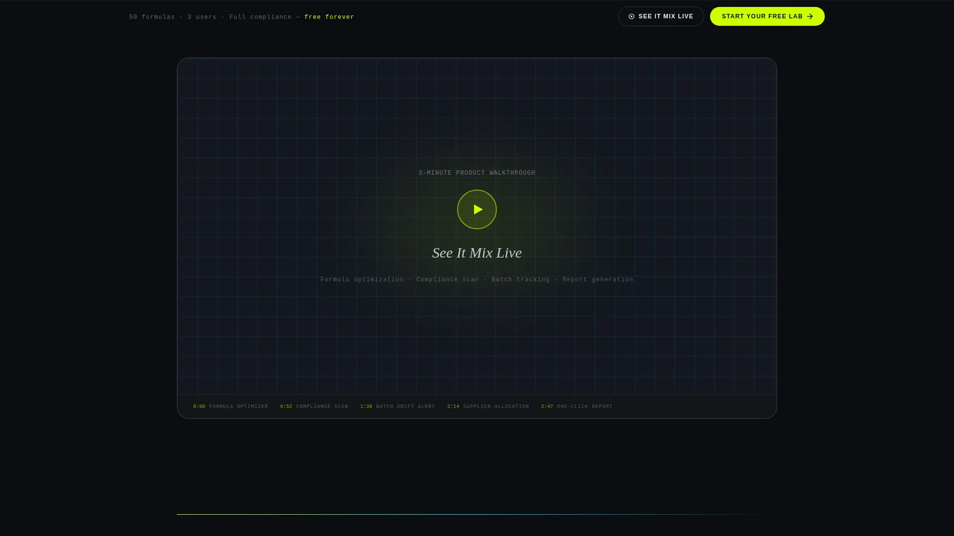
- The inline demo video trigger ("See It Mix Live") provides a secondary conversion path for visitors who want to evaluate the product before committing to a signup
- The escalating stakes narrative across the five spokes is designed to support both self-serve buyers and sales-assisted demos by surfacing every major operational pain point in a single scroll
Theme
Tech Glass
Creative direction
Problem→Solution Arc
Color system
Acid Digital
Style
Hub & Spoke (Anchor Nav)
Direction
Freemium/Trial
Page Sections
Terminal Hero Block
Anchor Navigation Rail
Problem-to-solution Spoke Sections
Sticky Conversion Bar
Freemium Comparison Card
Minimal Two-field Signup Form
Related questions
Can I customize the five spoke sections for different software features?
How does the sticky bottom bar work with the signup form?
Does the template include a secondary path for product demos?
Is the freemium comparison card editable?
Who is this template best suited for?



