Developer Hub | Free Website Template | Rocket
Devlog is a single-page comparison table landing page built for Wix developers who want to share deep technical tutorials publicly. It pairs real development challenges with matching tutorial previews inside a glassmorphic dark user interface. The design feels like a live coding environment, with a split-pane hero, scrolling problem-solution rows, floating stat badges, and two focused calls to action.
by Rocket studio
Quick summary
Devlog is a developer blog landing page that turns a comparison table into a storytelling engine. Each row pairs a real Wix development problem with a matching tutorial card. The hero renders like a live coding environment. Stat badges float between rows. Two calls to action guide readers from first scroll to signup without pressure.
Who this template is for
This template is built for technical creators who want to publish developer content in public. It works especially well for people whose audience already lives in the code editor.
- Freelance developers who build on the platform and want to document their methods for others stuck on the same problems
- Agency owners who want to demonstrate advanced technical depth to potential enterprise clients
- Design-first creators who have moved past drag-and-drop and want to show the hidden layer of power beneath it
What problem this template solves
Most developer blog pages look like generic article archives. They give readers no reason to trust the depth of the content before they commit to clicking. This template solves the credibility gap.
- Visitors arrive at a page that already looks like a working development environment, so they feel at home immediately
- The comparison table format shows the problem before it shows the solution, which proves the author understands the real pain points
- Floating stat badges give a fast sense of archive scale, so readers know the content goes deeper than one or two posts
What you get with this template
You get a single-page landing page structured to earn trust before asking for anything. Every section is designed to do one job well.
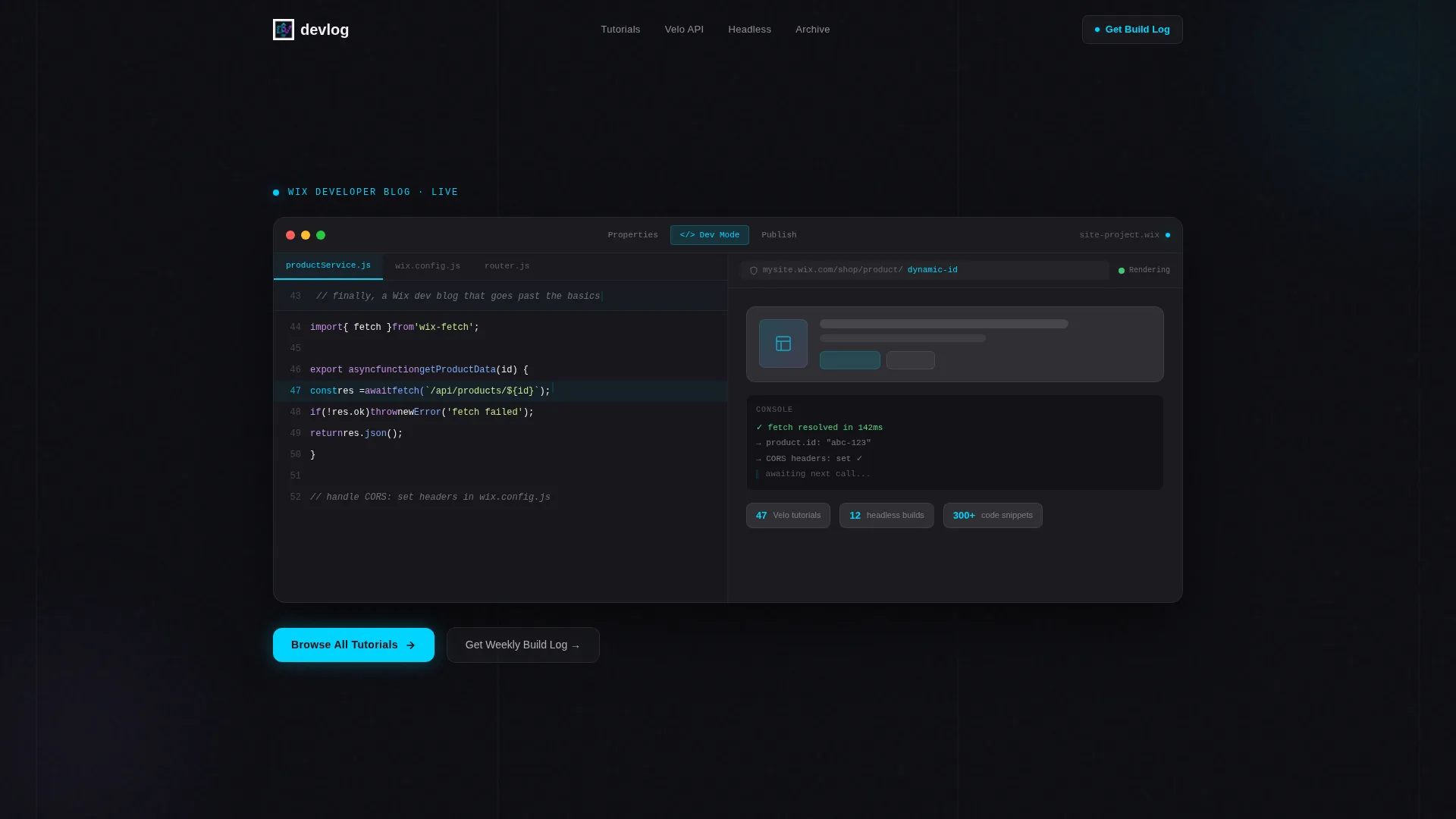
- A full-viewport dashboard hero with a split-pane editor layout, syntax-highlighted code on the left, and a live preview on the right
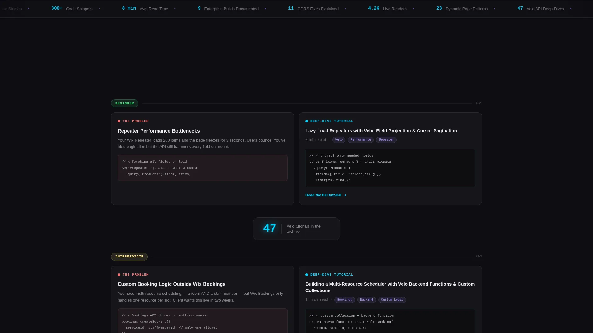
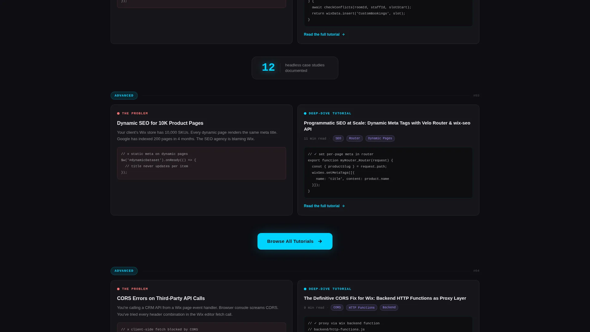
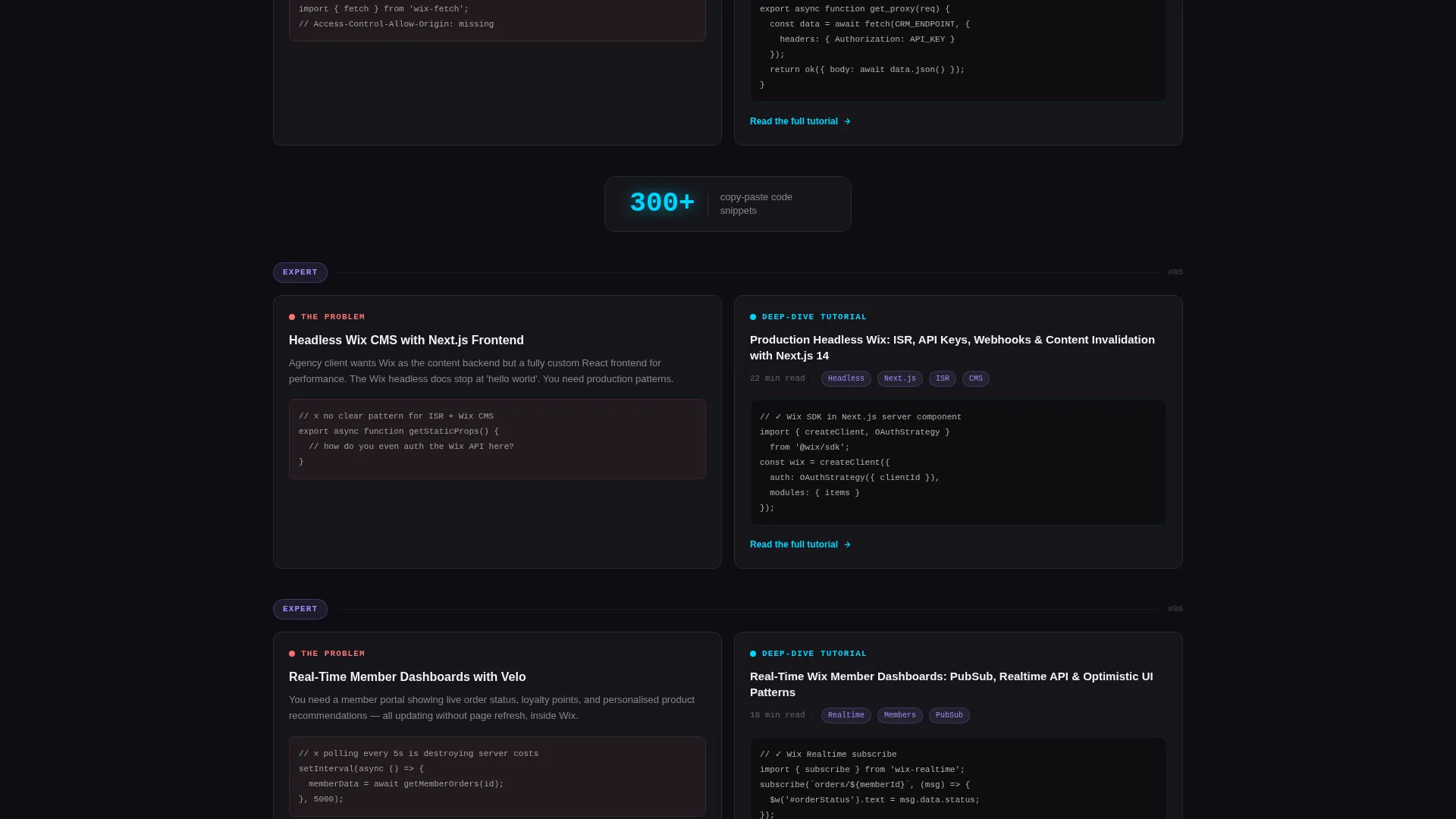
- A scrolling comparison table where each row presents a development challenge alongside a matching tutorial card showing the article title, read time, and a code snippet preview
- Two calls to action: a primary archive button that pins as a frosted floating bar on scroll, and a secondary inline email capture styled as a terminal prompt
Feature list
This template includes a focused set of components that work together to build reader confidence and drive archive clicks.
Split-Pane Dashboard Hero
The header renders a simulated development environment at full viewport width. Velo code with syntax-highlighted JavaScript sits on the left. A live site preview mid-render sits on the right. A blinking cursor holds at line 47, and the headline types itself in as a code comment. There is no stock imagery. The dashboard is the hero.
Scrolling Comparison Table
The core layout pairs development problems with tutorial previews in a two-panel glass structure. Left panels show the challenge. Right panels show the blog's solution as a frosted card with article title, read time, and a code snippet. Complexity escalates as the reader scrolls down, letting visitors self-select their skill level.
Floating Stat Badges
Between comparison rows, single-stat callouts appear in glassmorphic badges. These surface numbers like tutorial counts, case study totals, and snippet library size. They give readers a fast, concrete sense of the archive's depth without requiring a click.
Pinned Floating call to action Bar
After the third comparison row, the primary call to action appears as a frosted floating bar that stays pinned to the bottom of the viewport on continued scroll. This keeps the archive entry point visible without interrupting the reading experience.
Terminal-Style Email Capture
The secondary call to action is a single-field inline input styled as a terminal prompt. The placeholder reads your@email.dev. It fits the developer aesthetic and lowers the friction of the signup moment by matching the visual language the reader already trusts.
Glassmorphic Component System
Every card, badge, and panel uses the same frosted translucent surface language. Deep void black sits underneath. Frosted panels float above. Cyan accent pulses on hover states and active code highlights. Lavender marks secondary tags and category pills. The system is consistent across every section of the page.
Page sections overview
| Section | Purpose |
|---|---|
| Dashboard Hero | Opens with a full-viewport split-pane editor simulation and a self-typing headline |
| Comparison Table Row 1 | Pairs a styling challenge with a matching tutorial card |
| Comparison Table Row 2 | Escalates to repeater performance and custom logic problems |
| Comparison Table Row 3 | Covers dynamic SEO and headless CMS integration challenges |
| Floating Stat Badges | Surfaces archive scale numbers between comparison rows |
| Primary call to action Block | Introduces "Browse All Tutorials" button after the third row |
| Email Capture Section | Collects reader emails with a terminal-styled inline input field |
| Pinned call to action Bar | Floats the archive call to action at viewport bottom on continued scroll |
Design & branding system
The visual identity follows a Tech Glass theme built on a glassmorphic color system. The palette feels like a rain-streaked window at night with neon reflections pooling on the surface.
- Core colors: deep void black (#0D0D12) as the canvas, frosted translucent panels at (#FFFFFF0A), luminous accent cyan (#00D4FF) on hover states and active code highlights, muted lavender (#A78BFA) for secondary tags and category pills, and crisp anti-flash white (#F0F0F5) for body text
- Surface language: near-black backgrounds with frosted card surfaces floating above them, soft blur backdrops behind every panel, and interactive elements that pulse faintly with cyan
Mobile & speed optimization
The page is built as a single-page layout, which keeps the overall asset load focused. The glassmorphic surfaces are defined through CSS-level transparency and blur rather than heavy image files, which helps keep the page feeling fast on smaller screens.
- The comparison table rows are designed to stack vertically on mobile, preserving the problem-solution narrative flow without horizontal scrolling
- The pinned floating call to action bar adapts to mobile viewport height so it remains visible without covering critical content
How this template helps you convert
This template earns the conversion by delivering value before it asks for anything. The structure moves readers through a deliberate arc.
- The dashboard hero establishes credibility in the first second. Readers who work in code environments immediately recognize the layout and trust the source.
- The scrolling comparison table shows three real problems solved before the primary call to action appears. By the time the "Browse All Tutorials" button is visible, readers have already consumed enough to want more.
- The pinned floating bar and the terminal email capture stay present without being aggressive. Both calls to action match the visual language of the page, so they feel like natural next steps rather than interruptions.
Other information about this template
This template is designed for the Wix developer documentation and support niche. It fits naturally into a content strategy where a developer publishes tutorials, case studies, and code walkthroughs for a technical audience.
- The comparison table structure is flexible. Rows can represent any pairing of challenge and solution, making it adaptable to different archive depths and content categories.
- The floating stat badges are designed for numbers that change over time. As the archive grows, these figures can be updated to reflect the current library size.
- This template is well suited for a Wix developer blog that covers topics such as Velo APIs, custom booking logic, dynamic SEO for large product catalogs, and headless site architectures.
- The page direction is click-through, meaning the primary goal is driving readers into the blog archive rather than completing a transaction on the page itself.
Theme
Tech Glass
Creative direction
Problem→Solution Arc
Color system
Glassmorphic
Style
Comparison Table
Direction
Click-Through
Page Sections
Split-pane Dashboard Hero
Scrolling Comparison Table
Floating Stat Badges
Pinned Floating Call to Action Bar
Terminal-style Email Capture
Glassmorphic Component System
Related questions
Can I change the comparison table content to match my own tutorials?
Does this template include actual blog archive functionality?
Can I update the floating stat badges with my own numbers?
Is the email capture field connected to a mailing list by default?
Who is this landing page most useful for?


