Actionable Practices | Free Website Template | Rocket
Codex is a scroll-reveal landing page template built for professionals who turn complex workflows into structured best-practice guides. It uses a dark glassmorphic design, progressive card reveals, and a comparison panel to show readers exactly what they gain. A sticky call-to-action bar and a two-field form keep the conversion path simple and focused.
by Rocket studio
Quick summary
Codex is a single-page, scroll-driven landing page template designed for best practices guides and white papers. It pairs a cockpit-dark glassmorphic visual system with progressive spec-card reveals, a "Without versus. With" comparison panel, and a minimal lead-capture form. Every design decision supports one goal: moving professionals from curious reader to committed downloader.
Who this template is for
Codex is built for professionals who need to package structured knowledge and distribute it with authority. The template fits anyone producing a high-value best practices guide that earns trust before asking for a sign-up.
- Operations managers who need to standardize processes and present them as a credible, shareable resource
- Product leads preparing team playbooks or ritual documentation ahead of a funding milestone
- Solo consultants turning proprietary frameworks into downloadable deliverables they can sell or gate
What problem this template solves
Most guide landing pages look like blog posts dressed up with a download button. They bury the value, delay the proof, and ask for commitment before earning it. Codex fixes that pattern with a structure built around progressive disclosure and social proof through specificity.
- Visitors leave before reaching the offer because the value is not demonstrated early or visually
- Generic page layouts fail to convey that the content is rigorous, organized, and worth a work email
- Teams spend hours building a bespoke layout when a battle-tested template structure already exists
What you get with this template
You get a fully structured landing page ready to be populated with your best practices content. Every section is pre-designed and logically ordered so you can focus on filling in your framework rather than building from scratch.
- A scroll-reveal card system that progressively surfaces each practice as a self-contained data card
- A frosted split-panel comparison section contrasting "Without the Guide" and "With the Guide" metrics
- A two-field lead-capture form paired with an ungated preview path and a sticky repeat call-to-action bar
Feature list
This section covers the core functional and visual components built into the Codex template.
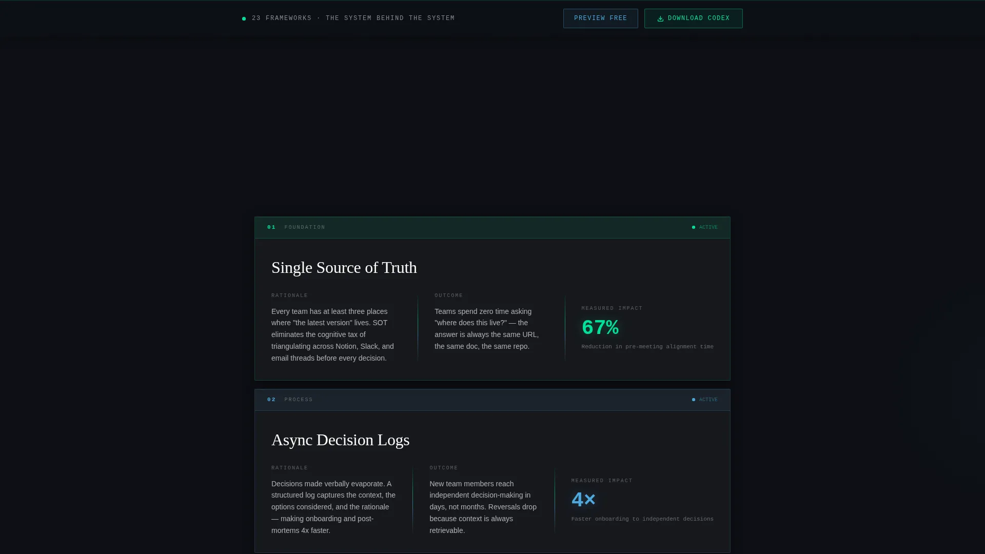
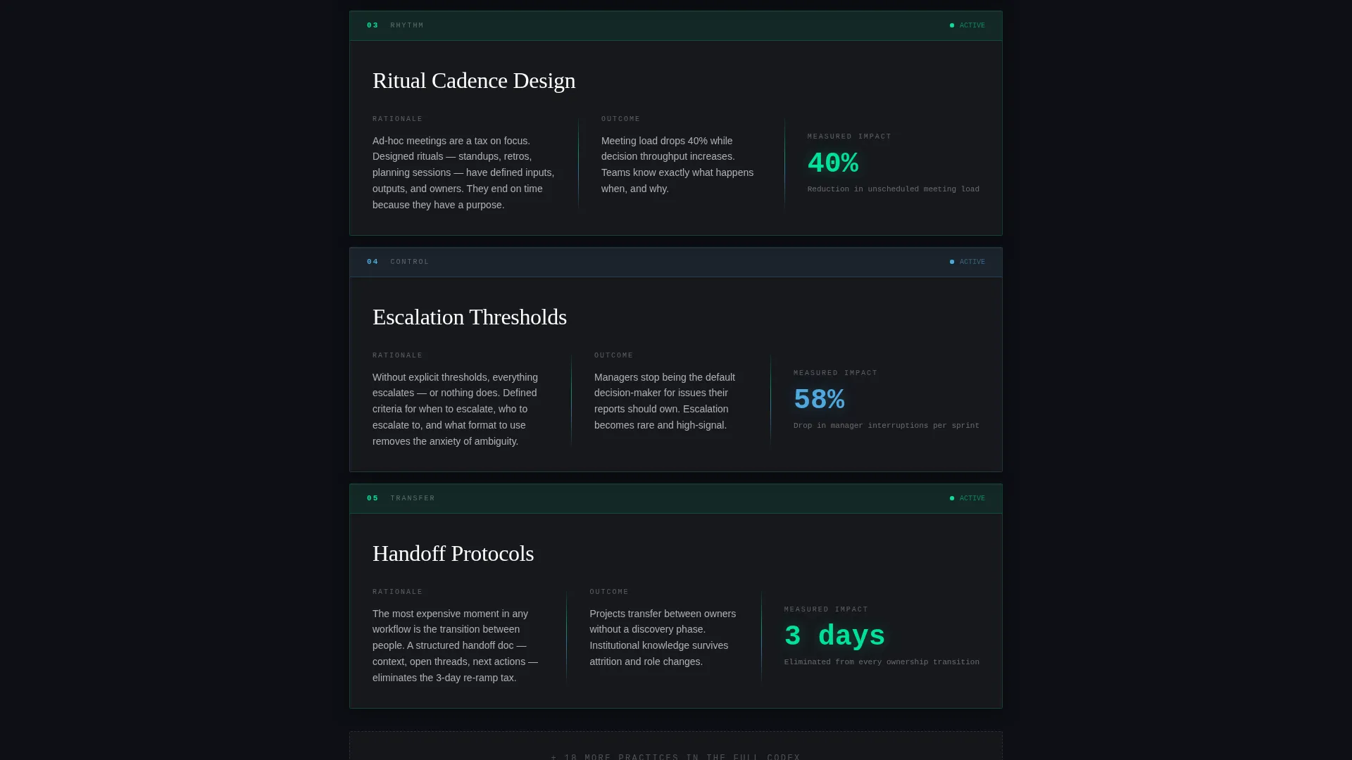
Progressive Scroll-Reveal Card System
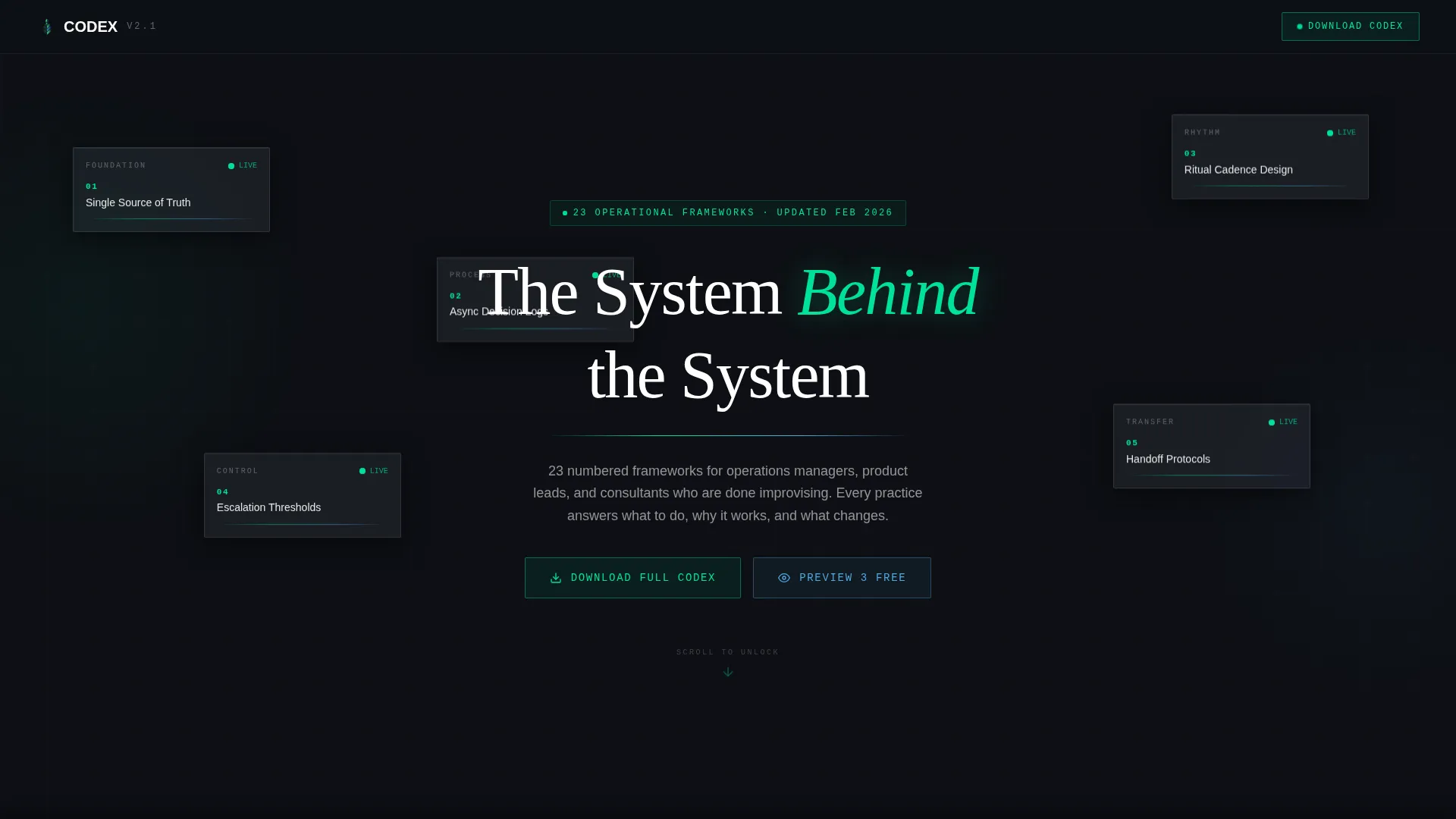
Each best practice surfaces as a numbered, titled data card on scroll. Cards materialize from a frosted blur into sharp focus and stack progressively, compressing earlier entries upward so the newest reveal always holds visual priority. The rhythm creates an addictive, dossier-like reading experience.
Dark Glass Panel Header
The header is composed of four or five translucent, blurred-glass rectangles staggered across a near-black viewport. Each panel holds a single best-practice title in crisp white monotype with a pulsing green status dot. Subtle parallax on scroll makes the panels drift as the visitor leans closer, with no hero image required.
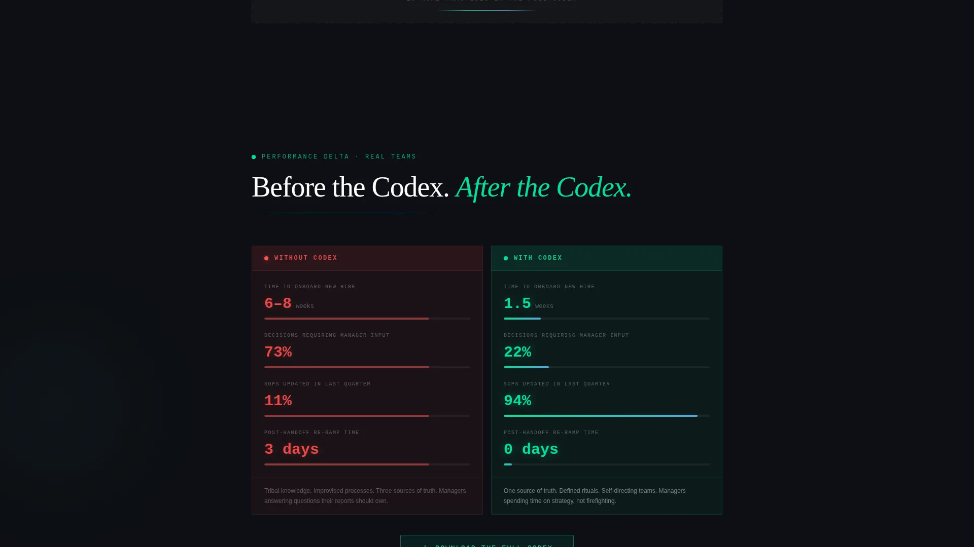
Comparison Conversion Panel
Midway through the page, a frosted split panel places "Without the Guide" chaos metrics directly beside "With the Guide" performance metrics. Numbers animate on entry, making the contrast immediate and concrete without relying on testimonials or abstract claims.
Sticky Call-to-Action Bar
After the visitor passes 60% scroll depth, a persistent bar appears repeating the primary call to action. This keeps the conversion path visible without interrupting the reading experience earlier in the scroll journey.
Dual Conversion Path Design
The template supports two parallel paths: a primary gated form asking only for work email and role, and a secondary ungated option offering a free preview of three practices. This proof-first structure earns trust before requesting commitment.
Spec-Sheet Data Card Layout
Every card is built around a consistent three-part structure: a rationale column on the left, a measurable outcome metric on the right, and a glowing divider between them. This answers "what to do," "why it works," and "what changes" in a single, scannable unit.
Page sections overview
| Section | Purpose |
|---|---|
| Dark Glass Header | Introduce the guide through staggered frosted panels with pulsing status accents |
| Headline Gradient Rule | Anchor the page theme under "The System Behind the System" with a green light rule |
| Scroll-Reveal Cards | Progressively surface each best practice as a numbered, focused data card |
| Comparison Split Panel | Contrast before-and-after metrics to demonstrate the guide's concrete value |
| Primary call to action Block | Drive downloads with a glass button and green glow hover state |
| Lead Capture Form | Collect work email and role via a two-field minimal form |
| Free Preview Path | Offer an ungated three-practice PDF to build trust before full commitment |
| Sticky call to action Bar | Repeat the download call to action after 60% scroll depth |
Design & branding system
The Codex template uses a Dashboard Pro theme built on a glassmorphic color system. Every visual decision reinforces the feeling of a live command center at night: purposeful glows, no decorative noise.
- Core palette: deep command-center charcoal (#0D0F14) for backgrounds, frosted panel white (rgba 255,255,255,0.08 with backdrop blur) for cards, electric status-green (#00E29A) for interactive accents, and cool data-blue (#4EA8DE) for secondary highlights
- Typography is crisp white monotype against near-black surfaces, keeping every label legible and technically precise
- Accent greens pulse only on interactive or high-priority elements; 1px luminous borders frame each frosted card without adding visual weight
Mobile & speed optimization
The template is designed so its dark-glass aesthetic and scroll animations translate cleanly to smaller screens. Visual weight stays low by relying on color and blur rather than large image assets.
- Frosted card layouts reflow vertically on mobile without losing the layered, depth-driven visual hierarchy
- Scroll-reveal animations are lightweight and CSS-driven, avoiding heavy JavaScript payloads that would slow initial load
- The sticky call-to-action bar and two-field form remain fully usable on touch screens without layout shifts
How this template helps you convert
Codex converts by earning trust progressively rather than demanding commitment upfront. The page structure is intentionally sequenced to move a skeptical professional from interest to action.
- The progressive card reveals demonstrate the depth and rigor of the guide before any form appears, so visitors arrive at the download offer already convinced of the value
- The comparison panel uses animated metrics to make the before-and-after contrast visceral and specific, removing the need for the visitor to imagine the benefit themselves
- The dual conversion path lowers friction by giving undecided visitors an ungated preview option, capturing partial engagement that the sticky bar can later convert to a full sign-up
Other information about this template
Codex belongs to the Documentation and Support category, sitting specifically within the White Paper and Research subcategory. It is purpose-built for the best practices guide niche, where the content itself is the product and the landing page must do the work of a sales conversation.
- The template style is Scroll Reveal (Progressive), meaning each section appears in sequence as the visitor scrolls, creating a controlled, narrative reading experience
- The creative direction follows a Spec Sheet approach, meaning information is organized as structured data units rather than flowing prose blocks
- The header concept is Dark Glass Panels, a no-illustration technique where the content panels themselves function as the visual centerpiece
- The conversion direction is Comparison/Versus, a format proven effective for guide and white paper offers where demonstrating contrast is more persuasive than listing features
Theme
Dashboard Pro
Creative direction
Spec Sheet
Color system
Glassmorphic
Style
Scroll Reveal (Progressive)
Direction
Comparison/Versus
Page Sections
Progressive Scroll-reveal Cards
Dark Glass Panel Header
Comparison Split Panel
Dual Conversion Path
Sticky Repeat Call to Action Bar
Spec-sheet Card Structure
Related questions
Who is the Codex template designed for?
Do I need design experience to use this template?
Can I offer a free preview alongside the full download?
What information does the lead-capture form collect?
Is the dark glassmorphic design suitable for a professional audience?


