Higher Education Digital Presence Directory Website Template
Codex is a higher education knowledge base landing page template built around a feature comparison table and an AI-powered search interface. It targets academic advisors, IT directors, and students who need fast, reliable answers from institutional documents. The design uses a Directory and Discovery theme with an iridescent color palette and a freemium signup flow.
by Rocket studio
Quick summary
Codex is a single-page landing page template for a university knowledge base platform. It showcases an AI-powered document search engine through a live dashboard preview header, a structured feature comparison table, and a freemium conversion flow. The template is built for higher education teams ready to replace outdated portals with one centralized, searchable knowledge engine.
Who this template is for
This template speaks directly to higher education professionals and students who spend too much time hunting for answers across disconnected systems. It is designed for teams that want to present a knowledge platform clearly and convert the right users quickly.
- Academic advisors who toggle between multiple outdated portals to answer routine student questions
- IT directors tasked with reducing redundant support tickets across departments
- First-generation students who need clear answers but do not always know the right question to ask
What problem this template solves
University knowledge is scattered. Syllabi, research papers, policy documents, and departmental FAQs live in separate systems that rarely talk to each other. This template gives knowledge platform teams a credible, conversion-ready page that communicates the value of centralization to every stakeholder at once.
- Advisors waste time switching between systems when one searchable index could surface the right answer instantly
- IT teams absorb high ticket volume from questions that indexed documents could resolve automatically
- Students without institutional experience struggle to navigate fragmented information across portals
What you get with this template
You get a fully structured, single-page layout that leads with a product dashboard preview and closes with a freemium signup form. Every section is purpose-built to match the decision-making journey of higher education buyers.
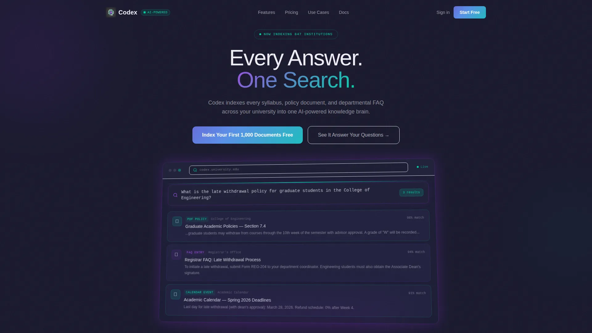
- A pixel-perfect dashboard preview header showing a real search query with AI-surfaced results fanning out as cards
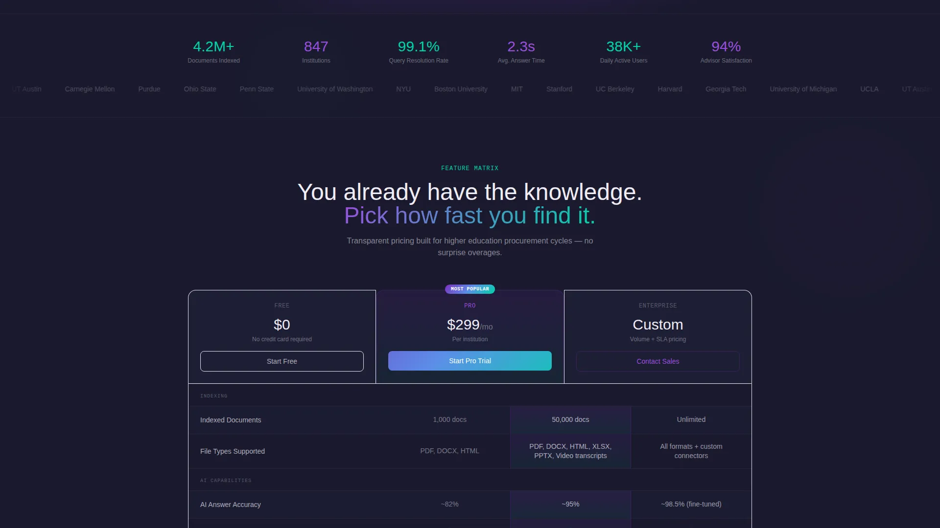
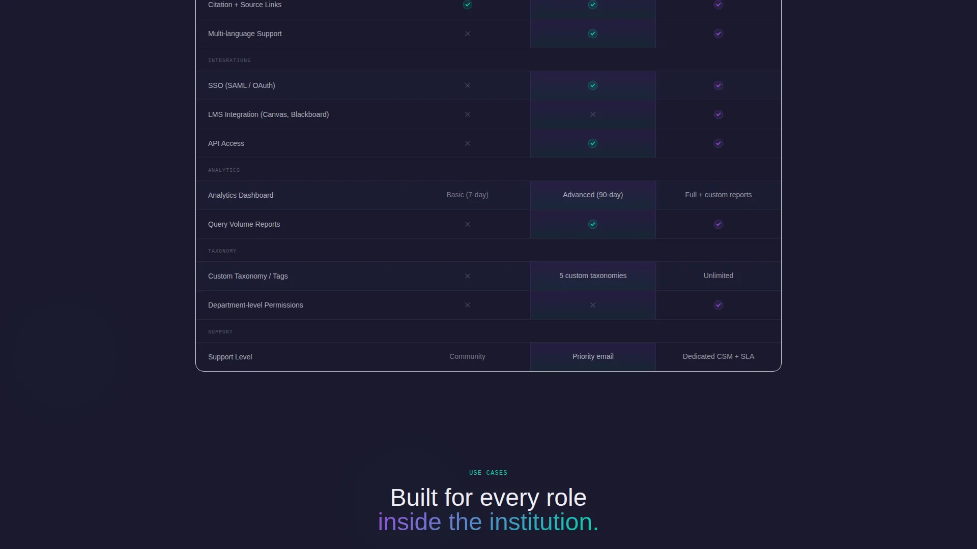
- A feature comparison table pitting free, Pro, and Enterprise tiers across rows relevant to higher education
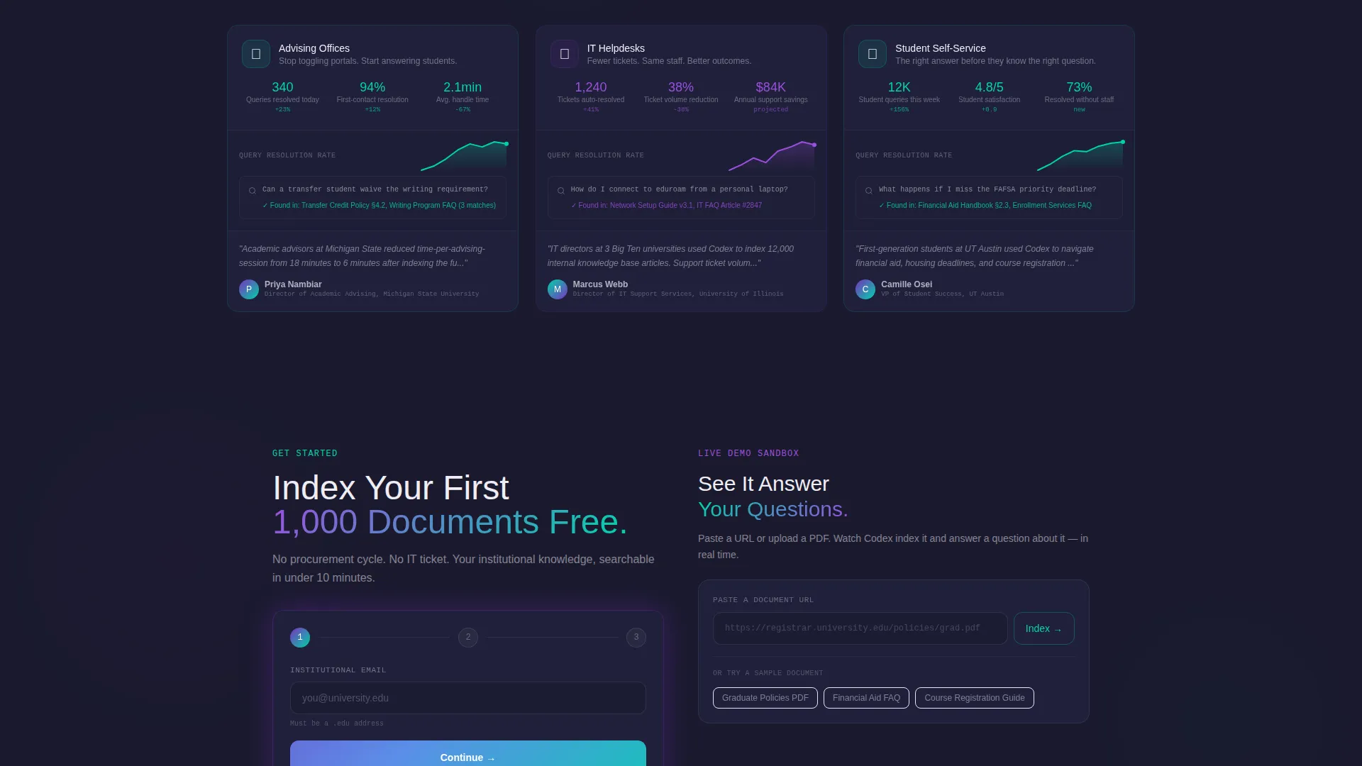
- Three use-case spotlights with micro-dashboard screenshots for advising offices, IT helpdesks, and student self-service
Feature list
This template delivers a focused set of components, each designed to build trust and move institutional buyers toward a trial signup.
AI Dashboard Preview Header
The header renders a product interface mid-query, showing how the AI surfaces a policy document, a related FAQ entry, and a registrar calendar link in response to a real graduate student question. The dashboard sits on a subtle 3D tilt against a deep graphite background, with holographic violet glowing along its edges.
Feature Comparison Table
The core of the page is a structured matrix comparing free, Pro, and Enterprise tiers. Rows cover indexed document volume, AI answer accuracy, single sign-on and learning management system integrations, analytics dashboards, and custom taxonomy support. Each row animates into view on scroll, with shimmer teal checkmarks and muted graphite limitation notes.
Use-Case Spotlights
Three spotlight blocks follow the comparison table, one each for advising offices, IT helpdesks, and student self-service. Each spotlight includes a micro-dashboard screenshot showing real query volume and resolution metrics, reinforcing that the platform fits institutions like the visitor's own.
Freemium Signup Flow
The primary call to action reads "Index Your First 1,000 Documents Free" and appears as a violet-to-teal gradient button both beneath the header and as a floating bar after the comparison table. The signup form collects institutional email, role, and estimated document volume through a simple slider.
Live Demo Sandbox Path
A secondary conversion path labeled "See It Answer Your Questions" lets visitors paste a URL or upload a PDF and watch the AI extract and index it in real time. This path shows the platform's value before asking for any commitment.
Scroll-Anchored Floating Bar
After the comparison table, a pinned floating bar keeps the primary call to action visible throughout the rest of the page. This ensures the signup prompt is always within reach as visitors read through the use-case spotlights and supporting copy.
Page sections overview
| Section | Purpose |
|---|---|
| Dashboard Preview Header | Show a live AI search query result to establish product credibility immediately |
| Reframe Headline | Deliver a single line that repositions the decision before the comparison table |
| Feature Comparison Table | Compare free, Pro, and Enterprise tiers across higher-ed-relevant capability rows |
| Advising Office Spotlight | Show query volume and resolution metrics for academic advising use cases |
| IT Helpdesk Spotlight | Demonstrate ticket reduction potential for IT support teams |
| Student Self-Service Spotlight | Illustrate how students find answers without escalating to staff |
| Floating call to action Bar | Keep the primary signup action pinned after the comparison table |
| Freemium Signup Form | Collect institutional email, role, and document volume to start the free tier |
| Live Demo Sandbox | Let visitors index a real document and see AI extraction before signing up |
Design & branding system
The visual identity follows a Directory and Discovery theme built on an AI Iridescent color system. The palette feels like light refracting through a prism onto a matte desk, with each accent color carrying a specific functional meaning across the page.
- Deep graphite (#1A1A2E) grounds every data-dense surface; shimmer teal (#00D4AA) signals search and retrieval actions
- Holographic violet (#7B2FBE) highlights AI-generated insights; soft pearl white (#F0EDF5) provides surface backgrounds and readable text
- Interactive elements carry a violet-to-teal gradient suggesting intelligence in motion, never competing with the iridescent accents
Mobile & speed optimization
The layout is designed with a scroll-first reading experience in mind. Section-by-section reveal animations keep the page feeling responsive and intentional on any screen size.
- The comparison table rows animate into view on scroll, keeping the data digestible rather than overwhelming on smaller screens
- The floating call-to-action bar adapts its position to remain visible without covering critical content on mobile viewports
- The signup form uses a slider input for document volume, making it fast and easy to complete on touch devices
How this template helps you convert
The page is structured to earn trust before asking for commitment. It shows the product working, then frames the tier decision, then removes the barrier to entry with a free-tier offer.
- The dashboard preview header demonstrates real AI query resolution before any copy makes a claim, so visitors see the value rather than read about it
- The comparison table reframes the choice as a speed decision rather than a cost decision, using the line "You already have the knowledge. Pick how fast you find it."
- The live demo sandbox lets visitors experience document indexing firsthand, which naturally surfaces the reason to upgrade from the free tier
Other information about this template
This template is built specifically for the higher education knowledge base market and reflects the decision-making language of that buyer group. It is a strong fit for teams building or marketing platforms in the knowledge management, institutional intelligence, or campus portal replacement space.
- The template style is a comparison table landing page, making it well suited for products with tiered pricing or feature differentiation
- The freemium and trial conversion model is built into the page structure, not added as an afterthought
- The header concept and creative direction are aligned with a Feature Matrix approach, keeping the product interface central to every section
- This template works within the Technology category and the Higher Education Digital Presence subcategory, making it relevant to edtech product teams and university technology offices alike
Theme
Directory & Discovery
Creative direction
Feature Matrix
Color system
AI Iridescent
Style
Comparison Table
Direction
Freemium/Trial
Page Sections
AI Dashboard Preview Header
Scroll-reveal Comparison Table
Three Use-case Spotlights
Freemium Signup Form
Live Demo Sandbox Path
Related questions
Who is the primary audience for this template?
Can I customize the comparison table rows for my own platform tiers?
What does the freemium conversion flow include?
Is the live demo sandbox a functional component out of the box?
What makes this template specific to higher education rather than general SaaS?



