Codex - Powerful Startup Landing Page Template
Codex is a modular card grid landing page built for startup knowledge bases. It uses a dark Tech Glass aesthetic with a Void & Violet color system to present founder playbooks by stage and scenario. Interactive frosted-glass cards, hover-reveal previews, and scroll-driven thematic clusters guide technical founders from first idea to Series B without friction or signup walls.
by Rocket studio
Quick summary
Codex is a single-page, card grid landing page template designed for startup knowledge bases. It organizes founder playbooks by stage and scenario, using a Tech Glass visual identity and a Void & Violet palette. Six to eight frosted-glass category cards anchor the header. Scroll-driven clusters and inline soft prompts convert visitors without gating content behind a signup wall.
Who this template is for
This template is built for founders and early-stage teams who need to present a structured library of startup guidance. The design and layout speak directly to technically minded readers who expect density, clarity, and zero fluff.
- Solo technical founders looking for go-to-market answers at odd hours
- Two-person founding teams navigating early legal and financial decisions
- First-time chief technology officers who just inherited a roadmap and a burn rate
What problem this template solves
Most knowledge base landing pages feel like generic blog indexes. They bury useful content under marketing copy and force visitors to sign up before they see anything worth reading. Founders searching for urgent answers need depth on arrival, not a conversion funnel.
- Visitors leave before reading because nothing signals real, organized depth
- Category navigation is flat and fails to reflect how founders actually search for help
- Trust is never established, so soft conversion prompts feel like interruptions
What you get with this template
You get a fully designed, single-page layout that puts your knowledge base front and center. The structure mirrors the nonlinear, scenario-driven way founders actually look for answers under pressure.
- A dark glass header with six to eight interactive frosted-glass category cards
- Scroll-driven thematic clusters organized around real founder scenarios
- A persistent top bar, per-card primary calls to action, and a soft inline email prompt
Feature list
This template delivers a focused set of interactive and visual features grounded in the source brief. Every element is purposeful and built around the reading habits of technical founders.
Frosted Glass Card Header
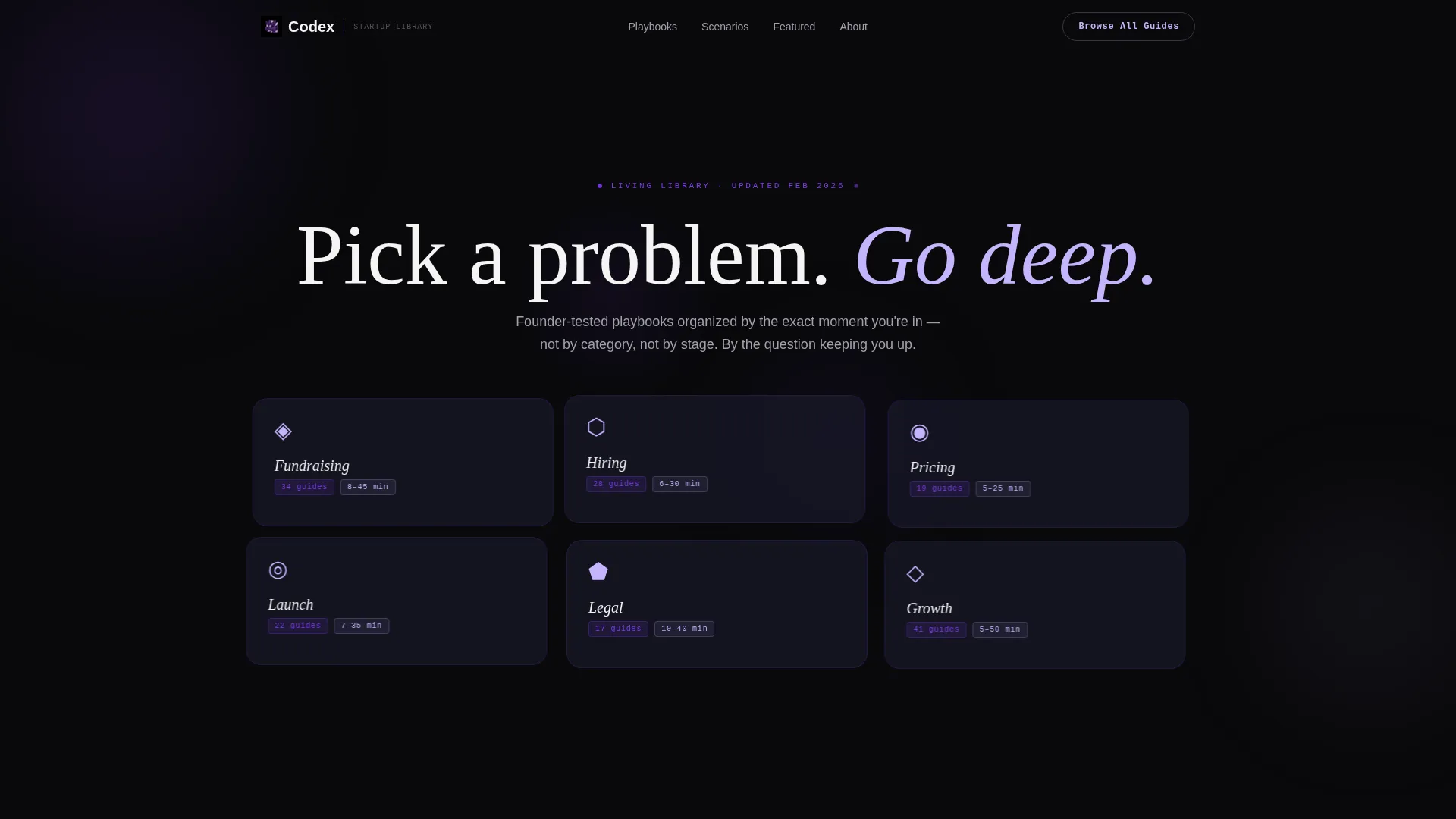
Six to eight translucent, frosted-glass category cards float against a pure black void in the header section. Each card catches a faint violet edge-light as if illuminated from behind. Cards shift with a subtle parallax effect on mouse movement, refracting light like real frosted acrylic.
Hover-Expand Card Previews
Hovering over any category card slightly expands it and reveals a three-line preview of what is inside. The preview shows article count, the latest update date, and a reading time range. This gives visitors enough context to choose a path without clicking away from the page.
Scroll-Driven Scenario Clusters
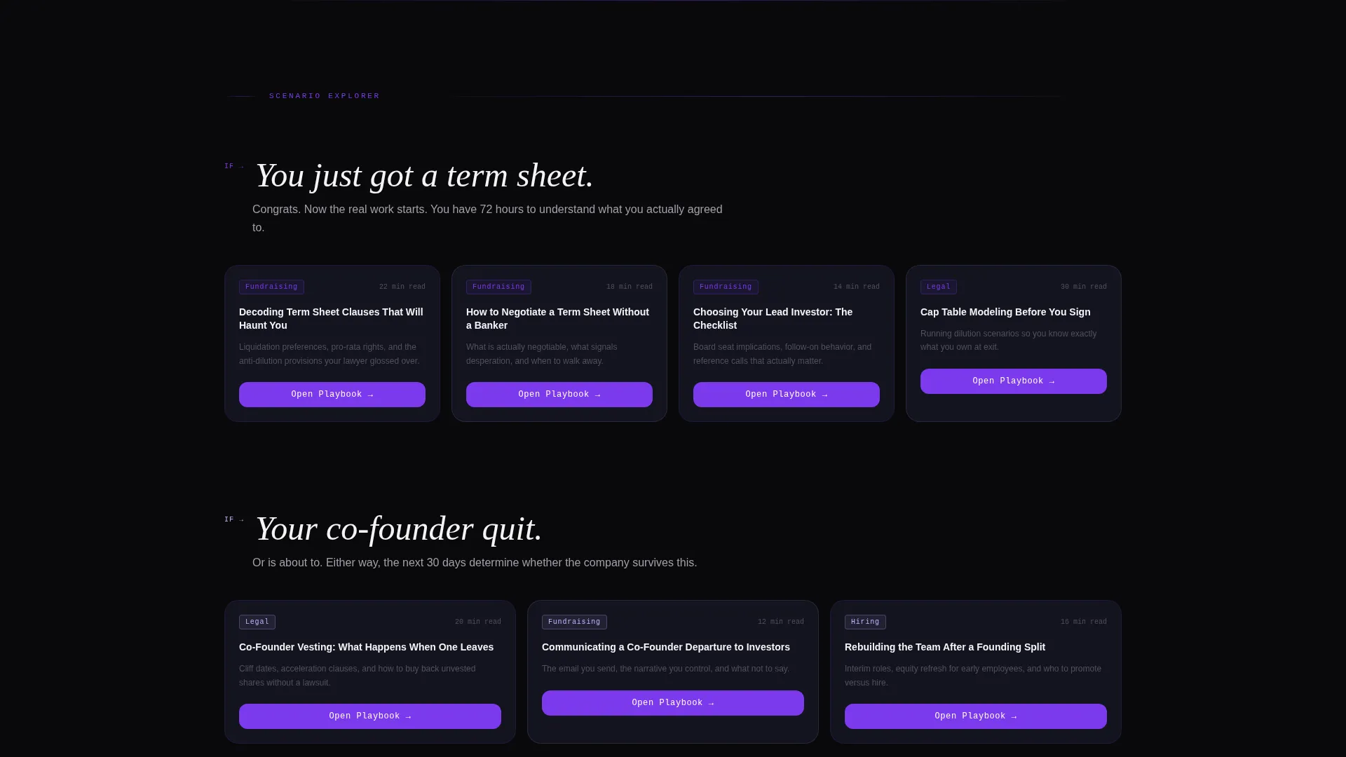
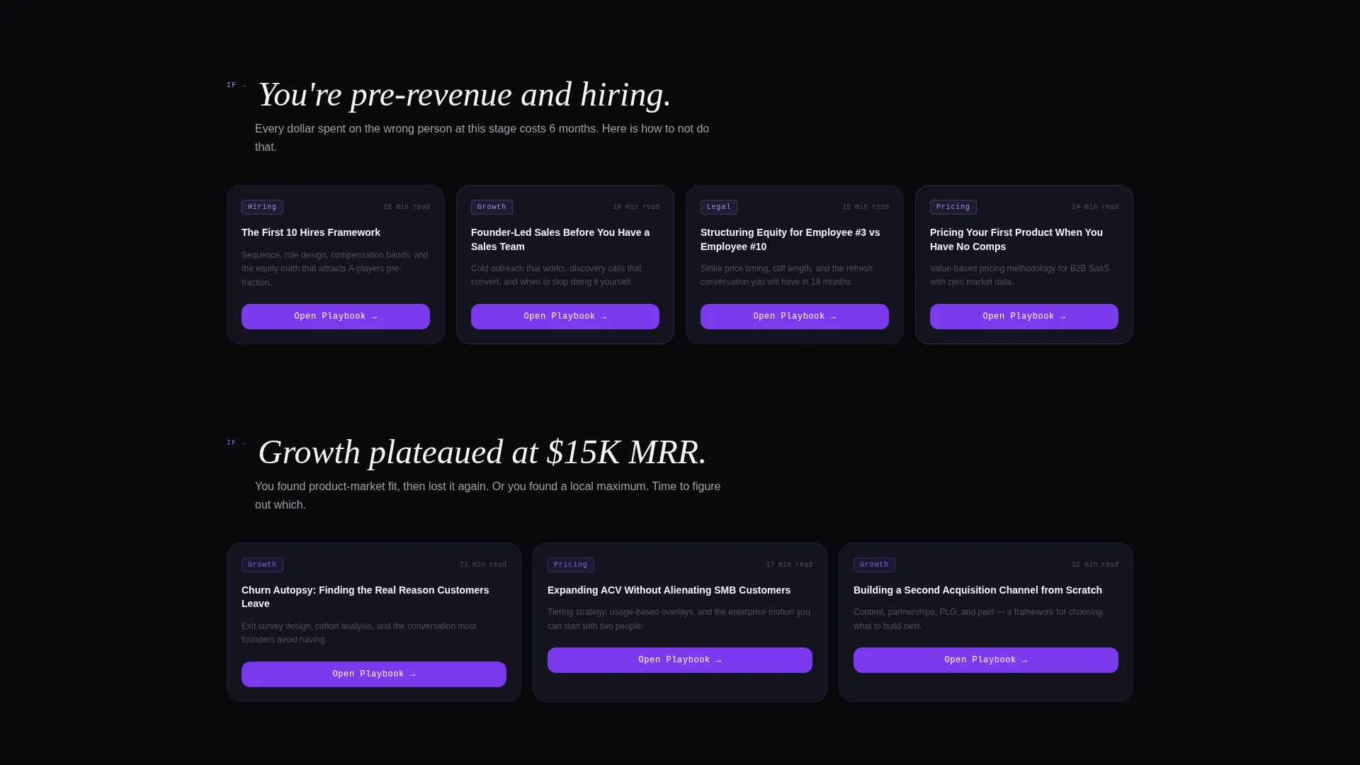
Below the header, the card grid reorganizes into thematic clusters tied to specific founder scenarios. Each cluster introduces a context line such as "You just got a term sheet" or "Your co-founder quit." Relevant cards fan out beneath each scenario, matching the panic-driven way founders actually search for answers.
Click-Through Optimized Card Actions
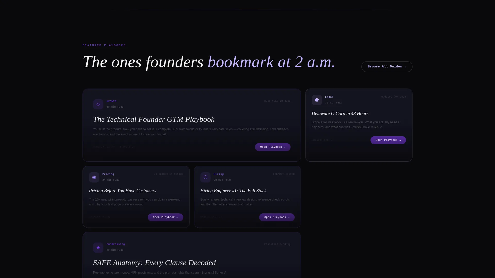
Every category card carries a primary call to action reading "Open Playbook" that routes directly into the full guide. No email gate and no signup wall appears before the first click. The page earns trust by showing content depth before asking for anything.
Persistent Top Bar Navigation
A persistent top bar carries a secondary call to action reading "Browse All Guides" for visitors who prefer scanning the full index. This ensures that fast scanners and deep readers both have a clear path forward at all times.
Soft Inline Email Prompt
After one full playbook read, a soft inline prompt appears asking "Want weekly founder briefings?" It includes a single email field and a button reading "Send Me the Briefing." The prompt is positioned to convert visitors who are already engaged, not those who have just arrived.
Page sections overview
| Section | Purpose |
|---|---|
| Persistent Top Bar | Carries secondary "Browse All Guides" call to action for scanners |
| Dark Glass Header | Displays six to eight frosted-glass category cards with parallax motion |
| Category Card Grid | Presents interactive cards for Fundraising, Hiring, Pricing, Launch, Legal, and Growth |
| Scenario Cluster Rows | Groups cards under real founder situations to aid nonlinear navigation |
| Inline Email Prompt | Captures email softly after visitor reads one full playbook |
Design & branding system
The visual identity follows a Tech Glass theme that feels like staring into a premium code editor at midnight. Every color choice and surface treatment reinforces the idea that the darkness is loaded, not empty.
- Absolute void black (#09090B) for backgrounds, frosted glass panel (#1A1A2E) for card surfaces, electric violet (#7C3AED) for primary interactive accents, and soft holographic lilac (#C4B5FD) for hover states and micro-interactions
- No hero images and no stock photography; all visual weight comes from the glass panel system and violet accent lighting
- Violet accents function as a signal system, meaning every purple glow or lilac shimmer tells the visitor that something is interactive, alive, and clickable
Mobile & speed optimization
The modular card grid layout is designed to reflow cleanly across screen sizes. The dark glass aesthetic and minimal image use keep the visual stack lean and fast to render.
- Card grid columns collapse into a readable single or double column stack on smaller screens
- No hero photography or heavy media assets means the page loads with a lighter visual payload
- Parallax and hover interactions are contained to pointer-based devices so mobile visitors get a clean, distraction-free layout
How this template helps you convert
Codex converts by building trust before asking for anything. The layout guides visitors from curiosity to commitment through three deliberate stages.
- The frosted-glass card header immediately signals organized depth and invites the visitor to pick a category without any friction or form
- Scenario clusters on scroll reflect real founder urgency, keeping visitors engaged longer and routing them toward the most relevant content
- The soft inline email prompt appears only after a visitor has already read a full playbook, converting an already-warm reader rather than interrupting a cold one
Other information about this template
Codex is a strong fit for founders building a startup knowledge base as a content product, a community resource, or a lead generation asset. The template style is a card grid, which makes it easy to scale the library as content grows.
- The template is built for the startup knowledge base niche within the broader startup digital presence category
- The Tech Glass theme and Void & Violet color system are cohesive enough to support custom branding by swapping accent colors
- The page is designed as a single-page, section-led landing page, not a multi-page website, so all navigation stays within one scrollable experience
Theme
Tech Glass
Creative direction
Interactive Explorer
Color system
Void & Violet
Style
Card Grid (Modular)
Direction
Click-Through
Page Sections
Frosted Glass Category Cards
Hover-expand Playbook Previews
Scroll-driven Scenario Clusters
Click-through Card Actions
Persistent Top Bar
Soft Inline Email Prompt
Related questions
Can I add more category cards beyond the original six to eight?
Does the template require visitors to sign up before reading content?
Is this template suitable for a knowledge base covering only one or two topics?
Can I change the color system to match my own brand?
What type of page is this template, a single page or a multi-page site?



