Library & Research Center Privacy Policy & Terms Website Template
Codex is a modular card-grid landing page built for digital library platforms. It guides compliance officers, learning and development managers, and operations directors from scattered documents to a single organized knowledge hub. A quiz-led conversion flow, a Forest Trust color palette, and a Hero's Journey scroll structure make every section feel purposeful and earn visitor trust before asking for a commitment.
by Rocket studio
Quick summary
Codex is a single-page digital library landing page template. It uses a modular card-grid layout, a Forest Trust color system, and a five-question readiness assessment to convert high-intent visitors. The design feels like a well-ordered private reading room: calm, authoritative, and precise. It is built for teams who manage whitepapers, policy manuals, compliance documents, and training modules at scale.
Who this template is for
This template is designed for teams whose daily work depends on having the right document at the right moment. It fits organizations where version confusion, scattered storage, and slow retrieval create real operational risk.
- Compliance officers who need audit-ready documents accessible at any hour
- Learning and development managers building structured onboarding paths from fragmented content libraries
- Operations directors responsible for keeping every team aligned on current procedures and policies
What problem this template solves
Organizational knowledge is often trapped in shared drives, email threads, and personal folders. When documents are hard to find, teams lose productive hours and compliance exposure grows. Codex addresses that gap directly.
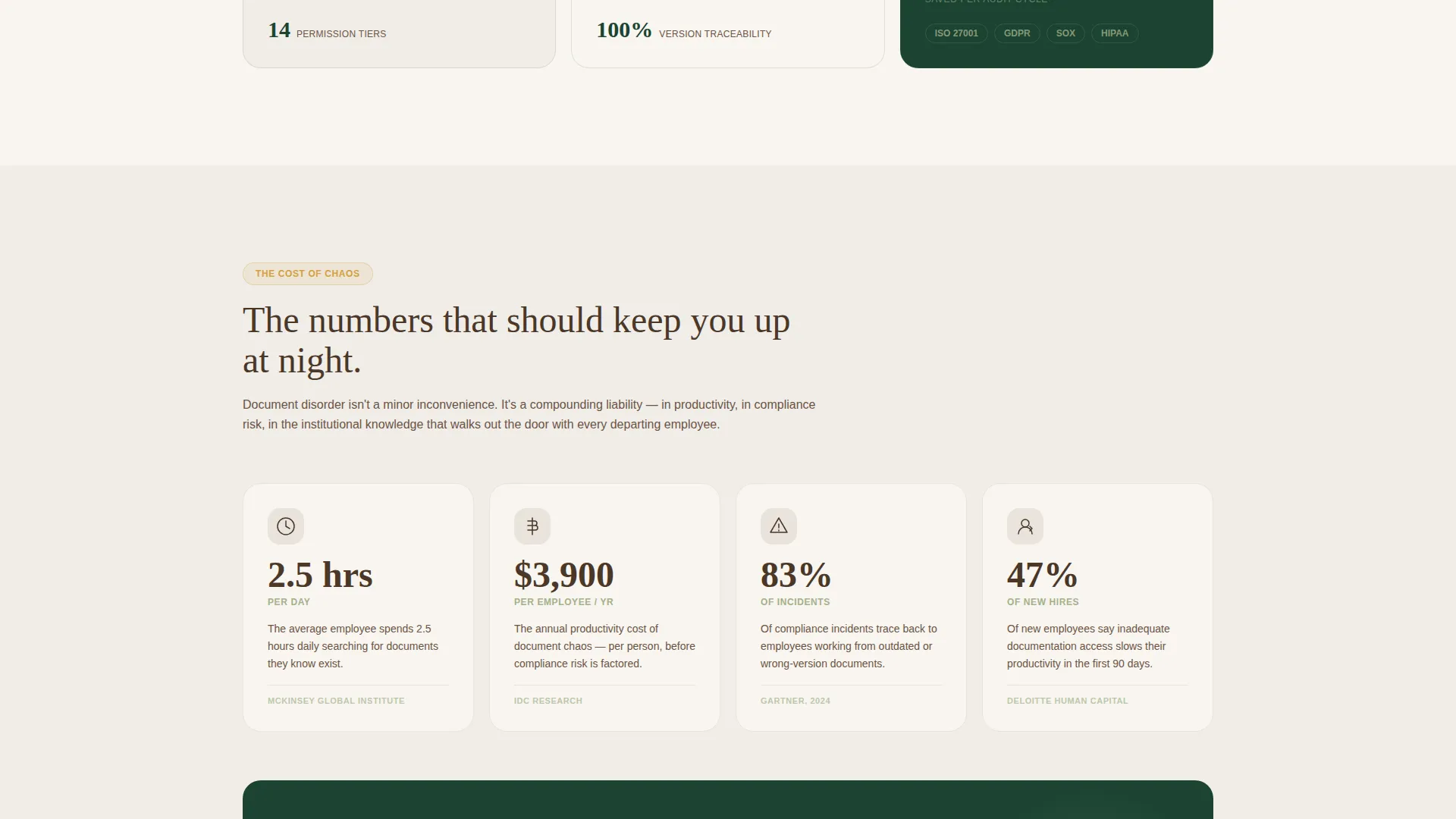
- Communicates the real cost of document chaos through data-driven "cost of chaos" cards
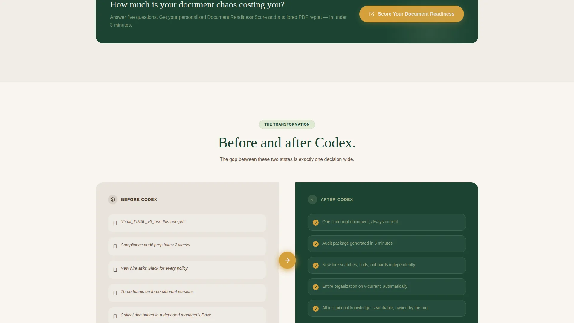
- Shows visitors a clear transformation from scattered files to a single searchable knowledge hub
- Moves high-intent buyers toward a personalized readiness assessment rather than a generic contact form
What you get with this template
The template delivers a fully structured, single-page layout ready to represent a digital library platform. Every section is purposefully sequenced to build trust, surface pain, and resolve it with a clear action path.
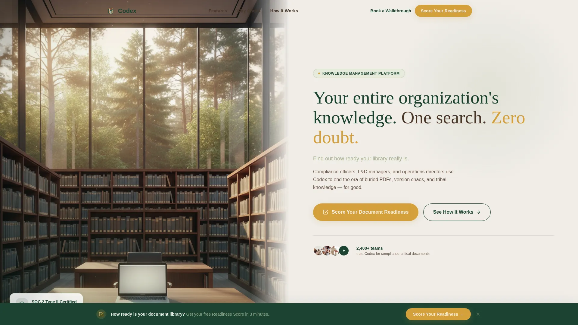
- A half-page hero with a corporate library photograph on the left and a sharp serif headline on the right
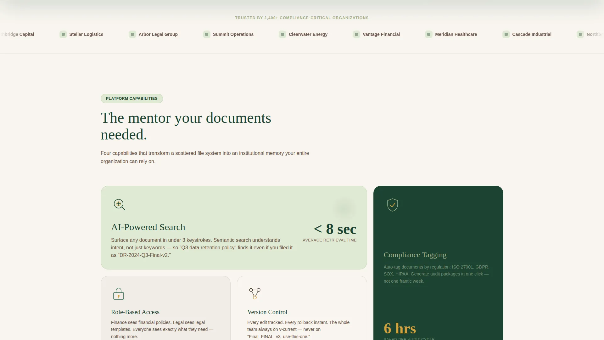
- A modular card grid presenting platform capabilities through evergreen line-art micro-illustrations
- A sticky conversion bar, a five-question progressive assessment, and a secondary "Book a Walkthrough" call-to-action path
Feature list
This template includes a focused set of design and layout capabilities drawn directly from the brief.
Half-Page Hero Section
The hero splits the viewport into two zones. The left side holds a golden-hour corporate library photograph. The right side carries a bold serif headline and a lichen-silver subline that invites visitors to discover their document readiness. This opening frame sets an authoritative, trustworthy tone from the first second.
Modular Capability Card Grid
A full row of modular cards introduces the platform's core capabilities. Each card covers one function: AI-powered search, role-based access, version control, and compliance tagging. Cards use evergreen line-art micro-illustrations to keep the visual language consistent and professional without cluttering the layout.
Cost-of-Chaos Statistics Section
A dedicated section renders real productivity and compliance-failure statistics as oversized numbers. Bark brown type on morning-fog white cards makes the data feel grounded and credible. The visual weight of these numbers creates productive tension that makes the solution section feel like genuine relief.
Before-and-After Transformation Row
Side-by-side card pairs contrast document disorder with organized clarity. A sap-amber arrow connects each "before" card to its "after" counterpart. This visual pairing makes the platform's value concrete rather than abstract and reinforces the Hero's Journey narrative arc built into the page scroll.
Five-Question Progressive Assessment
The primary conversion tool is an interactive five-question quiz titled "Score Your Document Readiness." Questions cover organization size, current storage method, document retrieval time, audit frequency, and biggest pain point. Each answer triggers a micro-animation: an evergreen progress bar that grows like a branch extending. Completion delivers a personalized readiness score and a tailored PDF report sent to the visitor's email.
Sticky Conversion Bar
After the cost-of-chaos section, a sticky bar resurfaces the primary call-to-action without interrupting the reading experience. It keeps the assessment offer visible as visitors continue scrolling, reducing the chance that a high-intent visitor loses the conversion path.
Page sections overview
| Section | Purpose |
|---|---|
| Hero Split Header | Establish authority and invite document readiness curiosity |
| Primary call to action Bar | Surface the assessment immediately below the hero photograph |
| Capability Card Grid | Introduce platform features through illustrated modular cards |
| Cost of Chaos | Make the productivity and compliance cost of disorder tangible |
| Sticky Conversion Bar | Re-surface the assessment call to action after tension peaks |
| Transformation Row | Show before-and-after document order with amber directional arrows |
| Assessment Flow | Guide visitors through five questions to a personalized score |
| Score Reveal Screen | Deliver readiness score and prompt PDF report email capture |
| Book a Walkthrough | Offer a direct next step for high-intent visitors |
Design & branding system
The Forest Trust color system gives Codex its distinctive feeling: cool, shaded, and institutionally credible, with one warm accent that draws the eye toward action.
- Deep evergreen (#1B4332) anchors navigation and headers; weathered bark brown (#4A3728) grounds body text; lichen silver (#A3B18A) softens card backgrounds and dividers; morning-fog white (#F0EDE8) fills the primary canvas
- Sap amber (#D4A03C) is reserved for calls-to-action and the transformation arrows, functioning as the sole warm accent in an otherwise cool palette
- Typography follows a Corporate Precision theme: sharp serif headlines project institutional authority while the overall layout breathes with generous whitespace
Mobile & speed optimization
The modular card grid is built to reflow cleanly across viewport widths. Section-by-section structure keeps the scroll experience coherent on smaller screens without losing the narrative rhythm.
- Card grid columns collapse to single-column stacks on mobile, preserving readability of micro-illustrations and statistics
- The sticky conversion bar is designed to remain accessible on touch screens without obscuring primary content
How this template helps you convert
Every scroll increment in Codex is designed to raise a specific concern and then resolve it, pulling the visitor toward a decision.
- The hero and immediate call to action placement capture attention and surface intent before a visitor has a chance to leave, using a question-led subline that prompts self-reflection rather than a generic pitch.
- The cost-of-chaos statistics section builds enough productive tension that the transformation row and assessment offer feel like genuine answers, not sales pressure, converting curious visitors into qualified leads through a personalized score and PDF report.
Other information about this template
Codex sits at the intersection of the Education and Training category and the digital library niche. It is purpose-built for Library and Research Center subcategory use cases, where the audience expects precision and calm rather than high-energy marketing copy.
- The template style is Card Grid (Modular), making individual capability sections easy to reorder, expand, or adapt as a platform's feature set grows
- The Hero's Journey creative direction means the page has a narrative arc: ordinary world, tension, transformation, and resolution are all mapped to specific scroll positions
- The Quiz and Assessment landing page direction is central to the conversion strategy: the readiness score differentiates this page from standard demo-request flows and gives visitors a reason to engage before committing
Theme
Corporate Precision
Creative direction
Hero's Journey
Color system
Forest Trust
Style
Card Grid (Modular)
Direction
Quiz/Assessment
Page Sections
Half-page Hero with Split Layout
Modular Capability Card Grid
Cost-of-chaos Statistics Section
Before-and-after Transformation Row
Five-question Progressive Assessment
Sticky Reassessment Conversion Bar
Related questions
Who is the Codex template designed for?
What is the primary conversion mechanism in this template?
Can I adapt the card grid to show more or fewer capabilities?
What does the "Book a Walkthrough" path do?
Does this template suit a single product or a broader platform?



