Sociology Quiz App Landing Page Template
Cohort is a sociology practice and quiz app landing page template built around rapid-fire quiz rounds, scenario-based practice sets, and a diagnostic assessment flow. It uses a Playful Geometric visual style, a Stats/Metrics dashboard header, and three student case study narratives to walk visitors from doubt to confident sign-up, all on a single, scroll-driven page.
by Rocket studio
Quick summary
Cohort is a single-page template for a sociology practice app. It opens with a live-style progress dashboard, pulls visitors through three student case study narratives, and converts them with a free five-question diagnostic. The design is warm, geometric, and built to feel like a well-loved study desk, inviting enough for a two-hour session.
Who this template is for
This template is built for anyone launching or showcasing a sociology study tool. It speaks directly to the people most likely to sign up and start quizzing.
- Undergraduate sociology students cramming for midterms or theory exams
- Advanced Placement (AP) students targeting top scores on their sociology assessment
- Graduate students reviewing classical theory before comprehensive exams
What problem this template solves
Most study app pages are either too generic or too technical. They fail to show students what real progress looks like before asking for a sign-up. This template solves that trust gap head-on.
- Passive reading habits do not build exam-ready recall, and the page makes that contrast visible
- Students do not know which sociological frameworks are weakest until a diagnostic shows them
- Generic calls to action fail to earn clicks; a personalized quiz promise earns more of them
What you get with this template
This template delivers a fully structured landing page with layered conversion paths, narrative-led scroll sections, and a clear visual system. Every section has a defined job.
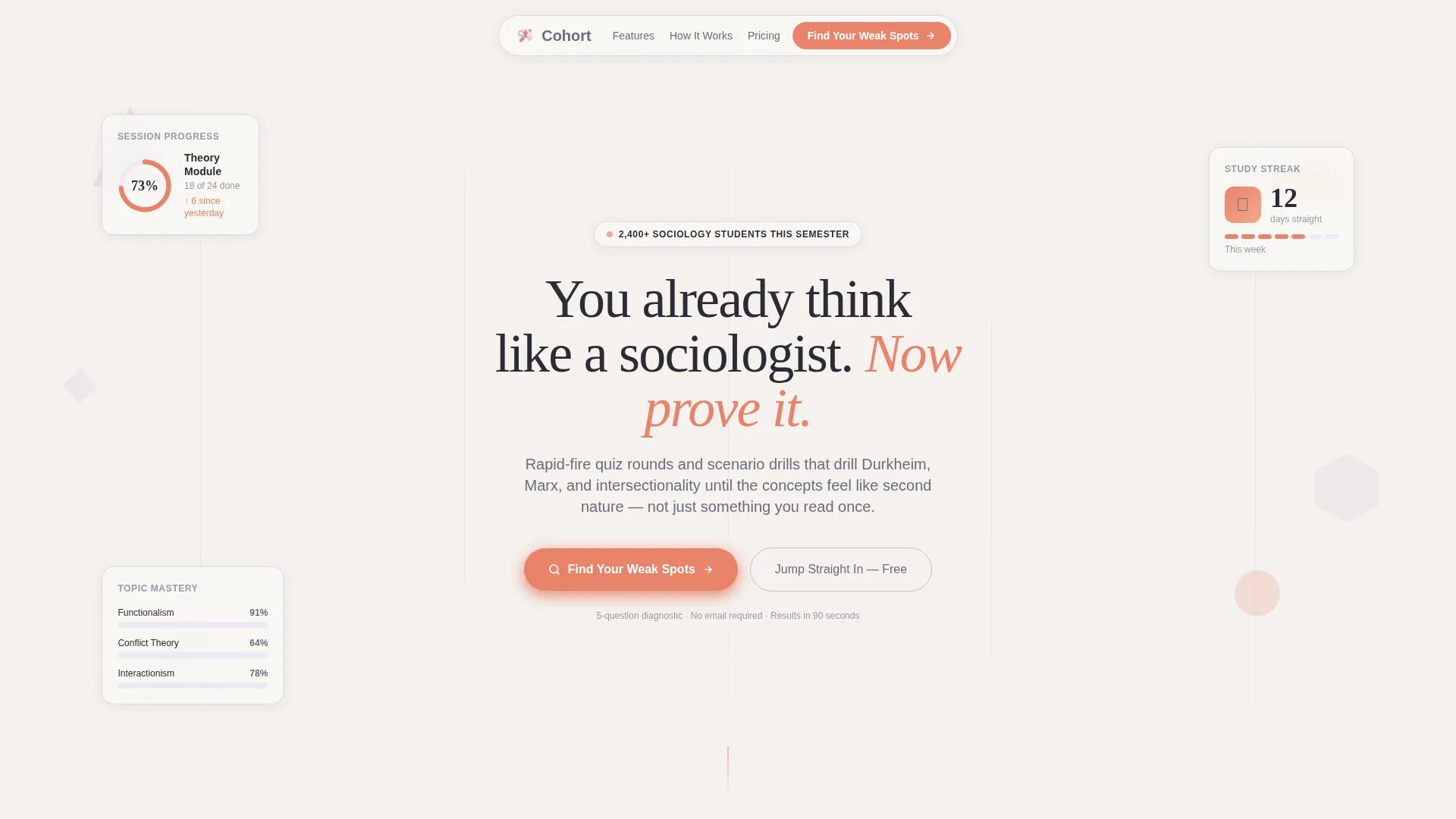
- A Stats/Metrics dashboard header frozen at a mid-session snapshot with progress rings, streak counters, and mastery bars
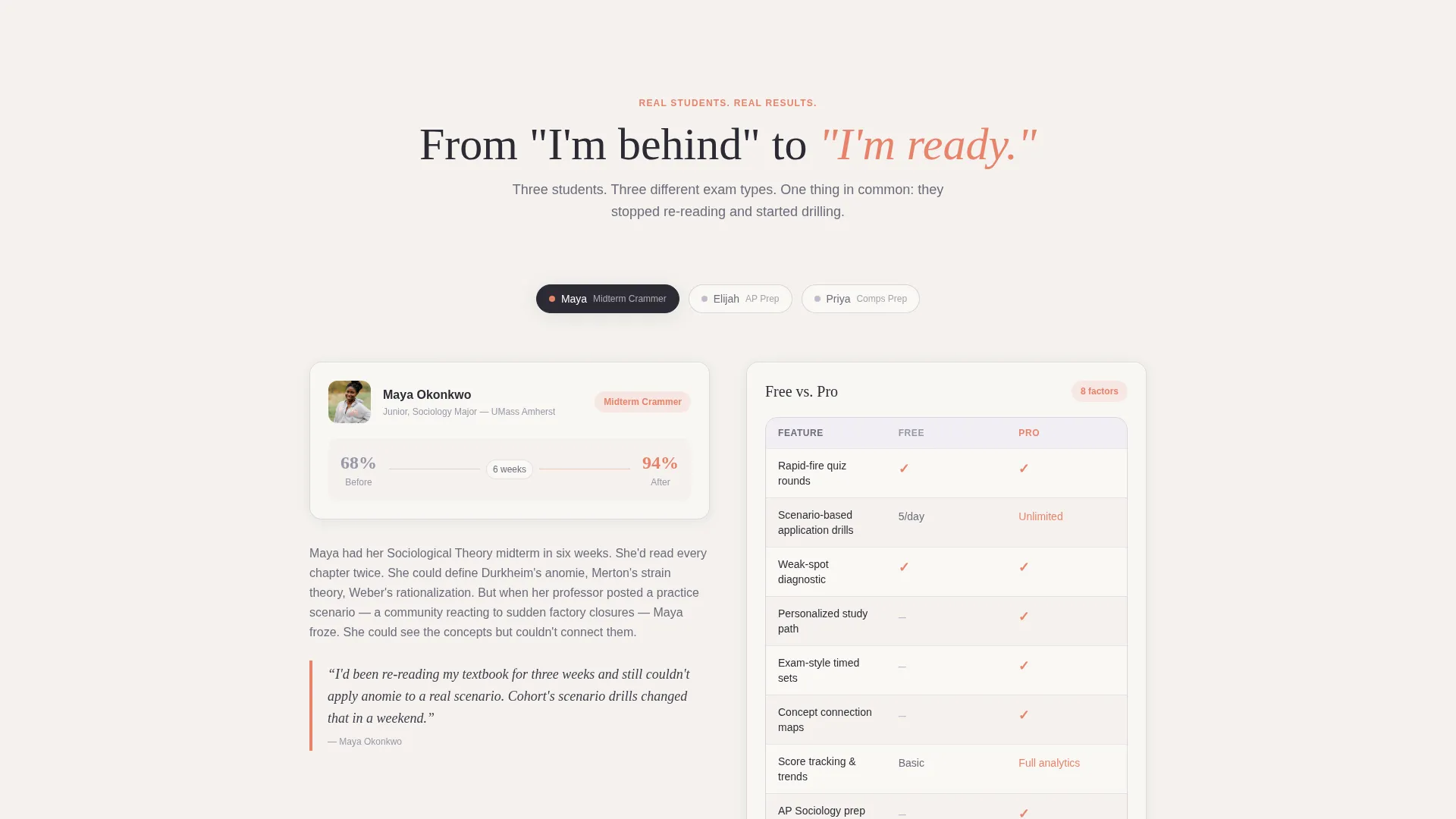
- Three narrative case study blocks each anchored by a comparison table (Free versus. Pro, Cramming versus. Spaced Repetition, Passive Reading versus. Active Quizzing)
- A dual conversion path: a primary "Find Your Weak Spots" diagnostic call to action and a secondary "Jump Straight In, Free" option
Feature list
This template is packed with purposefully designed components drawn directly from the brief. Each one earns its place on the page.
Stats/Metrics Dashboard Header
The header opens as a frozen mid-session dashboard. It shows a circular progress ring at 73% completion, a 12-day streak counter, a topic mastery bar chart with Functionalism at 91% and Conflict Theory at 64%, and an animated confetti burst beside a "Symbolic Interactionism, Mastered" badge. Soft translucent geometric shapes float behind the data.
Case Study Narrative Sections
Three student archetypes anchor the scroll: Maya (theory exam score raised from 68 to 94), Elijah (AP practice assessment passed two weeks early), and Priya (grad comps cleared on the first attempt). Each story escalates the sense of progress and makes the app's value concrete before the visitor reaches the call to action.
Embedded Comparison Tables
Each case study section contains its own comparison table. The tables contrast Free versus. Pro features, Cramming versus. Spaced Repetition study modes, and Passive Reading versus. Active Quizzing outcomes. They reveal the app's depth progressively as the reader scrolls.
Diagnostic Quiz Conversion Flow
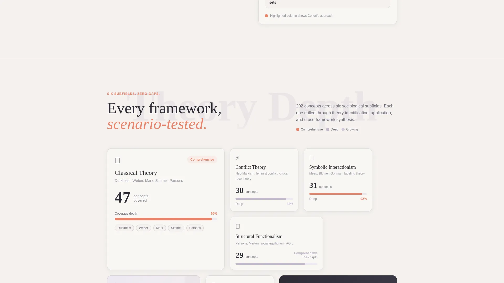
The primary call to action launches a free five-question diagnostic. It moves from theory-identification questions to scenario-application questions and then ranks results across six sociological subfields. A shareable mastery chart is displayed before any email is requested.
Dual Conversion Path Design
Visitors who want to skip the quiz can take a secondary path labeled "Jump Straight In, Free." This removes friction for high-intent visitors while the diagnostic path captures insight-seekers. Both paths lead to sign-up without forcing a single route.
Playful Geometric Visual System
Translucent triangles, hexagons, and half-circles in lavender and coral float throughout the page as decorative layer elements. The shapes reinforce the academic-yet-approachable tone without competing with the data-rich content sections.
Page sections overview
| Section | Purpose |
|---|---|
| Dashboard Header | Opens with a mid-session stats snapshot and headline fade-in |
| Maya Case Study | Shows score improvement narrative with Free versus. Pro table |
| Elijah Case Study | Tracks AP student progress with Cramming versus. Spaced Repetition table |
| Priya Case Study | Grad-level story with Passive Reading versus. Active Quizzing table |
| Diagnostic call to action Block | Drives "Find Your Weak Spots" quiz sign-up as primary conversion |
| Secondary call to action | Offers "Jump Straight In, Free" path for high-intent visitors |
Design & branding system
The Soft Mist color system keeps the page gentle enough to stare at for a full study session. Warm coral accents guide the eye toward interactive elements without creating visual fatigue.
- Cloud-white background (#F4F1EE), muted lavender (#C5B9CD) for card borders and dividers, chalk-slate (#6B6B7B) for body text, and warm coral (#E8836B) reserved for buttons, progress rings, and correct-answer highlights
- Playful Geometric theme uses floating translucent triangles, hexagons, and half-circles in lavender and coral as background layer elements
- Typography and layout evoke a well-worn textbook feel, familiar and focused, with margin-note energy built into the spacing
Mobile & speed optimization
The layout is designed to stay readable and functional across screen sizes. The scroll-driven narrative structure works naturally on a mobile viewport.
- Comparison tables are structured to remain scannable on narrow screens without horizontal scrolling
- The dashboard header elements, progress rings, streak counter, and bar chart, are sized to display clearly on small screens
- Geometric floating shapes are positioned as background layers so they do not obstruct content on any device
How this template helps you convert
Every structural decision on this page is aimed at moving a skeptical student toward action. The conversion logic is layered and deliberate.
- The dashboard header proves the app works before a single word of marketing copy appears, making the value visible immediately.
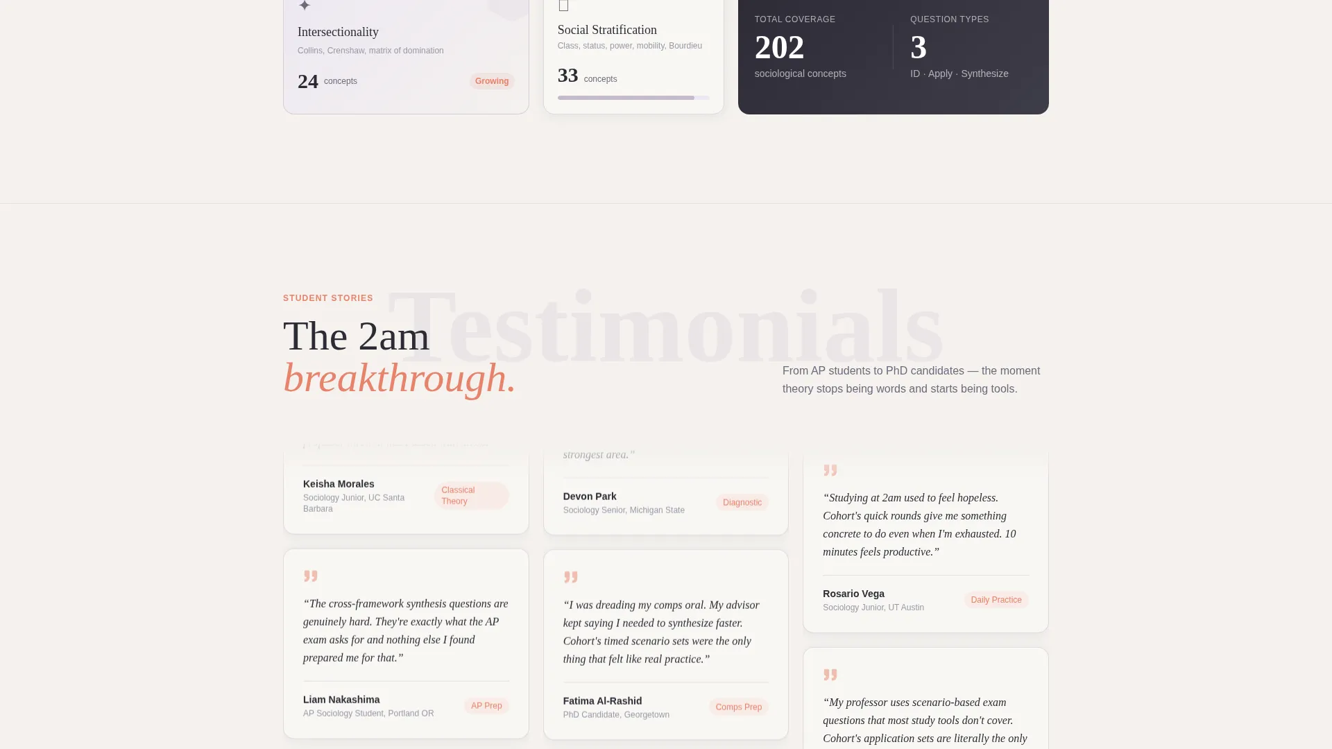
- The three case study narratives build trust by showing specific, realistic outcomes tied to real student archetypes, reducing doubt at each scroll depth.
- The diagnostic call to action earns the click by promising personalized insight first and requesting an email only after results are shown, lowering sign-up resistance.
Other information about this template
This template is designed for the sociology education niche and suits any practice or quiz app targeting students at multiple academic levels. A few additional details worth noting:
- The template style is Comparison Table, meaning tables are a core structural component, not decorative additions
- The creative direction follows a Case Study Narrative approach, making each scroll section feel earned rather than promotional
- The landing page direction is Quiz/Assessment, so the entire page architecture supports a diagnostic-first conversion funnel
- The Playful Geometric theme and Soft Mist color palette are matched to support long study sessions without visual fatigue
- This template covers sociological theory content from classical frameworks like Durkheim's anomie to contemporary concepts like intersectionality
Theme
Playful Geometric
Creative direction
Case Study Narrative
Color system
Soft Mist
Style
Comparison Table
Direction
Quiz/Assessment
Page Sections
Stats/metrics Dashboard Header
Three Case Study Narrative Sections
Embedded Comparison Tables
Diagnostic Quiz Conversion Flow
Dual Conversion Path Design
Playful Geometric Visual Layer
Related questions
Who is this landing page template designed for?
Can I customize the student case studies and comparison tables?
How does the diagnostic quiz conversion flow work on this page?
Does this template include the quiz functionality itself?
Is this template suitable for education niches beyond sociology?



