Sociology Education Professional Website Template
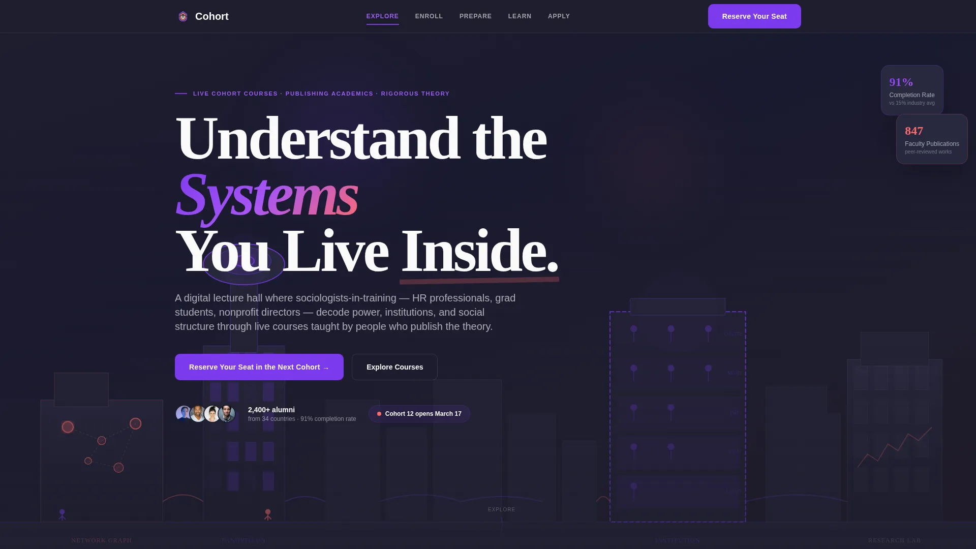
Cohort is a hub-and-spoke sociology landing page built for live cohort-based online courses taught by publishing academics. With a cinematic isometric cityscape header, anchor navigation guiding visitors through five learner journey stages, and a focused event registration flow, it turns curious visitors into enrolled students efficiently and confidently.
by Rocket studio
Quick summary
Cohort is a single-page sociology online course platform landing page. It uses anchor navigation to guide visitors through five clearly labeled phases: Explore, Enroll, Prepare, Learn, and Apply. The page drives event registration with a three-field form, a free session opt-in, and proof points stacked above the closing call to action.
Who this template is for
This template suits course creators and academic institutions running cohort-based sociology programs online. It is built for educators who want a structured, credible presence that converts curious visitors into registered learners.
- Mid-career human resources professionals retooling for organizational consulting roles
- Graduate students supplementing thin departmental course offerings with rigorous social theory
- Nonprofit directors needing academic grounding to strengthen grant narratives
What problem this template solves
Sociology course providers often struggle to communicate the depth and structure of their programs clearly. Generic course pages lose potential learners before they reach the registration form. This template solves that by walking every visitor through a logical, phased journey that builds trust at each step.
- Visitors leave before registering because the value of the course is buried or unclear
- Course credibility is hard to establish without showcasing instructor credentials and alumni outcomes
- Registration friction is high when forms feel abrupt or disconnected from the learning story
What you get with this template
You get a fully designed, section-rich landing page organized around the five phases of the learner journey. Every section is purposeful, and the layout progresses like a map being gradually illuminated as the visitor scrolls.
- A viewport-filling isometric cityscape header illustration with a floating headline
- Five anchor-nav spoke sections covering course catalog, weekly schedule, sample content, and alumni stories
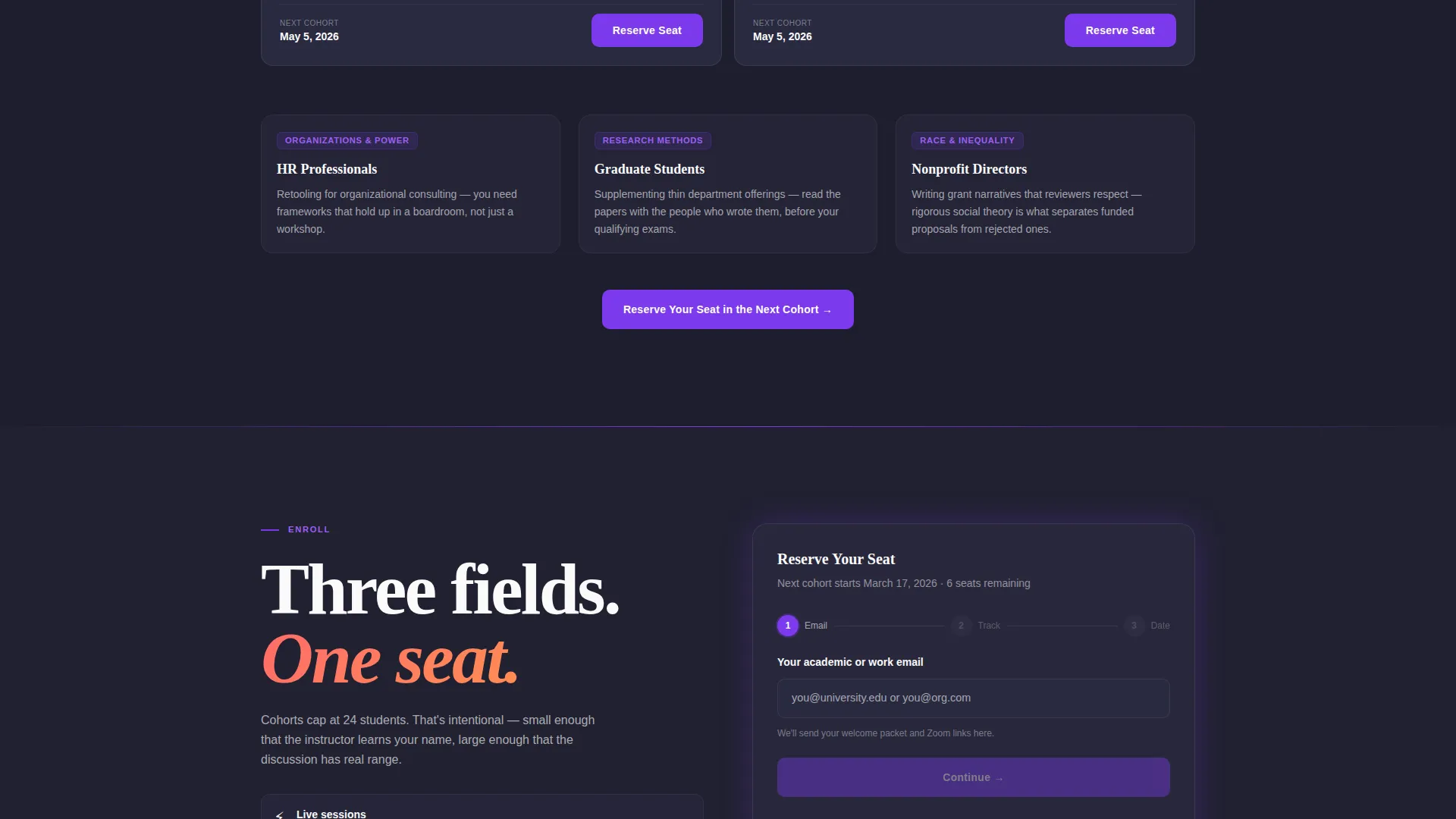
- A three-field event registration form with course track dropdown and cohort start date selection
- A secondary "Sit In on a Free Session" opt-in path for undecided visitors
Feature list
This template is built around a clear set of design and structural capabilities drawn directly from its creative brief.
Anchor Navigation with Five Journey Stops
A sticky anchor navigation bar pins to the top of the page and labels five stops: Explore, Enroll, Prepare, Learn, and Apply. Electric violet highlights mark the active section, giving visitors a clear sense of where they are in the learning journey at all times.
Isometric Cityscape Header Illustration
The header fills the entire viewport with a flat vector illustration of a stylized city. Each building represents a sociological concept, including a panopticon tower, a network-graph neighborhood, and an institution with transparent walls. Tiny figures move along dotted paths, and the headline "Understand the Systems You Live Inside" floats above the skyline.
Progressive Scroll Illustration System
Each transition between spoke sections triggers a subtle illustration element. A dotted path extends or a new building illuminates as the visitor scrolls, connecting the page narrative to the opening cityscape and making the scroll feel like following a map.
Course Catalog Cards with Instructor Credentials
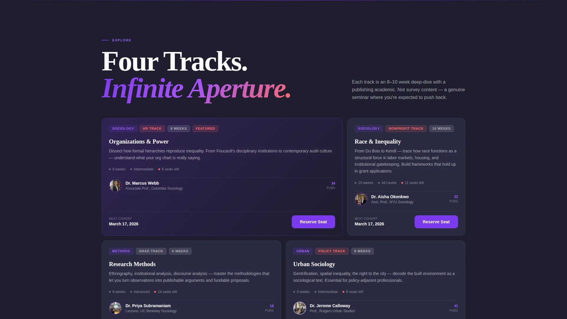
The Explore section displays course catalog cards tagged by topic. Each card surfaces instructor credentials, giving visitors immediate context about who is teaching and what the course covers before they commit to enrolling.
Phased Event Registration Form
The primary call to action, "Reserve Your Seat in the Next Cohort," appears in the header and resurfaces at the conclusion of every spoke section. The registration form collects email, preferred course track from a four-option dropdown, and preferred start date mapped to actual upcoming cohort launches.
Proof-Point Close in the Apply Section
The final spoke stacks three social proof metrics directly above the registration form: completion rate, alumni career moves, and instructor publication counts. This evidence-first close reduces last-moment hesitation before form submission.
Page sections overview
| Section | Purpose |
|---|---|
| Header Hero | Introduces the platform with a full-viewport isometric cityscape illustration and primary call to action |
| Explore Courses | Displays course catalog cards with topic tags and instructor credentials |
| Enroll Details | Explains the enrollment process and resurfaces the registration call to action |
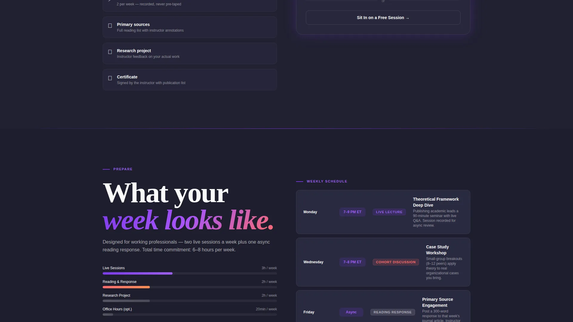
| Prepare Schedule | Shows weekly session formats and schedule breakdown |
| Learn Content | Presents sample lecture clips and reading list previews |
| Apply Outcomes | Stacks alumni stories and proof points above the closing registration form |
| Free Session Opt-In | Captures email for undecided visitors and sends a calendar invite |
Design & branding system
The visual identity follows a Corporate Precision theme expressed through a Dopamine Pop color system. The palette is structured and serious underneath, but every accent color delivers a small, deliberate reward.
- Deep charcoal slate (#1E1E2E) as the primary background, electric violet (#7C3AED) for primary actions and anchor navigation highlights, serotonin coral (#FF6B6B) for secondary accents and progress indicators, and bright chalk white (#FAFAFA) for text and card surfaces
- Flat vector illustration style with precise line work throughout the header and section transition elements
- The overall effect resembles a meticulously organized notebook where neon sticky tabs mark every important idea
Mobile & speed optimization
The layout is built to remain readable and navigable on smaller screens without sacrificing its visual identity. The anchor navigation and registration form are both designed with compact viewports in mind.
- The sticky anchor nav collapses cleanly so it does not consume valuable screen space on mobile devices
- Card-based course catalog layouts stack vertically on narrow screens, preserving readability
- The three-field registration form is sequenced for easy tap-through completion on touch devices
How this template helps you convert
Every structural decision in this template is oriented toward moving a visitor from curious observer to registered course participant.
- The anchor navigation creates a guided journey that reduces drop-off by giving visitors a clear path through five defined phases, so they always know what comes next.
- The primary call to action reappears at the end of every spoke section, meaning a visitor who reaches any stage of conviction can register immediately without scrolling back to the top.
- The proof-point stack in the Apply section places completion rate, alumni career outcomes, and instructor publication counts directly above the form, letting the evidence close the registration rather than relying on persuasive copy alone.
Other information about this template
This template was designed as part of a curated set of education and training landing pages built around specific niche use cases. It is a strong fit for sociology education providers who need a platform page that communicates academic rigor without feeling cold or institutional.
- The four course track options in the dropdown are pre-labeled: Organizations and Power, Race and Inequality, Research Methods, and Urban Sociology
- The secondary free session opt-in path captures an email address and triggers a calendar invite, offering a low-commitment entry point alongside the primary registration form
- The template style is Hub and Spoke with anchor navigation, meaning every section connects back to a central learner journey rather than functioning as isolated content blocks
- This template is well suited for platforms considering tools like Teachable or Thinkific as a course delivery layer, where the landing page drives initial registration before handing off to a course environment
Theme
Corporate Precision
Creative direction
Step-by-Step Guide
Color system
Dopamine Pop
Style
Hub & Spoke (Anchor Nav)
Direction
Event Registration
Page Sections
Sticky Anchor Navigation Bar
Isometric Cityscape Header
Progressive Scroll Illustration System
Course Catalog Cards
Three-field Registration Form
Proof-point Close Section
Related questions
Who is the ideal learner this template is designed to attract?
Can I customize the course track options in the registration dropdown?
How does the free session opt-in path work?
Does the anchor navigation stay visible while the visitor scrolls?
Can the illustration colors be changed to match a different brand?



