Coldchain — Trusted Perishable-Transport Landing Page Template
Coldchain is a split-screen landing page template built for temperature-controlled transport companies. It pairs an isometric reefer truck illustration with a live dashboard mockup, then walks visitors through four head-to-head comparison tables that quantify the cost of industry-standard cold-chain gaps. The result is a high-stakes B2B page that converts by making spoilage losses impossible to ignore.
by Rocket studio
Quick summary
Coldchain is a dark, data-forward landing page template for frozen and perishable food temperature-controlled transport businesses. A 50/50 split-screen hero anchors the layout, followed by four escalating spec-comparison tables, a fleet stats section, and a three-step spoilage risk audit form. Every design choice reinforces cold-chain precision and operational credibility.
Who this template is for
This template is built for B2B logistics operators who need to convince operations-minded buyers. It speaks directly to decision-makers who live and die by compliance documentation and margin protection.
- Frozen seafood distributors and grocery chain logistics directors focused on reducing spoilage claims
- Pharmaceutical cold-chain compliance managers who need audit-ready temperature documentation
- Temperature-controlled transport companies ready to replace generic carrier pages with a performance-driven pitch
What problem this template solves
Most cold-chain service pages describe capabilities in vague, reassuring language. Buyers who manage refrigerated freight lanes need proof, not promises. They arrive already skeptical, already carrying losses, and already comparing providers.
- Generic logistics pages fail to quantify the cost of a competitor's temperature variance or monitoring gaps
- Compliance-sensitive buyers need documentation evidence before they will approve a new carrier
- There is no natural pressure point on a standard service page that converts a cautious logistics director into a lead
What you get with this template
This template gives you a fully structured, single-page conversion layout ready for a cold-chain brand. Every section is purpose-built to move a skeptical buyer closer to submitting a lead.
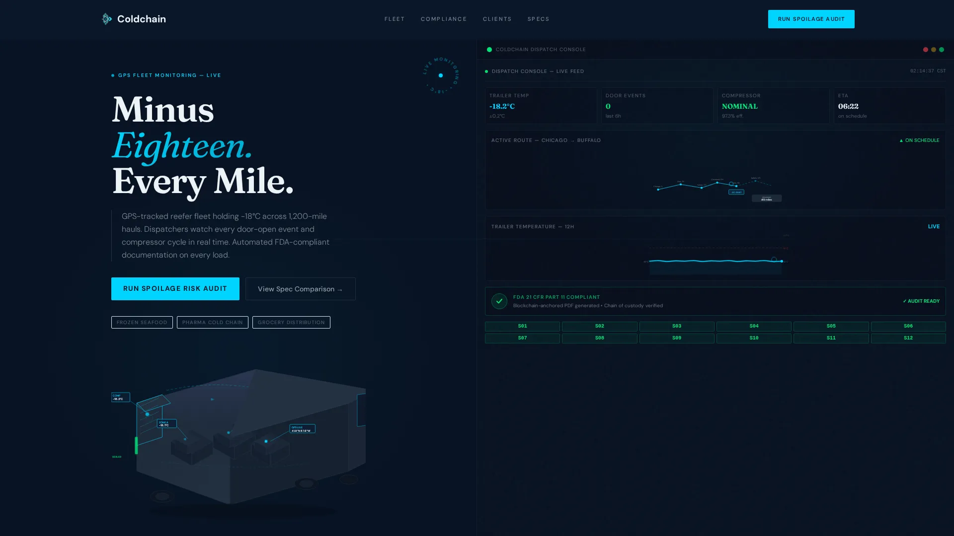
- A 50/50 split-screen hero featuring an isometric reefer truck cutaway illustration alongside a real-time dashboard mockup with route map, temperature graph, and compliance badge
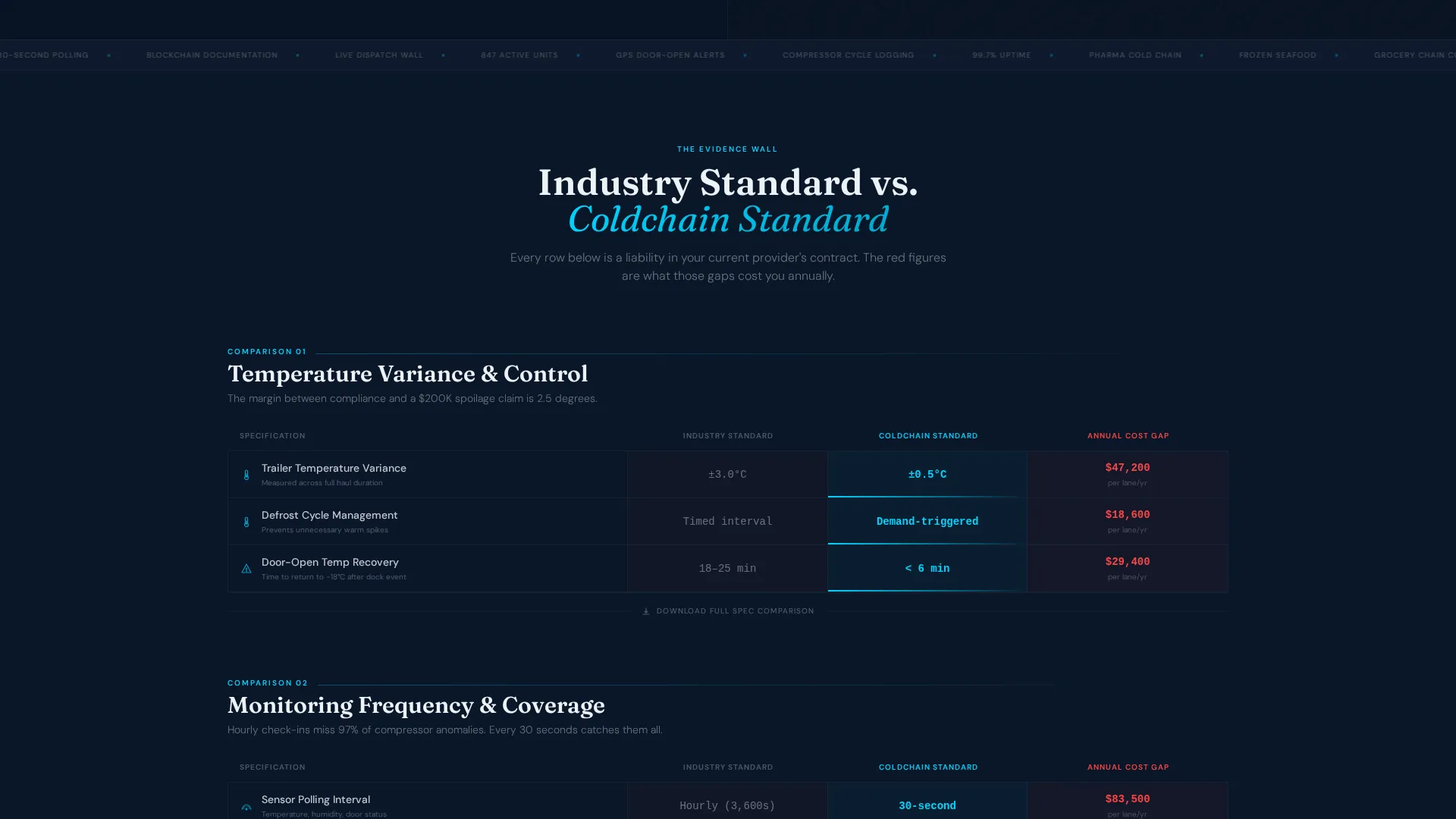
- Four head-to-head comparison tables with animated cyan accent lines, dollar-cost rows per spec gap, and isometric row icons
- A three-step progressive spoilage risk audit form, a fixed right-gutter call to action, a fleet stats section, and a scrolling capability marquee
Feature list
Split-Screen Isometric Hero
The hero divides the viewport equally. One half holds a cutaway isometric illustration of a reefer truck showing palletized cargo, compressor unit, airflow channels, and pulsing sensor nodes with cyan data callouts for live temperature, humidity, and GPS coordinates. The other half displays a dashboard mockup with a route map, a flat-line temperature graph at negative eighteen degrees Celsius, and a green compliance badge.
Four Escalating Comparison Tables
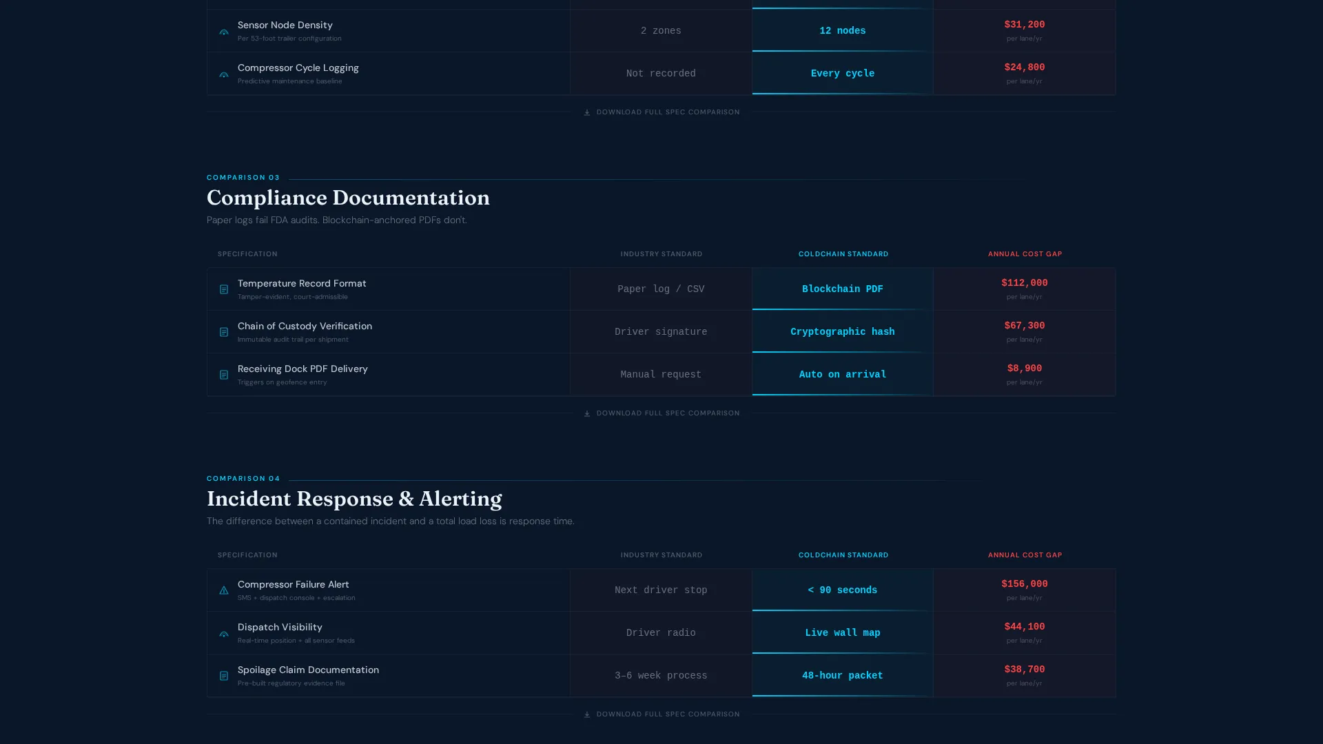
Each table places "Industry Standard" against "Coldchain Standard" across specs that grow more technical with each scroll. Comparisons cover temperature variance, monitoring frequency, and documentation method. Every row includes a small red dollar figure estimating the annual cost of the industry-standard gap, and cyan accent lines animate across each winning spec on scroll reveal.
Fixed Spoilage Risk Audit Call to Action
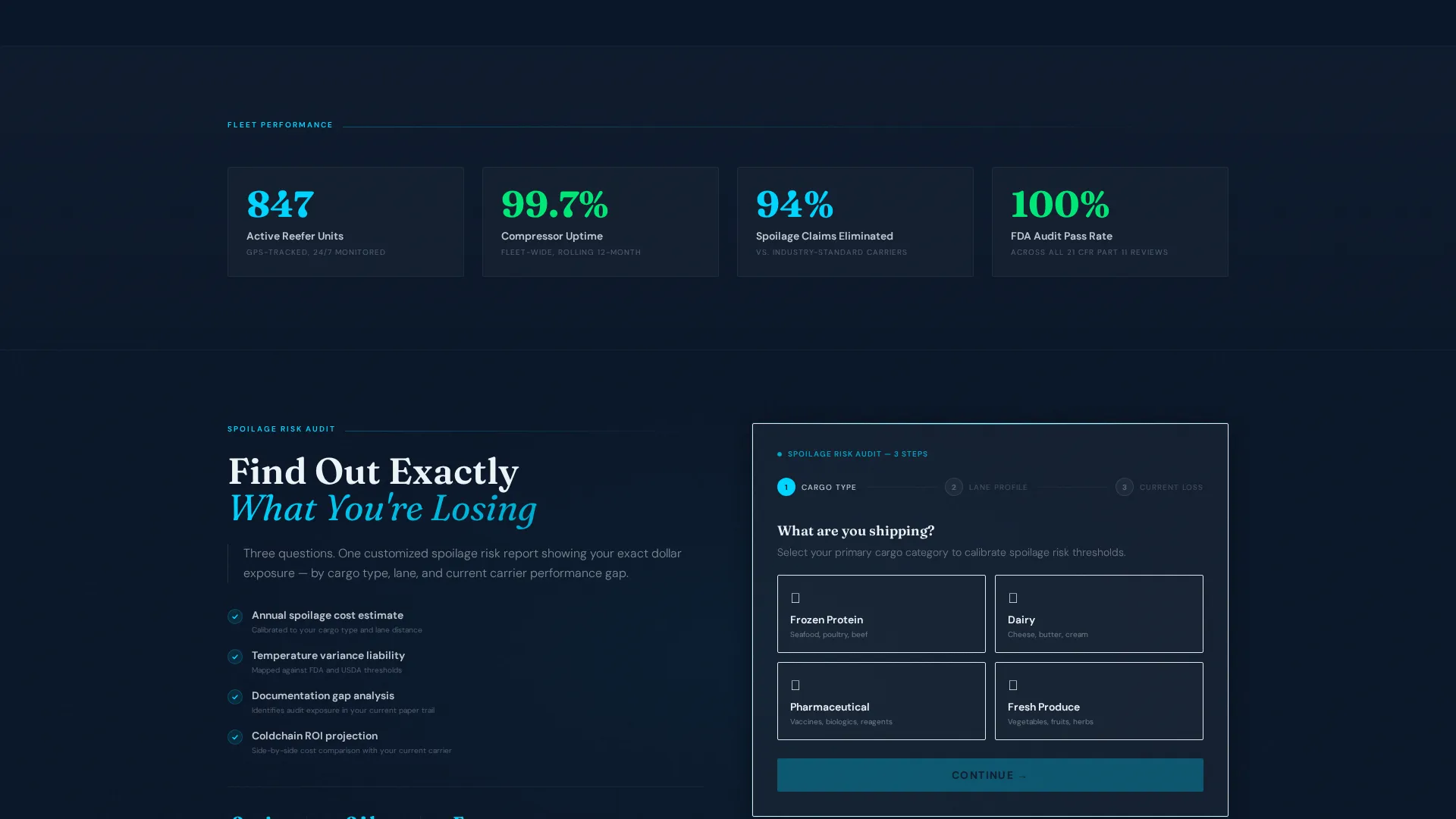
A primary call to action labeled "Run a Spoilage Risk Audit" sits fixed in the right gutter after the second comparison table. Clicking it opens a three-step progressive form: cargo type selection, average lane distance and frequency input, and current annual spoilage loss percentage entry.
Gated Spec Comparison Download
A secondary call to action appears beneath each comparison section. It offers a downloadable full spec comparison document gated behind a business email field. This gives buyers a low-friction next step and gives operators a qualified lead capture point.
Fleet Stats Section
Four key metric blocks display fleet size, uptime rate, spoilage reduction figure, and audit pass rate. These numbers function as social proof anchors between the comparison tables and the audit form, reinforcing the claims made in each comparison row.
Scrolling Capability Marquee
A continuous horizontal marquee runs capability tags across the full page width. It keeps the page active between heavy content sections and reinforces core service identifiers without interrupting the scroll narrative.
Page sections overview
| Section | Purpose |
|---|---|
| Hero Split Screen | Introduce brand and show live dashboard credibility |
| Capability Marquee | Reinforce service range continuously between sections |
| Comparison Table One | Compare temperature variance with cost-gap row |
| Comparison Table Two | Compare monitoring frequency with cost-gap row |
| Comparison Table Three | Compare documentation method with cost-gap row |
| Comparison Table Four | Final spec escalation, maximum liability pressure |
| Fleet Stats Block | Display four proof metrics as social anchors |
| Spoilage Risk Audit | Three-step progressive form for lead capture |
| Page Footer | Linear single-row footer with brand and navigation |
Design & branding system
The visual identity follows a Data Command theme. The palette is built to feel like the glow of a dispatch monitoring wall: dark enough that data floats forward, cold enough to suggest refrigeration through the screen.
- Color system uses deep terminal navy (#0A1628) for primary backgrounds, steel-panel gray (#1E2A3A) for card surfaces, refrigerant cyan (#00D4FF) for live data accents and graph lines, and compliance white (#EDF2F7) for body text and table headers
- Typography pairs Fraunces serif for display headings with DM Sans for body copy and data labels, creating contrast between editorial authority and technical precision
- No stock photography; isometric illustration style makes complex logistics legible and engineered in appearance
Mobile & speed optimization
The template is designed desktop-first, reflecting the logistics operations center context where dispatchers and logistics directors review vendor options on large screens. The layout and animation density are calibrated for that environment.
- Scroll-triggered comparison row reveals, cyan line-draw animations, and pulsing SVG sensor nodes are built as client-side components, keeping static sections lightweight
- Interactive elements including the three-step progressive form and comparison table hover states are isolated as client components to avoid blocking the static page load
How this template helps you convert
The entire page is built around a Comparison/Versus conversion model. Every section adds another layer of evidence before asking for a commitment.
- The four comparison tables build an evidence wall by making each industry-standard gap visible and costly, so visitors arrive at the audit form already aware of what they are losing with their current provider.
- The fixed right-gutter call to action and the gated download beneath each table give buyers two different commitment levels, capturing both ready leads and early-stage researchers in the same scroll.
Other information about this template
This template is suited to any operator in the frozen and perishable food logistics space who needs a conversion-focused web presence that goes beyond a standard service brochure.
- The template is localized for the US market with English copy, USD currency references, and distance in miles
- Animation intensity is high, with scroll-triggered reveals, marquee motion, and pulsing SVG nodes that bring the data command aesthetic to life
- The page structure supports both frozen protein and pharmaceutical cold-chain use cases, making it adaptable for carriers who serve multiple regulated cargo types
- Typography and color tokens are straightforward to update, so teams can swap brand colors and typefaces without rebuilding the layout
Theme
Data Command
Creative direction
Spec Sheet
Color system
Midnight Blue
Style
Split Screen (50/50)
Direction
Comparison/Versus
Page Sections
Split-screen Isometric Hero Section
Four Escalating Spec Comparison Tables
Fixed Spoilage Risk Audit Form
Gated Spec Comparison Download
Fleet Stats Proof Section
Scrolling Capability Marquee
Related questions
Who is this landing page template designed for?
What makes the comparison table layout effective for cold-chain sales?
Can this template support a pharmaceutical cold-chain audience?
Does this template include lead capture features?
What visual style does this template use?