Advanced Coworking Digital Presence Appointment Booking Website Template
Command is a scroll-reveal landing page template built for a coworking mobile app. It presents real-time occupancy tracking, room booking, member analytics, and multi-location rollup through a progressive feature matrix layout. The Data Command visual theme uses a Monochrome Steel palette, a comparison table, and a low-friction pilot sign-up form to move operators from curiosity to commitment.
by Rocket studio
Quick summary
Command is a single-page, scroll-reveal landing page template designed for a coworking mobile app. It opens with a device-framed dashboard preview and builds operational context layer by layer as visitors scroll. The page closes with a sticky comparison table and a three-field sign-up form, making the case for real-time workspace management without overwhelming the reader.
Who this template is for
This template is built for teams that manage physical workspace and need to communicate the value of real-time operational control to a focused audience of buyers.
- Community managers handling multiple communication channels and a shared spreadsheet
- Operations directors overseeing several coworking locations from a single device
- Franchise owners who want occupancy data on demand, without relying on phone calls
What problem this template solves
Coworking operators lose time and credibility when their tools cannot keep up with the pace of a live workspace. Double-booked desks, untracked meeting rooms, and missing member data create friction that compounds across every location. This template gives the app a page that matches the urgency of that problem.
- No unified view of desk availability, room bookings, and member status across locations
- Legacy tools that lack real-time sync, mobile-native design, or multi-site visibility
- No clear way to show buyers the difference between the app and a generic facility tool
What you get with this template
The template delivers a complete, ready-to-customize landing page built around progressive disclosure. Each scroll step reveals one operational layer, building toward a full dashboard picture before the call to action appears.
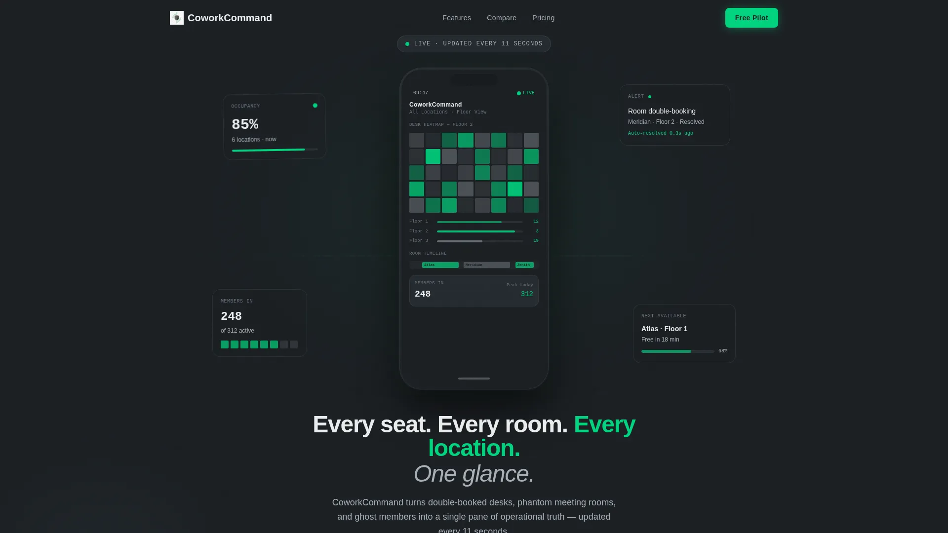
- A device-framed header with a live occupancy heatmap, desk availability counts, and a meeting room timeline
- A scroll-reveal feature matrix that adds one capability card per scroll tick, from occupancy to integrations
- A sticky side-by-side comparison table and a three-field pilot sign-up form with no credit card required
Feature list
This template includes purpose-built sections and components drawn directly from the Command brief. Each element serves a specific role in the conversion flow.
Device-Framed Dashboard Header
The header centers a mobile screen against a deep gunmetal background. It shows a live occupancy heatmap with floor numbers, ticking desk counts, and a color-coded meeting room timeline. A partially visible thumb at the bottom edge creates an immediate sense of real-world use.
Progressive Scroll Reveal Matrix
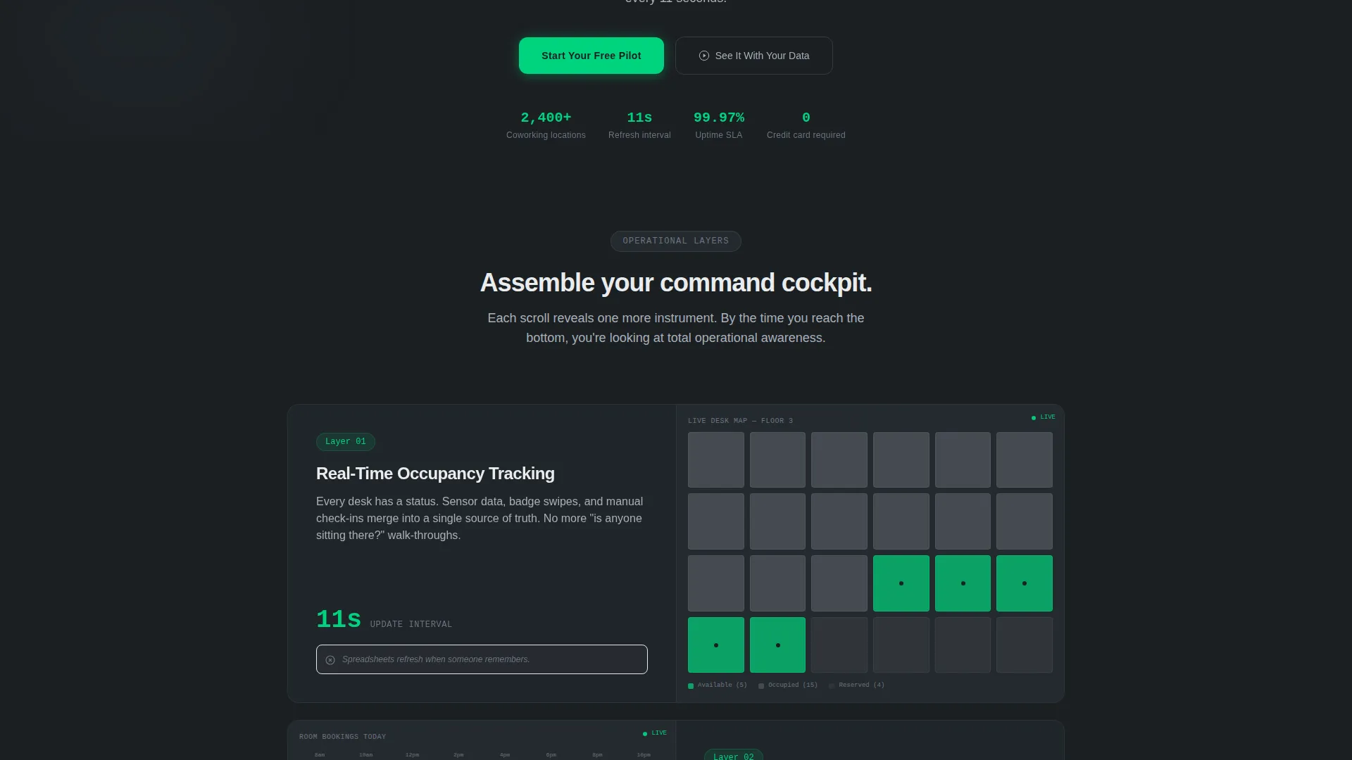
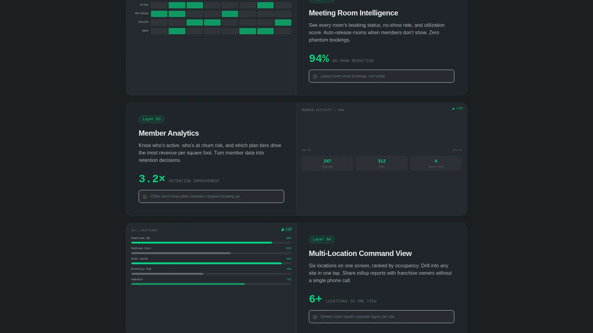
Each scroll tick materializes one new feature layer as a card or data row sliding into position. The sequence moves through occupancy tracking, room booking, member analytics, multi-location rollup, and integrations. The effect feels like assembling a cockpit instrument by instrument.
Competitor Comparison Rows
Between feature layers, comparison rows fade in to highlight what legacy tools lack. These include gaps in real-time sync, mobile-native design, and multi-site visibility. The contrast is visual and immediate, requiring no additional copy to land the point.
Sticky Comparison Table
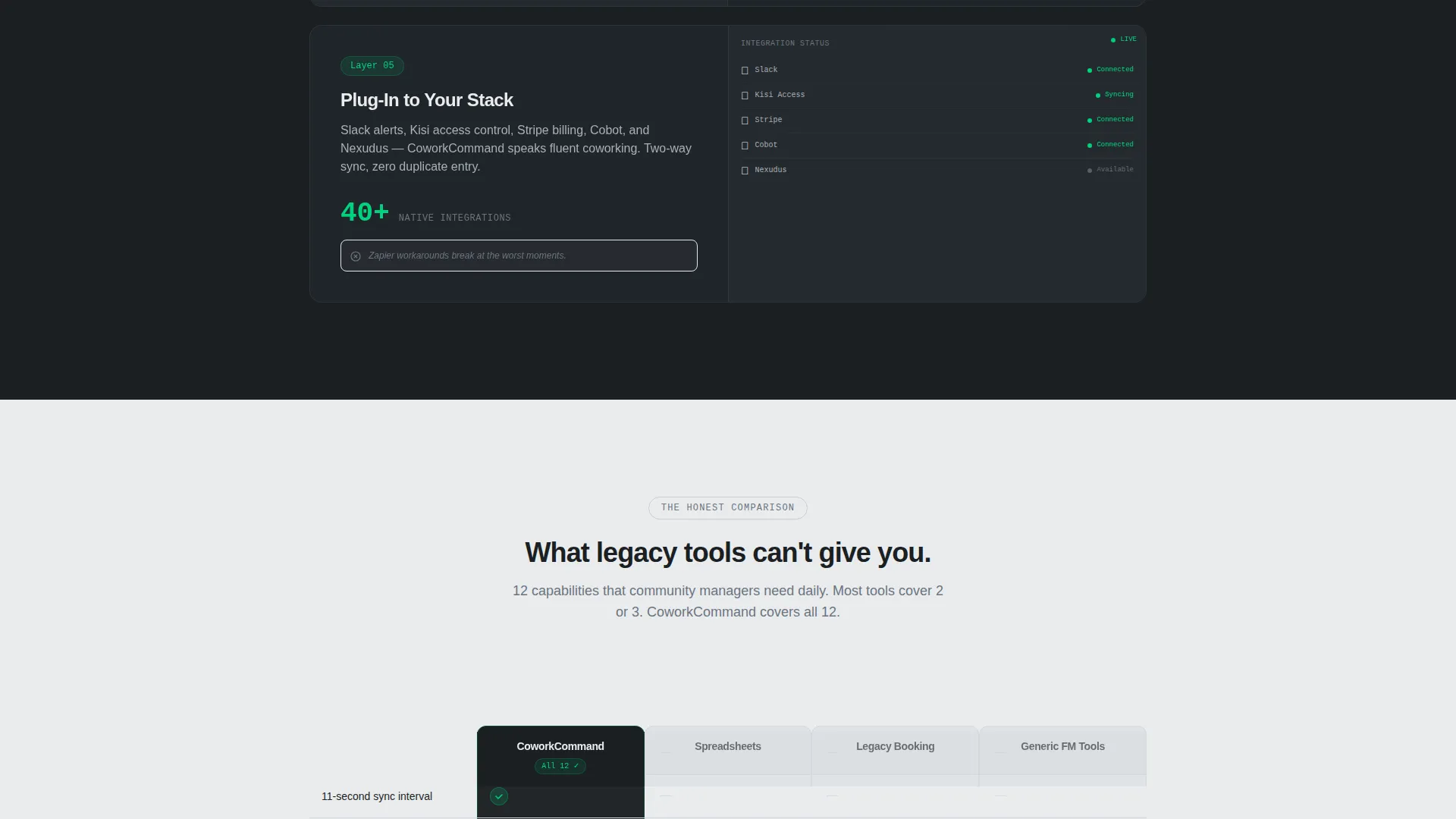
A twelve-row side-by-side table pins Command against spreadsheets, legacy booking platforms, and generic facility tools. Signal green checkmarks and muted aluminum dashes make capability gaps unmistakable at a glance. The table stays in view as the visitor scrolls through the final conversion section.
Pilot Sign-Up Form
The primary call to action asks for three fields only: workspace name, number of locations, and work email. There is no credit card requirement. A secondary path below the form links to a personalized demo booking with a calendar embed.
Live-Status Visual Language
Signal green is reserved exclusively for active metrics, live indicators, and primary call-to-action buttons. Thin one-pixel aluminum lines frame data visualizations, with green pulses marking active values. This visual discipline keeps the interface feeling operational rather than decorative.
Page sections overview
| Section | Purpose |
|---|---|
| Dashboard Preview Header | Anchors the page with a device-framed occupancy heatmap |
| Headline Fade-In | Delivers the core value statement below the device frame |
| Occupancy Tracking Card | Reveals the first feature layer on scroll |
| Room Booking Card | Adds meeting room management as the second layer |
| Member Analytics Card | Introduces member data tracking as the third layer |
| Multi-Location Rollup Card | Shows cross-site visibility as the fourth layer |
| Integrations Card | Completes the feature matrix as the fifth layer |
| Comparison Fade Rows | Contrasts legacy tool gaps between feature reveals |
| Sticky Comparison Table | Pins a twelve-row capability comparison mid-page |
| Pilot Sign-Up Form | Captures workspace name, location count, and work email |
| Demo Booking Path | Offers a secondary route to a personalized demo |
Design & branding system
The visual identity follows a Data Command theme built on a Monochrome Steel color system. Every surface is functional, with no ornamentation. The palette feels like the inside of a server rack: cool, matte, and deliberately restrained.
- Colors: deep gunmetal (#1B1F23), brushed aluminum (#A8B0B8), panel white (#EAECEE), and signal green (#00D47E) reserved for live indicators and primary calls to action
- Typography: aluminum on dark backgrounds, gunmetal on light backgrounds, with alternating gunmetal and panel white section backgrounds
- Data visuals: thin one-pixel aluminum lines with signal green pulses on active metrics
Mobile & speed optimization
The template is designed around a mobile-first use case, matching the product it promotes. The layout and scroll behavior are built to feel native on a phone screen.
- The dashboard header is device-framed to mirror the actual app interface on any screen size
- Scroll-reveal transitions are tied to vertical progress, keeping the experience smooth and intentional on touch devices
- The sign-up form uses three fields only, reducing friction on small screens where long forms lose completions
How this template helps you convert
The page is structured as a Comparison/Versus conversion flow. Every section builds buyer confidence before the call to action appears, so the form feels like a natural next step rather than a demand.
- The progressive feature matrix builds context gradually, letting visitors absorb each capability before the next one arrives, which reduces overwhelm and increases time on page.
- The sticky comparison table does the selling before the form appears, so visitors arrive at the call to action already persuaded rather than still evaluating.
- The two-path conversion section offers a low-commitment pilot form and a personalized demo option, giving different buyer types a route that matches their readiness.
Other information about this template
This template is categorized under Technology and the Coworking Digital Presence subcategory, targeting the Coworking Mobile App niche. It is suitable for teams preparing a product launch, a sales push to multi-location operators, or a referral-driven acquisition campaign.
- The template style is Scroll Reveal (Progressive), meaning each section enters the viewport on demand rather than loading all at once
- The creative direction is Feature Matrix, building a complete operational picture piece by piece across the scroll journey
- The header concept is Dashboard Preview, grounding the page in the actual product experience from the first viewport
- The landing page direction is Comparison/Versus, using structured contrast to reduce buyer hesitation before the sign-up form
Theme
Data Command
Creative direction
Feature Matrix
Color system
Monochrome Steel
Style
Scroll Reveal (Progressive)
Direction
Comparison/Versus
Page Sections
Device-framed Dashboard Header
Progressive Scroll Reveal Matrix
Sticky Comparison Table
Competitor Contrast Rows
Low-friction Pilot Form
Live-status Signal Green System
Related questions
Who is this landing page template designed for?
Can I customize the comparison table rows?
Does the sign-up form connect to a backend or payment system?
What makes the scroll reveal layout different from a standard landing page?
Is this template suited for a product launch or an ongoing sales page?



