Command - Powerful District CRM Landing Page Template
Command is a scroll-reveal landing page template built for school district CRM platforms. It uses a dark Data Command visual theme, a sticky comparison table, and a progressive section-reveal structure to guide district operations leaders from awareness to demo request. The layout is sharp, data-dense, and designed to earn trust fast.
by Rocket studio
Quick summary
Command is a single-page, scroll-reveal landing page template for a school district CRM platform. It targets superintendents, enrollment coordinators, and district communications leads. The design follows a Data Command theme built on a Carbon Fiber color system. Every section reveals progressively, building momentum from the product screenshot header through to the primary demo request form.
Who this template is for
This template is built for vertical SaaS products serving K-12 school district operations teams. It speaks directly to the people managing enrollment, family communications, and board compliance across large multi-school districts.
- Directors of operations managing 40-school rosters and complex enrollment pipelines
- Enrollment coordinators dealing with duplicate family records and high-volume intake seasons
- Communications leads who need to report parent engagement results to district leadership
What problem this template solves
District operations teams often run on fragmented toolsets: spreadsheets for enrollment, separate apps for parent messaging, and manual processes for board compliance. This template gives the product a landing page that makes fragmentation feel painful and the CRM solution feel inevitable.
- Visitors see a direct side-by-side comparison of their current stack versus a unified platform
- The scroll-reveal structure mirrors the experience of systems coming online, building confidence section by section
- The dual call-to-action path captures both demo-ready leads and research-phase prospects in the same flow
What you get with this template
You get a complete, fully structured landing page ready to represent a school district CRM product. The layout covers every stage of the buyer journey, from first impression through conversion.
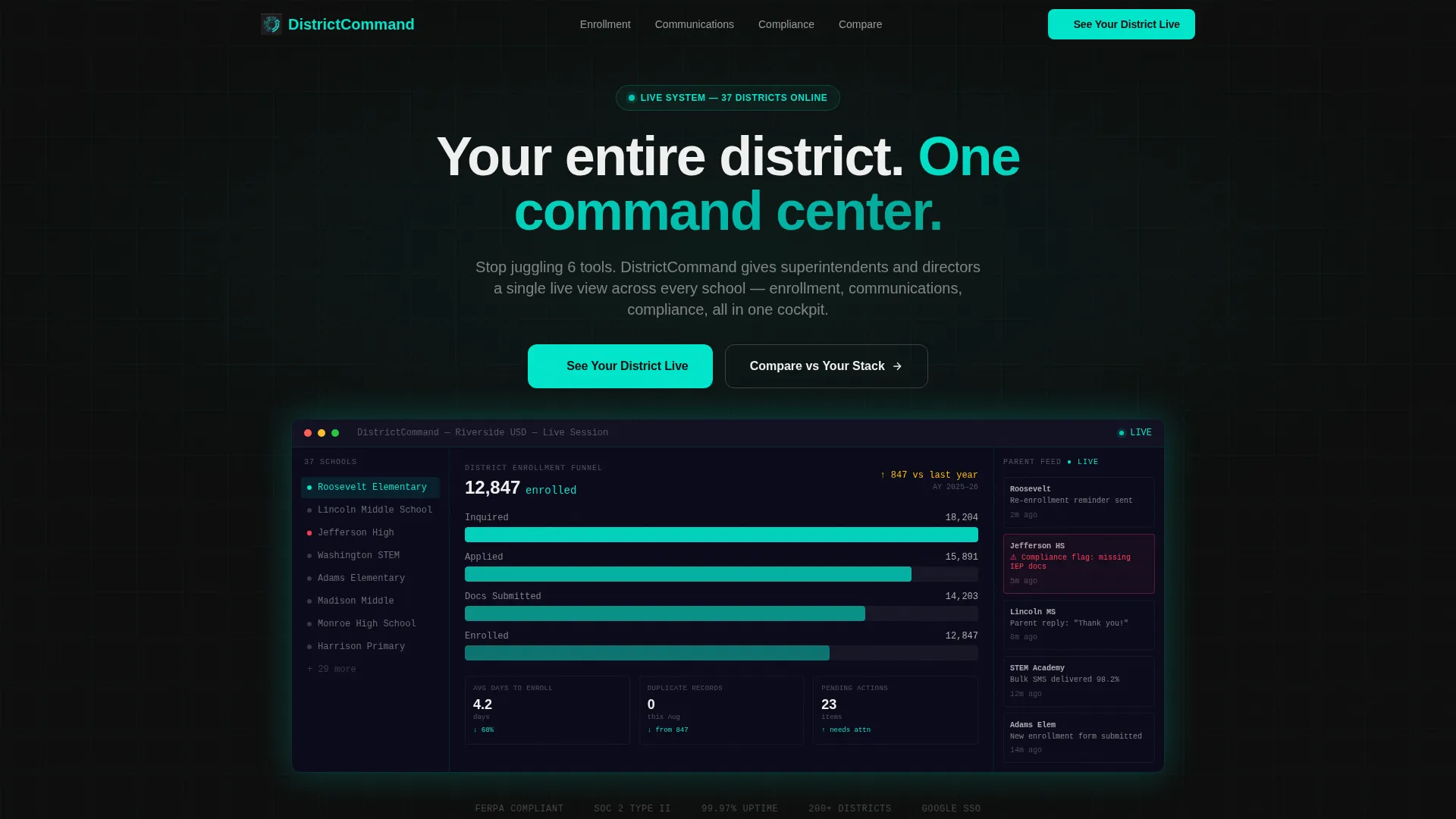
- A full-width product screenshot header with a live-data district dashboard visual
- A sticky mid-scroll comparison table pitting a unified platform against a fragmented current stack
- A primary demo request form and a secondary content download path for different lead readiness levels
Feature list
This template is built around prompt-specific components that serve the school district SaaS buyer journey. Each feature below reflects a deliberate design and layout decision from the source brief.
Full-Width Product Screenshot Header
The header opens with a pixel-sharp district dashboard screenshot showing 37 schools in a left rail, a district-wide enrollment funnel with 12,847 students, a live parent communication feed, and a pulsing red compliance flag. No stock photography is used. The headline "Your entire district. One command center." fades in above the screenshot to anchor the product's value immediately.
Progressive Scroll-Reveal Section Structure
Each content section reveals with upward momentum and a subtle fade-snap, as if systems are powering on in sequence. Enrollment management appears first, then parent communications, then compliance tracking. The reveal sequence builds a sense of escalating capability as the visitor scrolls.
Sticky Comparison Table
A persistent two-column comparison table appears mid-scroll and stays anchored as the visitor continues reading. It contrasts the unified platform against a fragmented multi-tool current stack, using green checkmarks for covered capabilities and red gap indicators for missing ones. The table makes the cost of fragmentation concrete before the call to action appears.
Animated Enrollment Pipeline Numbers
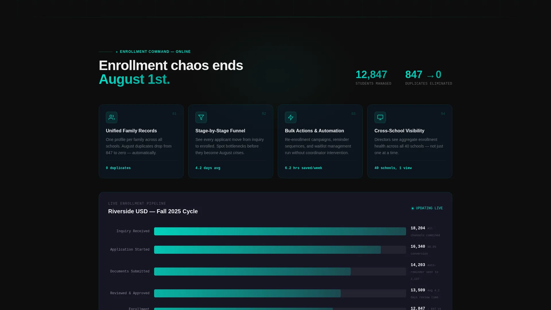
The enrollment management section features animated pipeline figures that count up on reveal, putting live data density front and center. This visual treatment reinforces the product's core promise of real-time district-wide visibility.
Dual Conversion Path
The page offers two routes to conversion. The primary path is a short demo request form collecting district name, number of schools, and current CRM status. The secondary path offers a downloadable migration playbook for prospects who are not yet ready to book a demo.
Carbon Fiber Dark Visual System
The entire page uses a dark-first layout built on deep cockpit black and woven graphite backgrounds. Status-light teal appears only on active data elements and interactive components. Alert white typography floats cleanly against dark panels throughout every section.
Page sections overview
| Section | Purpose |
|---|---|
| Header with Screenshot | Opens with product dashboard visual and headline to establish immediate credibility |
| Enrollment Management | Animates pipeline numbers to demonstrate real-time district-wide enrollment visibility |
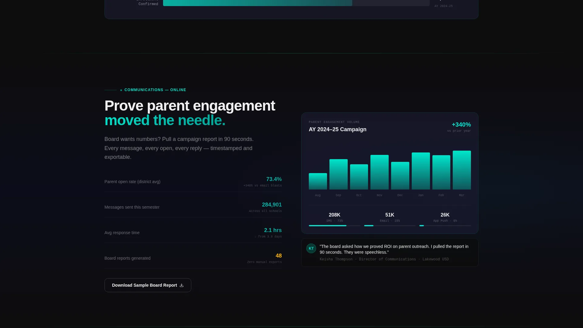
| Parent Communications | Illuminates message volume graphs showing engagement tracking across schools |
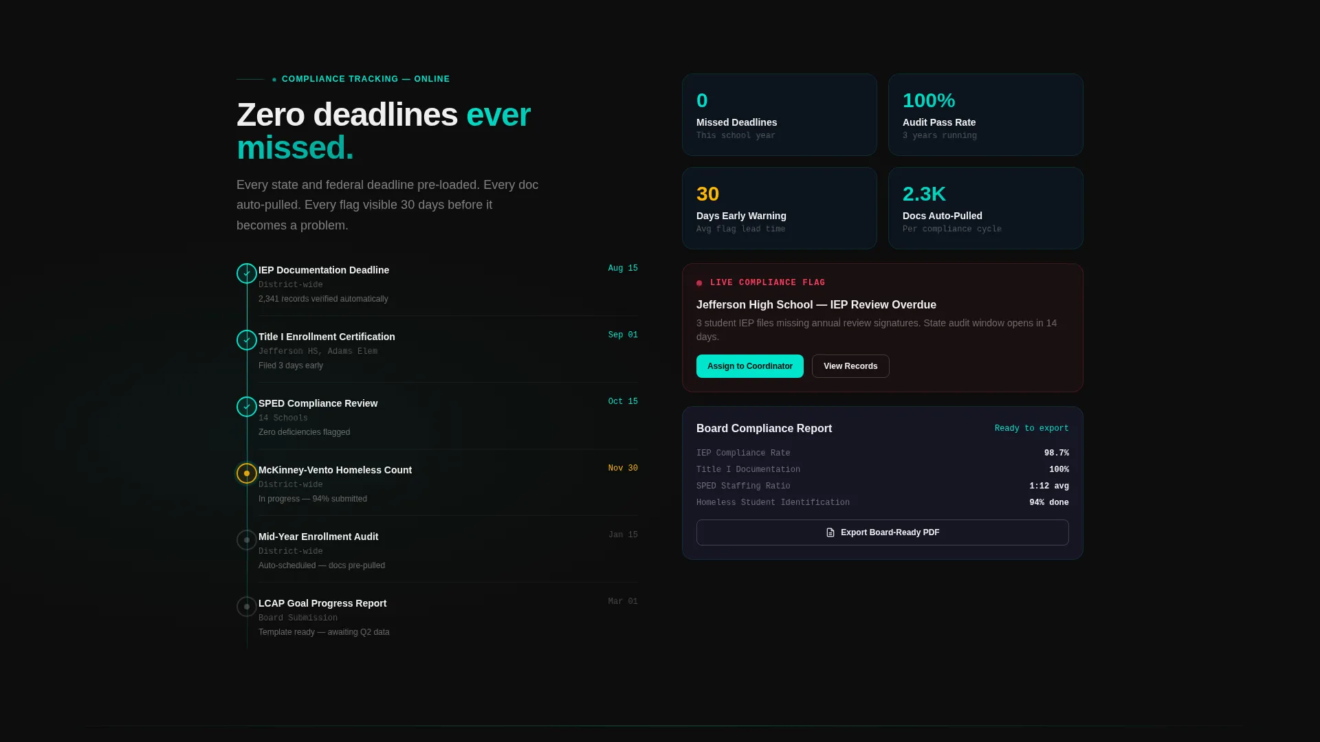
| Compliance Tracking | Reveals audit-ready timelines that address board reporting needs directly |
| Comparison Table | Sticky two-column table quantifies fragmentation pain against the unified platform |
| Demo Request Form | Primary conversion point collecting district name, school count, and current CRM |
| Migration Playbook call to action | Secondary download path for leads not ready to request a live demo |
Design & branding system
The template follows a Data Command visual theme built entirely on a Carbon Fiber color palette. Dark backgrounds dominate every section, with teal used only where data is active or interactive, making each metric feel like it is broadcasting in real time.
- Deep cockpit black (#0D0D0D) and woven graphite (#1A1A2E) form the base layer across all panels
- Status-light teal (#00E5CC) marks live data accents, interactive elements, and active metric displays
- Alert white (#F0F0F0) is used exclusively for typography, keeping text crisp and weightless against dark fields
Mobile & speed optimization
The template is structured as a single-page scroll-reveal layout, which keeps the asset load focused and the scroll path linear. The progressive reveal approach means sections load context as the user reaches them rather than all at once.
- Section-by-section reveal reduces visual complexity at any given scroll position
- The sticky comparison table is designed to remain functional and readable on smaller viewports
- The dual call-to-action structure keeps both conversion paths accessible without requiring deep scrolling on mobile
How this template helps you convert
Command is built around a Comparison/Versus landing page direction, meaning the conversion logic is baked into the layout itself. The page earns the click by quantifying pain before asking for commitment.
- The sticky comparison table surfaces the real cost of a fragmented stack, including hours lost, duplicate records, and missed compliance deadlines, before the demo form appears
- The progressive reveal sequence builds trust section by section, so visitors arrive at the call to action already convinced rather than still evaluating
- The dual conversion path captures both demo-ready leads with the primary form and research-phase prospects with the migration playbook download, reducing the number of visitors who leave without engaging
Other information about this template
Command is a Webflow-compatible landing page template suited for school district vertical SaaS products. It is part of a template marketplace collection focused on technology and B2B software categories.
- The template style is Scroll Reveal (Progressive), meaning each section animates into view as the visitor scrolls downward
- The creative direction is Launch Energy, which frames the scroll experience as a countdown sequence with each section feeling like a system coming online
- The header concept is Product Screenshot, using a real-data dashboard visual rather than illustration or stock imagery
- The landing page direction is Comparison/Versus, a layout strategy designed to make the alternative painful before presenting the solution
- The color system is Carbon Fiber, a dark-first palette with teal telemetry accents and white typography
- The theme is Data Command, which positions the product as a mission-critical operations platform for district leadership
Theme
Data Command
Creative direction
Launch Energy
Color system
Carbon Fiber
Style
Scroll Reveal (Progressive)
Direction
Comparison/Versus
Page Sections
Full-width Product Screenshot Header
Progressive Scroll-reveal Layout
Sticky Comparison Table
Animated Enrollment Pipeline Numbers
Dual Conversion Path
Carbon Fiber Dark Visual System
Related questions
Who is this template designed for?
What makes the comparison table different from a standard feature table?
Does this template support two different types of leads?
What sections are included in this landing page?
Can I adjust the color palette for my own brand?



