CommandCenter - Brutal Franchise Landing Page Template
Commandcenter is a Bold Brutalist franchise management landing page built for multi-unit operators who need total visibility fast. It leads with a five-tile KPI wall, a twelve-dimension comparison table, and a cascading stat-and-testimonial dossier. Every section drives toward a single goal: earning the app download before the reader reaches the call to action.
by Rocket studio
Quick summary
Commandcenter is a single-page franchise management software landing page built on raw data and zero decoration. It opens with five oversized KPI tiles, moves through a brutal competitor comparison table, and closes with a dual app-download call to action. The template is designed for operators who measure trust in numbers, not lifestyle photography.
Who this template is for
This template speaks directly to people running multiple locations who need proof before they commit. It is built for operators and teams who live inside the numbers every day.
- Franchisees managing multiple units across several counties who need one consolidated view
- Area developers scaling a brand to dozens of locations and tracking consistency at every door
- Corporate operations teams running audits across hundreds of units and needing a fast, credible pitch surface
What problem this template solves
Most franchise software pages bury the value inside long paragraphs and vague promises. Operators do not have time for that. They need to see the ROI argument assembled clearly and quickly.
- No single page forces an apples-to-apples comparison across competitors, so buyers cannot make a fast decision
- Stat-heavy products lose credibility when metrics are scattered and unsupported by peer proof
- Generic SaaS templates dilute the urgency that franchise operations teams actually feel at 6 AM
What you get with this template
You get a complete, production-ready landing page structure built around the Stats-First Impact creative direction. Every section is ordered to build conviction before the download ask.
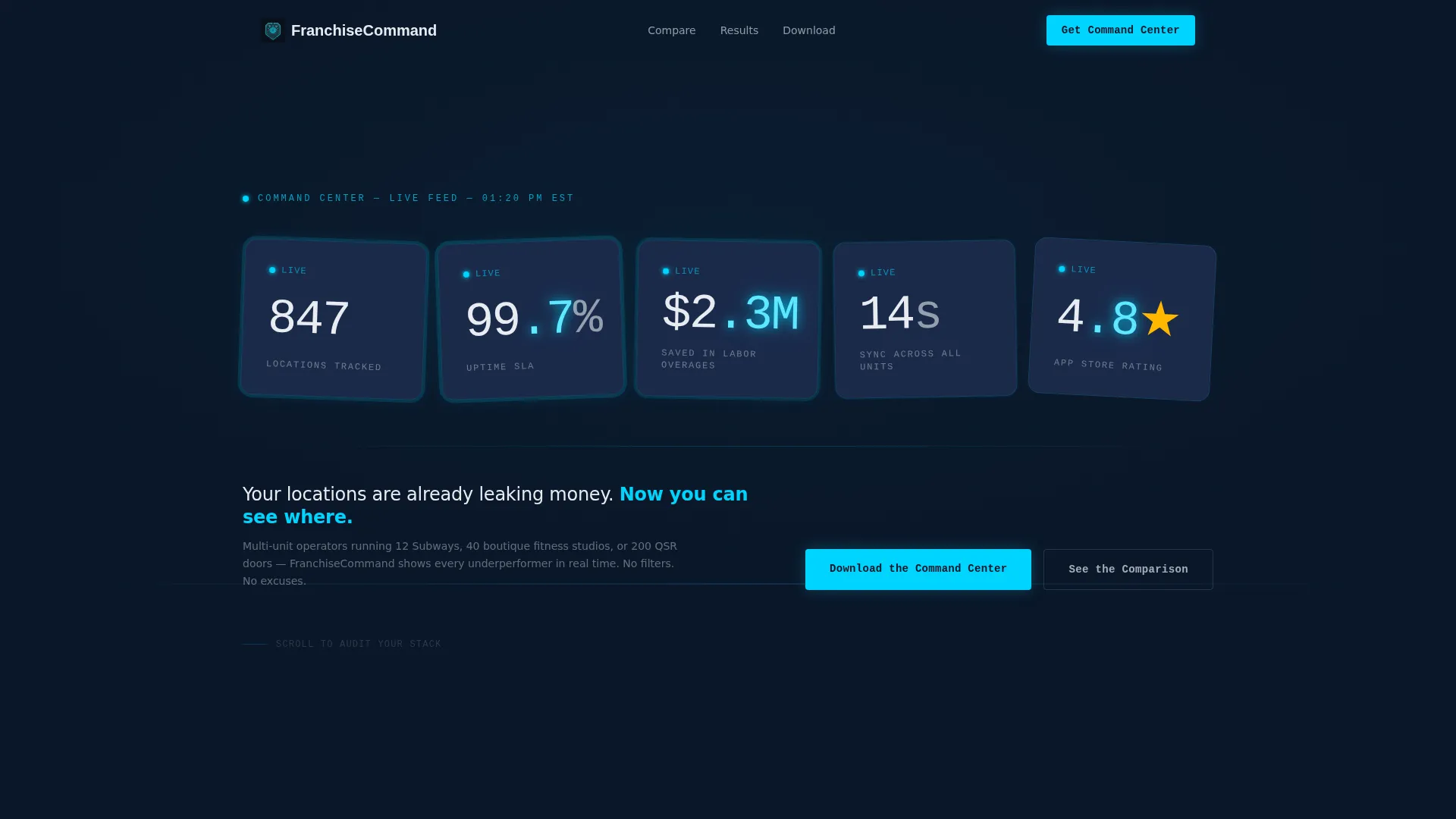
- A five-tile KPI metrics wall header with oversized mono-weight typography and a live-wire cyan pulse effect on decimal points
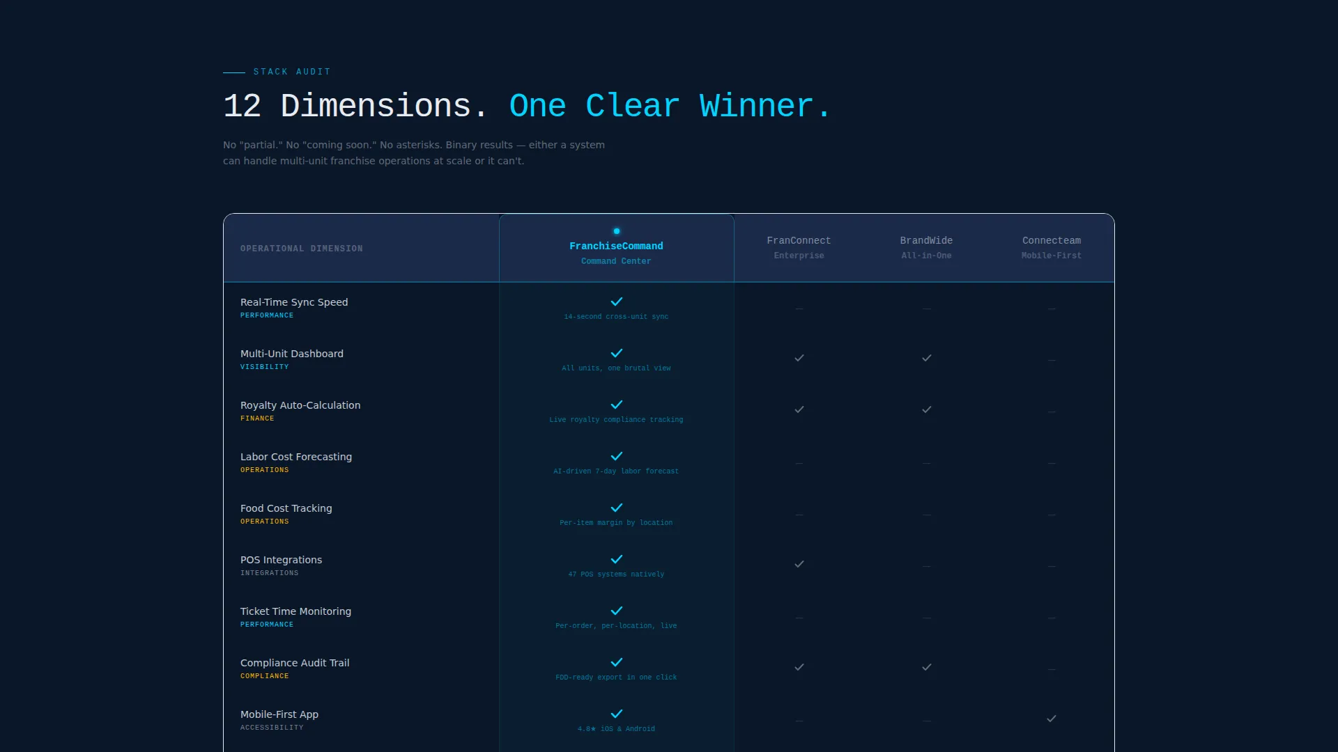
- A twelve-dimension comparison table stacking your product against three competitors with binary cyan checkmarks or empty voids
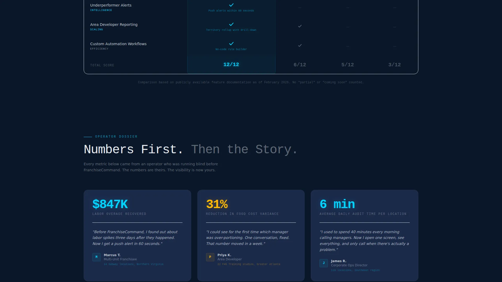
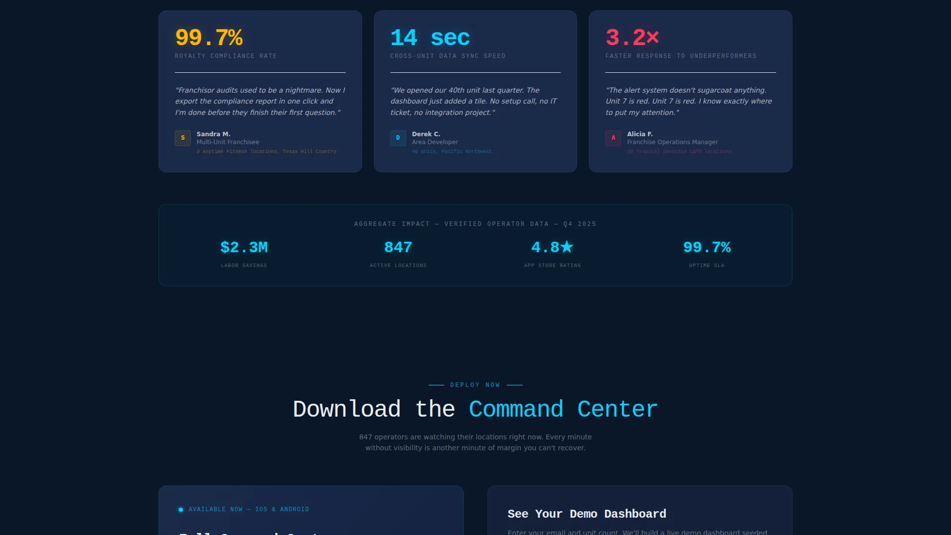
- A cascading dossier of individual stat cards, each paired with a one-sentence operator testimonial
- A dual-path conversion footer with App Store and Google Play badges, a cyan-on-navy QR code, and a secondary email-plus-unit-count demo form
Feature list
This section covers the core functional components included in the template, drawn directly from the design and structure brief.
Five-Tile KPI Header Wall
The header fills the viewport with five massive metric tiles: 847 Locations Tracked, 99.7% Uptime, $2.3M Saved in Labor Overages, 14-Second Sync Across All Units, and a 4.8-star App Store rating. Numbers are set in oversized mono-weight type against the abyss navy background, with the live-wire cyan pulsing subtly on decimal points to suggest live data.
Twelve-Dimension Comparison Table
The comparison table is the page's centerpiece. It stacks the featured franchise management software against three named competitors across twelve operational dimensions, including real-time sync speed, multi-unit dashboards, royalty auto-calculation, labor forecasting, food cost tracking, and point-of-sale integrations. Every cell is binary: a cyan checkmark or an empty void. No partial credits, no coming-soon entries.
Stat-and-Testimonial Dossier Cards
Below the comparison table, individual stat cards cascade in a relentless rhythm. Each card pairs a hard operational metric with a single-sentence testimonial from a recognizable operator type. The format builds cumulative proof: number, evidence, number, evidence, until the cost of not acting is clear.
Dual-Path App Download call to action
The conversion section offers two routes. The primary path features a "Download the Command Center" headline paired with App Store and Google Play badges and a QR code rendered in cyan against navy. The secondary path presents a lean form requesting only an email address and unit count to unlock a demo dashboard.
Stats-First Section Cadence
Every scroll section opens with a hard number before any explanatory text. This structural rule is baked into the template layout, ensuring the Stats-First Impact creative direction is maintained from header to footer without deviation.
Page sections overview
| Section | Purpose |
|---|---|
| KPI Metrics Wall | Opens the page with five live-style performance tiles to establish credibility immediately |
| Tagline Hook | Delivers the single-line provocation below the tiles to create urgency |
| Comparison Table | Stacks the product against three competitors across twelve operational dimensions |
| Stat Dossier Cards | Cascades metric-plus-testimonial pairs to build layered operational proof |
| App Download call to action | Drives the primary conversion action via app badges and a QR code |
| Demo Dashboard Form | Provides a secondary low-friction path requiring only email and unit count |
Design & branding system
The visual identity is Bold Brutalist, built to feel like a submarine control room where every illuminated element earns its place. There is no lifestyle photography, no decorative illustration, and no soft gradients.
- Color system uses abyss navy (#0A1628) as the dominant background, tactical slate (#1B2A4A) for card surfaces, live-wire cyan (#00D4FF) for data accents and interactive states, and concrete white (#E8ECF1) for all body typography
- Typography is mono-weight and oversized in the header tiles, shifting to concrete white for readable paragraph copy throughout the scroll
- Interactive states and decimal-point pulse effects use the cyan accent exclusively, keeping visual hierarchy strict and intentional
Mobile & speed optimization
The template is structured for fast scanning on any screen size. The KPI wall, comparison table, and dossier cards are all designed to reflow cleanly without losing the data-dense visual weight that defines the brand.
- The comparison table is built to scroll horizontally on smaller screens so no dimension column is hidden or truncated
- The QR code and app download badges are sized and spaced for thumb-friendly tap targets on mobile devices
- The stat dossier cards stack vertically on narrow viewports, preserving the number-then-proof rhythm in a single-column layout
How this template helps you convert
The page is engineered to make the download decision feel obvious by the time a visitor reaches the call to action. Every structural choice serves that goal.
- The KPI header leads with five proof points before any product description, so credibility is established in the first viewport
- The comparison table forces a side-by-side reckoning that makes competitor gaps visible and undeniable across twelve real operational dimensions
- The cascading stat dossier sustains momentum after the table, pairing hard numbers with operator voice so the emotional and rational case close together
Other information about this template
This template is categorized under Technology, specifically the Franchise Vertical SaaS subcategory, targeting franchise management software buyers. It was designed for the intersection of Bold Brutalist visual theme, Stats-First Impact creative direction, Midnight Blue color system, Comparison Table template style, and App Download landing-page direction.
- The template is a single landing page, not a multi-page website, optimized for one focused conversion flow
- It is suitable for franchise management software products targeting franchisees, area developers, and corporate operations teams in any food, fitness, or retail franchise vertical
- The Intersection Match Score for this template is 13, indicating strong alignment between the visual theme, creative direction, and franchise vertical SaaS niche
Theme
Bold Brutalist
Creative direction
Stats-First Impact
Color system
Midnight Blue
Style
Comparison Table
Direction
App Download
Page Sections
Five-tile KPI Metrics Header
Twelve-dimension Comparison Table
Stat-and-testimonial Dossier Cards
Dual-path App Download Call to Action
Stats-first Section Structure
Related questions
Can I replace the KPI header numbers with my own product metrics?
How many competitors does the comparison table support?
Is this template suitable for a franchise software product that is still early-stage?
Can the secondary demo form replace the app download as the primary call to action?
What industries beyond food franchises can use this template?



