Commanddash - Powerful SaaS Landing Page Template
Commanddash is a bento grid landing page built for B2B SaaS mobile apps targeting mid-market teams. It opens with a dark glass panel header, moves straight into an interactive ROI calculator, and walks visitors through side-by-side versus comparisons. The Monochrome Steel palette and Data Command theme make the product itself the visual centerpiece.
by Rocket studio
Quick summary
Commanddash is a single-page bento grid landing page for B2B SaaS mobile app products. It leads with a live-metrics header in dark glass panels, then flows into an embedded ROI calculator before any persuasion copy. Side-by-side versus comparisons and a persistent trial call to action carry the visitor toward conversion across every scroll depth.
Who this template is for
This template is built for SaaS companies selling a mobile companion to an existing desktop product. It works best when the core audience already lives inside a B2B workflow and needs a business case to justify the mobile switch.
- B2B SaaS teams marketing a mobile app to mid-market companies running 50 to 500 people
- Product marketers who need a calculator-first landing page that delivers value before asking for a lead
- Growth or demand-gen teams running comparison campaigns against competing mobile workflow tools
What problem this template solves
Sales reps, ops managers, and finance leads lose workflow momentum the moment they step away from a laptop. This template gives a SaaS mobile app a landing page that speaks directly to that gap and quantifies it before asking for anything in return.
- Teams struggle to communicate the ROI of a mobile app upgrade to skeptical B2B buyers
- Generic landing pages bury the value proposition under hero images and copy that never feels data-driven
- Without a structured versus comparison, visitors cannot quickly see what changes between their current state and the product being sold
What you get with this template
You get a fully structured, single-page bento grid layout with every major section pre-built for a B2B mobile SaaS audience. The design is opinionated and precise, so you spend your time replacing content rather than rebuilding structure.
- A dark glass panel header with six frosted bento cells each showing a distinct live-metric concept
- An interactive ROI calculator bento cell spanning two columns, with animated status-green output numerics
- A scrolling series of versus comparison rows, a persistent secondary call to action banner, and a feature comparison table leading to a 14-day trial prompt
Feature list
This section describes the core built-in capabilities of the Commanddash template as delivered.
Six-Cell Dark Glass Header
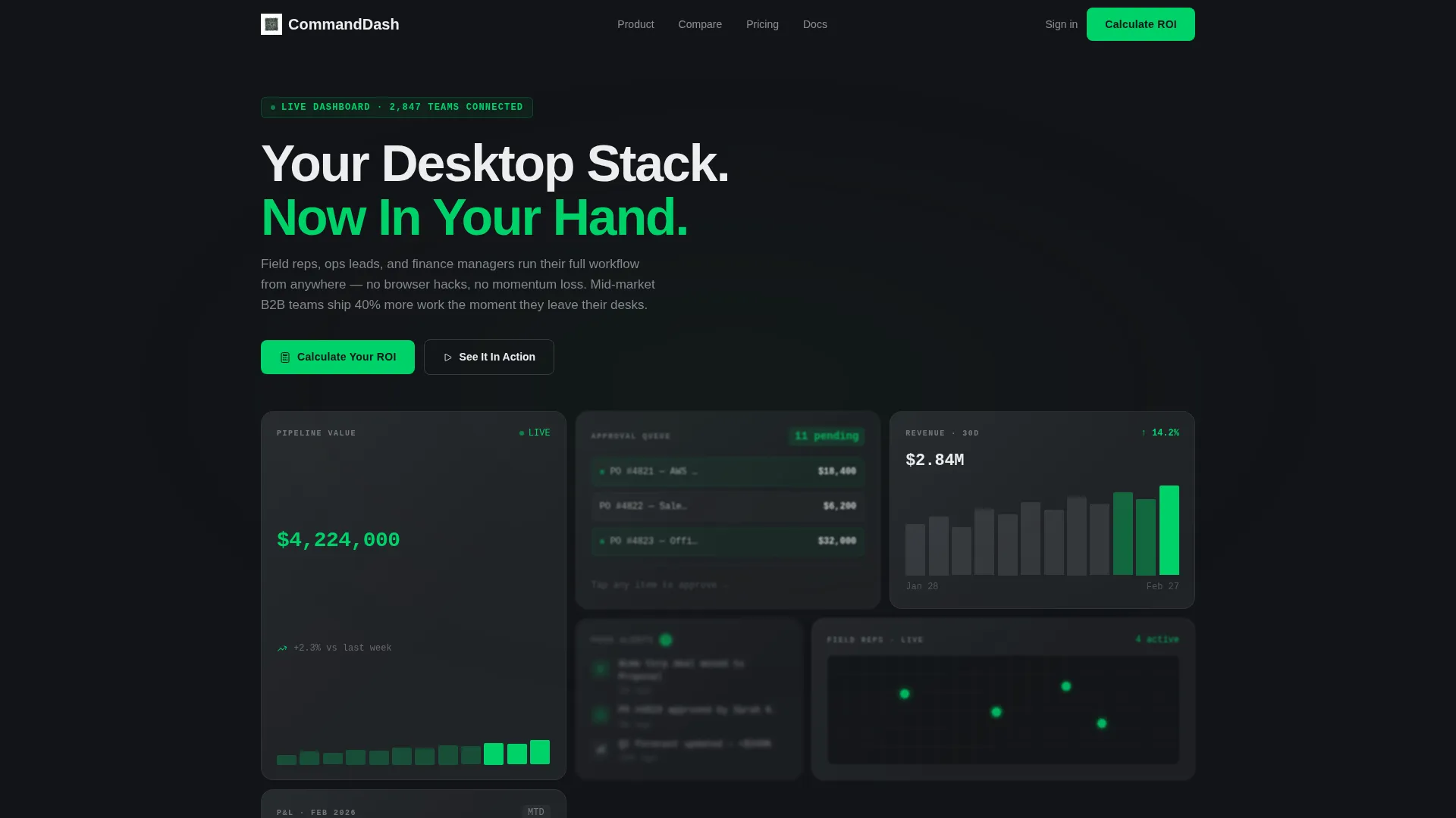
The header arranges six translucent bento cards in an asymmetric grid against a forge-black background. Each cell represents a distinct live metric: pipeline value, approval queue count, a 30-day revenue trendline, a push-notification preview, a geolocation map with rep pins, and a compact profit-and-loss snapshot. A depth-of-field blur on the rearmost cards creates a layered, control-room depth effect.
Embedded ROI Calculator Cell
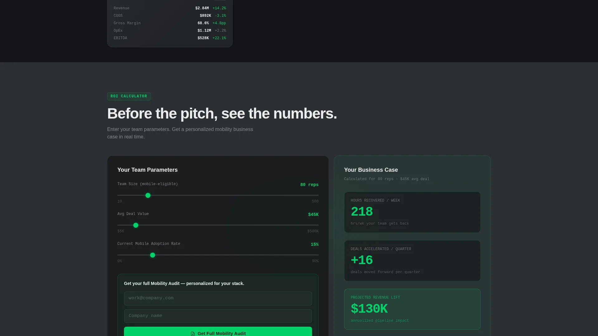
The second viewport places an interactive calculator directly inside a two-column bento cell. Visitors enter team size, average deal value, and current mobile adoption rate. The tool instantly renders hours recovered per week, deals accelerated per quarter, and projected revenue lift, all animated in status-green numerics.
Gated Results and Lead Capture
After a visitor runs their numbers, the results panel expands to reveal a gated input field. The visitor enters their work email and company name to receive a full mobility audit. This structure delivers a personalized business case before any personal information is requested.
Versus Comparison Row Layout
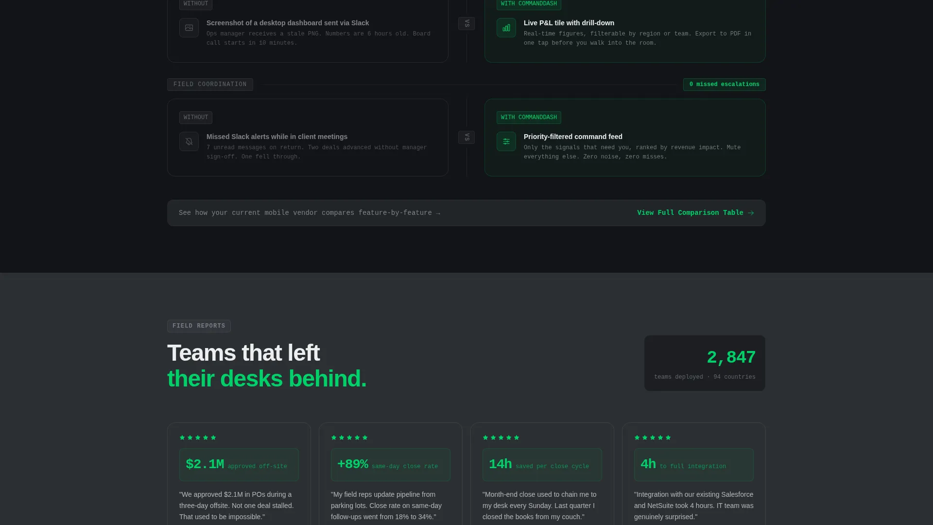
Each bento row below the calculator presents a left-cell "without" state alongside a right-cell "with" state. The without cell shows a clunky mobile browser view, a missed alert, or a spreadsheet on a small screen. The with cell shows the native app equivalent, crisp and fast. The grid density increases as the visitor scrolls, mimicking a zoom into a command center.
Persistent Secondary call to action Banner
A slim banner runs along the bottom of every versus row. It reads "See How [Competitor Category] Compares" and links to a detailed feature-by-feature comparison table. The table ends with a "Start Your 14-Day Command Trial" prompt, giving the visitor a second conversion path at every scroll stop.
Monochrome Steel Bento Grid System
Every card surface floats on aluminum at 6% opacity. Interactive borders catch a 1-pixel aluminum edge that makes each bento cell feel like a physical tile. Backgrounds alternate between forge black and gunmetal mid-tone, and all typography follows the signal white on dark or forge black on light rule without exception.
Page sections overview
| Section | Purpose |
|---|---|
| Dark Glass Header | Show six live-metric bento cells and headline |
| ROI Calculator Cell | Let visitors calculate their mobile workflow ROI |
| Gated Results Panel | Capture work email after calculator delivers value |
| Versus Comparison Rows | Compare painful without-state to native app experience |
| Persistent call to action Banner | Drive visitors to feature comparison table |
| Feature Comparison Table | Show side-by-side capability breakdown |
| 14-Day Trial call to action | Close the page with a direct trial start prompt |
Design & branding system
The visual identity follows a Data Command theme built on a Monochrome Steel palette. Every color decision reinforces precision and control rather than warmth or decoration.
- Core palette: forge black (#121417), gunmetal mid-tone (#2C2F33), brushed aluminum (#A8ADB3), and signal white (#EDEEF0) for primary text
- Single accent: status-green (#00D26A) reserved exclusively for live data numerics and active call-to-action states
- Typography tracks wide in signal white on dark surfaces and flips to forge black on any light surface; card surfaces float at 6% aluminum opacity with 1-pixel aluminum borders on every interactive edge
Mobile & speed optimization
The template is designed to feel native on the very device it is selling. Layout decisions at every scroll depth prioritize small-screen readability and fast visual orientation.
- Bento grid cells reflow cleanly for narrow viewports so the asymmetric header and versus rows remain legible on phone screens
- The ROI calculator input fields are sized and spaced for thumb interaction, keeping the engagement hook accessible without pinch-zoom
How this template helps you convert
The page is structured around a Calculator/Versus conversion model that earns the click by delivering value first and asking for commitment second.
- The ROI calculator appears before any persuasion copy, giving visitors a personalized business case in status-green numerics before a single lead field appears.
- The expanding results panel gates the full audit behind just two fields, work email and company name, lowering friction while still qualifying the lead.
- The persistent secondary call to action banner and feature comparison table give undecided visitors a second conversion path at every scroll position, ending at a 14-day trial entry point.
Other information about this template
Commanddash is built as a single-page bento grid landing page, making it straightforward to deploy as a standalone campaign page or as the primary acquisition surface for a B2B SaaS mobile product launch. The layout is opinionated enough to set a strong visual tone on day one and flexible enough to swap in real metrics, copy, and brand assets without restructuring the grid.
- The template is category-matched to the Technology vertical and the SaaS B2B Digital Presence subcategory
- The Intersection Match Score of 13 reflects a tight alignment between the bento grid template style, the Data Command theme, and the Calculator/Tool First creative direction
- The "Your Desktop Stack. Now In Your Hand." headline is pinned to the top-left bento cell and acts as the single H1 anchor for the entire page

Theme
Data Command
Creative direction
Calculator/Tool First
Color system
Monochrome Steel
Style
Bento Grid
Direction
Comparison/Versus
Page Sections
Six-cell Dark Glass Header
Embedded ROI Calculator
Gated Results Lead Capture
Versus Comparison Row Layout
Persistent Secondary Call to Action Banner
Monochrome Steel Bento Grid System
Related questions
What kind of product is this template designed for?
Do I need to rebuild the bento grid layout from scratch?
How does the ROI calculator work inside the template?
Can the gated results panel function as a lead capture step?
Can I adjust the number of versus comparison rows?



