Specialist Retail Digital Presence Professional Website Template
Commerce is a glassmorphic, card-grid landing page built for retail brands that need one unified command center. It presents real-time analytics dashboards, inventory pulse monitors, conversion funnels, and abandoned cart recovery in a dark, data-rich visual experience. The template is designed to capture qualified leads through a two-step progressive form and a bold "Launch Your Dashboard" call to action.
by Rocket studio
Quick summary
Commerce is a single-page, card-grid landing page template built for retail online store operators. It combines a live-feeling Dashboard Preview header, modular glassmorphic feature cards, and a lead-generation form flow into one cohesive experience. The design language is dark, layered, and data-forward, making the platform feel like a mission control room the moment a visitor lands.
Who this template is for
This template is built for growth-stage retail operators who need clarity, not more complexity. If you run a store and feel buried in disconnected tools, this template speaks your language.
- Direct-to-consumer brand founders scaling past their first $500,000 in revenue
- E-commerce merchants managing too many disconnected apps with no unified view
- E-commerce directors at mid-market retailers who need a single analytics pane instead of fourteen browser tabs
What problem this template solves
Most retail operators have the data. What they lack is a way to present their platform's capabilities in one compelling, trustworthy page that converts curious visitors into qualified leads.
- Scattered analytics tools make it hard to show prospects the full power of a unified dashboard
- Generic landing page templates fail to communicate the urgency and momentum of a live retail operation
- Long, fragmented sign-up forms lose visitors before they ever submit their details
What you get with this template
You get a fully structured, modular landing page that places your platform's most persuasive content front and center. Every section is designed to build confidence and push visitors toward action.
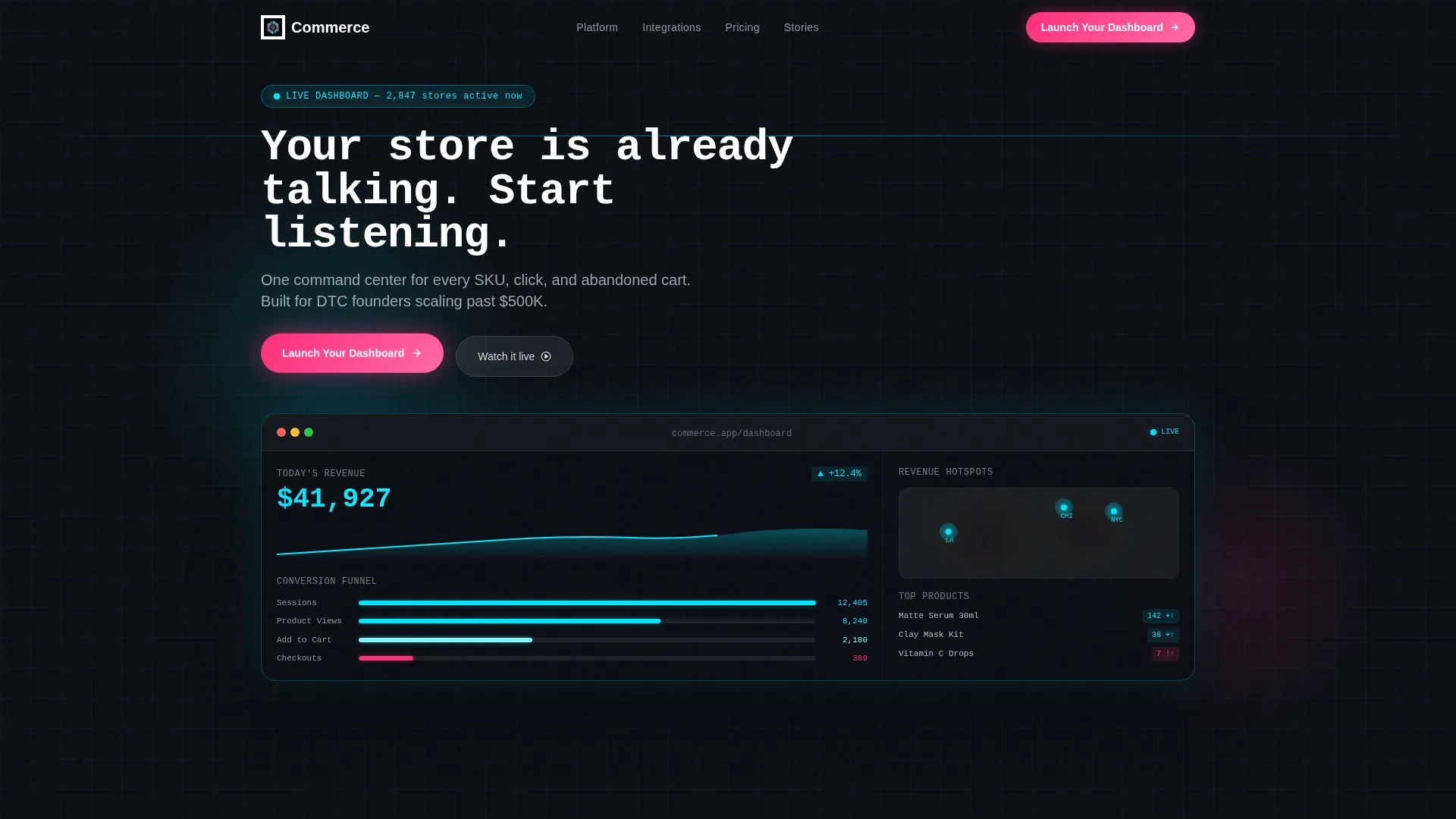
- A full-viewport Dashboard Preview header with animated metrics, a revenue ticker, a United States heatmap, a conversion funnel display, and a top-products carousel
- A modular card grid where each frosted glass tile showcases one platform capability with a hover-triggered micro-animation
- A two-step progressive lead-generation form that captures store URL, monthly revenue band, and operational pain points
Feature list
This template is built around a specific set of capabilities drawn directly from its design brief. Each one serves a clear purpose in the lead-generation flow.
Animated Dashboard Preview Header
The header spans the full viewport and simulates a live command center. A revenue ticker climbs past $41,200, a United States heatmap shows glowing hotspots, a conversion funnel narrows from 12,400 sessions to 387 checkouts, and a top-products carousel displays thumbnails, stock counts, and velocity arrows. A monospace headline types itself in over the display.
Modular Glassmorphic Card Grid
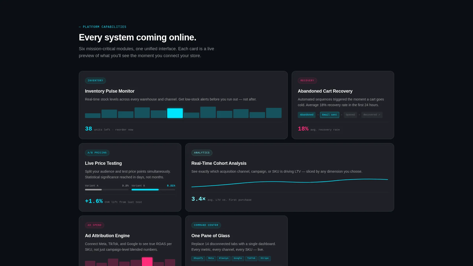
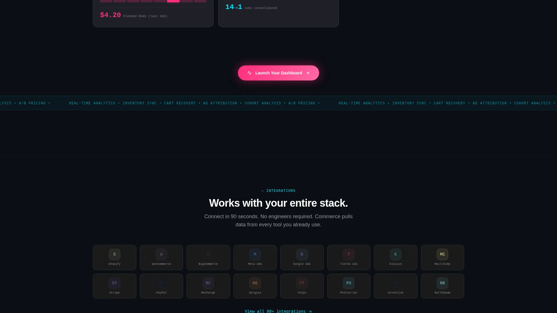
Each feature card is a frosted glass tile that floats above the deep black background. Cards brighten on hover and reveal a micro-animation of the feature they represent. The grid rhythm escalates from single cards to pairs to a full four-column integration showcase, building momentum as the visitor scrolls.
Two-Step Progressive Lead Form
The primary call to action opens a two-step form. Step one collects the store URL and monthly revenue band. Step two asks for name, email, and the visitor's biggest operational pain point via a dropdown. A personalized "dashboard preview loading" animation plays between steps, making the experience feel product-native before submission.
Persistent call to action Placement
The "Launch Your Dashboard" button first appears as a glassmorphic magenta pill floating in the header's bottom-right corner. It then reappears anchored after every third card row. This placement pattern keeps the conversion prompt visible throughout the entire scroll without feeling intrusive.
Social Proof and Case Study Section
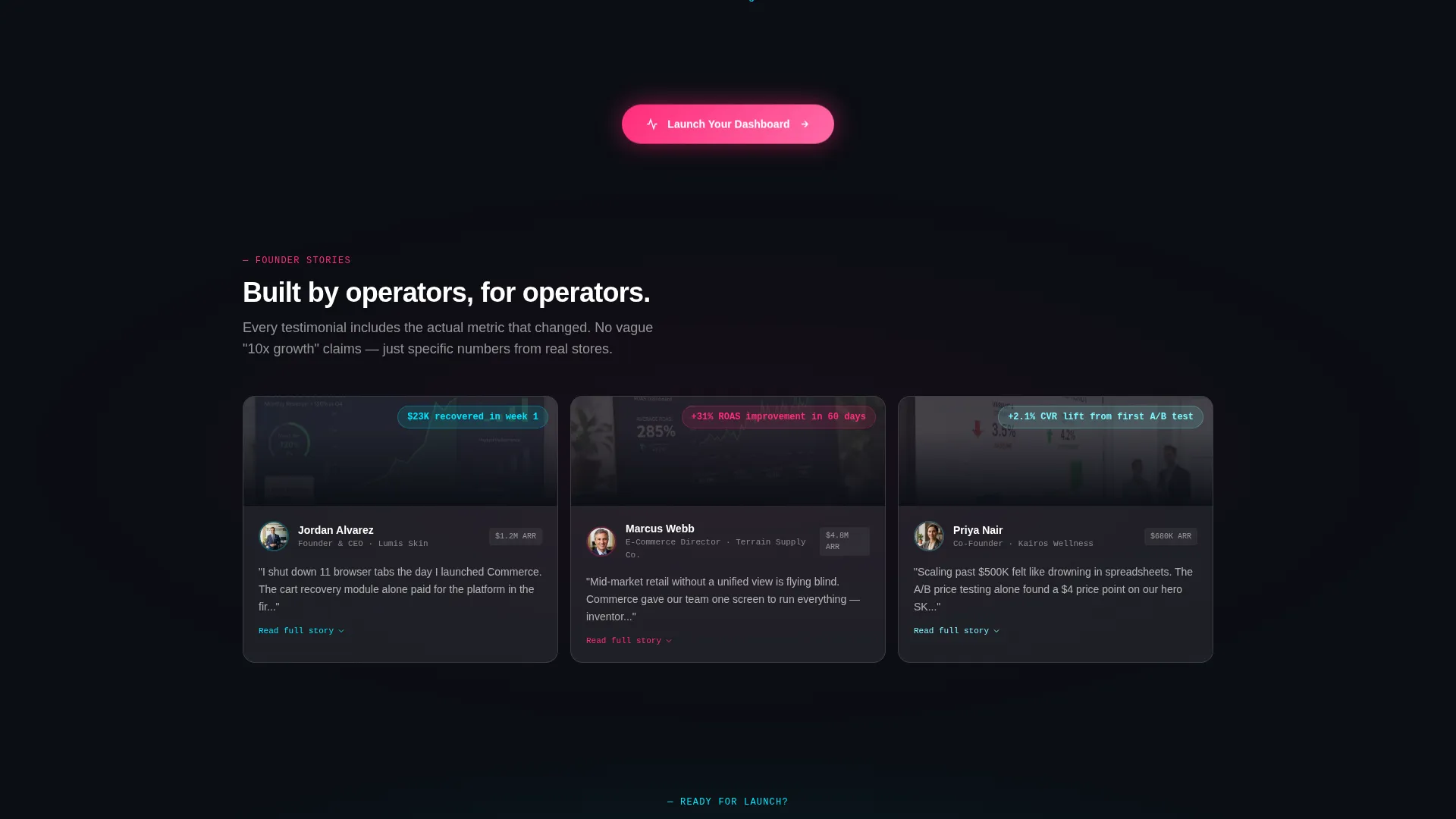
A testimonial mosaic places founder headshots inside their own dashboard screenshots. A metrics counter strip follows, then an inline-expandable case study card. Each element adds credibility at precisely the moment a visitor might hesitate.
Conversion Funnel Visibility Strip
A dedicated section renders the full conversion funnel as living data: sessions, product views, add-to-cart events, and checkouts displayed together. This section reinforces the platform's core promise by showing the funnel in action rather than describing it in text.
Page sections overview
| Section | Purpose |
|---|---|
| Dashboard Preview Header | Opens with animated live-metrics mockup to create immediate platform credibility |
| Headline Typewriter Block | Types the core value proposition in monospace over the dashboard visual |
| Feature Card Row | Introduces inventory sync capability via a single frosted glass card |
| Abandoned Cart Card | Highlights cart recovery feature with hover micro-animation |
| A/B Price Testing Card | Showcases price-testing capability in a paired card layout |
| Cohort Analysis Card | Presents real-time cohort analysis as a paired glassmorphic tile |
| Integrations Grid | Four-column card grid displaying platform integrations at a glance |
| Testimonial Mosaic | Founder headshots embedded inside their own dashboard screenshots |
| Metrics Counter Strip | Animated counter row reinforcing platform scale and social proof |
| Case Study Card | Inline-expandable card with a concrete brand growth story |
| Lead Generation Form | Two-step progressive form capturing store URL, revenue band, and pain point |
Design & branding system
The visual identity follows a Data Command theme executed through a glassmorphic color system. Every design choice reinforces the feeling of a live, high-stakes retail environment.
- Base layer is deep void black (#0B0E14); card surfaces use frosted translucent white at 8 to 12 percent opacity with a 12-pixel blur and a 1-pixel luminous border
- Electric cyan (#00E5FF) pulses through data lines and active-state borders; hot magenta (#FF2D7B) is reserved exclusively for call-to-action elements and alert badges
- Typography uses a monospace style for headline and data elements, reinforcing the command-center aesthetic throughout
Mobile & speed optimization
The template is designed to carry its visual intensity without collapsing on smaller screens. The modular card structure adapts naturally to narrower viewports.
- Card grid columns reflow from four columns to two and then to a single column as screen width decreases
- Subtle animations are scoped to individual card and header elements so they do not compete with layout stability on mobile
- The two-step form compresses cleanly to a single-column layout, keeping the lead-capture flow usable on any device size
How this template helps you convert
The entire page is engineered around one outcome: turning a retail professional's curiosity into a submitted lead. Every structural decision supports that goal.
- The animated Dashboard Preview header creates an immediate "this is already working" impression before the visitor reads a single word of copy, reducing skepticism from the first second of the visit.
- The persistent call to action placement and escalating card rhythm build pressure gradually, so by the time a visitor reaches the lead form, they have already seen enough proof to feel confident submitting.
- The two-step progressive form reduces friction by splitting data collection into two small commitments, and the "dashboard preview loading" animation between steps makes the visitor feel they are already inside the product.
Other information about this template
This template is built on a card-grid layout that makes it straightforward to swap feature cards in or out to match your platform's actual capabilities. The modular structure means no section is locked in place.
- The template is categorized under Technology and targets the Retail Digital Presence subcategory, making it relevant for retail online store platforms seeking qualified inbound leads
- The Launch Energy creative direction is intentional: each scroll step is designed to feel like a system coming online, sustaining attention across a long-format single page
- The header concept is a Dashboard Preview, meaning the first impression is data-rich and product-specific rather than abstract or brand-only
- This template pairs well with platforms that serve Shopify merchants, direct-to-consumer brands, or mid-market retail operations looking to consolidate their analytics stack
Theme
Data Command
Creative direction
Launch Energy
Color system
Glassmorphic
Style
Card Grid (Modular)
Direction
Lead Generation
Page Sections
Animated Dashboard Preview Header
Modular Glassmorphic Card Grid
Two-step Progressive Lead Form
Persistent Call-to-action Placement
Social Proof Mosaic and Metrics Strip
Related questions
Who is this landing page template built for?
Can I change the feature cards to match my platform?
How does the two-step lead form work?
Does the template include the actual dashboard data shown in the header?
What makes this template different from a standard retail landing page?



