Developer Portal Professional Website Template
Commit is a comparison-focused developer community forum landing page. It opens with a live-typed code snippet, drops straight into a feature-by-feature comparison table, and closes with real-time community metrics and a frictionless single-field sign-up. Built for technical audiences, it converts skeptical developers into members in one focused scroll.
by Rocket studio
Quick summary
Commit is a single-page developer community forum landing page built around one clear argument: this forum is better than the alternatives. The page opens with a terminal-style animated code snippet, follows with a detailed comparison table, backs it with live community metrics, and ends with a low-friction sign-up. The entire design speaks the visual language developers already know.
Who this template is for
This template is built for developer-focused communities and technical platforms that need to convince a skeptical audience to sign up. It works especially well when your community already has activity worth showing off.
- Backend engineers and self-taught developers who evaluate tools carefully before committing
- Open-source maintainers looking to attract contributors to a new community hub
- Tech leads and developer relations teams launching or growing a forum product
What problem this template solves
Most developer community pages fail because they make vague promises. Developers do not respond to marketing language. They respond to proof, specifics, and tools that feel native to how they already work.
- Generic landing pages cannot show why one forum is better than another
- Multi-step sign-up forms create friction for an audience that will simply close the tab
- Pages that rely on stock imagery feel disconnected from the actual product
What you get with this template
You get a complete, single-page layout with every section pre-built and wired for animation. The structure moves visitors from curiosity to conviction in a logical sequence.
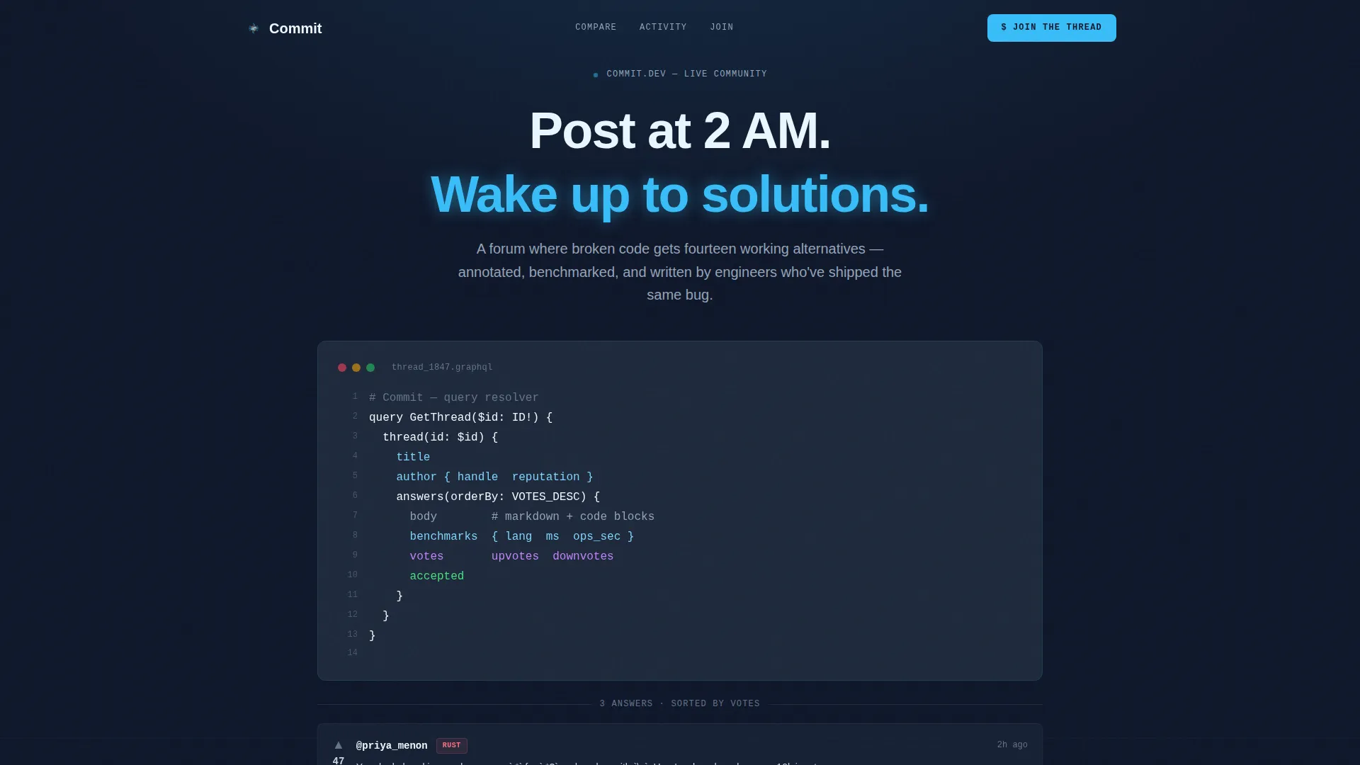
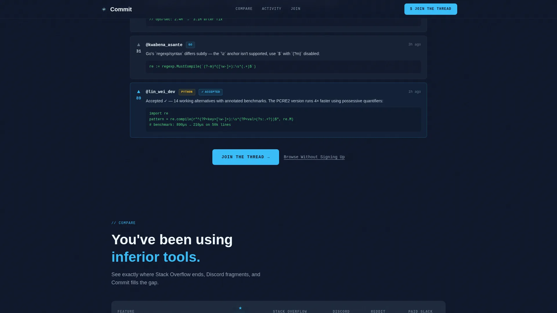
- An animated hero section with a live-typed, syntax-highlighted code snippet and a reply thread reveal
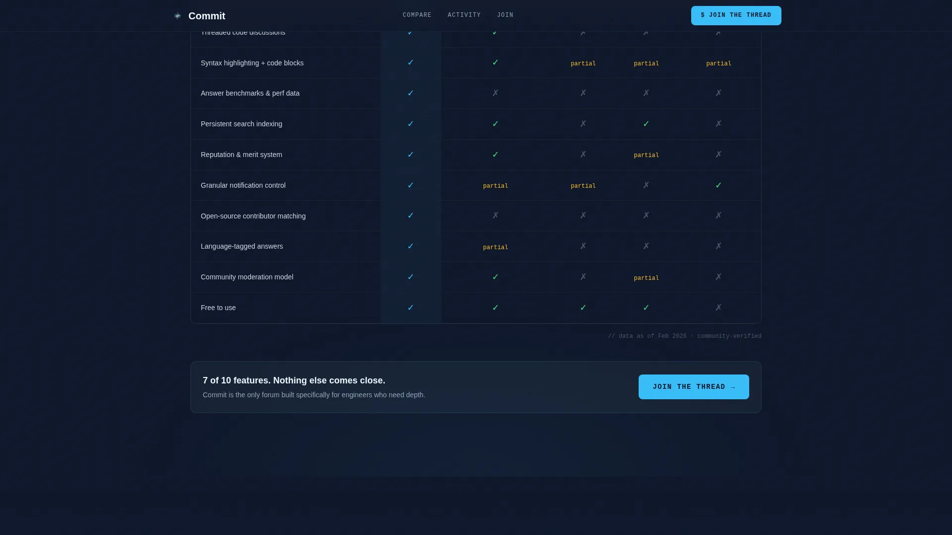
- A multi-column comparison table with animated row entries and sky-blue versus slate visual scoring
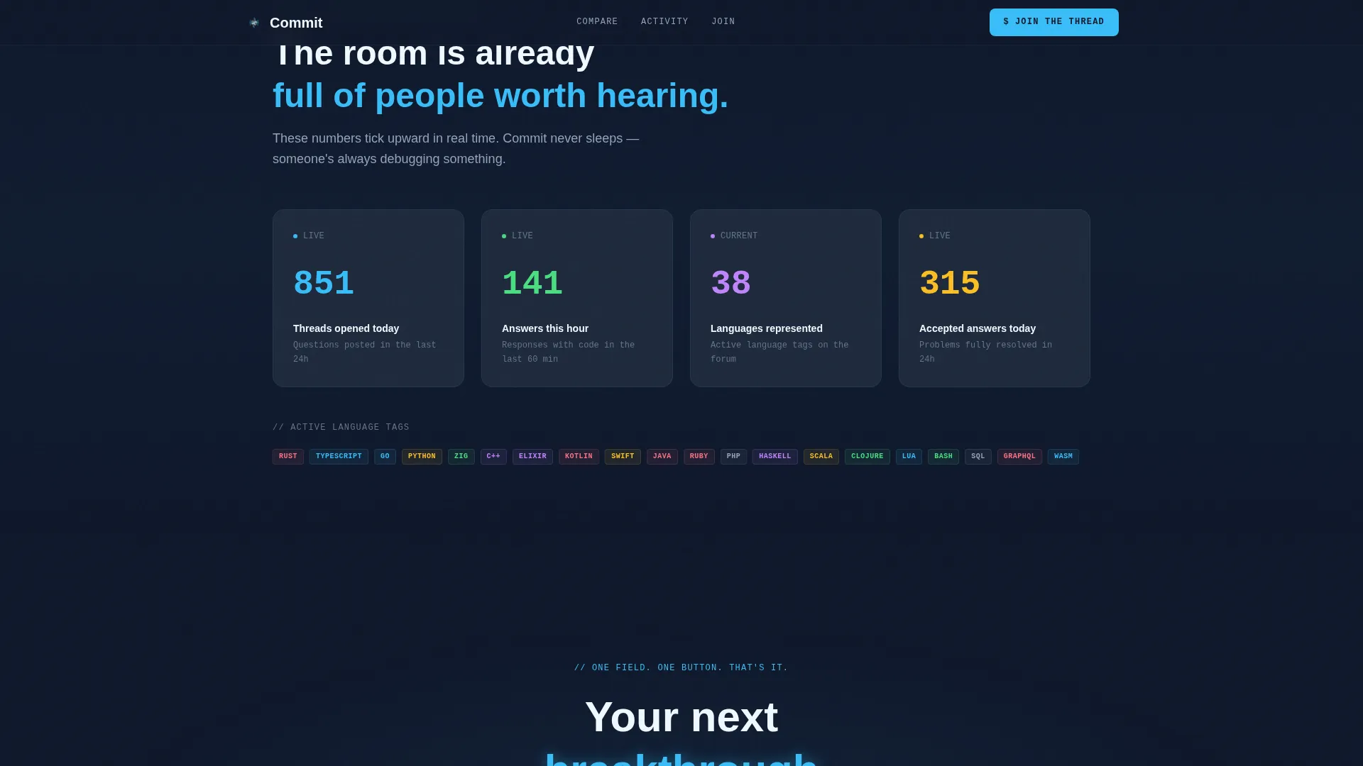
- A live metrics block with ticking counters and a conversion-focused call-to-action section with single-field sign-up
Feature list
This template delivers six distinct capabilities drawn directly from the project brief. Each one serves the developer audience and the conversion goal.
Live-Typed Code Snippet Hero
The hero section renders a real, syntax-highlighted code block, such as a GraphQL query or a Rust pattern match, in a monospaced font. Each line types in sequentially, and a blinking cursor holds at the end. Below it, three community reply cards unfurl with upvote counts, language badges, and a sky-blue highlight on the top answer.
Animated Comparison Table
The core section of the page is a structured table comparing the forum against alternative platforms across rows covering threading depth, code formatting, search indexing, moderation model, notification control, and reputation systems. Each row slides in horizontally on scroll. Sky-blue checkmarks land with a micro-bounce; slate icons mark the alternatives.
Live Community Metrics Block
Below the comparison table, a metrics row displays real-time ticking counters for threads created today, answers posted this hour, and programming languages represented. The counters animate upward on entry, giving visitors a live signal that the community is already active.
Single-Field Sign-Up Flow
The conversion section keeps commitment low. Visitors enter only a GitHub handle or email address in one input field and hit one button. This reduces the drop-off that typically comes from multi-step registration forms targeting a developer audience.
Dual Call-to-Action Structure
A primary "Join the Thread" button in sky-blue appears pinned after the comparison table and again in the footer. A secondary "Browse Without Signing Up" text link sits beneath it, offering a no-pressure alternative path that keeps hesitant visitors on the page.
Scroll-Driven Animation System
The page uses GSAP ScrollTrigger for scroll-based animations alongside CSS for the typing effect and cursor blink. Row slide-ins use cubic-bezier easing. Hover states activate on table rows, and the primary call-to-action button has a magnetic hover interaction.
Page sections overview
| Section | Purpose |
|---|---|
| Hero Code Snippet | Opens with a live-typed, syntax-highlighted code block and an animated reply thread reveal |
| Comparison Table | Compares the forum against alternative platforms row by row with animated checkmarks |
| Live Metrics Row | Displays real-time ticking counters for threads, answers, and languages |
| Call-to-Action Block | Delivers the primary sign-up prompt with a single field and dual action options |
| Footer | Closes the page with a horizontal flow layout and repeated conversion link |
Design & branding system
The visual identity follows a Dynamic Motion theme built on a Slate and Sky color system. The aesthetic is terminal midnight: disciplined, monochromatic slate broken by a single electric sky-blue frequency that guides the eye to every action point.
- Color palette: deep terminal slate (#1E293B) as the primary background, mid-gray code-block surface (#334155), sky-blue accent (#38BDF8) on links and interactive highlights, and pale cloud white (#F0F9FF) for foreground text and hover states
- Typography: JetBrains Mono for all code and snippet content, DM Sans for interface text and body copy
- No stock photography or illustrations; the code content and community data are the visual substance of the page
Mobile & speed optimization
The template is built desktop-first to match the primary developer audience. It is also responsive for mobile viewports so the experience holds across devices.
- Desktop-first layout with responsive breakpoints that preserve table readability on smaller screens
- GSAP ScrollTrigger drives scroll animations, and CSS handles the typing effect and cursor blink to keep animation logic separated and manageable
- Animation and interaction complexity is high by design; the template is structured to deliver this experience within a single-page layout
How this template helps you convert
The page is built as a Comparison and Versus landing page. Every section earns the next click rather than simply asking for it.
- The animated code snippet hero establishes credibility instantly by showing the actual forum experience in the first four seconds, before any marketing copy appears.
- The comparison table creates a felt contrast between this forum and the alternatives, so visitors arrive at the sign-up button already convinced rather than still evaluating.
- The live metrics block and dual call-to-action structure reduce the final barrier: the room already feels full, and joining requires only one field.
Other information about this template
This template sits in the Developer Portal subcategory under Documentation and Support. It is designed for developer community forum use cases with a B2C and B2B hybrid audience.
- The template style is Comparison Table, matching the Comparison and Versus landing page direction
- The creative direction is Launch Energy: the page is structured to build momentum from the first scroll event to the final sign-up action
- The header concept is Code Snippet, placing real technical content at the top of the viewport rather than a headline or hero image
- The footer follows a Vercel Horizontal Flow pattern, keeping the close of the page clean and professional
- The template is suited for teams launching a new developer forum or repositioning an existing community against well-known alternatives
Theme
Dynamic Motion
Creative direction
Launch Energy
Color system
Slate & Sky
Style
Comparison Table
Direction
Comparison/Versus
Page Sections
Live-typed Code Snippet Hero
Animated Comparison Table
Live Community Metrics Block
Single-field Sign-up Flow
Dual Call-to-action Structure
Scroll-driven Animation System
Related questions
What kind of community is this template designed for?
Can I edit the comparison table rows and columns?
Does the sign-up form come pre-connected to a backend?
What animation tools does this template use?
Is this template suitable for non-developer communities?



