Consumer App & Platform Pricing Website Template
Compare is a dashboard-style SaaS landing page template built for comparison platforms. It features an interactive hero grid, live-data-styled pricing tables, feature matrices, and a scrolling industry-report narrative. The layout targets procurement managers, startup founders, and IT directors who need fast, defensible decisions from structured side-by-side data.
by Rocket studio
Quick summary
Compare is a single-page landing page template designed for SaaS comparison platforms. It opens with a live comparison grid in the hero, escalates into an authoritative data narrative, and drives lead generation through graduated disclosure. Every section is built to give visitors real, usable data before asking for anything in return.
Who this template is for
This template is built for teams that run comparison platforms and need to convert analytical, time-pressured buyers. The design speaks directly to people who evaluate tools professionally and demand credible, structured evidence.
- Procurement managers comparing SaaS contracts against renewal deadlines
- Startup founders making late-night decisions between competing platforms
- IT directors building shortlists they can defend to a leadership team
What problem this template solves
Most comparison landing pages show static screenshots and broad marketing claims. They fail the buyer at the exact moment the buyer needs structured, actionable data. This template solves that by putting real comparison content front and center before any gate appears.
- Visitors leave pages that offer vague summaries instead of structured, side-by-side breakdowns
- Decision-makers distrust platforms that hide all data behind a sign-up wall
- Procurement teams need defensible evidence, not opinion-driven summaries
What you get with this template
You get a fully designed, single-page layout that functions as both a product demo and a lead generation engine. The template combines interactive data components with a narrative scroll that builds authority section by section.
- An interactive hero grid pre-loaded with three products across eight feature rows
- A scrolling industry-report layout with methodology cards, aggregate stats, and vertical-specific mini grids
- A graduated lead capture flow with a primary "Unlock Full Report" form and a secondary newsletter opt-in
Feature list
This template ships with a focused set of layout components, each engineered for comparison-platform credibility and conversion.
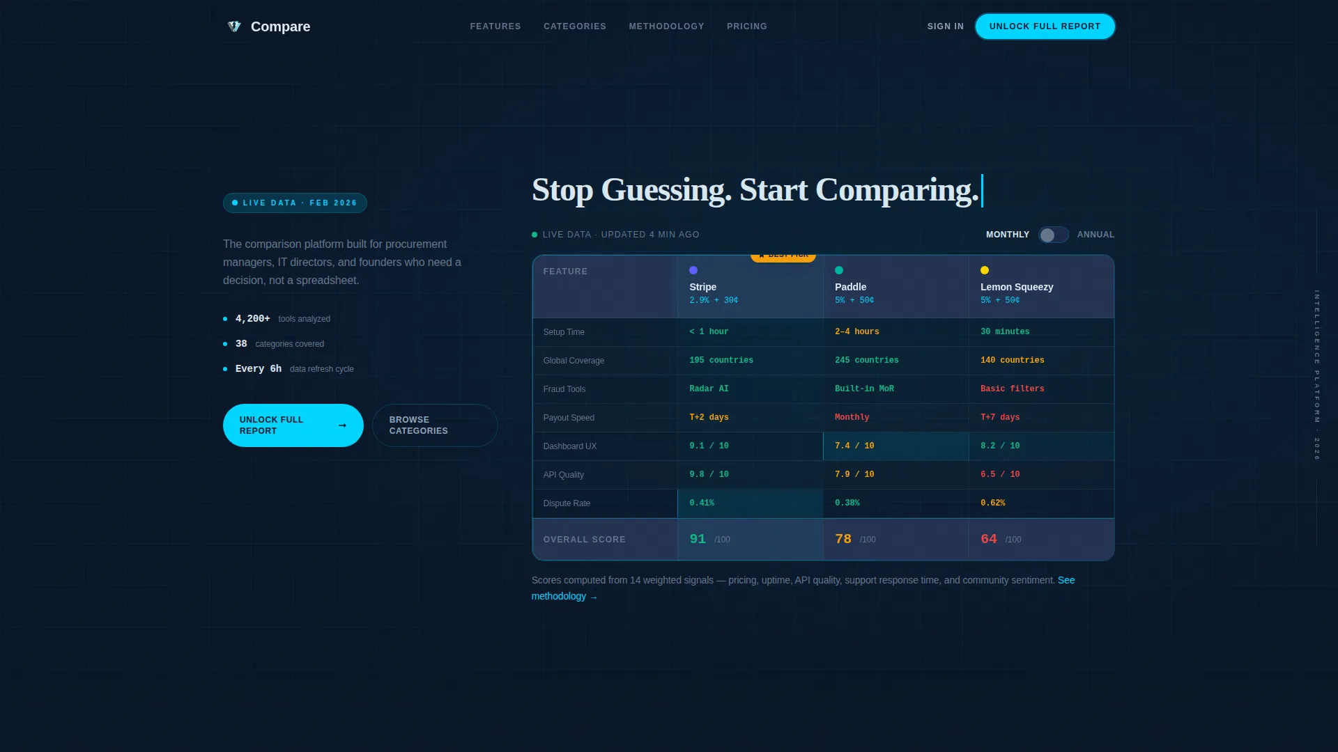
Interactive Hero Comparison Grid
The header embeds a functioning comparison grid directly into the hero section. It comes pre-loaded with three recognizable products across eight feature rows. Cells use live-data styling, and a winner badge animates into the top-scoring column as the visitor watches.
Annual and Monthly Pricing Toggle
A toggle switch inside the hero grid lets visitors flip between annual and monthly pricing views. This single interaction demonstrates the platform's core value proposition before the visitor scrolls a single pixel.
Self-Typing Headline Animation
The headline "Stop Guessing. Start Comparing." types itself above the hero grid on page load. This animation reinforces the intelligence-dossier feel of the template and draws the eye immediately to the comparison data below it.
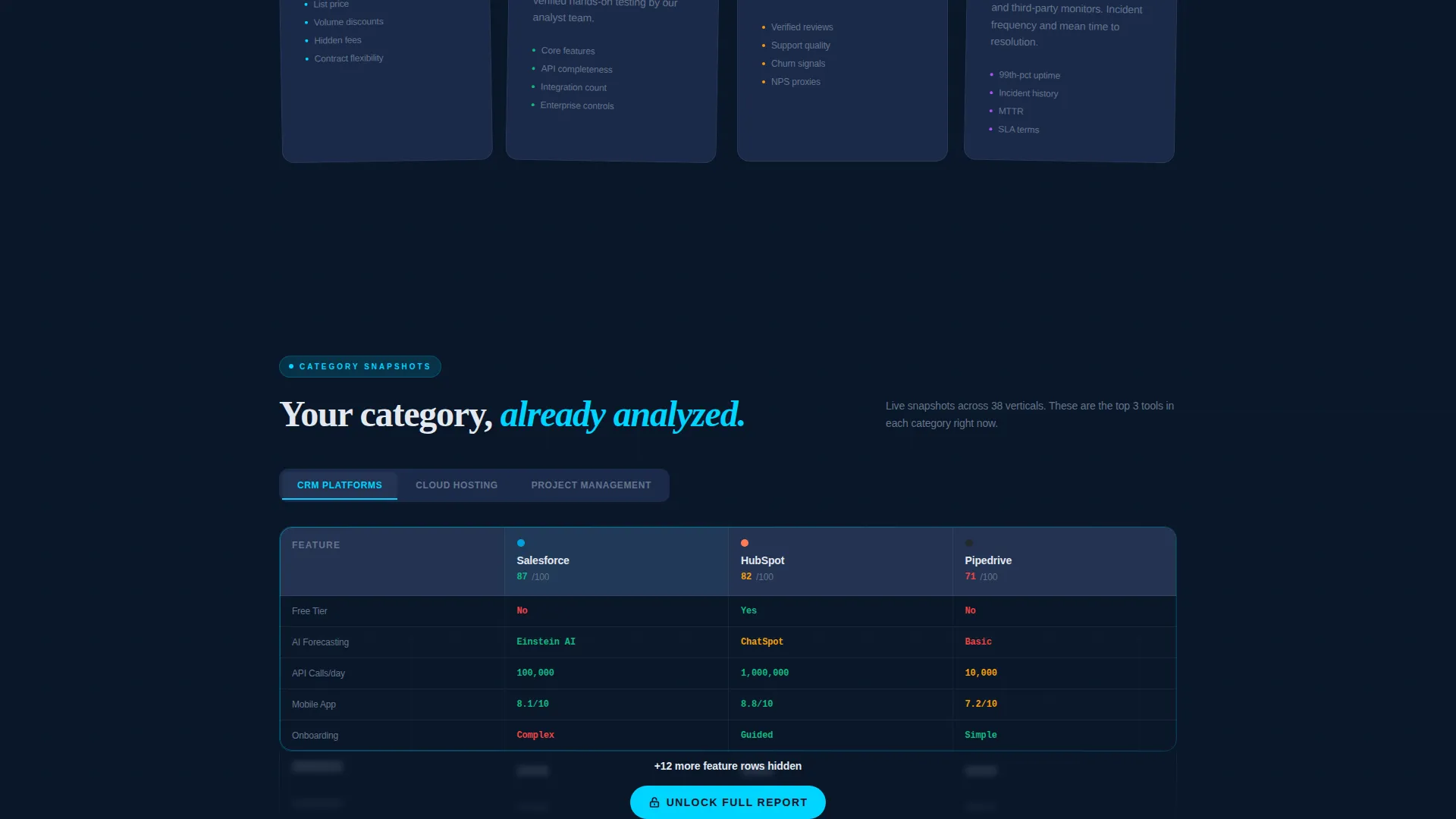
Methodology Transparency Cards
A dedicated section presents methodology cards that explain how scores are calculated. This builds trust through transparency and positions the platform as a credible research source rather than a paid ranking system.
Vertical-Specific Mini Data Grids
The template includes interactive comparison snapshots for specific software verticals such as customer relationship management, cloud hosting, and project management. Each mini grid responds to cursor interaction, keeping the scroll engaging throughout.
Graduated Lead Capture Flow
The primary call to action, "Unlock Full Report," appears after the second interactive grid. The form collects work email, company size via dropdown, and the category the visitor is actively evaluating. A secondary opt-in path captures newsletter subscribers with email only.
Page sections overview
| Section | Purpose |
|---|---|
| Interactive Hero Grid | Showcases live comparison data and animates a winner badge on load |
| Typing Headline Block | Delivers the core value proposition with an animated self-typing effect |
| Aggregate Stats Bar | Presents headline findings such as tools analyzed and categories covered |
| Methodology Cards | Builds credibility by showing how platform scores are calculated |
| CRM Comparison Snapshot | Lets visitors interact with a mini grid focused on CRM tools |
| Cloud Hosting Snapshot | Provides a vertical-specific comparison grid for cloud hosting options |
| Project Management Snapshot | Delivers an interactive breakdown of project management platforms |
| Primary Lead Capture | Gates the full report behind a short work-email and company-size form |
| Newsletter Opt-In | Offers a low-friction secondary path requiring only an email address |
Design & branding system
The visual identity follows a Dashboard Pro theme built around a Midnight Blue color system. The palette is engineered to feel like the glow of six monitors in a dark operations room, authoritative and precise.
- Deep terminal navy (#0A1628) as the primary background, steel-panel gray (#1B2A4A) for card surfaces, and cool interface white (#E2E8F0) for all body typography
- Signal cyan (#00D4FF) applied to active states, hover lines, data highlights, and the animated winner badge
Mobile & speed optimization
The template layout is structured to translate cleanly from wide dashboard views to narrower mobile screens. Data grids and methodology cards are designed to reflow without losing their core readability.
- Comparison grid columns are arranged to remain legible when stacked on smaller viewports
- Toggle switches and interactive mini grids retain their functionality across touch-based devices
How this template helps you convert
The conversion strategy is built on graduated disclosure. Visitors receive genuinely useful data at every stage, so by the time the gate appears, they already trust the platform and want more.
- The interactive hero grid delivers immediate value, letting visitors interact with live-styled comparison data before reading a single line of marketing copy.
- The scrolling data narrative builds authority through aggregate statistics and methodology transparency, warming the visitor toward the lead capture form with evidence rather than persuasion alone.
Other information about this template
This template is suited for teams launching or scaling a SaaS comparison platform in any software vertical. The layout supports multiple comparison categories within a single page flow and can be adapted to highlight different tool verticals by swapping the mini grid content.
- The template style is Dashboard and Data Grid, built on the Dashboard Pro theme
- The creative direction follows an Industry Report cadence, which suits platforms publishing original research or proprietary scoring methodologies
- The header concept is an Interactive Preview, meaning the product experience begins in the hero before any scroll occurs
- The Midnight Blue color system and signal cyan accent are designed to evoke an authoritative, data-first visual language consistent with enterprise and procurement audiences


Theme
Dashboard Pro
Creative direction
Industry Report
Color system
Midnight Blue
Style
Dashboard/Data Grid
Direction
Lead Generation
Page Sections
Interactive Hero Comparison Grid
Annual and Monthly Pricing Toggle
Methodology Transparency Cards
Vertical-specific Mini Data Grids
Graduated Lead Capture Form
Self-typing Headline Animation
Related questions
What type of platform is this template designed for?
Can I change the products shown in the comparison grid?
How does the lead capture flow work?
Does the template support multiple software verticals?
What makes this different from a standard SaaS landing page?


