Compare - Powerful Whitelabel Landing Page Template
Compare is a white-label comparison platform landing page built for SaaS teams, fintech product managers, and affiliate networks. It ships with a Feature Tab Switcher header, scroll-reveal spec sections, and a two-step deploy flow. The glassmorphic dark-cockpit design makes every capability feel live and production-ready from the first scroll.
by Rocket studio
Quick summary
Compare is a single-page, scroll-reveal landing page template for white-label comparison platforms. It targets fintech builders, insurtech founders, and affiliate networks who need to ship a credible comparison marketplace fast. The glassmorphic design, interactive header tabs, and progressive spec reveals make the product sell itself before a prospect ever reads a headline.
Who this template is for
This template is built for technical and commercial teams who need a comparison engine to feel real and trustworthy before a single line of their own code ships. It speaks the language of builders, not marketers.
- Fintech product managers adding a credit-card or loan comparison layer to an existing banking app
- Insurtech founders who need a quote-widget landing page ready before their next investor meeting
- Affiliate networks looking to replace patched-together WordPress tables with a polished, branded marketplace front end
What problem this template solves
Building trust for a white-label platform is hard. Prospects need to see the product working before they commit to deploying it. Most comparison platform pages rely on static screenshots and bullet points that fail to convey the depth of the underlying system.
- Visitors leave because they cannot tell whether the platform is genuinely production-ready or just a concept
- Teams spend weeks designing a credible demo page instead of building the actual product
- Affiliate and fintech buyers need to see rate tables, filter logic, and payout data in motion, not described in paragraphs
What you get with this template
You get a complete, conversion-focused landing page that demonstrates the comparison platform's capabilities through layered interactive design. Every section is pre-structured so your team can swap in real data and deploy quickly.
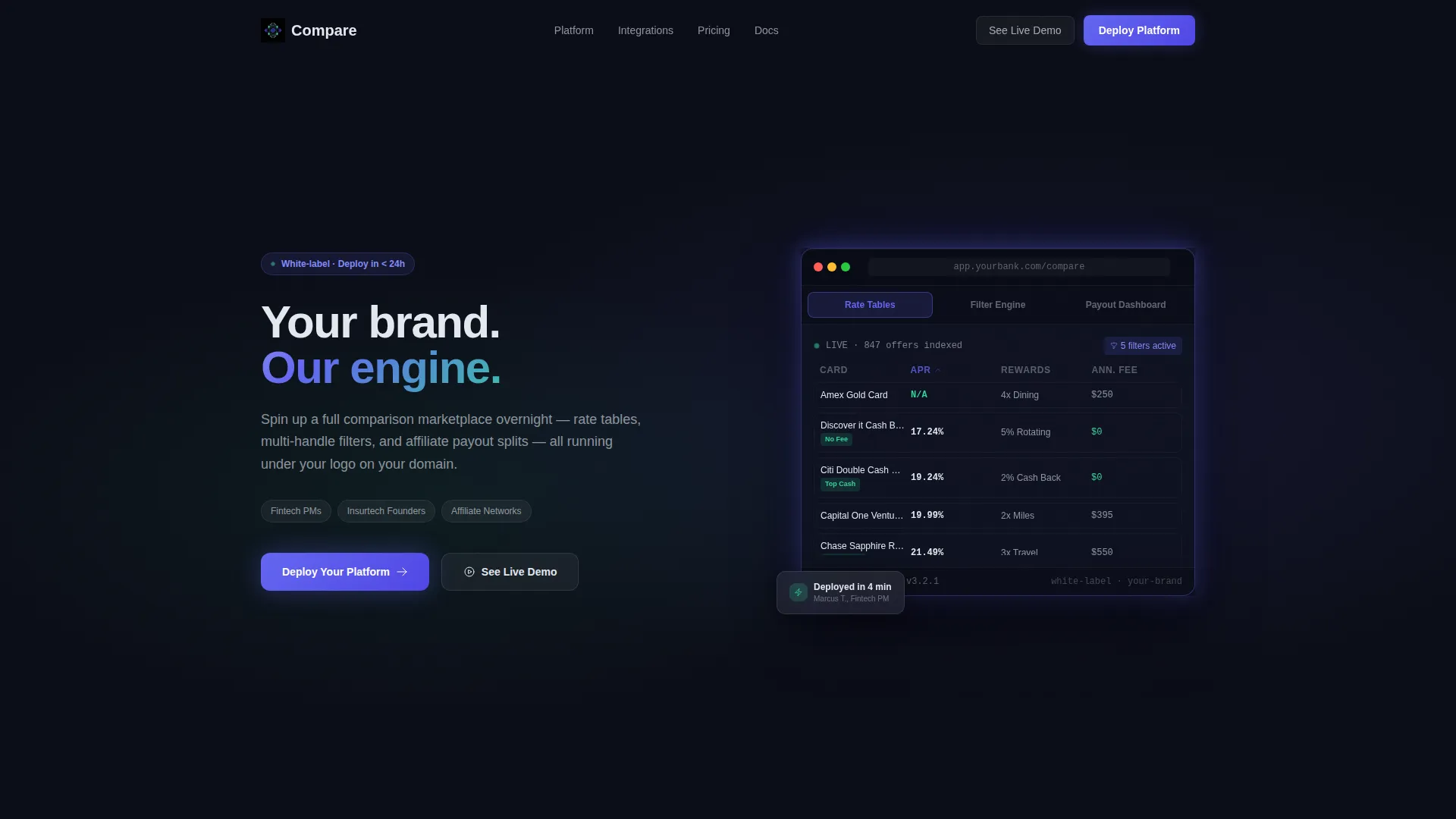
- A Feature Tab Switcher header with a 3D-tilted device mockup showing three live screen states
- Four scroll-reveal spec sections, each progressive and timed to disclose one capability at a time
- A two-step deploy flow with platform-type selection and app store badge delivery
Feature list
This template includes six tightly scoped components, each designed to remove buyer doubt and move prospects toward deployment.
Feature Tab Switcher Header
Three frosted-glass tabs labeled "Rate Tables," "Filter Engine," and "Payout Dashboard" sit across a device mockup. Each tab swap instantly changes the screen inside the mockup, showing a live credit-card grid, a multi-handle loan filter, and an affiliate earnings chart respectively.
Scroll Reveal Spec Sections
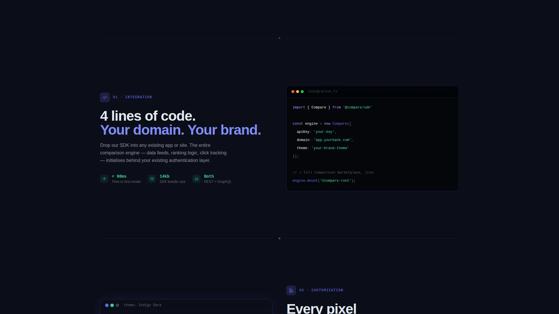
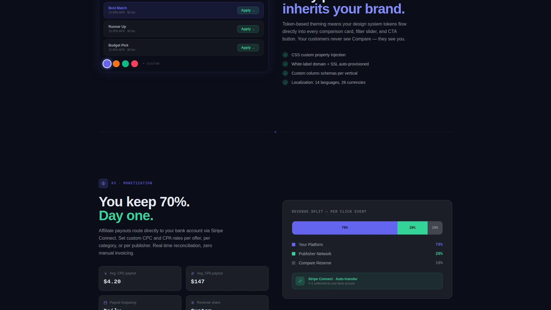
Four sections fade and slide into view as the visitor scrolls. Each reveal presents one capability with a supporting stat, a one-line explanation, and a glass-panel code snippet or schema preview. The sequence moves from integration to customization, then monetization, then scale.
Animated Scale Counter
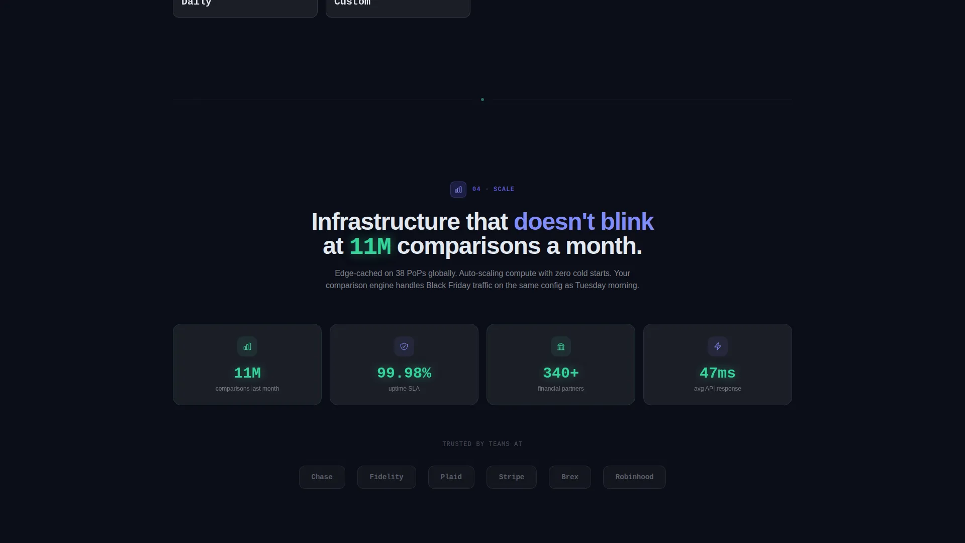
The fourth spec section features a counter that animates upward to display the platform's usage stat: 11 million comparisons served last month. The number pulses in neon mint to signal live data rather than a static claim.
Sticky Deploy Call to Action
A primary "Deploy Your Platform" pill appears as a sticky element after the visitor passes the second reveal. It travels with the viewport and reappears full-width at the page footer, keeping the conversion path visible at every stage of the scroll.
Two-Step Deploy Flow
Tapping the primary call to action opens a two-step modal. Step one asks the prospect to select their platform type (fintech, insurtech, affiliate, or other) and expected monthly traffic range. Step two delivers both App Store and Google Play badges plus a "Start on Web" link for desktop users.
Live Demo iframe
A secondary "See Live Demo" call to action opens an interactive iframe showing a working comparison widget. Prospects can interact with the product directly before committing, replacing abstract trust with hands-on proof.
Page sections overview
| Section | Purpose |
|---|---|
| Feature Tab Header | Demonstrates rate tables, filter engine, and payout dashboard via tab switching on a 3D device mockup |
| Integration Reveal | Shows the four-line code embed and branded domain setup with a glass-panel snippet |
| Customization Reveal | Displays a live theme editor morphing brand colors in real time |
| Monetization Reveal | Presents an affiliate payout split diagram showing revenue distribution |
| Scale Reveal | Animates a counter to 11M comparisons served, reinforcing platform credibility |
| Sticky Deploy call to action | Floats a pill button after the second reveal and anchors it throughout the scroll |
| Full-Width Footer call to action | Delivers the final "Deploy Your Platform" call to action with the two-step flow |
Design & branding system
The visual system is built around a Startup Velocity theme expressed through glassmorphic layering. The result feels like a heads-up display floating in a dark cockpit: translucent panels, luminous borders, and glowing data points over a near-black canvas.
- Core palette: deep void black (#0B0D17) for all backgrounds, frosted-panel white at 12% opacity (#FFFFFF1F) for glass cards, electric indigo (#6366F1) for primary actions and glowing borders, and neon mint (#34D399) reserved for success states and live data pulses
- Text is rendered in crisp anti-flash white (#E2E8F0) across all body copy, with metric values and live counters highlighted in mint to separate data from description
- Glass panels use subtle 1-pixel luminous borders and soft blurred edges, and the device mockup in the header casts a soft indigo glow onto the background beneath it
Mobile & speed optimization
The layout is designed to translate the glassmorphic depth of the desktop experience into a clean, touch-friendly mobile view. Scroll-reveal triggers are calibrated for vertical swipe rather than mouse scroll, keeping the progressive disclosure effect intact on smaller screens.
- Sticky pill call to action repositions cleanly within mobile viewport safe zones so it never blocks key content
- The two-step deploy flow collapses into a full-screen modal on mobile, making platform-type selection and app store badge delivery easy to tap through
How this template helps you convert
Every design and layout decision in this template is aimed at reducing the gap between "interested" and "deploying." The page works by showing, not telling, so prospects arrive at the call to action already convinced.
- The Feature Tab Switcher header lets visitors interact with three core platform capabilities before reading a single marketing claim, establishing immediate product credibility
- The progressive spec reveals build a rhythm of proof: each scroll rewards the visitor with a new layer of the platform, ending with a scale stat that confirms real-world usage
- The two-step deploy flow lowers commitment anxiety by asking only two lightweight questions before delivering the download path, and the live demo iframe lets skeptical buyers experience the widget firsthand
Other information about this template
This template is built on the Compare framework, a SaaS engine designed to let any brand launch its own comparison marketplace without building rate-table infrastructure from scratch. It is especially well-suited for teams operating in regulated or fast-moving verticals where time to market matters.
- The template supports white-label deployment, meaning the comparison interface runs entirely under the client's own domain and brand identity with no visible platform branding
- The payout dashboard section is designed to communicate affiliate revenue split logic visually, making it easier for affiliate network buyers to evaluate the monetization model at a glance
- The "Start on Web" path in the two-step flow makes this template usable beyond mobile app contexts, opening the door for browser-based platform deployments alongside native app launches
Theme
Startup Velocity
Creative direction
Spec Sheet
Color system
Glassmorphic
Style
Scroll Reveal (Progressive)
Direction
App Download
Page Sections
Feature Tab Switcher with Device Mockup
Progressive Scroll Reveal Sections
Animated Usage Counter
Sticky and Full-width Deploy Call to Action
Two-step Deploy Flow
Live Demo Iframe Widget
Related questions
Who is this landing page template designed for?
Can I replace the placeholder content with my own brand and data?
What does the two-step deploy flow actually do?
Does the live demo iframe require a real working backend?
Is this template suitable for both desktop and mobile users?



