Study Abroad Consultancy Landing Page Template
Compass is a zigzag landing page template built for study abroad consultancies. It guides prospective students and their families through every stage of the journey, from discovery call to arrival support, using a timeline-driven layout, botanical visual identity, and two clear conversion paths: a free personalized study plan and a one-on-one booking option.
by Rocket studio
Quick summary
Compass is a single-page template designed for study abroad agencies. It uses a chronological, alternating section layout to walk visitors through each milestone of the application journey. The design balances genuine wanderlust with practical reassurance, making it ideal for consultancies serving ambitious students and their families worldwide.
Who this template is for
This template is built for consultancies that guide students through foreign university applications, visa processes, and relocation logistics. It speaks directly to two audiences at once: the student chasing a new city, and the parent at the kitchen table who needs to trust the process.
- Study abroad agencies and admissions consultancies looking for a polished, conversion-ready landing page
- Independent education counselors serving student applicants aged 17 to 24 and their families
- Consultancy teams who want to present a structured, milestone-based service offering clearly and confidently
What problem this template solves
Most study abroad websites overwhelm visitors with information. Students and parents arrive already juggling university rankings, application deadlines, visa requirements, and housing searches across dozens of browser tabs. The template solves the clarity problem by presenting the entire journey as a single, ordered visual path.
- Replaces information overload with a step-by-step timeline that builds confidence at each scroll
- Removes friction from the first conversion by offering a free, no-login personalized study plan before asking for any commitment
- Gives anxious parents a secondary call-to-action path that fits their preference for direct human contact
What you get with this template
The template delivers a fully structured, single-page layout with every major section pre-designed and content-ready. Each component reflects the study abroad journey in chronological order, so visitors always know where they are and what comes next.
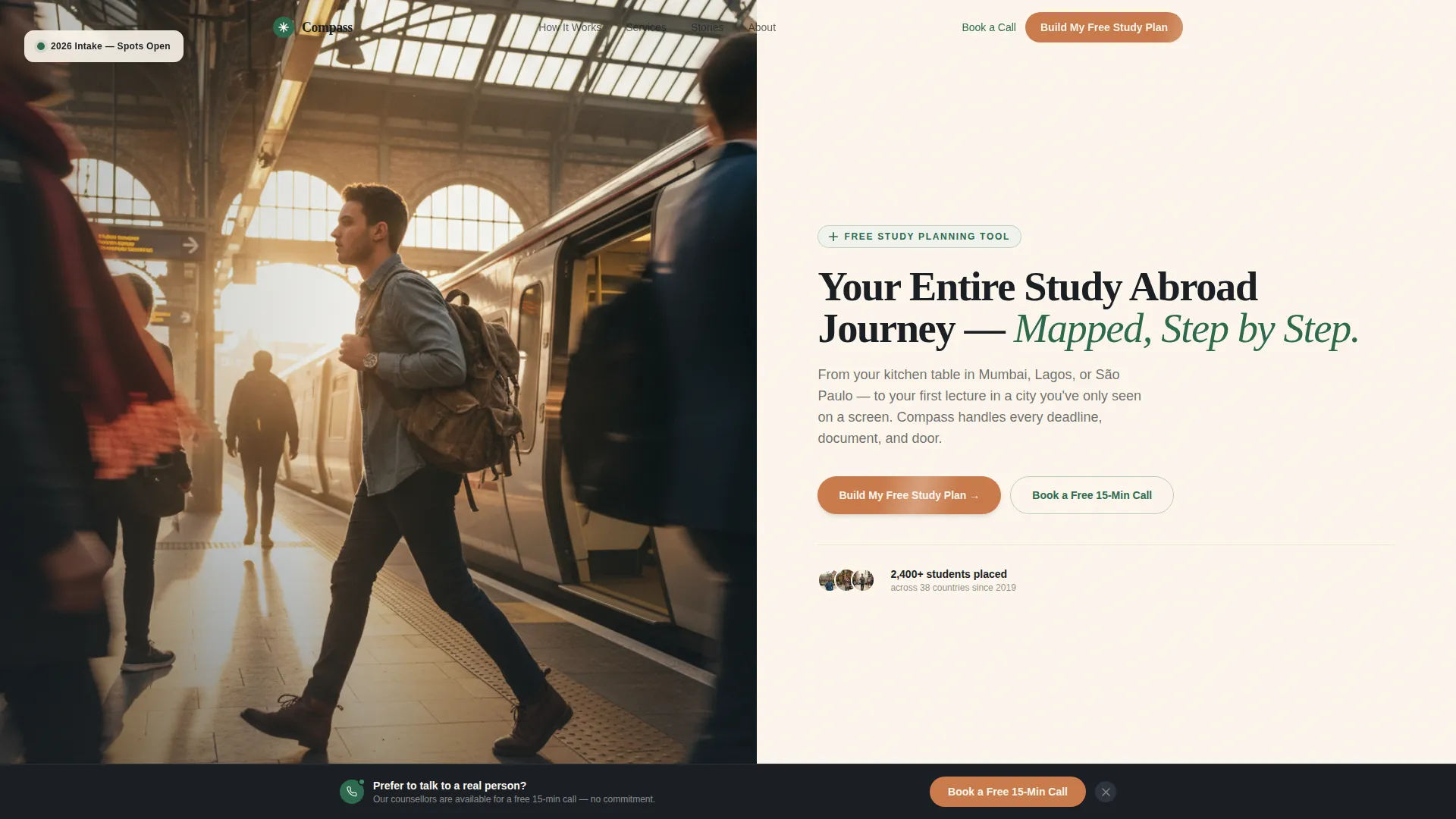
- A half-page header split with a photo on the left and a headline, subhead, and primary call-to-action button on the right
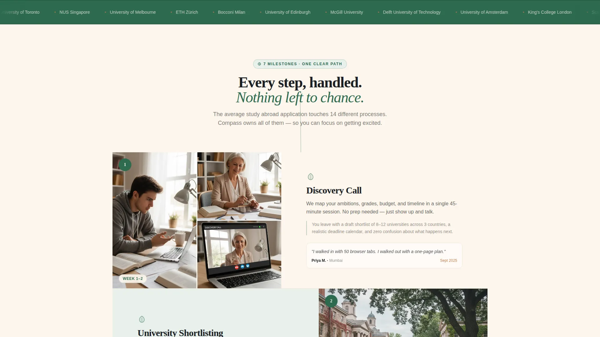
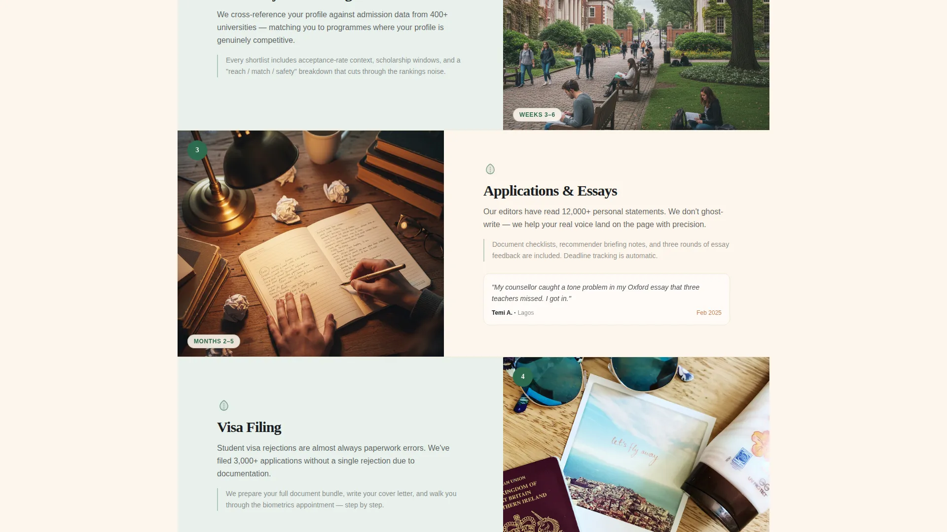
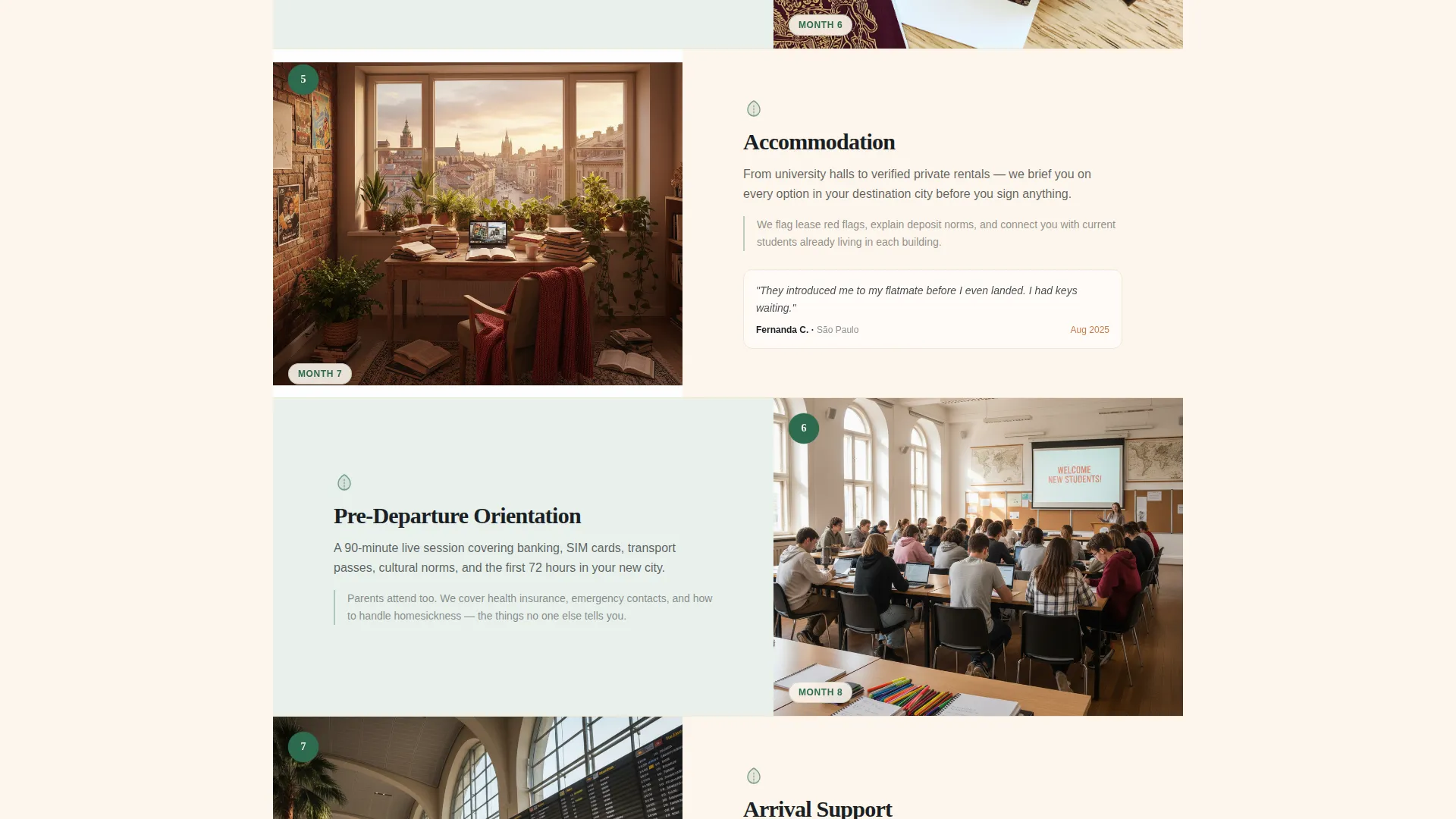
- Seven milestone zigzag sections representing Discovery Call, University Shortlisting, Application and Essays, Visa Filing, Accommodation, Pre-Departure Orientation, and Arrival Support
- Two built-in conversion paths: a three-step quiz that generates a downloadable PDF timeline, and a sticky bottom bar that surfaces a free 15-minute call booking after 60 percent scroll depth
Feature list
This template includes a carefully considered set of features grounded in the study abroad consultancy use case. Each one serves a specific purpose in the visitor journey.
Half-Page Photo and Text Header
The header splits the screen between a full-bleed candid travel photograph on the left and a serif headline, single-line subhead, and terracotta call-to-action button on the right. The layout communicates both the emotional promise of studying abroad and the structured guidance on offer, before the visitor scrolls a single pixel.
Zigzag Milestone Timeline
Seven alternating left-right sections each represent one chronological stage of the study abroad process. A thin vertical vine illustration threads down the center of the page, with a small botanical icon marking each milestone node. This layout makes the scroll feel progressive, turning page sections into a visual calendar of the journey ahead.
Free Study Plan Quiz Flow
The primary call-to-action, labeled "Build My Free Study Plan," opens a lightweight three-step quiz. Visitors select their destination preference using country flag cards, choose their intended intake year, and indicate their current education level. Completing the quiz instantly generates a personalized, downloadable PDF timeline with key deadlines. No credit card or login is required.
Sticky Secondary Conversion Bar
After a visitor reaches 60 percent scroll depth, a sticky bar appears at the bottom of the screen. It surfaces the secondary call-to-action, "Book a Free 15-Min Call," targeting parents or students who prefer a direct conversation over a self-serve tool. The bar stays visible without interrupting the main reading flow.
Student Testimonials at Milestone Nodes
Real student testimonials are embedded within the milestone sections, each timestamped to the relevant stage of the journey. This placement means social proof appears exactly where a visitor is most likely to feel uncertain, reinforcing trust at the moments that matter most.
Botanical Color and Typography System
The design uses a consistent four-color botanical palette applied across all sections, buttons, backgrounds, and text. Section backgrounds alternate between deep fern green and sun-warmed parchment. Warm serif typography for headings and a legible body typeface combine to create a scholarly yet inviting visual identity throughout.
Page sections overview
| Section | Purpose |
|---|---|
| Header Split | Introduce the consultancy and present the primary call-to-action |
| Discovery Call | Open the journey with an exploratory, low-pressure first step |
| University Shortlisting | Show how the consultancy narrows choices to the right fit |
| Application and Essays | Walk visitors through guided application and writing support |
| Visa Filing | Address visa anxiety with reassuring process specifics |
| Accommodation Search | Cover housing logistics with practical, reassuring detail |
| Pre-Departure Orientation | Prepare students for life in a new city before they leave |
| Arrival Support | Close the journey with on-the-ground guidance after landing |
Design & branding system
The visual identity follows an Educational Guide theme built on a botanical color palette. The overall feel recalls a leather-bound field journal, scholarly and alive, as if the content itself is rooted in something real and growing.
- Four-color botanical palette: deep fern green (#2D6A4F) for section backgrounds, sun-warmed parchment (#FDF6EC) as the primary canvas, terracotta clay (#C97B4B) for buttons and interactive highlights, and blackboard charcoal (#1B1F24) for body text
- Warm serif typefaces for headlines paired with a clean body face, reinforcing the Educational Guide theme across all milestone sections
- A hand-drawn vertical vine illustration with botanical icons at each milestone node, giving the scroll a sense of organic progression from first inquiry to arrival
Mobile & speed optimization
The alternating layout and full-bleed header photograph are structured to reflow cleanly on smaller screens. Each section is self-contained, making it straightforward to adapt proportions for mobile viewports without disrupting the timeline sequence.
- Zigzag sections stack vertically on mobile, preserving the chronological milestone order and keeping the journey readable on any screen size
- The sticky bottom bar is positioned to appear without obscuring primary content on mobile, so the secondary call-to-action remains accessible without interrupting the reading experience
How this template helps you convert
The template is built around a Freemium and Trial conversion model. Every design and copy decision is oriented toward earning the visitor's trust before asking for any commitment.
- The primary call-to-action, "Build My Free Study Plan," delivers immediate tangible value through a downloadable personalized PDF timeline, removing the barrier that usually stops first-time visitors from engaging with a consultancy
- The sticky "Book a Free 15-Min Call" bar re-engages visitors who scroll deeply but have not yet converted, offering a human touchpoint for those who prefer guidance over a self-serve quiz
- Milestone-level testimonials place real student voices at the exact points in the page where doubt is most likely to arise, reinforcing confidence and keeping visitors moving toward a conversion action
Other information about this template
The Compass template is designed as a standalone single-page layout for study abroad consultancies of any size. It requires no backend system or external platform to launch. The quiz flow and PDF output are described as part of the template concept and can be connected to your preferred tooling when building out the live page.
- The template style is classified as Zigzag and Alternating, making it well suited to any service with a sequential, stage-based process beyond study abroad
- The creative direction is Timeline Progression, meaning the visual and narrative structure is designed to escalate stakes naturally from exploratory early sections to action-oriented later ones
- The header concept is a Half-Page Photo and Text split, a flexible pattern that works with any high-quality travel or campus photography from your own library
- This template fits within the Education and Training category, specifically the Study Abroad and Admissions subcategory, and is optimized for the Study Abroad Agency niche
Theme
Educational Guide
Creative direction
Timeline Progression
Color system
Botanical
Style
Zigzag/Alternating
Direction
Freemium/Trial
Page Sections
Half-page Photo and Text Header
Zigzag Milestone Timeline Layout
Three-step Free Study Plan Quiz
Scroll-triggered Sticky Conversion Bar
Timestamped Student Testimonials
Botanical Educational Guide Branding
Related questions
Can I use this template for a consultancy that covers multiple destination countries?
Does the free study plan quiz require a login or payment from the visitor?
Who is the sticky bottom bar designed for?
Is this template suitable for a solo education counselor or only for larger agencies?
Can the visual style be adapted to fit an existing brand identity?



