Bold Brutalist Senior Care Knowledge Base Landing Page
Compass is a Bold Brutalist senior care knowledge base landing page built on a bento grid layout. It uses an Electric Indigo color system, high-motion animation, and a dark full-bleed hero with a pulsing search bar to serve adult children, home health aides, and geriatric social workers who need critical eldercare information fast. The single conversion goal is app download.
by Rocket studio
Quick summary
Compass is a single-page, section-led landing page template built for a senior care knowledge base app. It pairs a Bold Brutalist visual identity with an asymmetric bento grid layout, a dark full-bleed hero, and a scroll-linked floating call-to-action bar. Every section is designed to prove the depth of the knowledge inside the app before asking visitors to download it.
Who this template is for
This landing page template was designed for a very specific intersection: a mission-driven digital product and an audience under real pressure. It speaks to teams building eldercare apps, health information platforms, and senior care service tools that need a landing page as serious and functional as the product itself. It also works well as an agency landing page reference for teams creating health technology products with high emotional stakes.
- Product teams and developers launching a senior care knowledge base app who need a landing page that earns trust immediately.
- Home health aide training platforms, geriatric social work tools, and caregiver support apps that serve a professional secondary audience.
- Designers and developers evaluating Bold Brutalist web design concepts for a health-focused digital product or agency landing page project.
What problem this template solves
A landing page for a senior care knowledge base must prioritize functionality and scannability over aesthetic design. Most caregiving apps hide behind soft pastels and vague reassurances. That approach fails the daughter searching at 2 AM and the home health aide studying between shifts. This template solves the trust gap by showing real content before asking for a download. It replaces empty promises with visible proof.
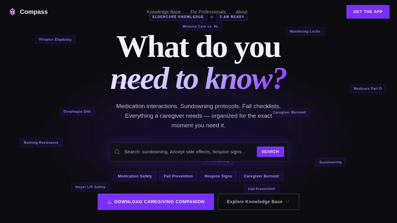
- Caregivers need direct access to specific information fast. The floating topic constellation in the hero section makes the depth of the knowledge base immediately visible, so visitors understand the value before they scroll.
- Users who discover the app on a laptop at night need to reach it on their phone the next morning. The SMS download form with a single phone number field removes every barrier between that insight and the app install.
- The page structure mirrors the caregiver's actual emotional journey, moving from curiosity to preparation to urgent action, so the landing experience feels relevant rather than generic.
What you get with this template
You get a complete, production-ready landing page layout built for a single conversion goal: driving app downloads. The template includes every section needed to move a high-stress visitor from first impression to committed action. No filler sections, no unnecessary complexity.
- A dark full-bleed hero with a pulsing violet search bar, oversized brutalist typography, and a floating constellation of clickable topic nodes that prove the knowledge base is real and deep.
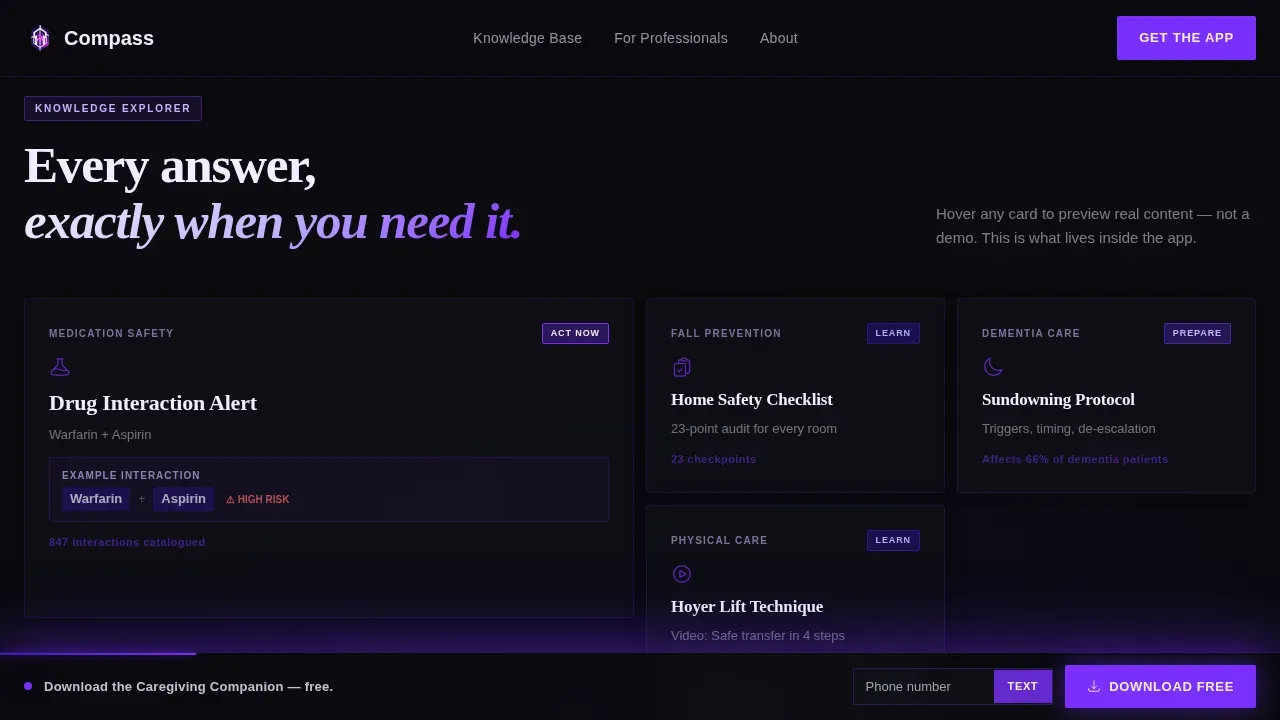
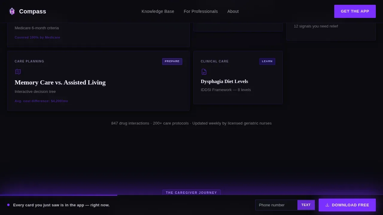
- An asymmetric bento grid knowledge explorer where each cell represents a content category, with hover states that expand cells using a glowing indigo border and a live content preview.
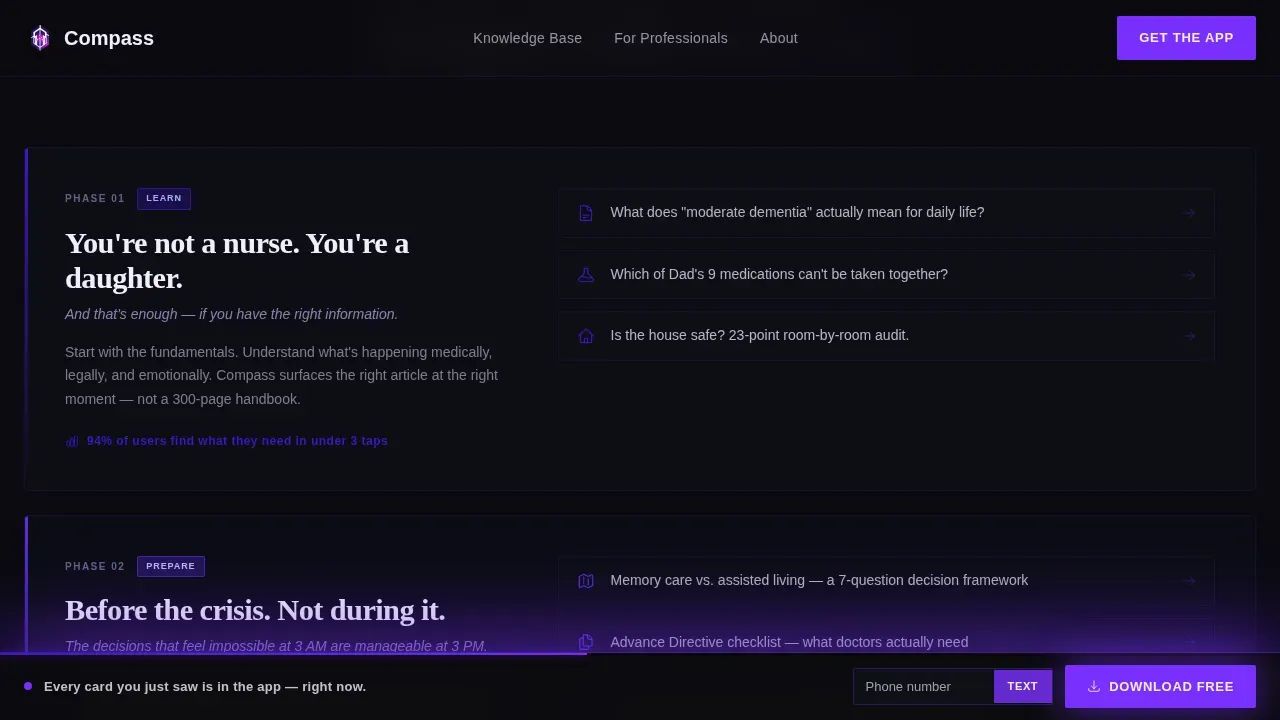
- A three-phase journey escalation section moving visitors through Learn, Prepare, and Act Now, plus a social proof section, an SMS download form, a floating scroll-linked call-to-action bar, and a minimal developer-style footer.
Feature list
This landing page template is built around six key design and functional capabilities. Each one is grounded in what the brief specifies and what the target users actually need.
Dark Full-Bleed Hero with Constellation Search
The hero section fills the entire viewport with void black (#0B0B0F). A single search bar pulses with a soft violet glow at center screen. Above it, oversized brutalist sans-serif typography sets the prompt: "What do you need to know?" Behind the bar, dozens of topic nodes drift slowly like constellations, each one clickable and each one a direct window into the knowledge base. This hero section is critical for making a strong first impression and capturing immediate user interest.
Asymmetric Bento Grid Knowledge Explorer
The bento grid is the core of the interactive elements on this page. Each cell is a different content category: a medication card with a real drug interaction example, a video thumbnail demonstrating a care technique, a decision tree for choosing between assisted living and memory care. Hovering any cell expands it with a glowing indigo border and a content preview. The grid rearranges subtly as visitors engage, surfacing related topics and making the landing page feel alive. This level of interactivity is key to user engagement throughout the scroll session.
Three-Phase Journey Escalation Section
This section structures the page narrative around how caregivers actually experience the process of managing a parent's decline. The three phases, Learn, Prepare, and Act Now, escalate from informational to emotional to urgent. Each phase includes real content previews, not placeholder promises. This mirrors real user behavior and keeps the motion of the page purposeful.
Scroll-Linked Floating Call-to-Action Bar
The primary call to action, "Download the Caregiving Companion," is pinned as a floating bottom bar. As visitors scroll deeper into the page, the bar intensifies its violet glow. This scroll-linked animation creates a dynamic feedback loop between user behavior and visual urgency. It keeps the conversion goal visible at every scroll depth without interrupting the content experience.
SMS Download Form
A secondary conversion path lets visitors text the app download link to themselves by entering only a phone number. One field, no friction. This form exists because the person researching on a laptop at 2 AM needs the app on their phone at tomorrow's doctor visit. Keeping lead capture forms extremely short is a proven principle of effective landing page design, and this template applies it directly.
Social Proof and Trust Section
The social proof section includes specific caregiver quotes, usage statistics, and professional endorsements from home health aides and geriatric social workers. Trust indicators like these are placed prominently because they address the credibility questions visitors bring when evaluating a health information service. Incorporating social proof directly influences new visitors and increases the likelihood of download.
Page sections overview
| Section | Purpose |
|---|---|
| Dark Hero Viewport | Establish depth and urgency with pulsing search bar and floating topic constellation nodes |
| Bento Knowledge Explorer | Show real content categories through interactive, expandable bento grid cells |
| Journey Escalation | Guide visitors through Learn, Prepare, and Act Now phases with real content previews |
| Social Proof Block | Build credibility with caregiver quotes, usage statistics, and professional endorsements |
| SMS Download Form | Capture phone number with a single-field form to send the app download link directly |
| Floating call to action Bar | Keep the primary download call to action visible and intensifying throughout the scroll session |
| Minimal Footer | Deliver copyright, essential links, and social icons in a clean developer-style footer |
Design & branding system
The visual identity is built on the Electric Indigo color system applied through a Bold Brutalist and neo brutalism design language. The result is a web design concept that feels unapologetically modern and completely unlike the soft, sympathetic aesthetic most caregiving platforms use. The color contrast between void black backgrounds and clinical white text is sharp and deliberate. Every ui element, from bento cells to the floating bar, follows the same raw logic.
- The color palette uses void black (#0B0B0F) for backgrounds, deep indigo (#3D17C6) as the primary accent, hot violet (#7B2FFF) for glowing interactive states, and clinical white (#F0EEFF) for text and card surfaces. This color contrast ensures immediate legibility and visual consistency across every section.
- Typography combines Fraunces display serif for emotional weight in headlines with DM Sans for body utility text. Both fonts are rendered at oversized, heavy weights. Headlines address pain points directly and state the value proposition clearly without softening the message.
- Icons, tags, and links use hard-edged, block-style treatment consistent with neo brutalism principles. There are no rounded corners, no gradient softness, and no pastels anywhere in the layout.
Mobile & speed optimization
This landing page is built mobile-first because the primary user is on a laptop at 2 AM but needs the app on their phone the next morning. The layout must work seamlessly across both contexts. Responsive design is essential here, not optional.
- The bento grid layout reflows for smaller screens, maintaining the visual hierarchy and keeping all interactive elements accessible with large touch targets. Navigation links remain visible rather than hidden behind collapsed menus, following sound usability principles.
- Images across the landing page should use descriptive alt tags for accessibility and to support search engine indexing. Developers should compress images before deployment to maintain fast load times, particularly for the constellation animation assets in the hero section.
How this template helps you convert
A well-structured landing page minimizes cognitive load and guides users toward a single desired action. This template focuses every design decision on one outcome: the app download. It earns the conversion by proving the knowledge is already inside the app, not by promising it later.
- The hero section creates immediate proof of depth. Visitors see real topic nodes like "Hospice Eligibility," "Wandering Locks," and "Medicare Part D" drifting across the screen before they scroll. This moves users from skepticism to curiosity within the first session seconds and gives them clear next steps without overwhelming them.
- The scroll-linked floating bar and the SMS form create two frictionless conversion paths. The floating bar intensifies its glow as visitors move deeper, matching emotional urgency to visual feedback. The SMS form removes all barriers for the late-night laptop user who needs access to the app on their phone by morning.
Other information about this template
This section covers additional practical details that help developers, designers, and product teams evaluate and deploy this template confidently. The template is built with Tailwind CSS, a utility-first framework that allows developers to build custom designs without writing custom CSS. Tailwind CSS makes it easy to customize a template's color scheme to match a brand identity, and responsive utilities in Tailwind CSS make it simple to create mobile-friendly websites. Templates built with Tailwind CSS can be optimized for performance, ensuring fast load times. Tailwind CSS allows for easy integration with analytics tools to track user interactions, and Tailwind CSS supports the creation of custom components that fit seamlessly into a design.
This is the Compass bold brutalist senior care knowledge base landing page template. It was designed at the intersection of the Electric Indigo color system, the Interactive Explorer creative direction, and the App Download landing page direction.
- Developers can use Google Analytics to track user engagement and understand user behavior across the page. Google Analytics integration helps teams evaluate which bento cells receive the most hover interactions and which scroll depths trigger the most SMS form submissions. Persistent user sessions can be configured to preserve user preferences across visits.
- The template supports dynamic content structures. No-code and low-code tools allow users to adapt the bento grid without extensive programming knowledge. Users can build on this template using natural language prompts in compatible no-code platforms, enabling rapid deployment without traditional coding workflows. AI-powered no-code platforms can automate backend processes and simplify app development on top of this foundation.
- The footer follows a GitHub Developer Minimal pattern with copyright text, essential links, and social icons. Developers can add a newsletter signup or subscribe prompt to the footer without disrupting the primary conversion flow. The footer also supports a logo placement and contact links.
- The template uses clean, semantic HTML and Tailwind CSS, which are essential for SEO. Proper use of header tags, alt tags for images, and descriptive meta tags supports search engine indexing. A well-optimized landing page built with Tailwind CSS can significantly improve search engine rankings.
- The landing page design scales well beyond the senior care niche. The same bento grid structure, neo brutalism visual language, and scroll-linked animation system work for SaaS apps, e commerce product pages, and agency landing page projects. Teams building e commerce stores, blogs, or other digital service pages can adapt the layout by swapping content categories and adjusting brand colors.
- Tips for customization include: change colors by updating the Tailwind CSS configuration file, swap fonts in the typography settings, and update the logo and brand name in the header and footer. Save a working copy of the project before making structural changes to the bento grid layout. The code is organized so that each section is a modular component, making the process of adapting the template straightforward for developers at any experience level.
Theme
Bold Brutalist
Creative direction
Interactive Explorer
Color system
Electric Indigo
Style
Bento Grid
Direction
App Download
Page Sections
Dark Full-bleed Hero with Constellation Nodes
Interactive Bento Grid Knowledge Explorer
Three-phase Journey Escalation Section
Scroll-linked Floating Call-to-action Bar
Single-field SMS Download Form
Social Proof and Trust Section
Related questions
Can I use this template for a different type of app or service?
How does the SMS download form work in this template?
Does the template include real eldercare content?
Is the bento grid layout customizable?
What animation and motion effects are included in the template?



