Compass - Trusted Seniorcare Landing Page Template
Compass is a split-screen landing page template built for senior care membership sites. It presents a searchable, filterable directory of senior care providers through an interactive explorer layout. The design uses dark glass panels, an AI Iridescent color system, and a scroll-driven demo flow that shows visitors exactly what the membership contains before asking for commitment.
by Rocket studio
Quick summary
Compass is a single-page, split-screen landing page template designed for senior care membership sites. It guides families through a visually rich directory experience, using interactive scroll sections and a click-through call-to-action flow. The template is built for one goal: turning overwhelmed visitors into confident members.
Who this template is for
This template is built for operators and founders running senior care membership platforms. The design and content flow speak directly to the audiences those platforms serve, while giving the platform owner a credible, trust-building first impression.
- Senior care directory founders who need a landing page that earns trust before asking for sign-up
- Geriatric care managers building referral networks and looking to attract professional members
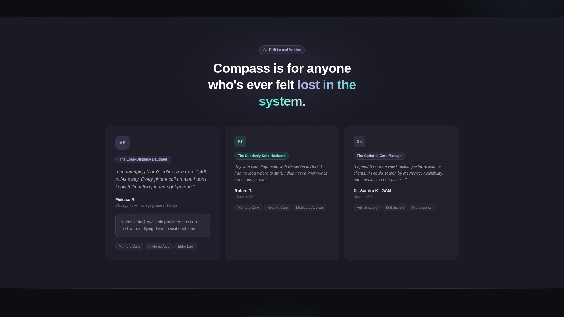
- Digital product creators launching care-navigation platforms aimed at families managing elder care remotely
What problem this template solves
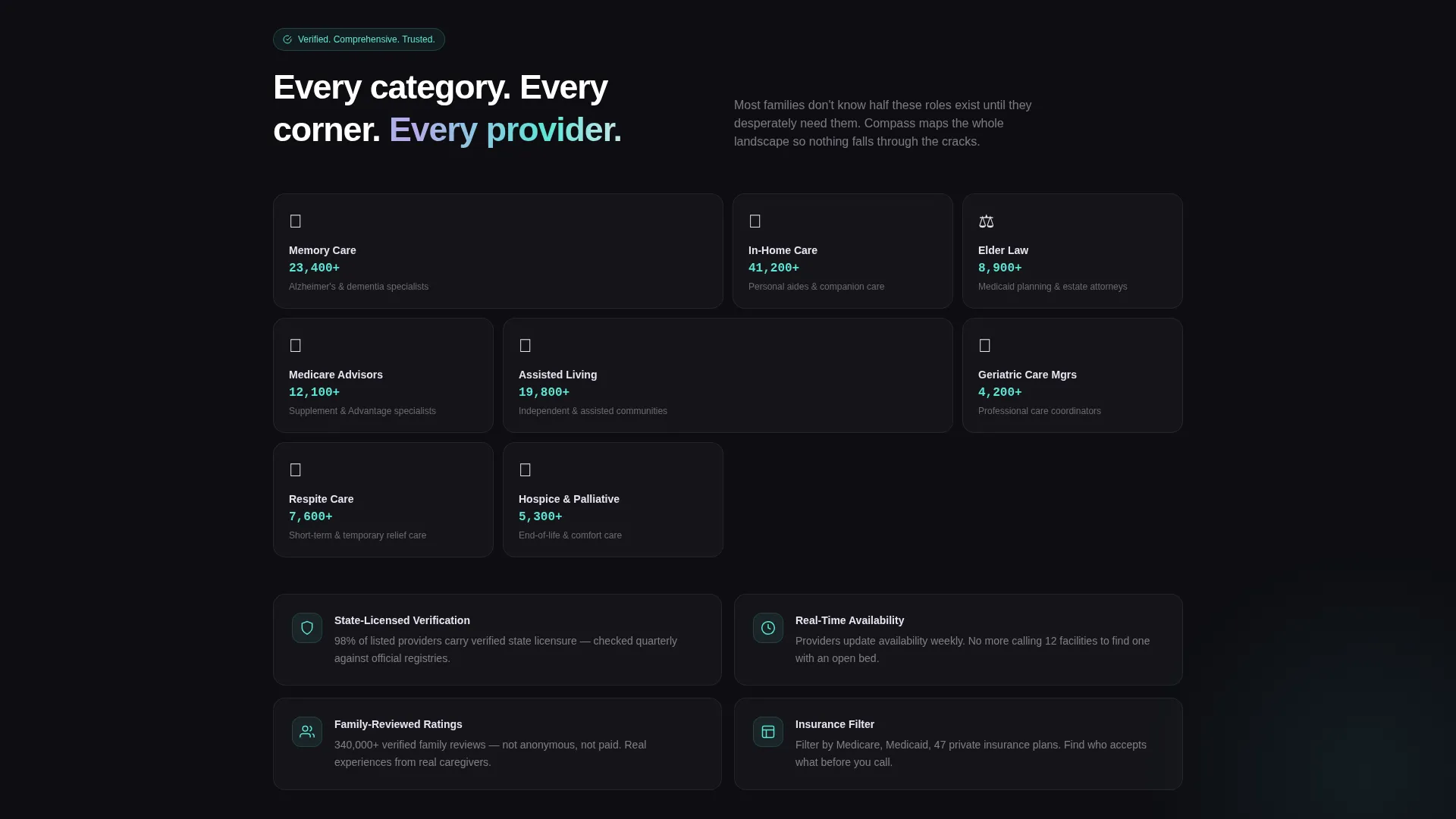
Families searching for senior care are overwhelmed. They face hundreds of provider types, from memory care facilities and in-home aides to elder law attorneys and Medicare supplement advisors, with no reliable way to compare or filter. A generic landing page cannot communicate that depth. This template solves that by letting visitors experience the directory before they commit.
- Visitors leave before signing up because they cannot tell what the membership actually contains
- The emotional weight of elder care decisions demands trust signals that most tech landing pages skip entirely
- A single call-to-action page with no form reduces friction for hesitant or time-pressed family caregivers
What you get with this template
You get a fully structured, single-page landing page with a 50/50 split-screen layout throughout. Every section is designed as an interactive discovery moment rather than a passive scroll. The page includes two calls to action, a scroll-driven scenario explorer, and a complete visual identity system.
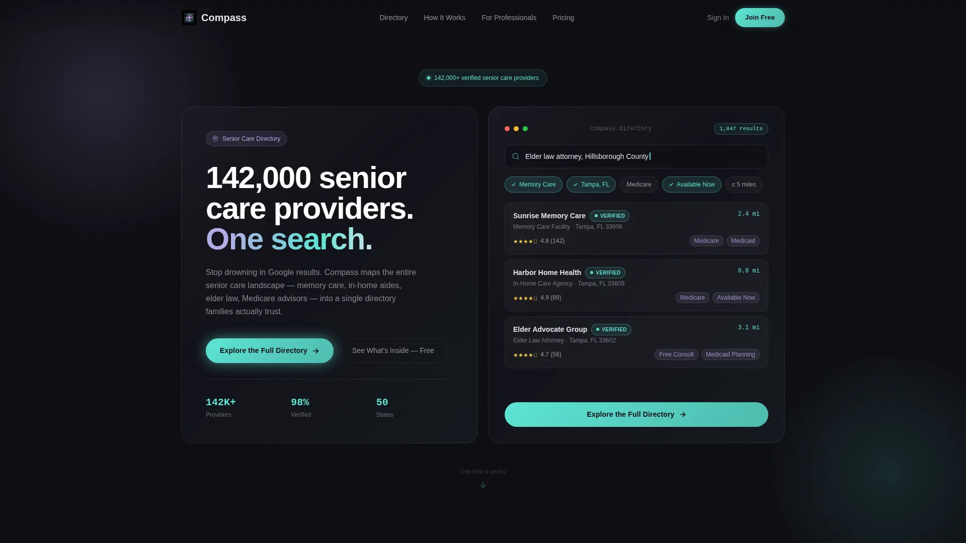
- A dark glass panel header with a live-feeling search interface and the primary call-to-action button
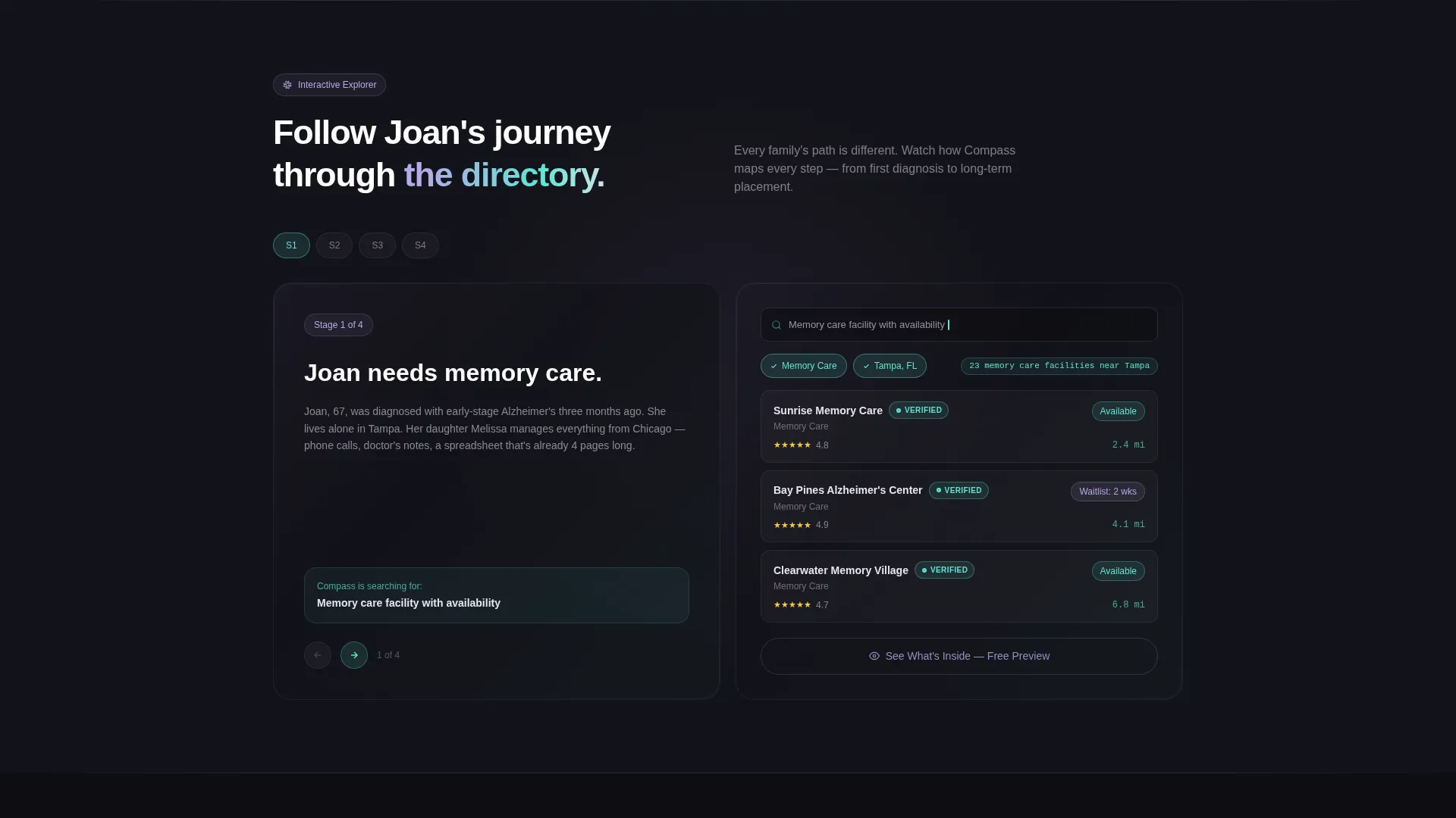
- A scroll-driven interactive explorer section with a fictional family scenario that deepens with each scroll step
- A sticky secondary call-to-action button that appears after the second interactive section for hesitant visitors
Feature list
This template delivers a focused set of page-level features grounded in the source brief. Each feature serves the core goal of converting uncertain visitors into members.
Split-Screen 50/50 Layout
The page divides every major section into two equal halves. The left side anchors context, such as a family scenario or headline, while the right side presents the active, explorable component. This structure keeps visitors oriented while showing the product in motion.
Dark Glass Panel Header
The header opens with two translucent, smoke-dark glass rectangles floating against a deep obsidian background. The left panel holds the headline. The right panel displays a glowing search interface with pre-populated filters for care type, zip code, insurance accepted, and availability. A subtle parallax shift responds to mouse movement.
Scroll-Driven Interactive Explorer
Below the header, the left half locks to a fictional family scenario while the right half animates filters, populates results, and flips provider cards to reveal ratings, specialties, and verified badges. As the visitor scrolls, the scenario deepens, shifting from memory care to elder law attorneys, Medicaid consultants, and respite care.
Click-Through Call-to-Action Architecture
There is no form on this page. The primary call-to-action, "Explore the Full Directory," appears first inside the header's right glass panel and repeats as a sticky button after the second interactive section. A secondary call-to-action, "See What's Inside - Free Preview," anchors the mid-page explorer for visitors who need more before committing.
AI Iridescent Color System
The visual identity uses deep obsidian, holographic lavender, soft pearl shift, and prismatic teal as an accent on interactive hotspots and hover states. The palette feels technological and warm at the same time, avoiding the clinical coldness that often alienates elder care audiences.
Provider Card Flip Components
Inside the explorer section, provider cards animate on scroll to reveal a second face showing ratings, specialties, and verified badges. This component teaches visitors what a real directory result looks like without requiring an actual login.
Page sections overview
| Section | Purpose |
|---|---|
| Dark Glass Header | Introduces headline, live search interface, and primary call-to-action |
| Interactive Explorer | Demonstrates directory depth through scroll-driven scenario and animated results |
| Scenario Deepening | Shifts care type filters per scroll step to show full directory breadth |
| Sticky call to action Button | Keeps primary action visible after the second interactive section |
| Mid-Page Explorer Anchor | Holds secondary call-to-action for hesitant visitors mid-scroll |
Design & branding system
The Compass template uses an AI Iridescent color system that balances futuristic design with human warmth. Every color decision is intentional: the dark base feels focused and trustworthy, while the iridescent accents signal intelligence without intimidation.
- Core palette: deep obsidian (#0D0D12) as background, holographic lavender (#B8A9E8) for panel sheen, soft pearl shift (#E8E4F0) for text surfaces, and prismatic teal (#5DE5D5) for interactive hotspots and hover states
- Visual texture: translucent dark glass panel effects with faint iridescent edge reflections and a subtle mouse-parallax breathing motion on the header
- Theme: Directory and Discovery, where every visual element reinforces the feeling of finding clarity inside a complex landscape
Mobile & speed optimization
The template is designed with a single-page, scroll-led structure that keeps the overall page weight focused. The split-screen layout and interactive explorer components are built for visual impact without unnecessary complexity.
- The 50/50 split-screen adapts naturally to narrower viewports, stacking panels vertically on smaller screens
- Sticky call-to-action placement ensures the primary action remains reachable at every scroll depth on mobile
How this template helps you convert
This template earns the click by demonstrating value before asking for commitment. The page teaches visitors what the membership contains through lived experience rather than bullet points.
- The interactive explorer lets visitors almost use the directory, which removes the biggest objection: "I don't know what I'm paying for." By the time they reach the bottom, the product has already worked for them.
- The two-tier call-to-action system serves both ready buyers and hesitant ones. The primary button appears early and stays sticky. The secondary "Free Preview" anchor catches visitors who need one more reason to act.
Other information about this template
Compass is categorized under Technology with a subcategory of Senior Care Digital Presence. It is purpose-built for the senior care membership site niche and scored a strong intersection match in that category. The template uses a matched intersection of theme, creative direction, color system, layout style, header concept, and landing-page direction, making it a cohesive system rather than a collection of independent design choices.
- Template style: Split Screen (50/50), with the Interactive Explorer creative direction driving every scroll section
- Header concept: Dark Glass Panels, paired with the AI Iridescent color system for a unified visual language
- Landing page direction: Click-Through, with no form on the page and all actions routing to a membership signup flow
Theme
Directory & Discovery
Creative direction
Interactive Explorer
Color system
AI Iridescent
Style
Split Screen (50/50)
Direction
Click-Through
Page Sections
Split-screen 50/50 Layout
Dark Glass Panel Header
Scroll-driven Interactive Explorer
Click-through Call to Action Architecture
Provider Card Flip Components
AI Iridescent Color System
Related questions
Who is this landing page template designed for?
Does this template include a sign-up form?
Can I customize the fictional family scenario in the explorer section?
What types of senior care providers does the explorer section showcase?
How does the sticky call-to-action button work on this page?



