Verified Accounting Services Landing Page Template
Ledger is a bento grid landing page template built for high-caliber accounting firms. It follows a Problem-to-Solution arc, opening with a dashboard-style header and moving through pain-point cards, team profiles, and animated outcome counters. The dark Data Command visual identity and a single click-through call to action make it feel authoritative, precise, and ready to earn trust fast.
by Rocket studio
Quick summary
Ledger is a single-page bento grid template for accounting firms that need to project forensic precision and strategic authority. The scroll arc moves visitors from recognized pain points through credentialed team introductions to collective outcome data. One clear call to action closes the page: "See How We'd Handle Yours."
Who this template is for
This template is built for accounting practices that serve sophisticated clients. It works best when the firm has credentials, outcome data, and individual specialists worth showcasing.
- CPAs and forensic accounting teams serving mid-market companies, founders facing audits, or family offices managing complex multi-generational wealth
- Boutique firms wanting a premium, high-trust first impression without relying on a contact form
- Firm principals or marketing leads who want a template that does the persuasion work through evidence, not copy volume
What problem this template solves
Most accounting firm pages either look generic or bury their best proof in walls of text. Prospects with real financial complexity need to feel confident fast. This template solves the first-impression problem by structuring the page as a logical evidence trail.
- Visitors land on a dashboard-style header that signals data fluency before a single word is read
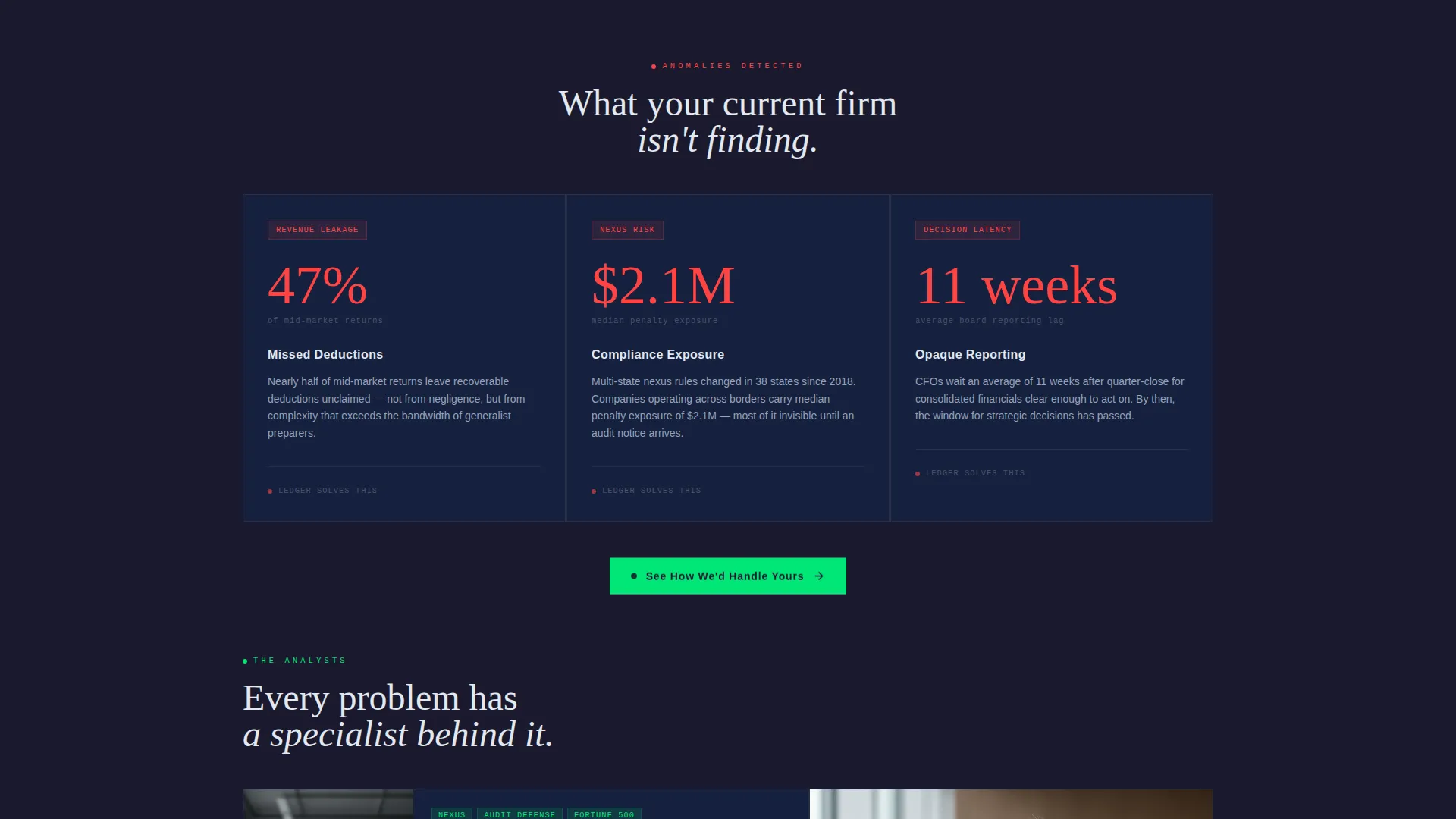
- Pain-point cards with stark statistics make the problem feel real and recognized
- Team cards with micro-case-study metrics replace vague credential lists with specific proof
What you get with this template
You get a fully structured bento grid landing page ready to customize with your firm's real data, portraits, and outcomes. Every layout decision is made to support the scroll arc from urgency to confidence.
- A dark Data Command visual identity using woven graphite, machined titanium, instrument-panel silver, and signal green interactive accents
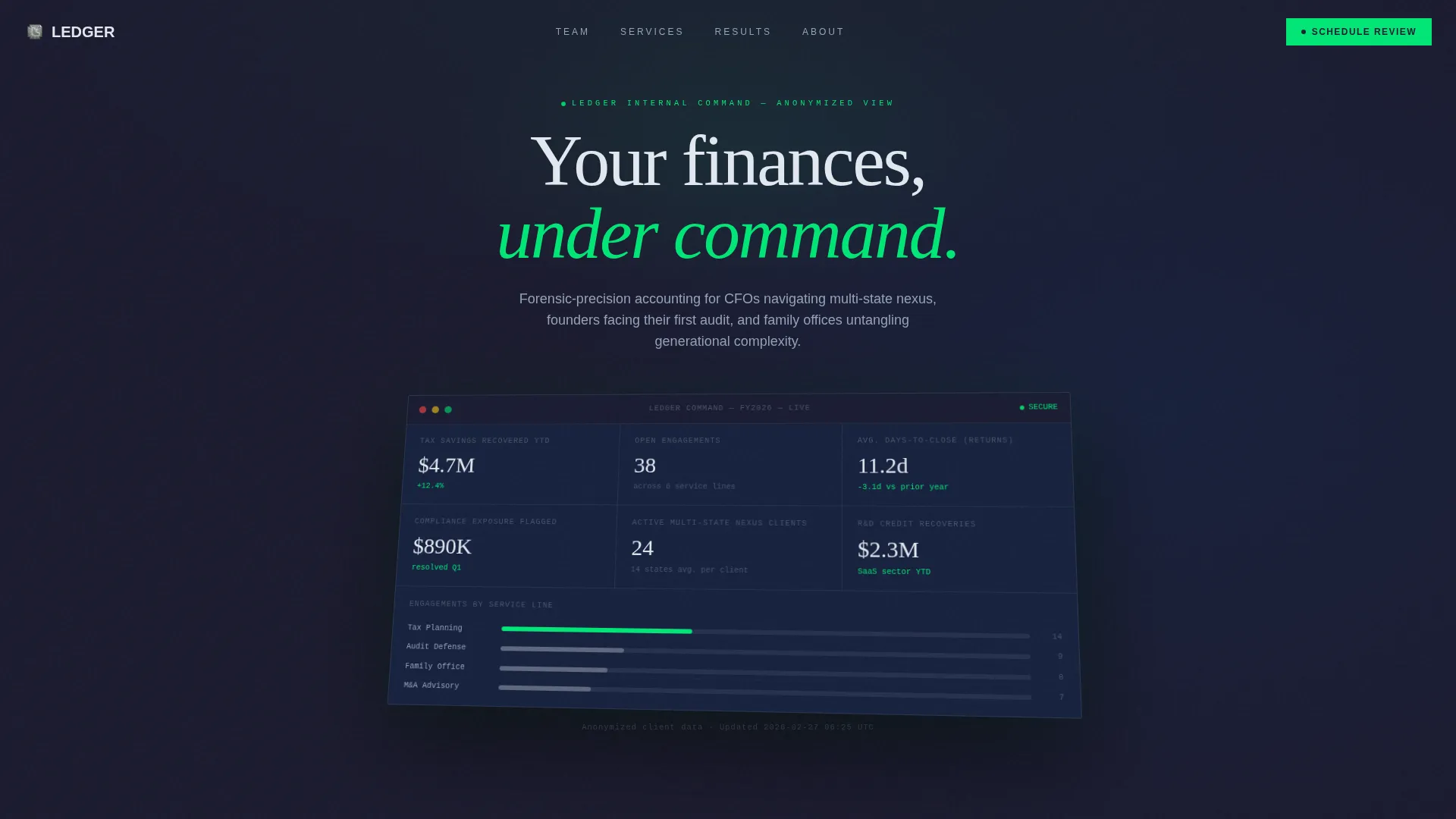
- A header block styled as a product screenshot at a shallow isometric angle on the graphite background
- Three pain-point bento cards, a team member row with portrait and specialty cards, and a full-width animated impact counter row
Feature list
This section describes the key built-in capabilities that make Ledger distinct from a standard firm template.
Bento Grid Layout Architecture
The entire page is built on a responsive bento grid. Cards resize and reflow across the scroll, creating a structured visual rhythm that feels organized and intentional without feeling rigid.
Problem-to-Solution Scroll Arc
The layout is intentionally sequenced. Pain-point cards appear first with red-shift accents and single stark statistics. Team member cards follow immediately, each pairing a portrait with a specialty and a micro-case-study result. The arc resolves in a collective impact row.
Isometric Dashboard Header
The header features a stylized product screenshot at a shallow isometric angle on a deep graphite background. It gives the impression of a live internal dashboard, signaling data competence before the visitor reads anything.
Signal Green Interactive States
The Carbon Fiber color system reserves signal green (#00E676) exclusively for interactive moments: hovered cards, live metrics, and call-to-action edges. Every other surface stays dark and controlled, so green only appears when something deserves attention.
Animated Impact Counter Row
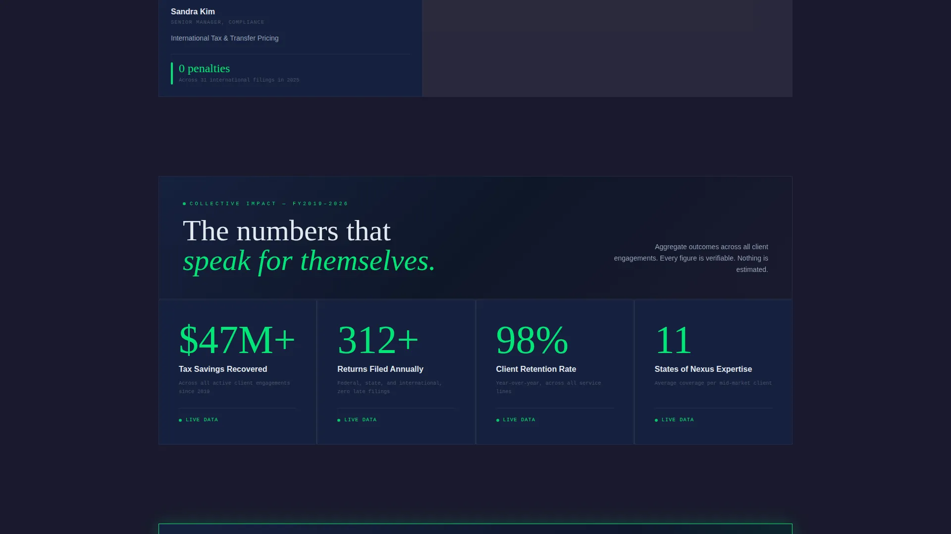
The final bento row is a single wide card that displays the team's collective outcomes as animated counters. This closes the scroll arc with quantified proof rather than a generic summary statement.
Floating and Anchored call to action Design
The call to action "See How We'd Handle Yours" appears twice: first as a floating pill after the pain-point row, then anchored inside the final bento cell. No form is used. The page earns the click through accumulated evidence.
Page sections overview
| Section | Purpose |
|---|---|
| Isometric Dashboard Header | Opens with a stylized internal dashboard screenshot to signal data command |
| Pain Point Cards | Three titanium cards with red-shift accents and stark statistics surface urgent problems |
| Floating call to action Pill | A pill-style call to action appears after pain points to capture early, high-intent visitors |
| Team Member Row | Portrait cards pair each specialist with their focus area, years of experience, and a micro-case-study metric |
| Collective Impact Row | A full-width animated counter card displays the firm's combined outcomes to close the arc |
| Anchored Final call to action | The primary call to action locks into the last bento cell as a permanent, confident close |
Design & branding system
The visual identity follows a Data Command theme built on the Carbon Fiber color system. The palette is deliberately restrained: every illuminated element earns its presence.
- Core surfaces use woven graphite black (#1A1A2E) and machined titanium (#16213E); text is rendered in instrument-panel silver (#E2E8F0) for clear contrast without harshness
- Signal green (#00E676) is reserved strictly for interactive states such as hovered cards, live metric highlights, and call-to-action edges, keeping the palette disciplined and purposeful
- Red-shift accents appear only on the pain-point cards to create visual urgency in the problem row before the palette resolves back to controlled dark tones
Mobile & speed optimization
The bento grid structure is built to reflow cleanly across screen sizes. The layout adapts without losing the deliberate visual hierarchy that makes the scroll arc work.
- Cards stack in a logical vertical order on smaller screens, preserving the pain-then-solution narrative sequence
- The isometric header, floating call to action pill, and anchored final call to action all maintain their visual roles regardless of viewport width
How this template helps you convert
Ledger is designed around earned confidence. The page does not ask for anything until it has built a case. Every layout element is positioned to reduce hesitation and increase the perceived cost of not clicking.
- The dashboard header and pain-point row establish immediate relevance, making mid-market CFOs, founders, and family office clients feel recognized within seconds of arriving
- Team cards with specific micro-case-study metrics, such as "Recovered $2.3M in R&D credits for a SaaS client," replace generic bio copy with verifiable proof that raises conversion intent before the call to action appears
Other information about this template
This template is categorized under accounting firm website templates and is specifically designed for the accounting firm team page niche. It is a strong fit for firms wanting a technology-forward presentation without sacrificing professional authority.
- The template style is Bento Grid, the theme is Data Command, and the creative direction follows a Problem-to-Solution Arc with a Product Screenshot header concept
- The landing page direction is Click-Through, meaning the page is optimized to drive a single confident action rather than capture leads through an on-page form
- This template sits in the Technology category and is well suited for firms whose clients include technology companies, SaaS founders, and data-driven financial teams who respond to a precise, instrument-grade visual language

Theme
Data Command
Creative direction
Problem→Solution Arc
Color system
Carbon Fiber
Style
Bento Grid
Direction
Click-Through
Page Sections
Bento Grid Page Layout
Problem-to-solution Scroll Arc
Isometric Dashboard Header
Signal Green Interactive States
Animated Collective Impact Counters
Floating and Anchored Call to Action Placement
Related questions
Does this template include a contact form?
Can I replace the dashboard screenshot with my firm's own visuals?
How do I update the team member cards?
What types of firms benefit most from this template?
Is the bento grid flexible for different team sizes?



