Swift iOS Development Course Landing Page Template
Compile is a production-grade Swift and iOS development landing page template built for online courses targeting serious developers. It features a modular card grid layout, a Corporate Precision visual identity with a Botanical color system, freemium conversion paths, student case study storytelling, and curriculum module cards that pair code snippets with simulator output, all optimized for desktop-first developer audiences.
by Rocket studio
Quick summary
Compile is a single-page landing page template designed for Swift and iOS development online courses. It uses a modular card grid to guide visitors from inspiring student stories through dense curriculum detail, ending at a clear freemium call to action. The page feels like a freshly opened Xcode project: structured, purposeful, and ready for real work.
Who this template is for
This template is built for course creators, developer educators, and EdTech teams who teach iOS development at a serious level. It speaks directly to the audiences those courses serve: mid-career developers pivoting from backend or Android environments, bootcamp graduates who can build simple apps but freeze at architecture decisions, and team leads who need enough Swift fluency to review pull requests with confidence.
- Course creators selling production-grade Swift and iOS development curriculum to working professionals
- Developer educators who need a page that earns trust before asking for commitment
- EdTech teams converting developer audiences through freemium or free-trial models
What problem this template solves
Most course landing pages look like marketing pages written by marketers. Developers notice immediately. They scan for signal, real project examples, honest scope, and proof that graduates actually ship iOS apps into the app store. Generic templates cannot convey that credibility. Compile solves this by structuring the page around measurable student outcomes, real code, and a curriculum that shows its depth before asking for enrollment.
- Developer visitors distrust vague promises; this template leads with specific graduate outcomes and employer logos
- Bootcamp graduates and career pivoters need to see architecture-level content, not just hello-world swift tutorials
- Freemium conversion requires a frictionless first step; this template makes "Start Module One Free" the dominant call to action
What you get with this template
You get a fully structured, modular landing page built to convert developer visitors into enrolled students. Every section is purposeful. The layout moves visitors from social proof and inspiration through curriculum depth and into a low-friction signup flow, all without a single unnecessary element.
- A Logo Bar hero section, three student case study cards, curriculum module grid, outcomes stats bar, testimonial strip, and a Pattern 1 linear single-row footer
- A sticky bottom call-to-action bar, a two-field modal signup form (email and primary language dropdown), and a secondary syllabus PDF lead capture path
- Full design system with JetBrains Mono for headlines and code blocks, DM Sans for body text, and a four-color Botanical palette
Feature list
Modular Card Grid with Case Study Narrative
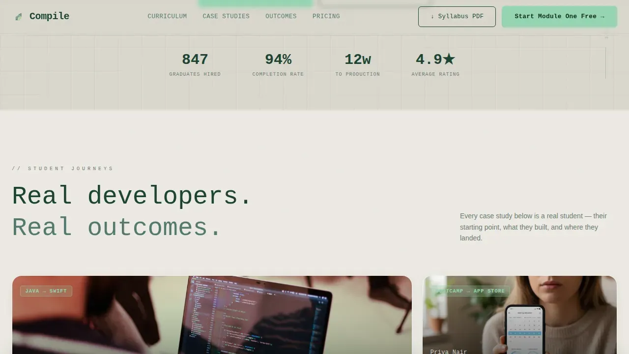
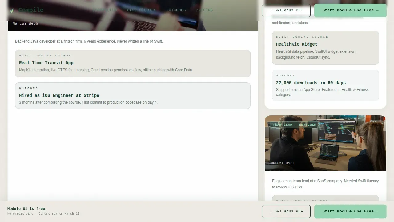
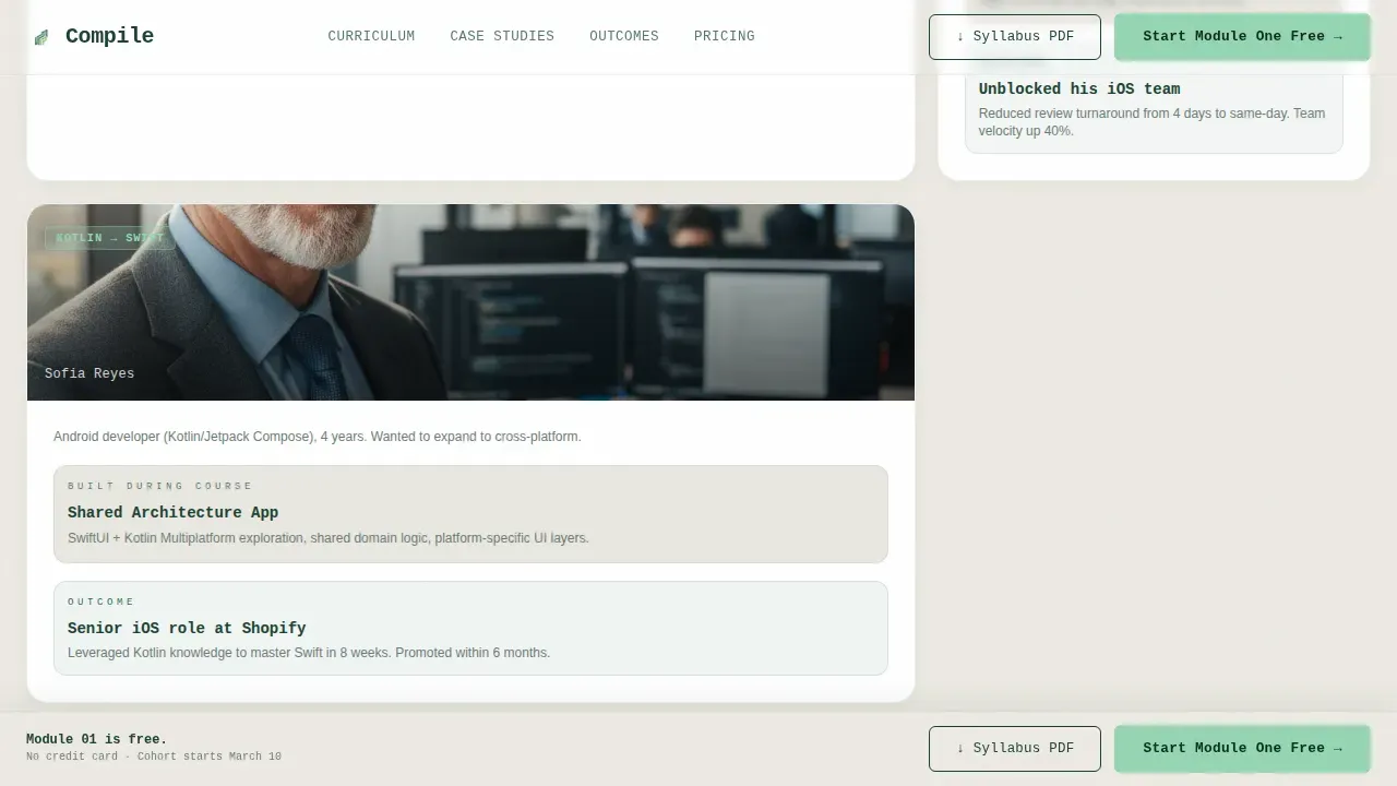
The page is organized as a card grid that tells real stories. Each card opens with a student's starting point, backend Java developer, self-taught hobbyist, or computer science student, and moves through their capstone project to a measurable outcome. Cards shift from wide, breathing case study layouts near the top to dense, information-rich module breakdowns as the visitor scrolls deeper. This mimics the feeling of moving from inspiration into focused study. SwiftUI makes it easier to imagine clean, modular user interface like this, and this template translates that clarity into a web page layout that developers immediately respect.
Curriculum Module Cards with Code and Simulator Views
Each curriculum module is represented as a card with a code snippet on one side and the running simulator output on the other. This dual-panel format lets visitors see exactly what they will build in each module. The data shown is real: Core Data stacks, async networking layers, MapKit integration, HealthKit widgets, and App Store submission pipelines. Visitors who browse these cards understand the course is not teaching toy apps. The code side uses monospaced typography consistent with Xcode's own editor, reinforcing that this is a page built by people who understand the development environment.
Freemium Conversion Flow with Sticky Call to Action
The primary conversion path is "Start Module One Free." This call to action appears first inside the header and again as a sticky bottom bar after the third card row, so it is always accessible no matter how far a visitor has scrolled. Clicking opens a lightweight two-field modal form: email address and current primary language, offered as a dropdown covering Python, Java, Kotlin, JavaScript, and Other. No credit card is required. A secondary path, "Download the Syllabus PDF," captures leads who are not ready to commit but want to compare against other courses before deciding.
Logo Bar Social Proof Header
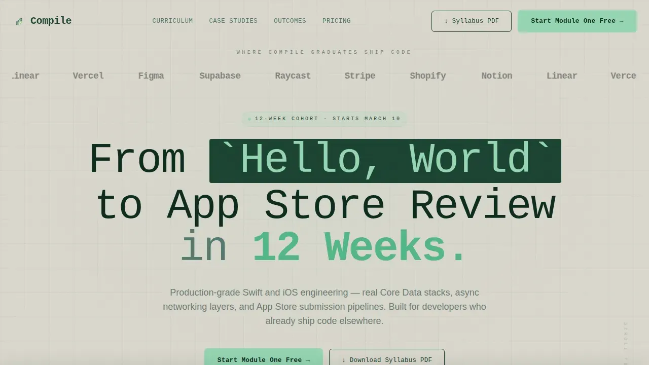
The header opens with a horizontal strip of employer logos representing companies where graduates now ship iOS apps. This is the first thing a visitor sees, and it delivers the kind of social proof that makes a developer pause mid-scroll. Below the logo bar, a single monospaced headline reads "From Hello, World to App Store Review in 12 Weeks." No hero image is used. The restraint signals that the course respects the visitor's time the way good code respects memory. Including authentic employer recognition as trust signals is one of the most effective ways to convert skeptical technical audiences.
GSAP ScrollTrigger Animations and Stagger Reveals
The template uses GSAP ScrollTrigger to animate card grid sections as they enter the viewport. Cards stagger into view rather than appearing all at once, creating a sense of progressive revelation that matches the course's own narrative arc. A marquee text element runs horizontally across one section, adding kinetic energy without distracting from the content. These animations use client-side rendering while static content sections use server components, keeping the page responsive and snappy for developers accessing it from a Mac or any device.
Outcomes Stats Bar and Testimonial Strip
A large-number outcomes bar, anchored in deep chlorophyll green, displays the metrics that matter to developer visitors: hire rates, app download counts, and course completion figures. Below it, a horizontal testimonial strip pairs graduate photos with named quotes. Both sections provide the kind of specific, verifiable social proof that converts developers who have already been burned by overpromising courses. Collecting user feedback from real graduates and featuring it prominently is what separates this template from generic course pages.
Page sections overview
| Section | Purpose |
|---|---|
| Logo Bar Hero | Employer logos and monospaced headline establish credibility immediately |
| Student Case Studies | Asymmetric bento grid tells three graduate journeys with real outcomes |
| Curriculum Module Cards | Code-plus-simulator card grid shows what each module actually builds |
| Outcomes Stats Bar | Large-number display anchored in chlorophyll communicates scale of results |
| Testimonial Strip | Horizontal photo-and-quote row delivers named, specific graduate voices |
| Sticky call to action Bar | Persistent freemium prompt appears after third card row and stays visible |
| Modal Signup Form | Two-field form captures email and primary language with no credit card |
| Syllabus PDF Capture | Secondary lead path for visitors comparing courses before committing |
| Footer Row | Pattern 1 linear single-row footer closes the page cleanly |
Design & branding system
The visual identity follows a Corporate Precision theme expressed through a Botanical color system. The palette feels like a well-kept greenhouse inside a corporate campus: disciplined architecture softened by living things. Typography reinforces the developer context at every level, with JetBrains Mono carrying all headlines and code block elements and DM Sans handling body text for readability.
- Warm parchment (#DAD7CD) dominates backgrounds; deep chlorophyll (#1B4332) anchors headers, code blocks, and the stats bar; muted sage (#52796F) separates card surfaces; bright new-growth green (#95D5B2) appears only on buttons and progress indicators
- JetBrains Mono is used for all headline text and code snippets, reinforcing the Xcode-adjacent aesthetic; DM Sans handles body copy for clear, comfortable reading at longer lengths
- Colors, fonts, and spacing follow a consistent system that supports customization without breaking visual coherence
Mobile & speed optimization
The template is desktop-first by design. Developers browsing course pages typically do so on a Mac laptop with a large screen, and the card grid layout is optimized for that context. Full mobile support is included so that the page works correctly on iPhone and iPad, including touch-accessible interactive elements positioned in the lower portion of the screen for comfortable one-handed use.
- Card grid reflows gracefully from multi-column desktop to single-column mobile, preserving the case study narrative structure on smaller screens
- The sticky call-to-action bar and modal form are designed to remain functional and readable on any screen size, from a large desktop display to an iPhone or iPad
- Static content sections use server components while animations and the signup form use client-side rendering, keeping the overall page architecture clean and maintainable
How this template helps you convert
This template is built around a single conversion goal: getting a developer to start Module One for free. Every design and content decision supports that goal without adding friction or distraction.
- The logo bar and case study cards build trust before any ask is made, so visitors arrive at the call to action already convinced that graduates ship real iOS apps into the app store
- The sticky "Start Module One Free" bar stays visible as visitors scroll through curriculum cards, reducing the chance they leave before finding a moment of commitment
- The free module ends on a deliberate cliffhanger, the student's first app compiles and runs, but the architecture will not scale, and Module Two shows them why, creating a natural upgrade motivation that does not require hard sales pressure
Other information about this template
This template covers ground that goes well beyond visual design. The page is structured to communicate course depth to technical visitors who will instantly recognize shallow content. Several practical considerations shaped its construction.
- Swift app templates make it easier to get started building iOS apps without starting from scratch every time; this landing page template follows the same principle by giving course creators a project-ready starting point
- Developing a course page from scratch is a costly and time-consuming process; using a well-structured template reduces risk and allows for faster development and launch
- The compile production grade swift ios development landing page template is designed specifically for the Swift and iOS development education niche, not adapted from a generic course template
- App templates are coded to ensure your app runs efficiently; similarly, this page template is structured to guide visitors efficiently toward the freemium conversion path
- The template supports customization of colors, typography, card content, logo images, testimonial photos, and videos without requiring changes to the underlying layout system
- Including eye-catching images and videos on your landing page can capture the attention of potential visitors; the template provides card slots for demo videos, simulator screenshots, and student profile images
- Social media channels such as Twitter and video platforms such as YouTube are top discovery channels for developer audiences; the page's content structure makes it easy to share specific cards or sections as posts across those platforms
- Tracking and optimizing landing page performance is key to improvement; the template's clean section structure makes it straightforward to integrate analytics events and track user behavior at each scroll depth
- To develop iOS apps with Swift, learners need Xcode, which is the integrated development environment (Xcode IDE) provided by Apple for building iOS apps; the curriculum module cards reference Xcode directly so visitors immediately understand the tools they will use
- Most production iOS apps need authentication, data persistence, and push notifications; this template's curriculum cards highlight those features explicitly so visitors understand the course covers what real apps require
- The page title, meta description, and open graph fields are editable within the template so course creators can align the page with their own branding and search results positioning
- Machine learning topics can be added as additional module cards if the course curriculum includes on-device machine learning content, since the grid system is modular and extensible
- Helpful resources such as documentation links, swift tutorials, and further reading can be added to the footer or as supplemental card elements without disrupting the primary conversion flow
- Browsing the template is straightforward; the modular card system means you can review each section independently and decide which to customize or reorder for your specific course structure
- The template supports upload of custom employer logos, student profile images, and app store assets within the logo bar and case study card slots
- For teams that want to publish the page quickly, the layout is structured so that placeholder content is replaced section by section without needing to redesign the overall grid
Theme
Corporate Precision
Creative direction
Case Study Narrative
Color system
Botanical
Style
Card Grid (Modular)
Direction
Freemium/Trial
Page Sections
Case Study Card Grid with Graduate Outcomes
Curriculum Module Cards with Dual-panel Code View
Freemium Signup Flow with Modal Form
Employer Logo Bar and Social Proof Header
Outcomes Stats Bar and Named Testimonial Strip
GSAP Scrolltrigger Animations and Sticky Call to Action
Related questions
Who is this landing page template designed for?
Can I customize the card content, colors, and typography?
Does this template include the signup form and sticky call-to-action bar?
What animation and interactivity is built into the template?
How does the freemium cliffhanger module work in this template?



