Government Software & SaaS Reviews Website Template
Comply is a hub-and-spoke landing page template built for a government review management platform. It opens with an interactive dashboard demo above the fold, then guides visitors through four data-driven spoke sections, each pairing a bold research finding with a direct product connection. The design runs on a terminal-dark acid palette and is built to earn every click-through by the weight of evidence.
by Rocket studio
Quick summary
Comply is a single-page, hub-and-spoke landing page template for a GovTech platform that aggregates citizen reviews of government agencies. It combines a live interactive dashboard header, a sticky anchor navigation rail, and four research-style spoke sections that move public administrators from awareness to action. The entire page is built to earn a click-through before asking for anything.
Who this template is for
This template is built for GovTech founders, public-sector software teams, and agency communications leads who need to turn fragmented constituent feedback into a credible sales conversation. It works best when the product already has data, case studies, or research findings worth presenting.
- City managers and county communications directors who need to prove service responsiveness
- State-level customer experience officers working toward constituent satisfaction benchmarks
- GovTech product teams positioning a review aggregation or public-sector analytics platform
What problem this template solves
Government agencies collect constituent feedback across dozens of disconnected channels: Google reviews, Yelp listings, 311 portals, and social media threads. By the time a department head hears about a service failure, a journalist often already has the story. This template gives the platform a page structure that makes the fragmentation problem undeniable before it offers the solution.
- Administrators lack a unified view of citizen feedback spread across Google, Yelp, and 311 portals
- Service failures surface on social media before internal teams are alerted
- Constituent satisfaction benchmarks go unmeasured because no single data source covers the full picture
What you get with this template
This template delivers a fully structured, single-page layout with high interactivity and a clear conversion path. Every section is purpose-built for a data-heavy, B2G (business-to-government) sales context. Nothing requires a form on the page itself, the click is earned, not demanded.
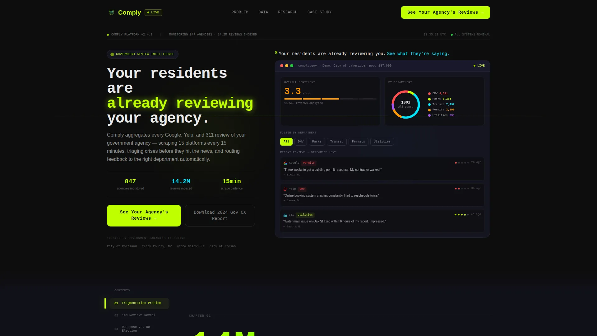
- An interactive above-the-fold dashboard showing fictional city data, live sentiment scores, a donut chart, and a scrolling review feed
- A sticky left-rail anchor navigation linking to four spoke sections structured as chapters of a public-sector research brief
- A primary call-to-action button placed in the anchor nav and at the close of every spoke, plus a secondary email-capture text link for report downloads
Feature list
This template is built around five core structural and interactive capabilities drawn directly from the design brief.
Interactive Above-the-Fold Dashboard
The header embeds a functioning mini-dashboard showing a fictional city ("Demo: City of Lakeridge, pop. 187,000") with live-updating review sentiment scores, a department donut chart, and three recent reviews scrolling in with source icons. Visitors can click department names and watch the data re-sort instantly. The headline types itself in monospace, no static screenshot anywhere above the fold.
Hub-and-Spoke Anchor Navigation
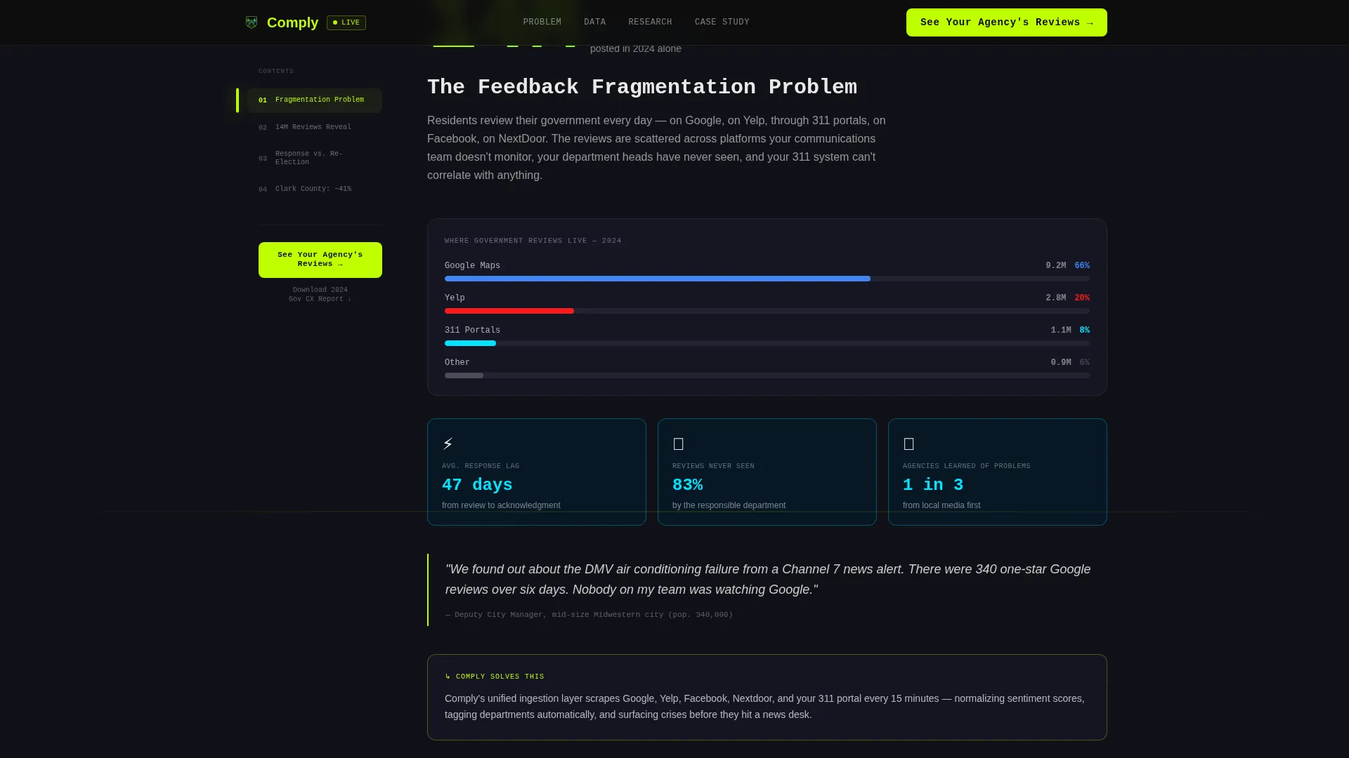
A sticky left-rail navigation anchors to four spoke sections and stays visible as visitors scroll. Each anchor link is labeled like a chapter in a research brief: "The Feedback Fragmentation Problem," "What 14 Million Government Reviews Reveal," "Response Time versus Re-Election Correlation," and "Case Study: How Clark County Cut Complaints 41%." Electric lime highlights the active section at all times.
Data-Led Spoke Sections
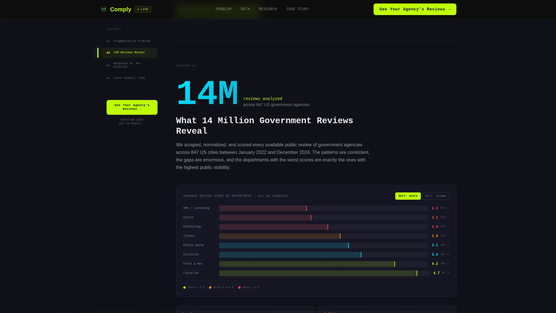
Every spoke section leads with a bold data finding, an oversized statistic, an animated chart, or a pull quote from a real administrator. The section then unpacks methodology and connects the insight directly to a platform capability. This structure mirrors a consulting industry report and builds cumulative evidence before asking for any commitment.
Click-Through Conversion Path
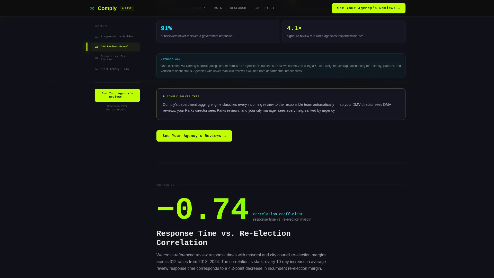
The primary call-to-action, "See Your Agency's Reviews," appears in the sticky anchor nav and closes every spoke section. It routes to a next page where visitors enter their agency name and receive a free snapshot report. There is no form on this page. A secondary text link, "Download the Full 2024 Government CX Report," captures emails for leads not yet ready to demo.
Scroll-Triggered Animation System
The template uses scroll-triggered counters, animated charts, and typewriter headline effects throughout. Intersection Observer logic fires animations only when elements enter the viewport, keeping the experience smooth during a long research-style scroll. The terminal aesthetic, phosphorescent data pulsing against dark backgrounds, reinforces the always-on command center feel.
Page sections overview
| Section | Purpose |
|---|---|
| Interactive Dashboard Header | Demonstrate the product live above the fold before the visitor reads a paragraph |
| Sticky Anchor Nav Rail | Keep all four spoke sections reachable at any scroll depth |
| Spoke 1: Fragmentation Problem | Lead with a stat that frames the core data-silo pain |
| Spoke 2: 14 Million Reviews | Present aggregated research findings with animated data visuals |
| Spoke 3: Response Time Correlation | Connect response speed to re-election outcomes with research backing |
| Spoke 4: Clark County Case Study | Deliver proof via a 41% complaint-reduction result and close with a call-to-action |
| Developer Minimal Footer | Provide lean footer links without distracting from the conversion path |
Design & branding system
The template uses an Acid Digital color system built entirely around terminal-dark backgrounds and phosphorescent accent colors. The result feels like a live operations screen running at 2 a.m., focused, high-contrast, and always in motion.
- Void black (#0D0D0D) and interface gray (#1A1A2E) form the gradient backgrounds that keep sections visually distinct without breaking the nocturnal energy
- Electric lime (#BFFF00) owns every interactive element: hover states, progress bars, anchor nav active indicators, and primary call-to-action buttons
- Scanner blue (#00E5FF) marks data visualizations, donut chart segments, and secondary callout blocks; chalk white (#EAEAEA) handles body text for sustained readability
Mobile & speed optimization
The template is built desktop-first to honor the command center dashboard experience, but the layout is fully responsive for smaller screens. Animations are handled with CSS and Intersection Observer rather than heavy JavaScript libraries.
- The interactive dashboard header adapts its layout for tablet and mobile viewports without losing the live-update behavior
- Scroll-triggered counters and animated charts fire only when elements enter the viewport, reducing unnecessary processing during the initial page load
- The sticky anchor nav collapses gracefully on smaller screens so the conversion path remains accessible throughout the scroll
How this template helps you convert
The conversion strategy is cumulative. By the time a visitor has scrolled through three spoke sections, they are not questioning whether a review problem exists, they are wondering how severe theirs is. The page earns the click rather than demanding it.
- The interactive dashboard above the fold lets visitors experience the product immediately, before any sales copy has to explain what it does.
- Each spoke section builds on the last, layering a data finding, a research methodology note, and a direct product connection that makes the call-to-action feel like a logical next step rather than a hard sell.
- The dual call-to-action structure captures two distinct intent levels: visitors ready to act click through to the agency snapshot report, while those still researching download the Government CX Report and enter the email funnel.
Other information about this template
This template is part of the Startup Velocity theme family and uses the Acid Digital color system. It is designed specifically for business-to-government sales contexts where proof, data, and credibility outweigh traditional feature lists. A few additional details worth noting:
- Typography uses JetBrains Mono for headlines, data displays, and the typewriter effect, paired with DM Sans for body text to maintain readability at length
- The footer follows a developer-minimal pattern (Pattern 8), clean and link-light, so it does not compete with the spoke section calls-to-action
- The template is designed for English (US) localization with US government agency context, including 311 portal references and public-sector terminology throughout
Theme
Startup Velocity
Creative direction
Industry Report
Color system
Acid Digital
Style
Hub & Spoke (Anchor Nav)
Direction
Click-Through
Page Sections
Live Interactive Dashboard Header
Sticky Hub Anchor Navigation
Research-style Spoke Sections
Dual Call-to-action Conversion Path
Scroll-triggered Animation System
Related questions
Does this template include the actual review data shown in the dashboard demo?
Can I adjust the number of spoke sections in this template?
Is there a lead capture form built into this landing page?
Who is this template designed for?
What makes the Industry Report creative direction effective for a B2G audience?



