Specialist Dental Software Privacy Policy & Terms Website Template
Comply is a scroll-reveal landing page template built for dental compliance platforms. It opens with a live terminal audit display, walks visitors through interactive regulatory domains, and closes with a split-view comparison that quantifies the real cost of manual compliance. The Bold Brutalist design and monochrome palette signal precision, authority, and zero tolerance for disorder.
by Rocket studio
Quick summary
Comply is a single-page, scroll-reveal landing page template designed for dental compliance management platforms. It combines a code-terminal header, an interactive regulatory explorer, and a side-by-side comparison layout to guide practice managers, solo dentists, and DSO compliance officers from curiosity to a free audit request.
Who this template is for
This template is built for teams and founders who sell compliance software specifically to dental practices. The layout and copy architecture are calibrated for audiences who live inside regulatory pressure daily.
- Practice managers who handle sterilization logs, radiograph audits, and infection control documentation
- Solo dentists overwhelmed by OSHA, HIPAA, and state dental board requirements
- DSO compliance officers responsible for keeping multiple locations audit-ready at once
What problem this template solves
Dental compliance platforms are hard to sell because the problem feels abstract until a fine lands or a license is threatened. A generic software landing page cannot convey that urgency. Comply solves this by making the stakes visible and personal before asking for any commitment.
- Visitors cannot immediately see how deep their regulatory exposure runs without an interactive guide
- Manual compliance costs in time and fine risk are invisible until they are calculated side by side
- Most compliance software pages lead with features rather than the relief of having order imposed on chaos
What you get with this template
You get a complete, fully structured single-page layout that takes a visitor from the first scroll through to a low-friction audit request. Every section has a defined job, and the design system reinforces authority at every step.
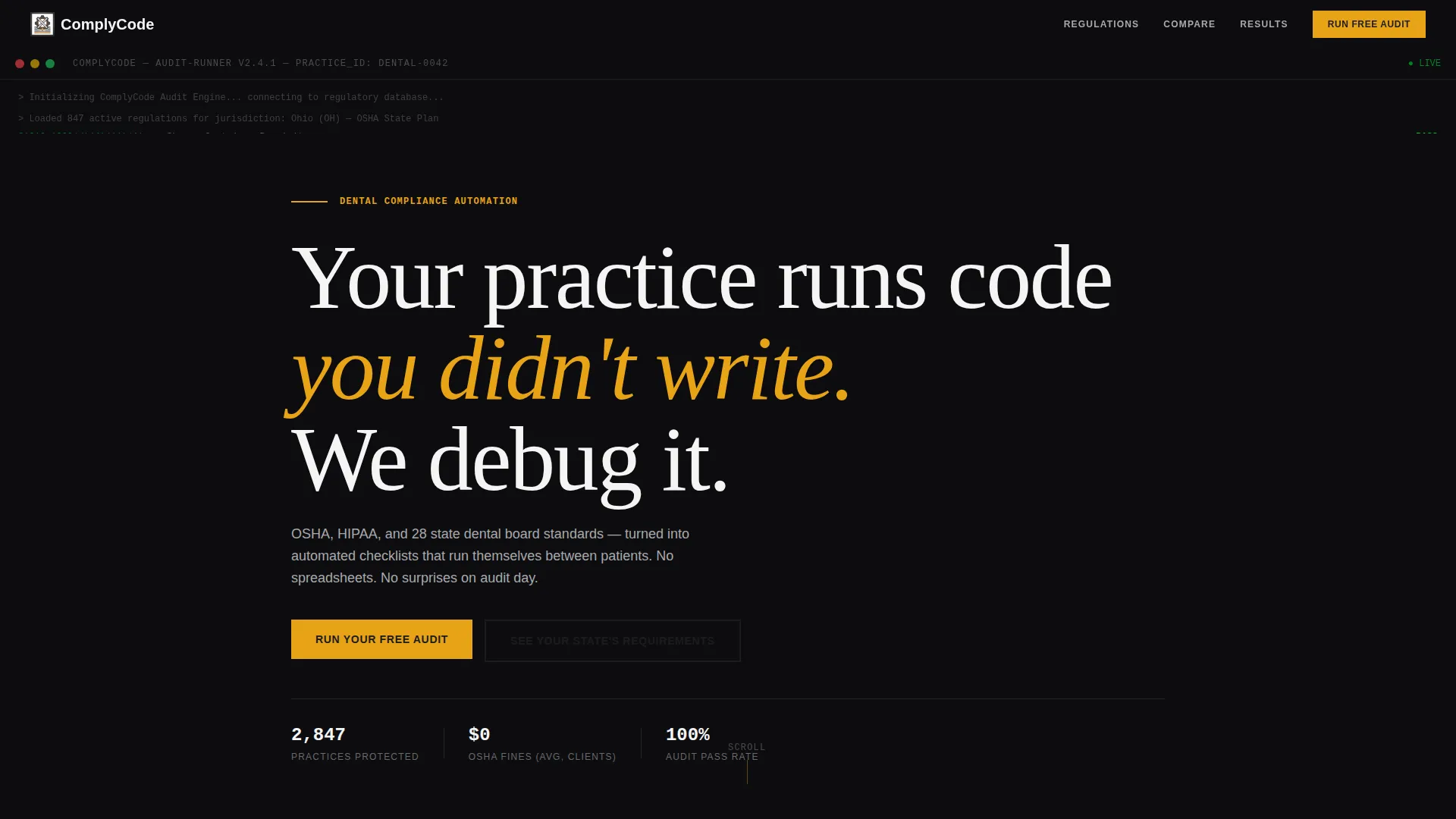
- A full-viewport dark terminal header with live-scrolling OSHA citation checkmarks
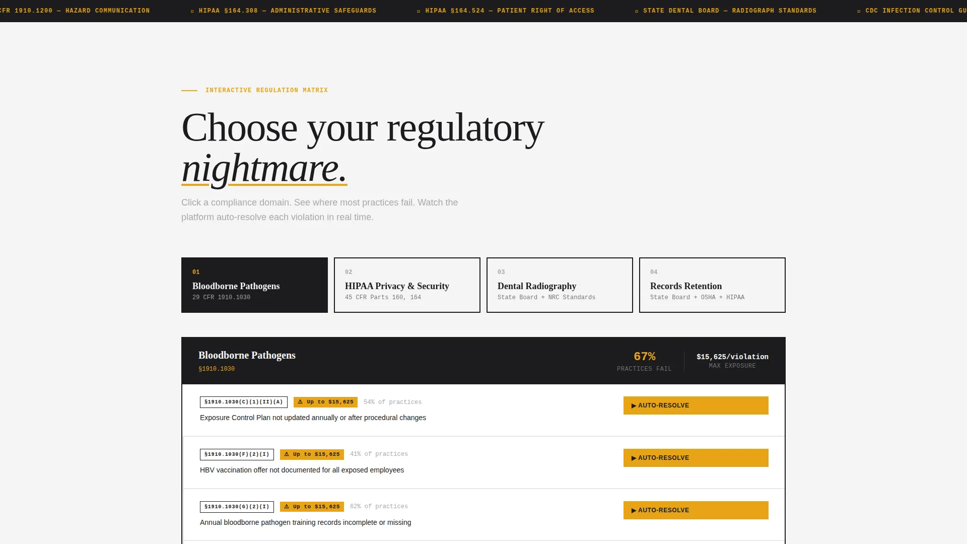
- An interactive compliance domain explorer covering Bloodborne Pathogens, Hazard Communication, Dental Radiography, and Records Retention
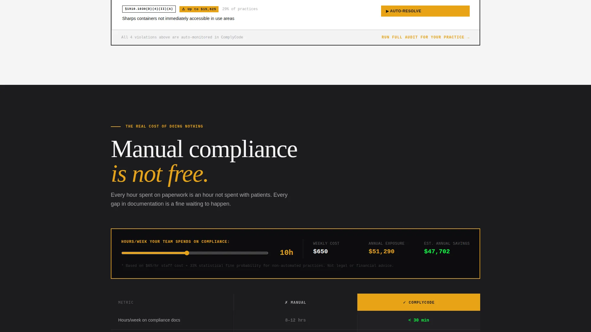
- A persistent split-view comparison block with real time-cost calculations and a single-field "Run Your Free Audit" call to action
Feature list
This template delivers purpose-built components that reflect the specific mechanics described for the Comply platform.
Live Terminal Audit Header
The header opens as a full-viewport dark terminal screen. Monospaced lines auto-scroll and check against real OSHA regulation codes, each marked with a green checkmark. After four seconds, the terminal shrinks and the brutalist headline appears beneath it.
Interactive Regulatory Explorer
Each scroll section reveals a specific compliance domain. Visitors click into any domain to expose its regulation matrix, see common failure points, and watch the platform auto-resolve violations in real time. Stakes escalate progressively from paperwork gaps to fine amounts and license suspension thresholds.
Split-View Compliance Comparison
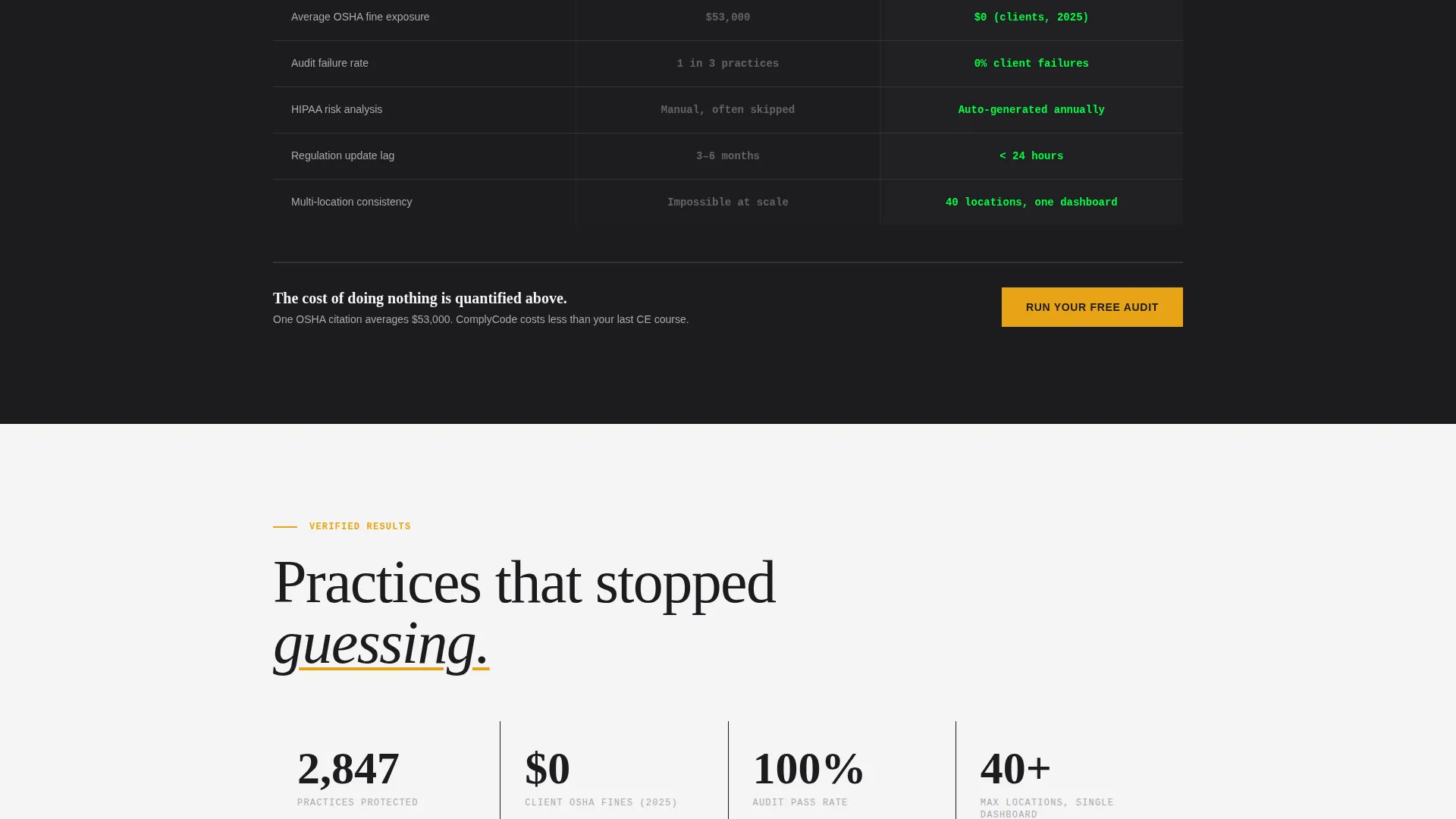
A persistent split view mid-scroll contrasts Manual Compliance against Automated Compliance. The block displays real time-cost calculations including hours per week, average fine exposure, and audit failure rates, making the cost of inaction concrete before any sign-up is requested.
Single-Field Free Audit Form
The primary call to action is a minimal one-field form asking only for the visitor's state of practice. Submitting it instantly generates a personalized regulatory exposure snapshot, removing all friction from the first conversion step.
Secondary No-Commitment call to action Path
A secondary path labeled "See Your State's Requirements" gives hesitant visitors a low-stakes entry point. It presents a compliance map view without requiring contact information, keeping more visitors in the funnel.
Scroll Reveal Progressive Layout
The entire page uses a scroll-reveal architecture. Sections appear progressively as the visitor scrolls, controlling the narrative pace and ensuring that context and stakes are established before conversion elements appear.
Page sections overview
| Section | Purpose |
|---|---|
| Terminal Audit Header | Hooks compliance professionals with recognizable OSHA citation syntax |
| Brutalist Hero Headline | Establishes platform voice and frames the core problem |
| Bloodborne Pathogens Domain | Opens the interactive regulatory explorer at the first compliance topic |
| Hazard Communication Domain | Expands the explorer into chemical and material safety regulation |
| Dental Radiography Domain | Introduces radiograph-specific audit requirements and failure points |
| Records Retention Domain | Escalates stakes with fine amounts and license suspension thresholds |
| Manual versus. Automated Split | Presents side-by-side time-cost and fine-exposure calculations |
| Free Audit Form | Converts visitors with a single state-of-practice field |
| State Requirements Map | Provides a secondary no-commitment path for undecided visitors |
Design & branding system
The visual identity follows a Bold Brutalist theme with a Monochrome Steel color system. Every design decision prioritizes function over decoration, deliberately evoking the precision of clinical instruments.
- Core palette: structural charcoal (#1C1C1E), brushed aluminum (#A8A9AD), clinical white (#F4F4F5), with warning-sign amber (#E8A317) reserved exclusively for interactive states and violation flags
- Typography is oversized and unapologetically heavy, with monospaced fonts used wherever code or regulation citations appear
- Backgrounds alternate strictly between near-black and clinical white with no gradients and no decorative softness
Mobile & speed optimization
The scroll-reveal layout is structured to perform cleanly on smaller screens without losing the progressive narrative flow that makes the page effective.
- Section-by-section reveal pacing is maintained on mobile so stakes still escalate in the intended order
- The single-field audit form remains prominent and easy to complete on touch devices
- The terminal header animation is designed to resolve quickly so the headline beneath it is never buried on mobile viewports
How this template helps you convert
This template is engineered around a specific conversion sequence: establish credibility, quantify the problem, then remove friction from the first step.
- The live terminal header earns immediate trust from compliance professionals by displaying real OSHA citation syntax, establishing that the platform understands their world before a single marketing claim is made.
- The interactive explorer lets visitors self-diagnose their regulatory exposure across four compliance domains, creating personal investment in the solution before the comparison block arrives.
- The split-view comparison with real cost calculations answers the "why now" objection directly, and the single-field audit form reduces the conversion ask to its absolute minimum.
Other information about this template
This template is categorized under Technology and the Dental Software subcategory, targeting the Dental Compliance Management niche specifically. A few additional details worth knowing before you build with it.
- The template style is Scroll Reveal (Progressive), meaning section visibility is controlled by scroll position throughout the entire page
- The header concept is Code Snippet, a deliberate choice to signal technical credibility to an audience that works with regulation codes daily
- The creative direction is Interactive Explorer, which means the page is designed to be poked and navigated, not just read top to bottom
- The landing page direction is Comparison/Versus, making the Manual versus. Automated split view the structural centerpiece of the conversion architecture
- Color usage is intentionally strict: amber (#E8A317) appears only on interactive states and violation flags, never as a decorative element
Theme
Bold Brutalist
Creative direction
Interactive Explorer
Color system
Monochrome Steel
Style
Scroll Reveal (Progressive)
Direction
Comparison/Versus
Page Sections
Live Terminal Audit Header
Interactive Regulatory Domain Explorer
Split-view Compliance Comparison
Single-field Free Audit Form
No-commitment Secondary Call to Action
Scroll Reveal Progressive Layout
Related questions
Who is this landing page template designed for?
Can I adapt the compliance domains in the interactive explorer?
What does the free audit form ask visitors to provide?
Does the Bold Brutalist design work for a professional dental audience?
Is there a path for visitors who are not ready to sign up?



