Accessibility Statement Landing Page Template
Comply is a split-screen landing page template built for a SaaS accessibility statement generator. It pairs a dark-mode code aesthetic with a Problem-to-Solution scroll arc, guiding startup CTOs, solo developers, and ops leads from compliance anxiety to confident action. A sticky comparison table, a free-scan call to action, and a live demo modal do the heavy lifting.
by Rocket studio
Quick summary
Comply is a single-page template built for a SaaS tool that generates legally defensible accessibility statements in under sixty seconds. The design uses a 50/50 split screen throughout, pairing a dark terminal aesthetic with a clear Problem-to-Solution narrative. Every section escalates the compliance problem on the left and resolves it on the right.
Who this template is for
This template is designed for founders and developers who need to close a compliance gap fast. It speaks directly to people who are already under pressure, not those planning ahead.
- Startup CTOs fielding demand letters and shipping under deadline
- Solo developers handed a compliance ticket with no prior context
- Growth-stage operations leads facing an ADA audit as part of Series B due diligence
What problem this template solves
Accessibility compliance feels technical, expensive, and urgent all at once. Most teams do not know where to start, and a generic boilerplate statement only makes things worse. This template frames the product as the fastest, clearest path out of that problem.
- Visitors arrive with anxiety about legal exposure and unclear next steps
- Existing solutions like manual writing or legal firms feel slow and costly
- The page needs to earn trust quickly before a visitor bounces to a competitor
What you get with this template
You get a fully structured single-page layout with a defined visual system, persuasive content architecture, and conversion-focused components. Every design and copy decision is grounded in the compliance-buyer mindset.
- A 50/50 split-screen layout that runs the full scroll length of the page
- A sticky mid-page comparison table pitting manual, agency, and tool-based approaches side by side
- Two conversion paths: a primary free-scan call to action and a secondary demo modal requiring zero input
Feature list
This section covers the key functional and visual components built into this template.
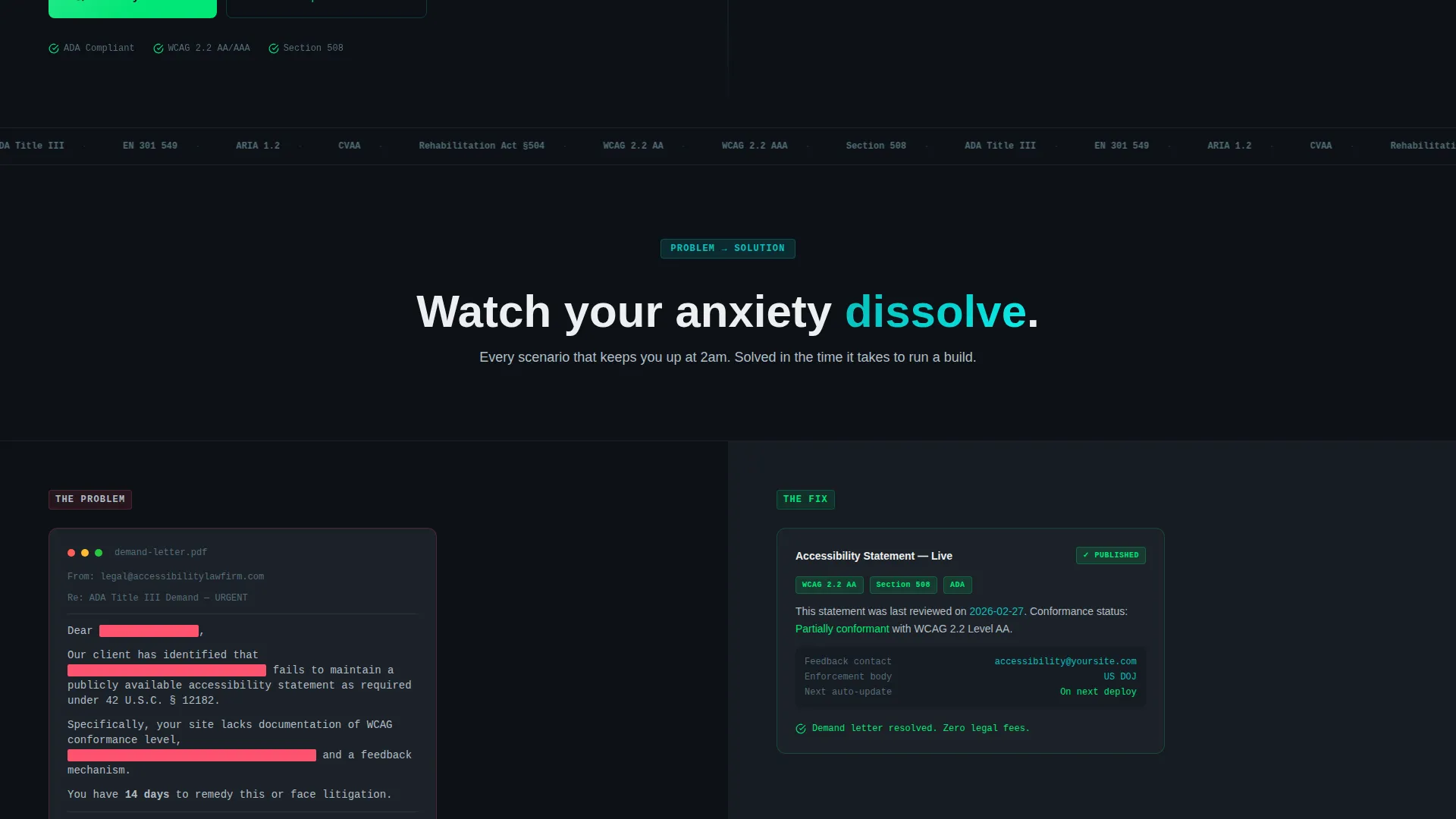
Split-Screen Problem-to-Solution Layout
The page is divided 50/50 from header to footer. The left panel always shows the problem: a redacted demand letter, a failing audit screenshot, a Slack message from legal. The right panel always shows the resolution. As the visitor scrolls, the tension on the left grows and the calm on the right deepens.
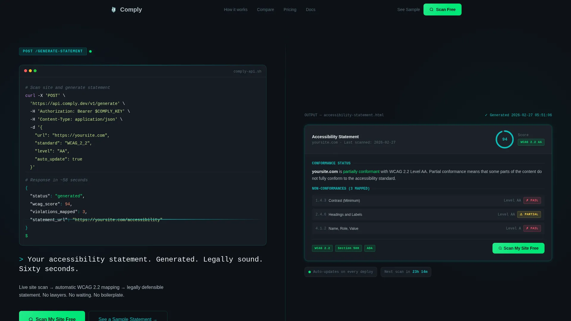
Code Snippet Header with Live Output Panel
The header does not use photography or illustration. The left panel shows a realistic dark-mode code block with a single API call and a blinking cursor. The right panel renders the output: a formatted accessibility statement with Web Content Accessibility Guidelines (WCAG) badges, a last-scan timestamp, and a compliance score glowing in teal.
Sticky Comparison Table
A mid-page table anchors the decision moment. It compares manual statement writing, legal firm outsourcing, and the Comply tool across four dimensions: time to deploy, annual cost, WCAG version coverage, and auto-update frequency. The primary call to action appears again directly below the table.
Dual Conversion Path Design
The primary call to action, "Scan My Site Free," appears first inside the header's right panel and again pinned below the comparison table. A secondary path, "See a Sample Statement," opens a live demo modal that requires zero input. Visitors can commit or preview without friction.
Monospace Self-Typing Headline
The headline beneath the header animates in monospace type: "Your accessibility statement. Generated. Legally sound. Sixty seconds." This micro-interaction reinforces the terminal-and-code identity and communicates the product's speed before any body copy is read.
Escalating Section Narrative
Each scroll section adds stakes. A failing Lighthouse audit gives way to a passing one. A Slack message from legal gives way to a compliance dashboard. A competitor page with broken links gives way to a real-time monitoring feed. The structure mirrors the emotional arc of the buyer.
Page sections overview
| Section | Purpose |
|---|---|
| Split-screen header | Introduce the API and rendered output side by side |
| Typing headline block | Deliver the core value proposition in four short phrases |
| Problem escalation one | Show a redacted demand letter against the generated statement |
| Problem escalation two | Show a failing audit against the passing audit result |
| Problem escalation three | Show a Slack legal message against the compliance dashboard |
| Problem escalation four | Show a broken competitor page against the real-time feed |
| Sticky comparison table | Compare three approaches across four criteria |
| Primary call to action anchor | Repeat free-scan call to action below comparison table |
| Demo modal trigger | Offer a zero-input sample statement preview |
Design & branding system
The visual identity follows a Startup Velocity theme built around the Teal Catalyst color system. Every color has a defined role, and no color appears outside that role.
- Deep terminal black (#0D1117) holds all backgrounds, giving the page a dark-mode IDE feel
- Catalyst teal (#0ABFBC) dominates headings, interactive borders, and the compliance score display
- Soft interface gray (#B0BEC5) carries all body text for readable contrast without harshness
- Hot deploy green (#00E676) appears exclusively on calls to action and success states, never decoratively
Mobile & speed optimization
The split-screen layout adapts for smaller viewports so the narrative sequence stays intact. The code block and output panel reflow into a stacked single-column layout on mobile without losing the left-problem-right-solution logic.
- Section panels stack vertically on mobile, preserving the problem-then-solution reading order
- The sticky comparison table scrolls horizontally on narrow screens to keep all four columns accessible
- The demo modal is touch-friendly and requires no form input to open or navigate
How this template helps you convert
The page is engineered around two conversion moments, each matched to a different buyer readiness level.
- The header call to action catches visitors who arrive already convinced. They see the code block, the rendered output, and the green "Scan My Site Free" button within the first viewport. No scrolling required to convert.
- The comparison table catches visitors who need proof. After seeing three approaches scored across four criteria, the free-scan button below the table removes the last reason to hesitate.
Other information about this template
This template fits within the Documentation and Support category, specifically the Policy and Legal Documentation subcategory. It is purpose-built for the accessibility statement niche.
- The template is designed as a single landing page, not a multi-page site
- It is suited for SaaS products that serve compliance, legal documentation, or developer tooling use cases
- The visual system is transferable to other developer-facing or technical SaaS products with minimal rebranding
- Color roles are strictly defined, making it straightforward to swap brand colors while preserving the conversion hierarchy


Theme
Startup Velocity
Creative direction
Problem→Solution Arc
Color system
Teal Catalyst
Style
Split Screen (50/50)
Direction
Comparison/Versus
Page Sections
Split-screen Problem-to-solution Layout
Code Snippet Header with Output Panel
Sticky Mid-page Comparison Table
Dual Conversion Path Design
Monospace Self-typing Headline
Escalating Scroll Narrative
Related questions
Who is this landing page template designed for?
Does the template include the actual accessibility statement generator?
Can I use this template for a product outside of accessibility compliance?
What are the two conversion paths built into this template?
What does the comparison table include?


