Pharmaceutical Software & SaaS Reviews Website Template
Comply is a bento grid landing page template built for pharmaceutical review intelligence platforms. It uses a glassmorphic dark design to display live sentiment data, adverse event flags, and geographic complaint clusters. The template is designed for pharmaceutical companies, regulatory affairs teams, and pharmacy chain operators who need to monitor patient reviews across multiple sources and convert prospects into free trial users.
by Rocket studio
Quick summary
Comply is a single-page, bento grid landing page template built for B2B SaaS platforms operating in the pharmaceutical review management space. It surfaces live metrics, sentiment data, and compliance signals through a glassmorphic dark interface. The template targets pharmaceutical companies and regulatory teams who need to demonstrate data power to their own prospects and convert visitors into free trial accounts.
Who this template is for
This template is purpose-built for software companies and platform teams serving the pharmaceutical industry. It works best when your product aggregates review data from multiple sources and your prospects are time-pressed compliance professionals. The design speaks directly to technical buyers who respond to evidence over persuasion.
- Pharmaceutical brand managers tracking post-launch perception of new generics across pharmacy directories and patient forums
- Regulatory affairs teams monitoring adverse event language before it escalates to a formal signal at regulatory bodies
- Pharmacy chain operators who need to identify location-level complaint clusters before they surface in board-level reports
What problem this template solves
Pharmaceutical companies face a specific and costly problem: patient reviews, adverse event mentions, and complaint data are scattered across dozens of sources. Aggregating that data manually is slow, error-prone, and often happens too late. A landing page that demonstrates real-time aggregation power must itself feel organized, authoritative, and clinical.
Standard templates built for general software companies cannot carry the weight of compliance-driven messaging. They lack the visual vocabulary that regulatory professionals and healthcare professionals expect. They also fail to convert prospects who need to see data before they trust a product.
- Generic templates bury the platform's core value under promotional copy instead of showing live intelligence
- Prospects from pharmaceutical companies need to feel the product working before they commit to a sign-up
- Risk management workflows require that the marketing surface reflects the same precision as the product itself
What you get with this template
You get a fully structured, single-page bento grid landing page template with six distinct content zones. Every section is designed to work as a discrete capability card, each holding a metric, a one-line explanation, and a hover-expand interaction that reveals a product screenshot behind frosted glass. The template provides a complete design system, conversion flow, and layout structure ready for web development teams to build on.
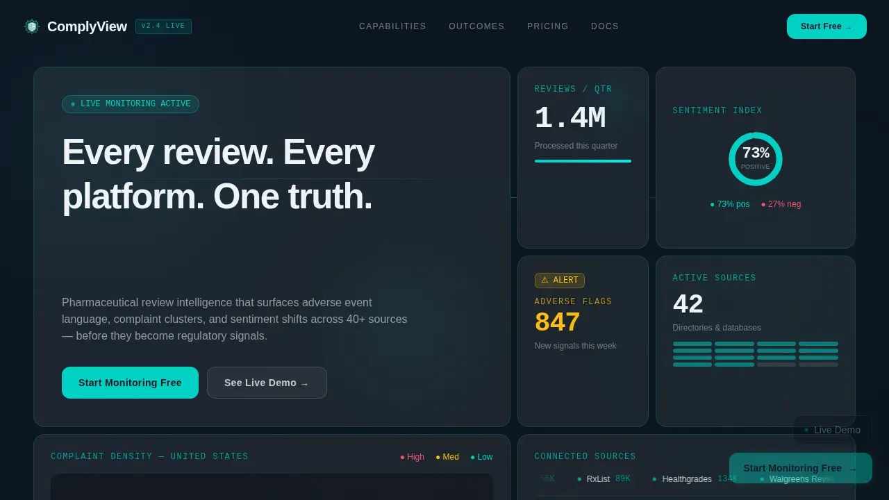
- A full-viewport stats wall header with animated sentiment data, a geographic heat map, a source ticker, and a typewriter headline card
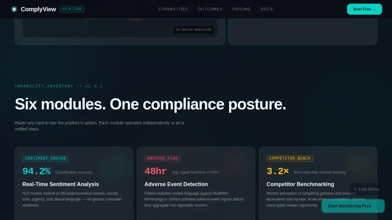
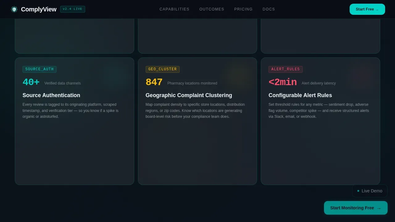
- Six capability module cards covering sentiment analysis, adverse event flagging, competitor benchmarking, source authentication, geographic clustering, and alert rule configuration
- A three-step sequential trial conversion form paired with a sandbox call to action, plus a pinned floating glass button for the primary conversion path
Feature list
This template ships with a structured set of design and layout capabilities drawn directly from the brief. Each feature below reflects a component or behavior specified in the source prompt.
Full-Viewport Bento Stats Wall
The header section is a living metrics display that fills the entire viewport with frosted glass cards. It shows anonymized numbers such as review volume processed per quarter, a sentiment donut chart, a geographic heat map of complaint density, and a scrolling source ticker. Each source in the ticker carries a live connection-status indicator. The largest card holds the typewriter headline. Data is the hero of this landing page, not a photograph.
Hover-Expand Capability Cards
Below the header, six capability module cards sit in a modular bento grid. Each card is equal in size until a visitor hovers over it. On hover, the card expands to dominate the grid momentarily and reveals a product screenshot behind frosted glass. This micro-interaction teaches the visitor about the platform through exploration rather than passive reading. Teams building for pharmaceutical companies will find this approach effective for technical audiences who prefer to discover rather than be told.
Three-Step Sequential Conversion Form
The trial conversion section presents a short, three-field sequential form. It asks for a company email, a drug name or pharmacy brand to monitor, and a review volume tier selection. The form is deliberately short to reduce friction and encourage completion. Short forms on landing page templates are essential for lead capture in compliance-heavy industries where buyers are cautious with the data they share.
Floating Glass Call-to-Action Button
A floating glass button is pinned to the bottom-right corner of the viewport. It carries the primary call to action and becomes progressively more opaque as the visitor scrolls deeper into the page. This scroll-velocity opacity behavior reinforces the sense that the visitor is already engaging with the product and nudges them toward the conversion point without interrupting the content flow.
Interactive Sandbox Path
The secondary conversion path opens an interactive sandbox modal populated with synthetic data. Prospects can explore a live demo dashboard before entering any personal information. This approach is particularly effective for pharmaceutical companies and healthcare organizations whose procurement teams need to evaluate functionality before approving a trial sign-up. The sandbox reduces the perceived risk of commitment.
Social Proof with Outcome Metrics
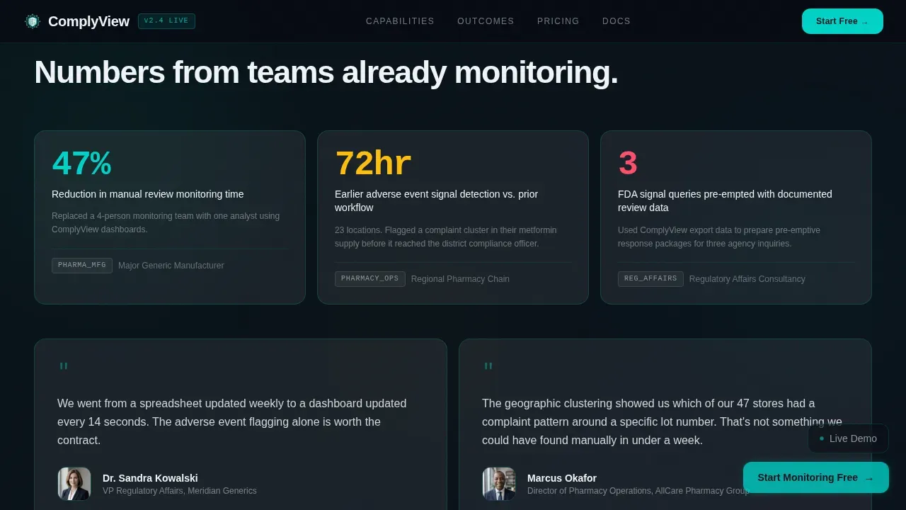
The social proof section uses named client-type logos paired with specific outcome numbers rather than generic testimonials. For example, a pharmacy chain operator might be shown alongside a metric indicating how many complaint clusters were identified in a given period. This format builds credibility for potential clients who are skeptical of vague marketing claims and who operate under strict standards in the pharmaceutical industry.
Page sections overview
| Section | Purpose |
|---|---|
| Stats Wall Header | Display live metrics and animated sentiment data in a full-viewport bento layout |
| Typewriter Headline Card | Materialize the core platform message letter by letter inside the largest header card |
| Source Ticker Strip | Scroll review sources with live teal connection-status dots for each channel |
| Capability Cards Grid | Present six power module cards with hover-expand micro-interactions and screenshot reveals |
| Social Proof Row | Show client-type logos alongside specific numeric outcomes |
| Trial Conversion Section | Capture leads with a three-step sequential form and sandbox call to action |
| Floating call to action Button | Pin the primary conversion button and adjust opacity based on scroll depth |
| Footer | Deliver horizontal flow navigation and supporting links |
Design & branding system
The visual identity is built on a Tech Glass theme using a glassmorphic color system. The palette was designed to feel like looking through a laboratory cleanroom window at night, with translucent layers stacked over deep darkness and edges catching faint light. Every surface implies depth without visual weight.
- Core colors: deep pharma black (#0B0F19) background, frosted panel white at 12% opacity (#FFFFFF1F) for cards, clinical teal (#00D2C6) for live data accents and calls to action, and soft warning amber (#FFBE0B) on alert states
- Typography: DM Sans for headings and body text, JetBrains Mono for data values and metrics, both rendered in pure white (#F0F4F8) for optical clarity at every size
- Border and surface treatment: 1px teal glowing strokes on card borders, layered frosted card panels over near-black backgrounds, and GPU-accelerated animations including the spinning donut chart, pulsing geographic dots, and scroll-velocity floating button opacity
Mobile & speed optimization
The template is built desktop-first, which aligns with the primary users: pharmaceutical brand managers and regulatory affairs professionals working on workstations. However, the layout also delivers a functional mobile experience for healthcare professionals and other stakeholders who review dashboards during clinical rounds or away from their primary workstations.
- Responsive design across various devices ensures that the bento grid reflows cleanly on tablet and mobile screen sizes
- GPU-accelerated transforms are used exclusively for animations, and Intersection Observer handles section reveal triggers to keep performance efficient
- The responsive design approach means the template can work seamlessly across various devices without requiring separate mobile-specific builds
How this template helps you convert
This landing page template is structured around a single principle: show the product working before asking for anything. Every design decision supports that goal, from the metrics wall at the top to the sandbox modal at the bottom. The result is a conversion flow that earns the click rather than requesting it.
- The stats wall header immerses visitors in live data immediately, making them feel they are already inside the platform and creating urgency to access the full experience
- The hover-expand capability cards let prospects explore the platform's power at their own pace, building confidence and supporting user retention by rewarding curiosity with deeper information
- The three-step sequential form and sandbox call to action provide two distinct conversion paths that match different buyer readiness levels, improving overall sign-up rates across the target audience
Other information about this template
This template sits at the intersection of pharmaceutical software marketing, compliance communication, and high-interactivity web development. The sections below cover additional context relevant to buyers evaluating this template for their team or platform.
- Templates like Comply are designed to support market research workflows by giving pharmaceutical companies a polished landing page that reflects their data capabilities to potential clients and other stakeholders
- The template structure supports document control thinking: each card section is a discrete, versioned unit that teams can update independently, which mirrors the version control practices common in life sciences organizations
- Electronic records and electronic signatures are central concerns in life sciences; while the template itself is a frontend layout, it is designed to link visually to the kinds of platforms that manage these workflows for regulatory compliance
- The bento grid layout makes it straightforward to ensure compliance messaging is prominent, with space allocated for trust signals such as compliance badges for relevant regulatory standards like FDA 21 CFR Part 11 or EU GMP Annex 11
- For teams planning a market entry campaign or broader marketing campaigns, this template provides the professionally designed landing structure needed to establish credibility with healthcare organizations and healthcare providers from the first visit
- The template supports sustainable practices in digital marketing by providing a reusable, modular layout that reduces the cost and time associated with creating new landing page assets from scratch for each campaign
- Using this template, companies can save time during the web development phase and start creating a compliant, conversion-focused landing page without rebuilding the design system each time
- The drag and drop functionality available in most modern page builders means teams can adapt the bento grid layout, swap in their own data metrics, and customize color schemes, meta tags, and copy to match their brand without deep coding knowledge
- The drag and drop functionality also allows non-technical marketing team members to manage updates independently, reducing dependency on development resources
- Effective market research conducted before a product launch often reveals that healthcare professionals and healthcare delivery teams respond better to data-forward interfaces than to copy-heavy promotional pages, which is the core design bet this template makes
- For companies operating across different countries, the template's modular structure makes it straightforward to adapt regulatory language and compliance references for specific markets without rebuilding the full layout
- Training programs for new team members are easier to run when the template follows clear, documented design patterns, which this bento grid system provides
- Platforms built on this template can support improving patient outcomes indirectly by helping pharmaceutical companies surface adverse event signals and complaint clusters faster, enabling quicker responses from the relevant teams
- Risk management is embedded in the visual logic of the template: the amber alert color state, the adverse event flagging card, and the geographic complaint cluster module all communicate that the platform takes risk management seriously as a core function
- The template includes structural space for blog or article sections if teams wish to expand to pharmaceutical websites with a content marketing layer, though the primary layout is a single-page landing page
- Landingi and Leadpages are two examples of platforms where teams can use pre-built templates to customize review-specific workflows; this template is designed to work with comparable page-building environments
- Data protection considerations are reflected in the template's trust signal section, where compliance badges and certification references can be displayed prominently for visitors evaluating the platform's data security posture
- The template's clinical and modular aesthetic aligns with industry standards for compliance software, making it suitable for companies serving both mid-market and enterprise-level pharmaceutical clients
- For teams focused on easy retrieval of important information, the bento grid structure means every capability is visible at a glance, and hover interactions provide deeper detail without requiring navigation away from the page
Theme
Tech Glass
Creative direction
Spec Sheet
Color system
Glassmorphic
Style
Bento Grid
Direction
Freemium/Trial
Page Sections
Full-viewport Bento Stats Wall Header
Hover-expand Capability Module Cards
Three-step Sequential Trial Form
Scroll-velocity Floating Call to Action Button
Interactive Sandbox Demo Path
Social Proof with Specific Outcome Metrics
Related questions
Who is the Comply template designed for?
Does this template include the interactive sandbox and conversion form layout?
Can the bento grid be customized for different pharmaceutical brands?
How does this template support compliance messaging for life sciences companies?
Is the template suitable for both desktop and mobile users?



