Micro-SaaS & Developer Tools Cost Estimator Website Template
Comply is a dashboard and data grid landing page template built for an ADA accessibility checker tool. It combines a live audit dashboard preview, an industry-scale violations counter, a risk calculator, and a before-and-after compliance score section. The Void and Violet color system gives the page a dark, high-contrast visual identity that feels built for developers and compliance professionals.
by Rocket studio
Quick summary
Comply is a single-page landing page template designed for an ADA accessibility checker. It opens with a browser-framed dashboard preview showing a live scan in progress, then guides visitors through escalating data sections that illustrate the scale of accessibility violations, personal legal risk, and proof of remediation. The page closes with a free scan offer and a secondary email capture for a quarterly report.
Who this template is for
This template is built for software products that help users find, rank, and fix web accessibility issues. It speaks directly to people who already feel the pressure of compliance deadlines or client handoffs.
- Front-end developers patching inherited codebases with unknown accessibility debt
- Compliance officers at mid-size e-commerce companies facing legal demand letters
- Agency owners who need to hand clients a clean audit report before launch day
What problem this template solves
Many accessibility tools struggle to communicate urgency and credibility at the same time. A raw list of violations does not tell a visitor why they should act today or how serious their exposure really is.
- Visitors arrive without context on the scale of accessibility failures across the web
- Potential users cannot quickly estimate their own legal or financial risk
- No visual proof exists that fixing violations is a structured, mechanical process rather than a heroic effort
What you get with this template
The template delivers a complete single-page layout that combines a data-rich hero, three content sections that build a narrative of risk and resolution, and two conversion touchpoints. Every section is designed to deepen urgency and lower the barrier to a first scan.
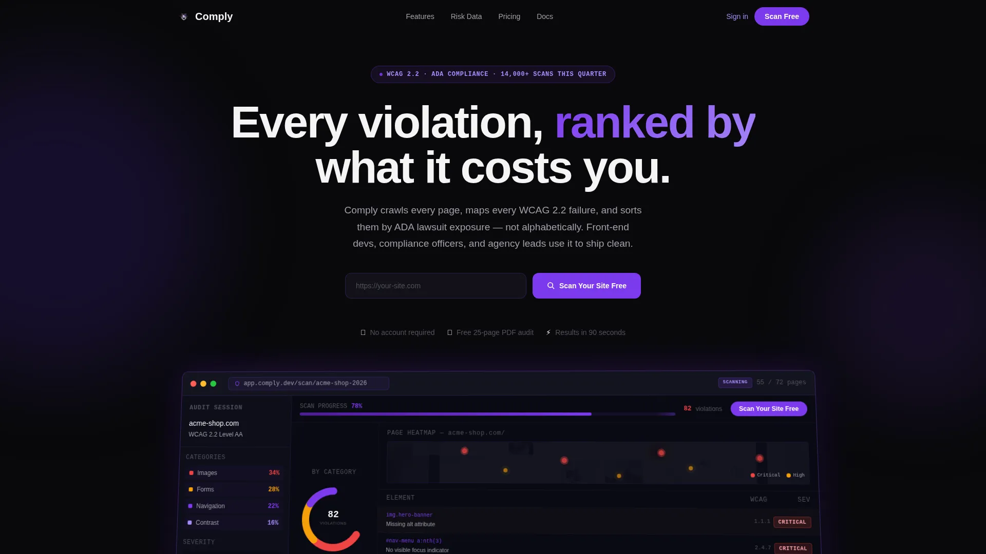
- A browser-chrome-framed dashboard hero with a donut chart, a severity heatmap, and a flagged-elements rail showing real WCAG criterion codes
- An industry violations counter grid, a personal risk calculator, and a before-and-after compliance score section with diff-view code changes
- A sticky bottom bar call to action and a secondary email capture field for visitors who want the quarterly accessibility report
Feature list
Live Dashboard Hero with Browser Chrome Frame
The header renders a pixel-perfect screenshot of the app's main audit view inside a browser chrome frame. It shows a donut chart breaking violations by category, a severity heatmap with pulsing red and amber hotspots, and a left-rail list of flagged elements with WCAG 2.2 criterion codes in monospace type. The dashboard sits at a slight Z-axis angle above the void black background with a soft violet drop shadow.
Industry Violations Counter and Sortable Data Grid
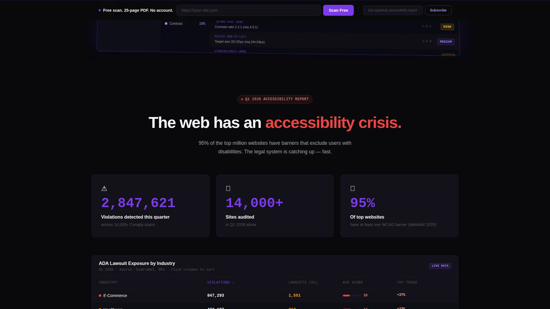
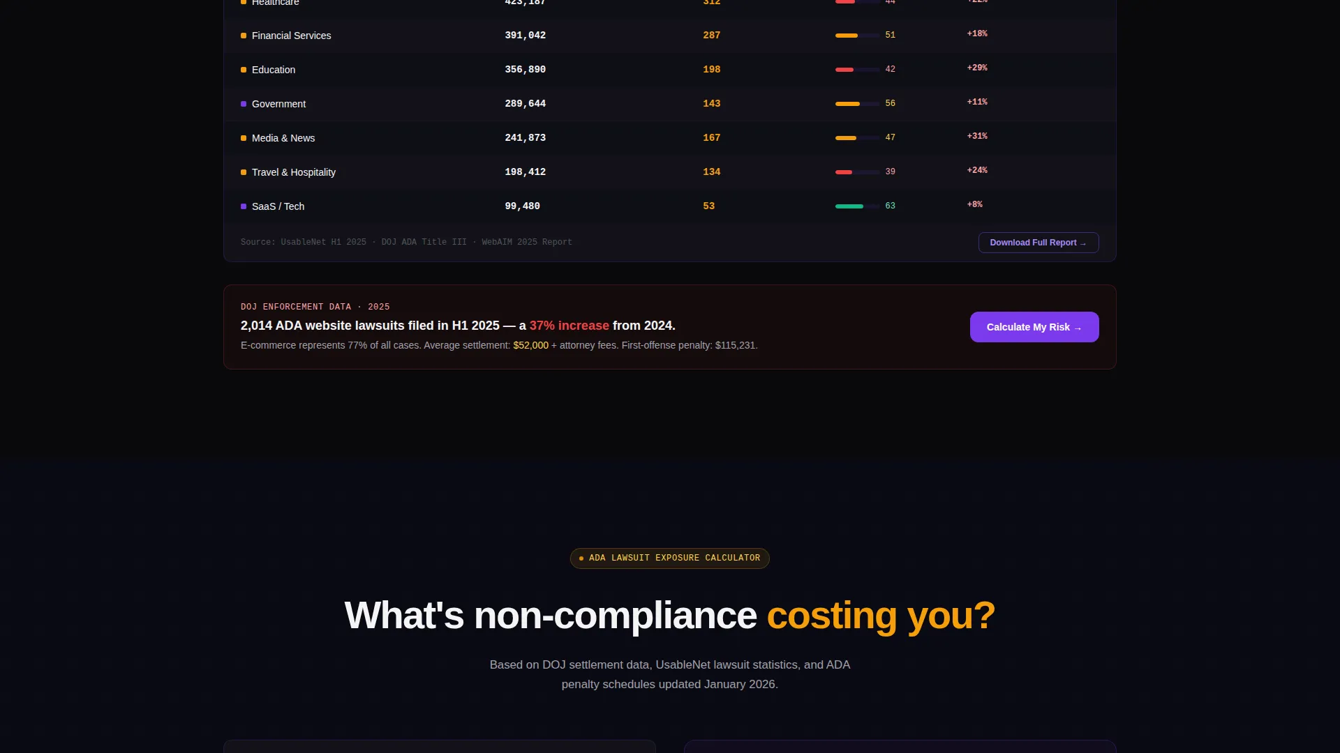
Section one presents a live counter displaying violations detected across thousands of scans this quarter. Below the counter, a sortable grid breaks failure rates down by industry vertical, with alternating row shading in void and near-black and violet row-hover states. This gives visitors immediate context on the scale of the accessibility problem before they engage with their own site.
Personal Risk Calculator Section
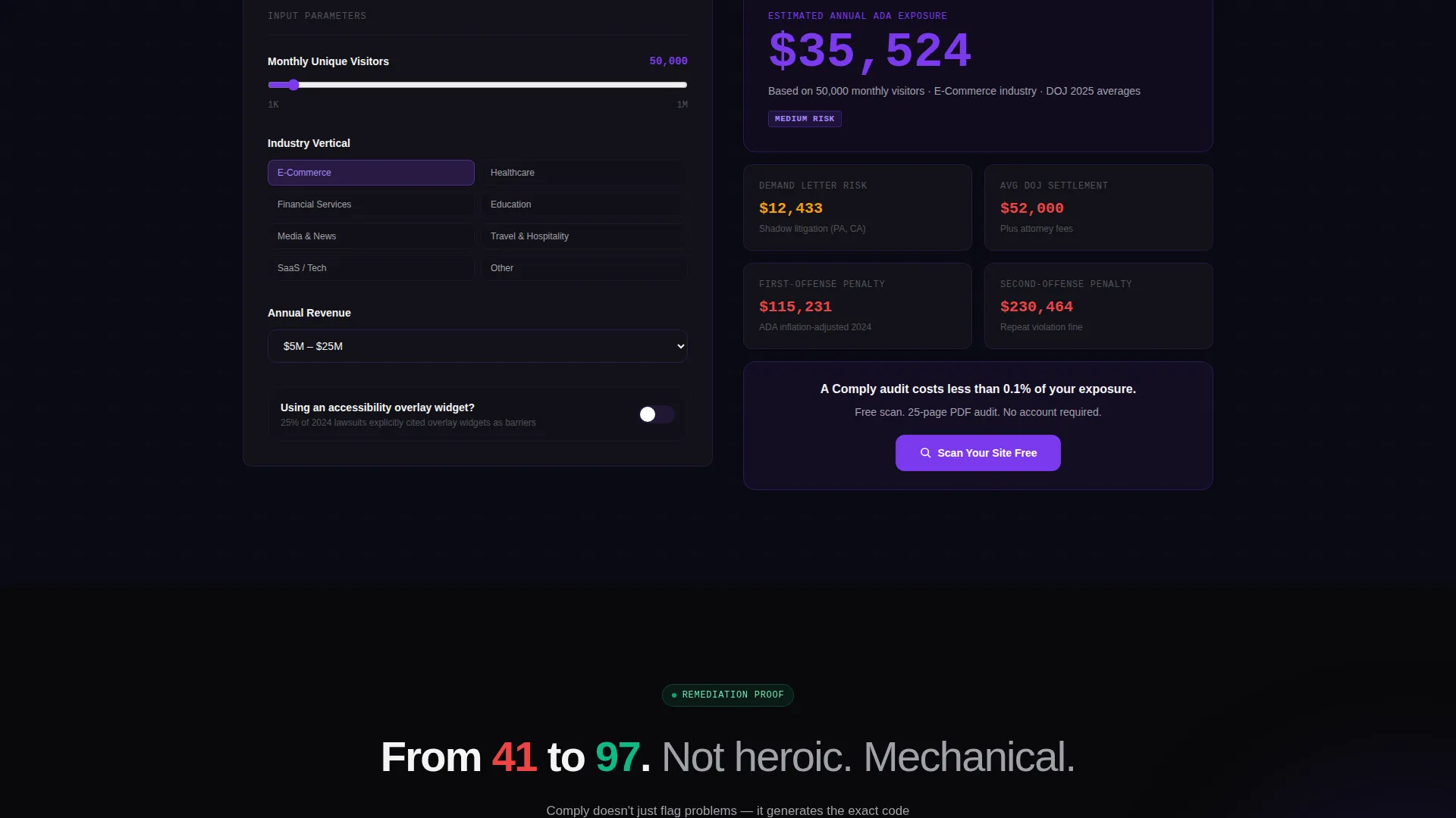
Section two offers an interactive risk calculator. Visitors input their monthly traffic volume and the tool estimates ADA lawsuit exposure in dollars, referencing real Department of Justice settlement averages. This escalates the stakes from industry-scale data to a personal financial number that is hard to ignore.
Before-and-After Compliance Score with Code Diff View
Section three shows a site's accessibility score rising from 41 to 97 after remediation. Alongside the score, a diff-view panel displays the actual code changes responsible for the improvement. This section reframes the remediation process as structured and achievable rather than overwhelming.
Two-Step Conversion Flow with Free PDF Audit
The primary call to action opens a two-step flow: paste a URL, then select a platform (macOS, Windows, or browser extension). No account creation is required for the first scan. The tool generates a free 25-page PDF audit that watermarks premium violation details, creating a clear upgrade incentive.
Sticky Bottom Bar and Secondary Email Capture
After the risk calculator section, a sticky bottom bar repeats the primary call to action so it stays visible during scroll. A secondary email field labeled for the quarterly accessibility report captures visitors who arrived for the industry data and are not yet ready to install the app.
Page sections overview
| Section | Purpose |
|---|---|
| Dashboard Hero Header | Showcase live audit preview inside a browser chrome frame with donut chart, heatmap, and WCAG code rail |
| Violations Counter Grid | Display industry-scale violation data in a sortable grid broken down by vertical |
| Personal Risk Calculator | Let visitors input traffic volume and see estimated ADA lawsuit exposure |
| Compliance Score Before/After | Show a score jump from 41 to 97 with a code diff view proving mechanical remediation |
| Primary call to action Bar | Sticky bottom bar repeating the free scan offer after the risk calculator section |
| Secondary Email Capture | Email field for the quarterly accessibility report targeting data-focused visitors |
Design & branding system
The Void and Violet color system gives Comply the visual tone of a dark-mode integrated development environment. Every color choice reinforces accountability and precision, so the interface feels like a professional audit tool rather than a marketing page.
- Backgrounds use absolute void black (#09090B); data cards float on near-black (#121218) with 1-pixel violet borders; section headers use clinical white (#F4F4F5)
- Interactive elements including buttons, toggles, and sortable column headers use electric violet (#7C3AED); deep ultraviolet (#2D1B69) anchors accent gradients
- The overall theme follows a Directory and Discovery layout where data grids, alternating row shading, and hover states organize information the way a file browser organizes a codebase
Mobile & speed optimization
The template is built with a responsive layout so the dashboard hero, data grids, and calculator sections stack and reformat cleanly on smaller screens. The design keeps heavy visual elements like the angled dashboard preview and the severity heatmap lightweight in layout structure so they do not create awkward overflow on mobile viewports.
- The sticky bottom bar remains functional on mobile so the primary call to action is always reachable without scrolling back to the top
- Data grid sections use condensed mobile layouts that preserve the alternating row shading and violet hover states without horizontal overflow
How this template helps you convert
The page is structured as an escalating data narrative. Each section hands off to the next with increasing personal stakes, moving a visitor from passive observer to motivated action-taker before they reach the bottom call to action.
- The dashboard hero establishes credibility immediately by showing a real audit in progress with visible WCAG criterion codes and severity data, creating trust before a single marketing claim appears.
- The risk calculator personalizes the threat by converting industry statistics into a visitor's own estimated dollar exposure, making inaction feel financially specific rather than abstract.
- The before-and-after compliance score with code diff view removes the fear of complexity by showing that remediation follows a clear, repeatable process, making the free scan the obvious next step.
Other information about this template
Comply fits squarely in the Micro-SaaS and Developer Tools category, where buyers expect data-dense layouts and functional visual design over decorative flourishes. The Industry Report creative direction is well suited to products that benefit from third-party-scale data as social proof.
- The template style is Dashboard and Data Grid, meaning the layout prioritizes scannable tabular data, hover-state interactivity cues, and monospace type accents over narrative long-form copy
- The header concept is Dashboard Preview, a pattern where the product interface itself serves as the hero image, reducing the need for illustrated mockups or lifestyle photography
- The App Download landing page direction means every conversion touchpoint points toward a first install or scan, with the free PDF audit acting as the bridge between curiosity and commitment
- The template works for any ADA accessibility checker, web accessibility auditing tool, or WCAG compliance scanner that uses a downloadable or browser-based client model
Theme
Directory & Discovery
Creative direction
Industry Report
Color system
Void & Violet
Style
Dashboard/Data Grid
Direction
App Download
Page Sections
Browser-framed Dashboard Hero
Sortable Industry Violations Grid
ADA Lawsuit Risk Calculator
Before-and-after Compliance Score
Two-step Free Scan Conversion Flow
Sticky Call to Action Bar and Email Capture
Related questions
Who is this template designed for?
Can I customize the violation categories and data shown in the dashboard hero?
Does the risk calculator section require a backend connection?
Is any account creation required to use the free scan flow?
What platforms does the two-step download flow support?



