Automotive Compliance Management Landing Page Template
Comply is a bold brutalist landing page template built for automotive compliance management platforms. It features a live-style dashboard grid, a three-tab feature switcher, and a head-to-head comparison matrix that lets the data speak. The monochrome steel palette and warning-amber accents create an interface that feels as serious as the work it represents.
by Rocket studio
Quick summary
Comply is a single-page landing page template designed for automotive compliance platforms. It pairs an industrial brutalist design with a data-first layout: a tab-switching dashboard grid up top, a feature comparison matrix below, and conversion paths that earn the click by showing exactly where competitors fall short.
Who this template is for
This template is built for compliance-heavy automotive software companies that need to speak directly to the professionals carrying the most regulatory risk. The layout, tone, and data structure all reflect what those buyers actually need to see before they act.
- Dealer group compliance managers overseeing multiple rooftops across several states
- Fleet operations directors managing renewal cycles and federal reporting obligations
- Finance and insurance managers who need clear proof of recall and disclosure coverage
What problem this template solves
Most automotive software landing pages bury their value in prose. Compliance buyers do not read paragraphs, they scan grids, count gaps, and look for proof. This template solves the mismatch between how compliance platforms sell and how compliance professionals actually evaluate tools.
- Generic software pages fail to show coverage depth across specific tasks like title processing, recall tracking, or state fee calculation
- Competitors look equal on paper until a side-by-side matrix exposes what they skip or only partially support
- Conversion paths that require a full demo booking add friction before the buyer has seen enough to care
What you get with this template
You get a complete, production-ready landing page layout that prioritizes data density and compliance credibility. Every section is designed to answer the questions a compliance officer asks before recommending a platform to their team.
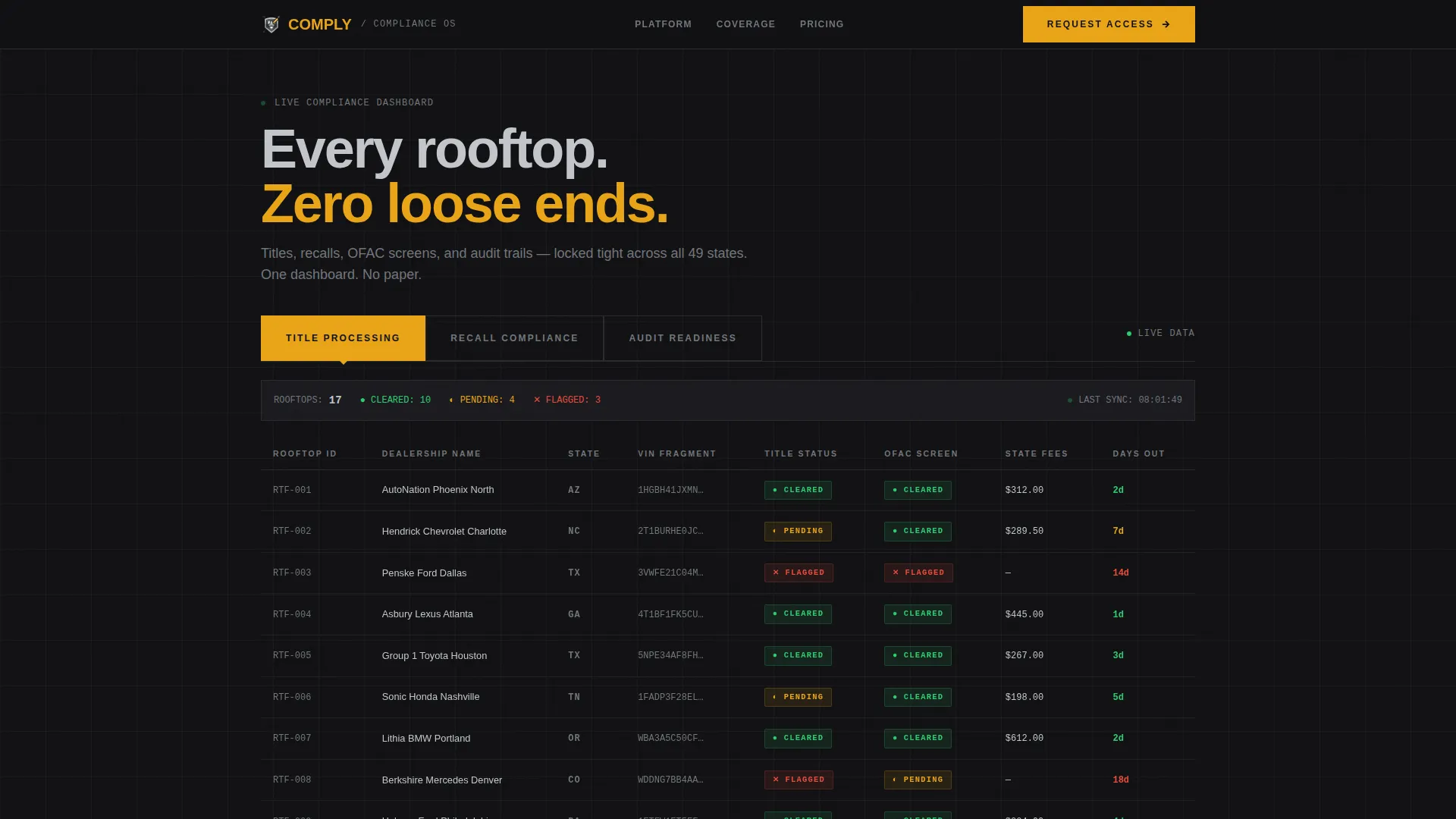
- A Feature Tab Switcher header with three brutalist tabs, a live-style data grid showing seventeen dealership rooftops, and scrollable VIN fragments
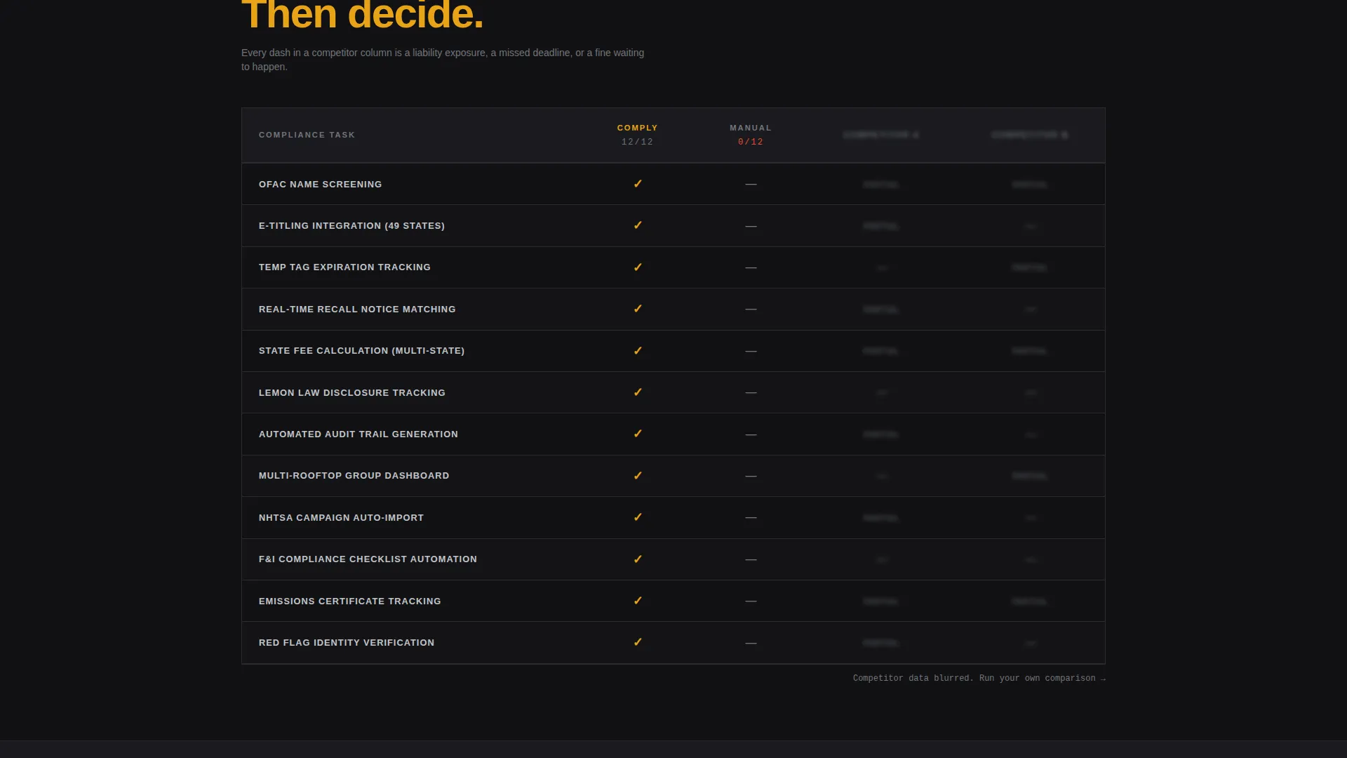
- A Feature Matrix comparison grid with rows covering OFAC name screening, temporary tag expiration tracking, state fee calculation, e-titling integration, and recall notice matching
- Two conversion paths: a pinned bottom-bar call to action that opens a two-field modal, and a secondary form at the base of the comparison matrix
Feature list
This template is built around five core design and layout capabilities. Each one is grounded directly in the source brief.
Three-Tab Feature Switcher Header
The header spans the full viewport width with three oversized slab-type tabs: TITLE PROCESSING, RECALL COMPLIANCE, and AUDIT READINESS. The active tab displays a live-style data grid with status columns showing green cleared, amber pending, and red flagged states. Clicking any tab swaps the entire grid below without navigating away from the page.
Live-Style Compliance Data Grid
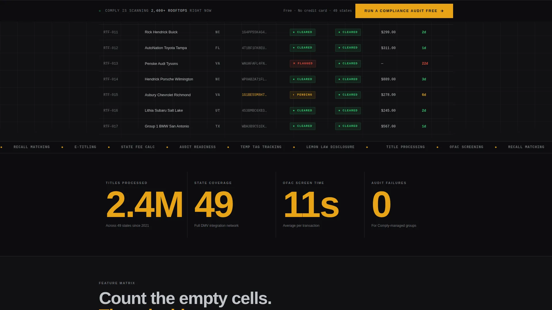
The default grid displays seventeen dealership rooftops with real VIN fragments scrolling through one column. Status indicators use a clear three-color system so compliance officers can read the room at a glance. Each tab reveals a progressively more granular dataset, rewarding exploration without requiring a product tour.
Brutalist Feature Comparison Matrix
Below the header, a full comparison grid positions the platform against manual processes and two blurred competitor columns. Each row maps to a specific compliance task, and each cell contains either an amber checkmark, a steel-gray dash, or a muted partial label. The visual gap between columns does more persuading than any paragraph could.
Full-Width Stat Callout Blocks
Between grid sections, single-stat callout blocks break up the scroll with high-impact proof points. These full-width blocks punctuate the data-heavy layout with breathing room, keeping the eye moving without losing momentum.
Dual Conversion Path System
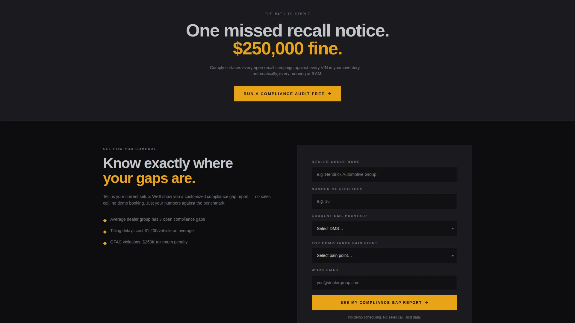
The primary call to action is pinned to a slim bottom bar that appears after the first grid section scrolls into view. It opens a two-field modal asking for dealership group name and number of rooftops. A secondary path at the base of the comparison matrix triggers a longer qualification form with fields for current provider, top compliance pain point, and work email.
Page sections overview
| Section | Purpose |
|---|---|
| Tab Switcher Header | Displays the live compliance data grid with three swappable tab views |
| Compliance Data Grid | Shows seventeen rooftop statuses with VIN fragments and color-coded indicators |
| Feature Matrix | Compares platform coverage against manual processes and competitor columns |
| Stat Callout Blocks | Delivers full-width proof points between dense grid sections |
| Pinned call to action Bar | Anchors the primary conversion path after the first grid scrolls into view |
| Secondary Lead Form | Captures deeper qualification data at the bottom of the comparison matrix |
Design & branding system
The visual identity follows a Bold Brutalist theme built on a Monochrome Steel color system. The palette evokes raw industrial materials: unfinished concrete, overhead fluorescent lighting, and sheet metal stacked in a stamping plant. Warning amber appears only where the eye must go, making every interactive element feel deliberate and weighted.
- Core palette: forge-black (#111113) for backgrounds, rolled steel (#71757B) for secondary text and dashes, machined aluminum (#C2C5CA) for body type, and warning amber (#E8A317) exclusively for buttons, toggle states, and comparison checkmarks
- Typography is oversized, industrial-weight slab type rendered loud against dark panels, with alternating background densities creating a scroll rhythm between data and breathing room
- Amber accents are strictly reserved for interactive states and call-to-action surfaces, so no decorative use dilutes their signal strength
Mobile & speed optimization
The template is structured for responsive display across device sizes. The dense grid and tab-switching behavior are designed to remain readable and functional as the viewport narrows.
- The data grid and comparison matrix reflow cleanly so compliance officers reviewing on a tablet or phone can still read status columns and cell states without horizontal scrolling
- The pinned bottom-bar call to action and modal remain accessible at all viewport widths, keeping the primary conversion path reachable regardless of device
How this template helps you convert
This template is engineered around a single conversion philosophy: let the data earn the click before the copy asks for anything. The layout removes friction at every step of the buyer's evaluation.
- The comparison matrix makes competitor gaps visible without a single persuasive sentence, so the buyer reaches the call to action already convinced rather than still skeptical
- The pinned bottom-bar call to action requires only two fields, lowering the commitment barrier for a first-touch conversion while the secondary form captures qualified intent from buyers who have scrolled through the full matrix
Other information about this template
This template sits at the intersection of automotive software and compliance management, a niche where visual credibility and data specificity matter more than brand storytelling. The layout is built to support platforms operating across title processing workflows, emissions certification tracking, recall liability management, and regulatory audit preparation.
- The template style is Dashboard and Data Grid, making it well suited for platforms that need to demonstrate product depth rather than just describe it
- The Bold Brutalist theme and Monochrome Steel color system signal operational seriousness without relying on stock-photo polish or generic SaaS gradients
- The Comparison and Versus landing page direction is a proven structure for compliance software buyers who arrive with a shortlist and need a reason to commit
Theme
Bold Brutalist
Creative direction
Feature Matrix
Color system
Monochrome Steel
Style
Dashboard/Data Grid
Direction
Comparison/Versus
Page Sections
Three-tab Feature Switcher Header
Live-style Compliance Data Grid
Brutalist Feature Comparison Matrix
Full-width Stat Callout Blocks
Dual Conversion Path System
Related questions
Who is this template designed for?
Can I customize the tab labels and grid data?
What conversion paths does this template include?
Does the comparison matrix require real competitor data?
Is this template suitable for a single product or a full platform?



