Healthcare Software & SaaS Privacy Policy Website Template
Comply is a card-grid landing page template built for healthcare compliance software. It uses a Data Command visual theme with a Monochrome Steel palette to project authority and precision. The page follows a Problem→Solution Arc, opening with a live-metrics header and moving through modular pain-point cards that flip to platform features. A qualifying lead-capture form anchors the conversion flow.
by Rocket studio
Quick summary
Comply is a single-page, card-grid landing page template designed for healthcare compliance software platforms. It opens with a live-metrics dashboard header, walks visitors through a structured Problem→Solution Arc using modular flip cards, and closes with a friction-low lead-capture form offering a personalized compliance score. Every design decision reinforces control, precision, and credibility.
Who this template is for
This template is built for healthcare software companies and compliance platform vendors who need to convert serious, senior buyers quickly. The audience is not casual browsers. They are decision-makers under real regulatory pressure.
- Hospital system Chief Operating Officers managing Centers for Medicare and Medicaid Services audit cycles
- Clinic network administrators tracking Health Insurance Portability and Accountability Act incident logs across dozens of locations
- Health plan compliance directors facing Office of Inspector General deadline pressure
What problem this template solves
Compliance software is a hard sell. Buyers are skeptical, time-poor, and already burned by tools that overpromised. A generic landing page loses them in the first scroll. This template solves the credibility gap with a specific visual and structural approach.
- It replaces vague marketing language with precise statistics rendered at hero scale, building immediate trust
- It mirrors the visitor's pain before introducing the solution, making the platform feel like it was built for their exact situation
- It reduces form friction by offering a personalized compliance score instead of a demo call, lowering the barrier to conversion
What you get with this template
You get a fully structured, single-page layout that is ready to customize for a healthcare compliance software product. The design system, section order, and conversion logic are all built in.
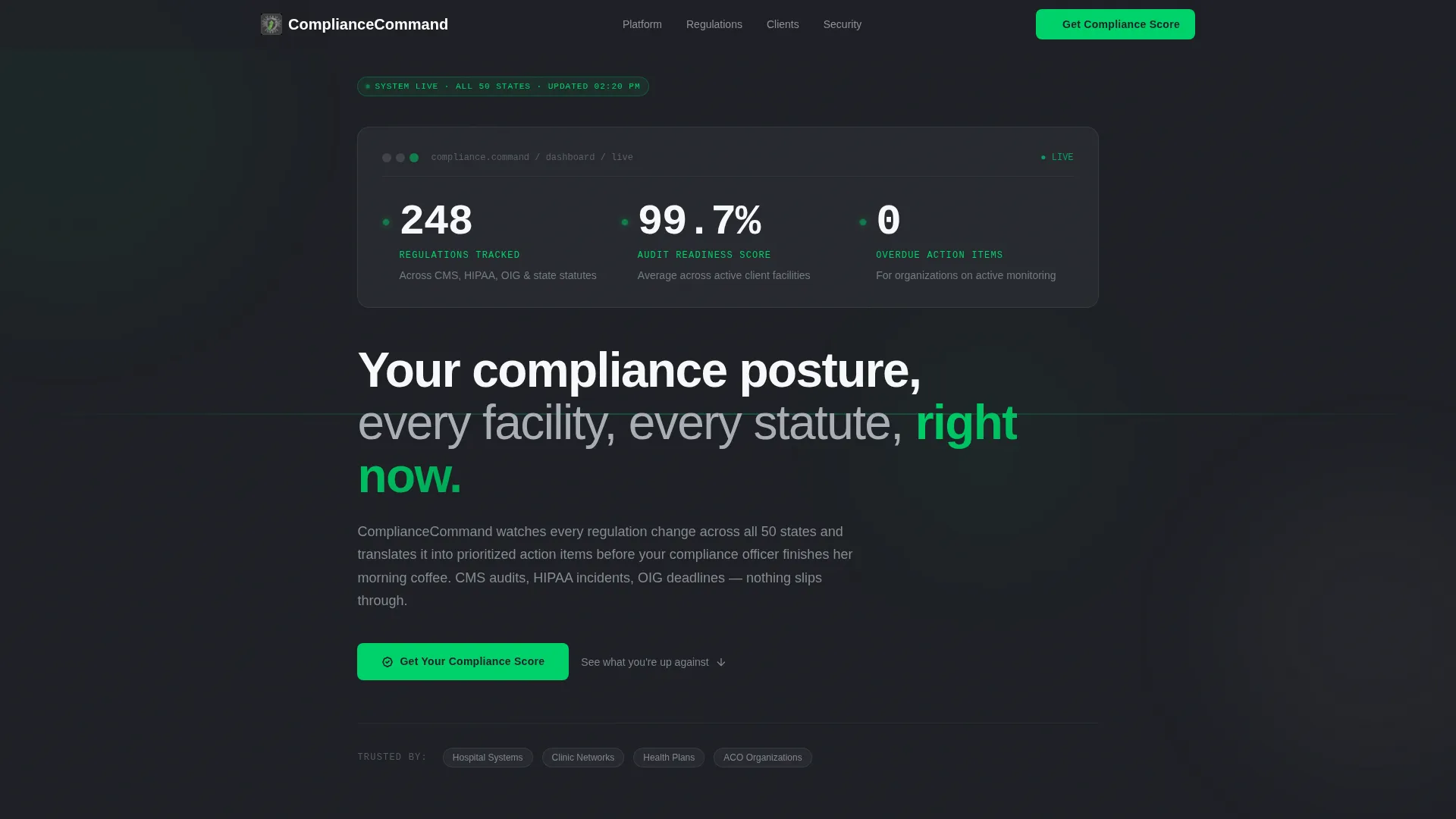
- A gunmetal metrics dashboard header displaying three key performance numbers with a signal-green pulse indicator
- A modular card grid that presents pain-point statistics and flips to matching platform features on scroll
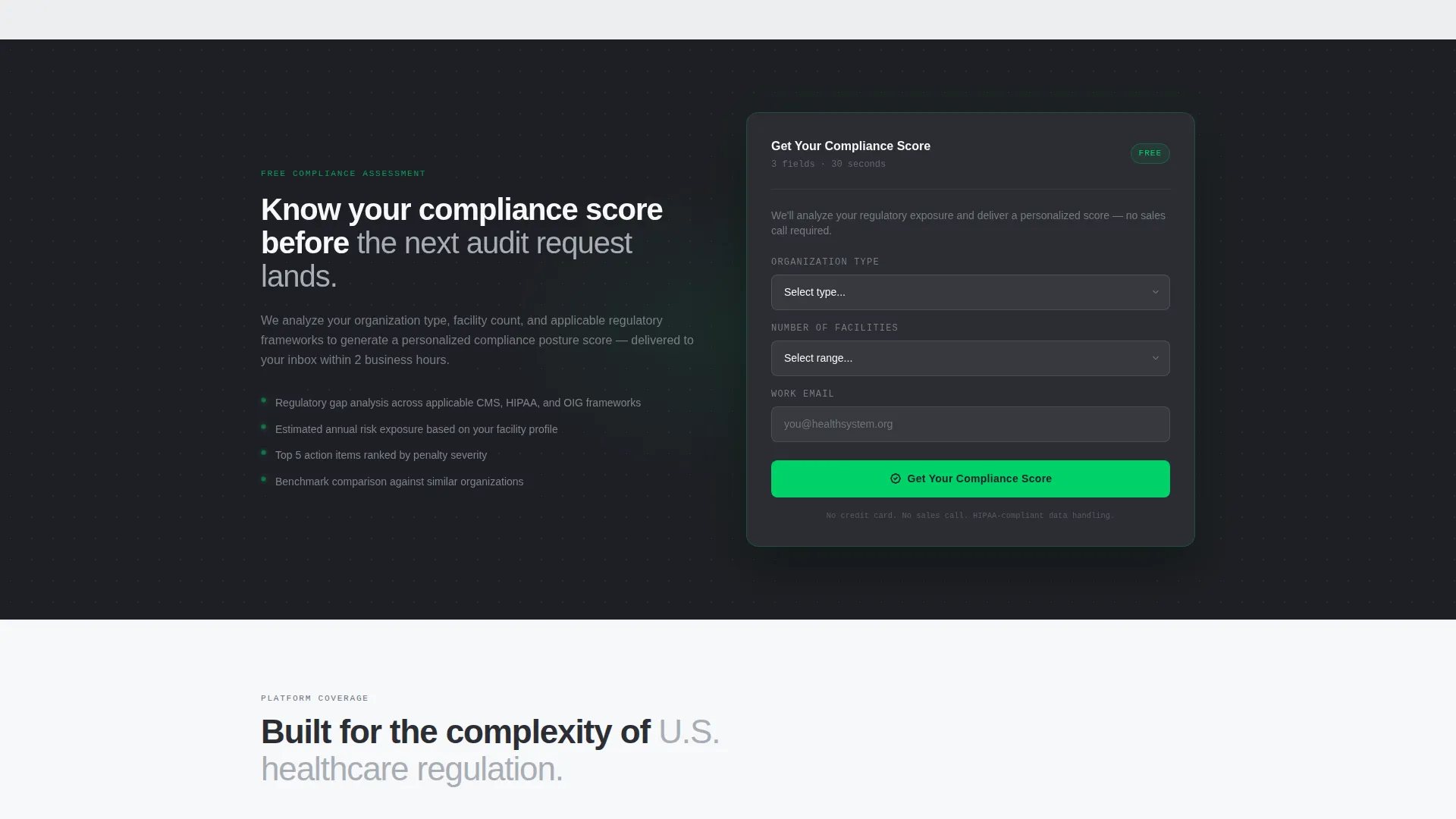
- A mid-page and mobile sticky lead-capture form asking for organization type, facility count, and work email
Feature list
This template includes purpose-built components that serve both the visual identity and the conversion goal. Each one is grounded in the source brief.
Live-Metrics Dashboard Header
The header is styled as a frozen mid-update command panel. It displays three large-format numbers: regulations tracked, audit readiness score, and overdue action items. A signal-green dot pulses beside each figure to reinforce active system status. There is no photography, no illustration, no human imagery. The data carries the hero moment entirely.
Modular Pain-Point and Feature Card Grid
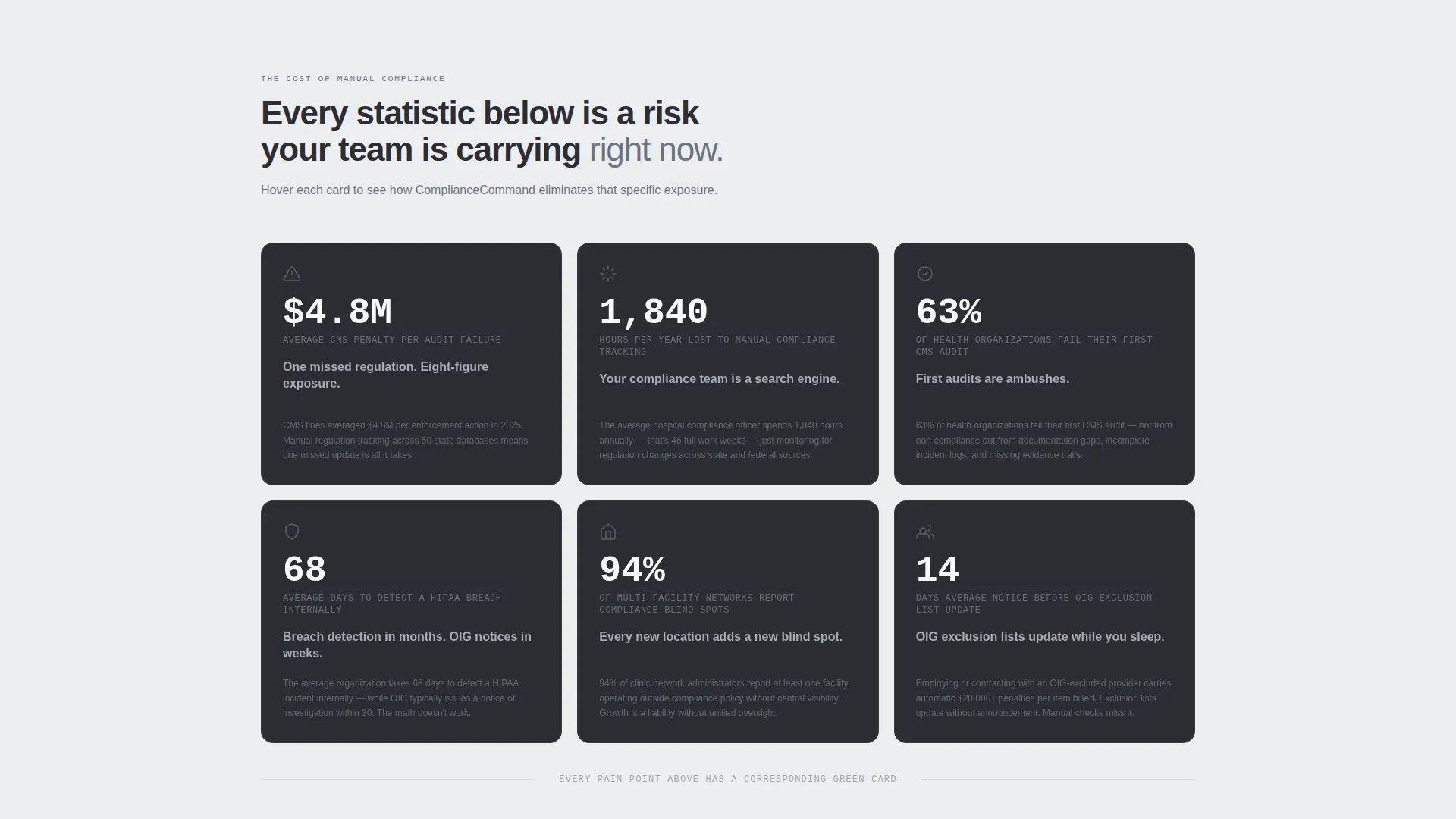
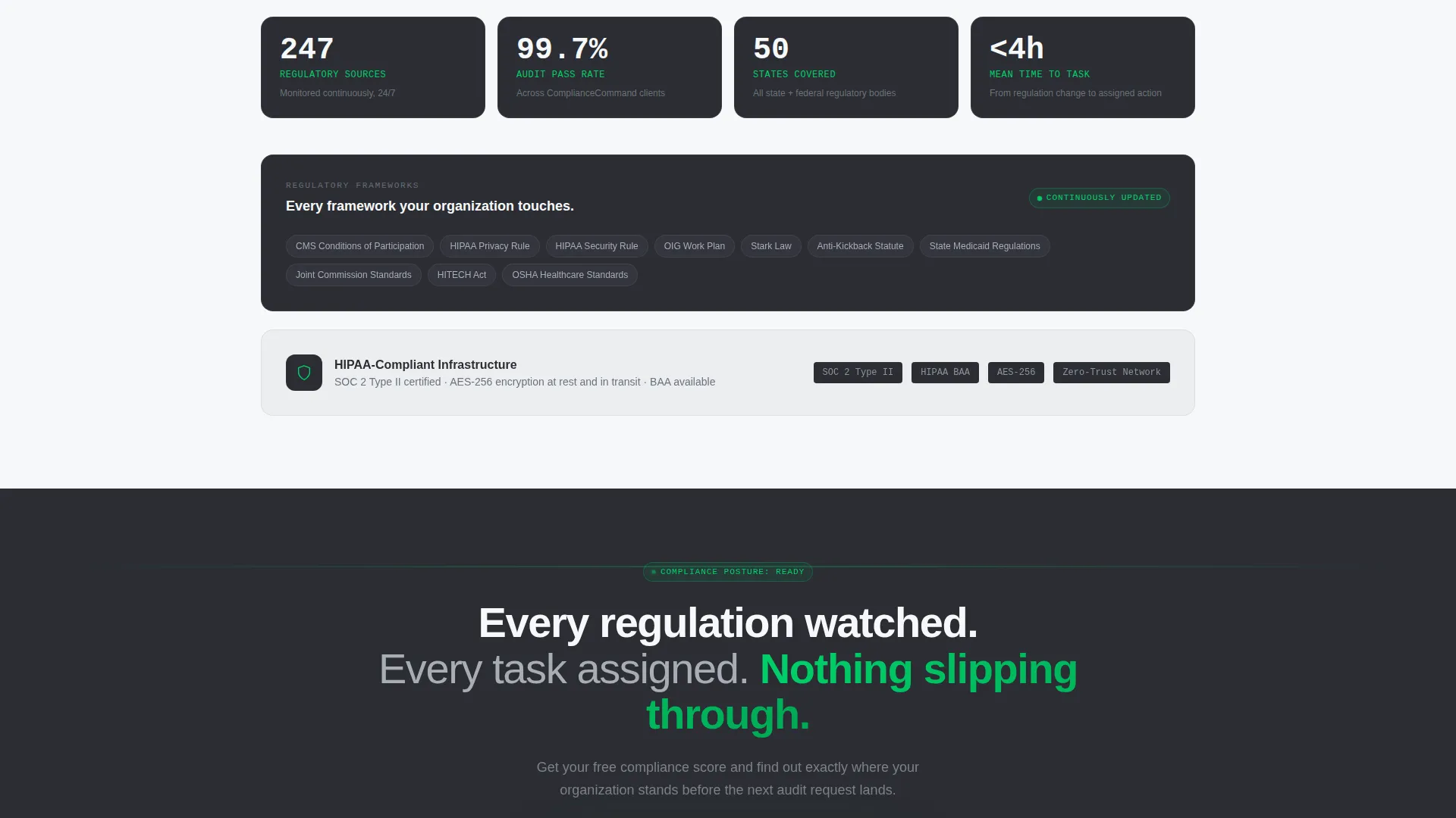
The page body is built on a repeating card-grid structure. The first pass of cards shows brutal industry statistics in aluminum text on gunmetal backgrounds. On further scroll, the same grid transitions: each card reveals the platform feature that addresses the specific pain, with signal-green bleeding in as the visual metaphor for resolution. The rhythm is deliberate tension followed by deliberate release.
Problem-to-Solution Arc Layout
The page is structured as a ratcheting narrative. Pain-point cards come first, stacking pressure on the visitor. Feature cards follow in the same positions, providing direct answers. This structure is not decorative. It is the primary persuasion mechanism, designed so that by the last row, the visitor has mentally completed the before-and-after comparison.
Qualifying Lead Capture Form
The call-to-action is "Get Your Compliance Score." The form asks three qualifying questions: organization type, number of facilities, and work email. It appears once mid-page after the pain-point section and again as a sticky bottom bar on mobile. No demo scheduling, no pricing conversation. The compliance score promise delivers perceived immediate value in exchange for contact information.
Monochrome Steel Design System
Every color in the palette earns its place through function. Gunmetal (#2B2D33) is the card background. Brushed aluminum (#A8ADB5) carries secondary text. Surgical white (#F7F8FA) renders primary numbers and headlines. Signal green (#00D26A) is used exclusively for positive-state indicators, active buttons, and hover interactions. Section rows alternate between surgical white and a faint gray (#EDEEF0) to separate content without visible borders.
Data-Only Hero Concept
There are no stock photographs or human faces anywhere on the page. The numbers themselves serve as the visual anchor. This choice communicates that the platform is built on data precision, not marketing gloss. For a compliance audience that distrusts hype, this is a trust signal in itself.
Page sections overview
| Section | Purpose |
|---|---|
| Metrics Dashboard Header | Establishes authority with three live-format compliance statistics and a signal-green pulse indicator |
| Pain-Point Card Grid | Stacks pressure on the visitor using brutal industry statistics rendered in aluminum on gunmetal |
| Mid-Page Lead Form | Captures qualified leads at peak tension with the "Get Your Compliance Score" prompt |
| Feature Card Grid | Releases tension by mapping each pain-point card to a direct platform feature with signal-green accents |
| Sticky Mobile call to action Bar | Repeats the lead form as a persistent bottom bar on mobile to maintain conversion access throughout scroll |
Design & branding system
The visual identity is built on a Data Command theme executed entirely in Monochrome Steel. No warmth enters the palette. Every color serves a function, and that restraint is itself a credibility signal for a compliance audience.
- Core palette: gunmetal base (#2B2D33), brushed aluminum (#A8ADB5), surgical white (#F7F8FA), and signal green (#00D26A) reserved strictly for positive states and interactive elements
- Section backgrounds alternate between surgical white and light gray (#EDEEF0) to create visual separation without borders, keeping the layout clean and structured
- Typography renders primary metrics in oversized surgical white; secondary labels and descriptive text appear in brushed aluminum against gunmetal card surfaces
Mobile & speed optimization
The template is structured with mobile conversion in mind. The sticky bottom bar behavior ensures the lead form stays within reach no matter how far a visitor scrolls on a smaller screen.
- The card grid uses a modular layout that reflows naturally for narrower viewports without losing the pain-to-feature arc sequence
- The sticky mobile call to action bar repeats the "Get Your Compliance Score" form as a persistent element, preventing drop-off when the desktop mid-page form is no longer visible
How this template helps you convert
This template is engineered to move a skeptical senior healthcare buyer from arrival to form submission through a specific sequence of trust signals and emotional progression.
- The metrics dashboard header delivers immediate credibility by leading with precise numbers rather than promises, establishing the platform as data-driven before the visitor reads a single marketing sentence
- The Problem→Solution Arc card grid creates a mirror effect where each visitor recognizes their specific pain point and sees the resolution in the same visual frame, making the platform feel purpose-built for their role
- The low-friction "Get Your Compliance Score" form replaces a high-commitment demo request with an offer of personalized value, qualifying the lead while reducing the psychological cost of the click
Other information about this template
This template is a strong fit for healthcare compliance software vendors who operate in a competitive space where buyer trust is earned through specificity, not claims. A few additional details worth noting:
- The template style is Card Grid (Modular), making it straightforward to swap, reorder, or extend individual cards without restructuring the whole page
- The header concept is Stats and Metrics, which aligns naturally with how compliance buyers evaluate tools: they look for numbers first, narrative second
- The creative direction follows a Problem→Solution Arc, a structure that works particularly well for regulated-industry software where the cost of inaction is quantifiable
- The lead generation direction means there is no pricing section and no product tour embedded in the page, keeping the visitor focused on a single conversion action
- The template sits in the Healthcare Software and Software as a Service subcategory under the Technology category, making it relevant for any compliance platform targeting multi-facility healthcare organizations
Theme
Data Command
Creative direction
Problem→Solution Arc
Color system
Monochrome Steel
Style
Card Grid (Modular)
Direction
Lead Generation
Page Sections
Live-metrics Dashboard Header
Modular Pain-to-feature Card Grid
Problem-to-solution Arc Structure
Qualifying Lead Capture Form
Monochrome Steel Color System
Data-only Hero Concept
Related questions
Who is the target buyer for this landing page template?
Does the template include a demo booking or pricing section?
Can I change the statistics shown in the header?
How does the card grid work structurally?
Is this template suitable for a single compliance product or a broader platform?



