Specialist Optometry Software Privacy Policy & Terms Website Template
Comply is a dashboard-style landing page template built for optometry compliance management platforms. It combines a Data Command visual identity, animated provider tiles, radial CE progress rings, and a scrollable feature matrix to give practice managers and compliance officers an immediate sense of control. The template drives toward app download with paired store badges and a team-sharing email path.
by Rocket studio
Quick summary
Comply is a single-page, dashboard-driven landing page template designed for optometry compliance software. It opens with a scrolling logo bar, moves through an animated provider snapshot, and builds trust through a layered feature matrix before closing on a clear app download call to action. The dark Void and Violet color system makes every green status indicator feel earned.
Who this template is for
This template is built for teams selling or marketing optometry compliance software to practice operators who feel the weight of regulatory exposure every day. It speaks directly to people who have too many providers, too many deadlines, and too little visibility.
- Regional optometry group practice managers overseeing 14 or more providers across multiple office locations
- Compliance officers at private equity-backed vision care organizations who need scalable, auditable documentation
- Solo practitioners who received a state board warning letter and want a system that prevents a second one
What problem this template solves
Managing license renewals, Health Insurance Portability and Accountability Act audit trails, and continuing education credit deadlines across several locations inside a spreadsheet is a fragile approach. One missed expiration date can trigger a state board inquiry that takes months to resolve. This template shows prospects exactly what unmanaged compliance looks like and positions the platform as the monitored alternative.
- Practices lose track of individual provider license expiration dates when headcount grows beyond a handful of doctors
- Continuing education credit deadlines vary by state and renewal cycle, making manual tracking error-prone at scale
- Audit preparation without a centralized record system puts practices at risk during unexpected state board reviews
What you get with this template
The template delivers a fully structured, single-page layout with every section mapped to a specific stage of the buyer's decision. Visitors move from institutional credibility to feature detail to a confident call to action without a single dead end.
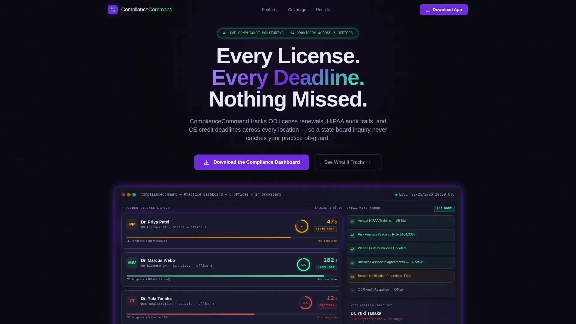
- An animated hero dashboard with provider license countdown tiles, radial continuing education progress rings, and a cascading Health Insurance Portability and Accountability Act task queue
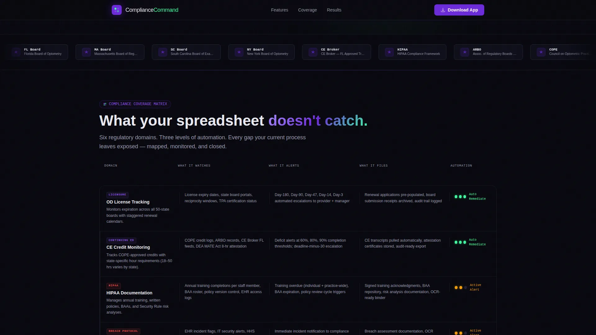
- A scrollable feature matrix grid organized by regulatory domain, including licensure tracking, audit documentation, and continuing education monitoring
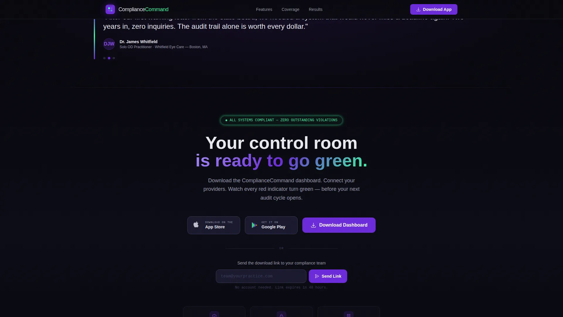
- An app download section with paired App Store and Google Play badges alongside a secondary email input for team sharing
Feature list
This section covers the key capabilities the template is built to showcase. Each one maps to a real concern for the compliance-focused buyer.
Animated Provider Dashboard Snapshot
The hero section renders a live-feeling dashboard with named provider tiles, license expiration countdowns, and radial progress rings showing continuing education completion percentages. The specificity of entries like "Dr. Patel: OD License TX, 47 days remaining" makes the platform feel operational before the visitor reads a single marketing claim.
Scrolling Institutional Logo Bar
A horizontal marquee ribbon displays optometry group logos and state board seals at a deliberate pace. It establishes regulatory credibility and peer recognition before any feature copy appears, which is critical for a compliance audience that trusts institutions over promises.
Feature Matrix Compliance Grid
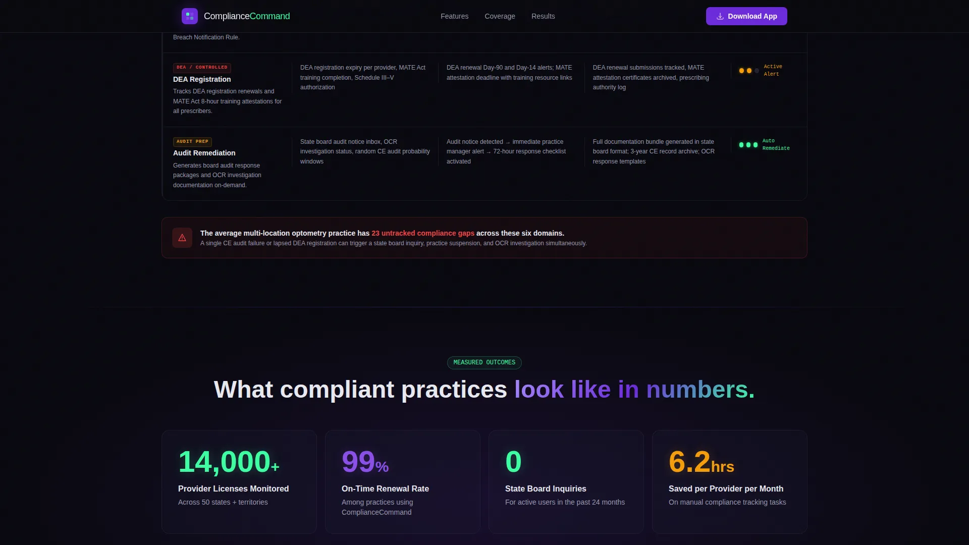
A structured grid of capability cards organizes the platform by regulatory domain. Each row covers a distinct area such as licensure tracking, Health Insurance Portability and Accountability Act documentation, continuing education monitoring, and audit preparation. Columns break down automation depth: what the system monitors, what it alerts, and what it files.
Cascading Health Insurance Portability and Accountability Act Task Queue
The hero section includes a live-style task queue with green checkmarks cascading down completed items. This visual device communicates that the platform does not just track problems; it resolves them, shifting the emotional register from anxiety to control.
App Download Call to Action with Team Sharing
The primary call to action button invites visitors to download the compliance dashboard directly, with App Store and Google Play badges displayed side by side. A secondary single-field email input lets a practice manager send the app link to their team without leaving the page.
Scroll-Linked Animation System
SVG neon grid lines, Intersection Observer-triggered stat counters, dashboard tile hover states, and feature matrix row highlights activate as the visitor scrolls. The animations reinforce the "control room" feeling without distracting from the compliance message.
Page sections overview
| Section | Purpose |
|---|---|
| Hero Dashboard Snapshot | Opens with animated provider tiles, CE rings, and HIPAA task queue to simulate the platform in use |
| Scrolling Logo Bar | Displays optometry group logos and state board seals to establish institutional trust |
| Feature Matrix Grid | Walks through regulatory domains with automation depth columns to reveal coverage gaps |
| Social Proof Counters | Scroll-triggered animated stat counters and specific provider examples build believability |
| App Download call to action | Drives conversion with store badges and a secondary email team-send field |
| Footer | Horizontal flow footer pattern closing the page cleanly |
Design & branding system
The Void and Violet color system creates a spacecraft bridge atmosphere: dark, calm, and completely monitored. Every color carries a functional meaning that reinforces the compliance theme visually before the visitor processes any text.
- Core palette: absolute void black (#09090F) as the base, deep command violet (#6C2BD9) for active elements and hover states, cool interface gray (#1A1A2E) for surface layers, electric status mint (#3DFFA2) for success and healthy compliance states, and clinical white (#E8E8F0) for all body text
- Typography pairing: Manrope for headings to carry authority and structure, DM Sans for interface labels and data annotations to keep the dashboard feel clinical and legible
- Animation language: SVG neon grid lines, pulsing violet on interactive elements, mint checkmarks for resolved tasks, and magnetic call to action button behavior that reinforces the sense of precision
Mobile & speed optimization
The template is built desktop-first because compliance officers and practice managers typically review detailed dashboards at a workstation. Full mobile support ensures the layout is usable when a manager needs to check on the go.
- CSS animations power the radial progress rings and pulse effects, reducing dependency on heavy JavaScript libraries for visual fidelity
- Intersection Observer handles scroll-triggered stat counters and section reveals, so animations fire only when the element enters the viewport
- The logo marquee and dashboard tile hover states are structured to degrade gracefully on smaller screens without breaking the core layout
How this template helps you convert
The page is architected so that by the time a visitor reaches the call to action, they have already self-identified the compliance gaps the platform would close. Conversion is the natural conclusion of the scroll, not a cold ask.
- The dashboard snapshot in the hero section creates immediate product recognition. Visitors who manage real providers see their own situation reflected in the tile data, which builds personal relevance before any feature is explained.
- The feature matrix deepens the gap analysis as the visitor scrolls. Each row in the compliance checklist grid surfaces a regulatory domain the visitor may be handling manually, and the automation depth columns make the cost of that manual approach visible.
- The app download section arrives after the case has already been made. Paired store badges and the team-send email field lower the barrier to commitment, offering two distinct entry points for different buyer decision styles.
Other information about this template
This template is categorized under Technology and specifically targets the optometry software subcategory. It is localized for United States practices, with date formats set to MM/DD/YYYY and references calibrated to state board language and USA regulatory contexts.
- The template style is Dashboard and Data Grid, making it well-suited for any compliance or monitoring platform that benefits from showing data in motion rather than static marketing copy
- The Data Command theme and Void and Violet color system are purpose-built for this intersection of healthcare technology and regulatory software, where a clinical, authoritative visual register builds trust faster than lifestyle imagery
- The page is designed as a single-page landing experience, not a multi-page site, which keeps the user journey linear and conversion-focused
- Footer pattern follows the Vercel Horizontal Flow layout, providing a clean, structured close to the page without unnecessary navigation
Theme
Data Command
Creative direction
Feature Matrix
Color system
Void & Violet
Style
Dashboard/Data Grid
Direction
App Download
Page Sections
Animated Provider Dashboard Snapshot
Scrolling Institutional Logo Bar
Feature Matrix Compliance Grid
Cascading HIPAA Task Queue
App Download Call to Action with Team Sharing
Scroll-linked Animation System
Related questions
Who is this landing page template designed for?
What sections are included in the template?
What call to action does this template use?
Can this template be adapted for a single-location practice?
Does the template include real provider data?



