Specialist Pharmacy Software Privacy Policy & Terms Website Template
Comply is a pharmacy quality management landing page template built for compliance-driven teams. It leads with an interactive risk assessment tool, then guides visitors through a comparison table contrasting manual tracking against the platform. The design uses a Tech Glass visual system with iridescent gradients, frosted-glass cards, and a live dashboard mockup to build immediate credibility and drive app downloads.
by Rocket studio
Quick summary
Comply is a single-page pharmacy compliance landing page template that puts an interactive scoring tool front and center. Visitors assess their own risk before reading a word of marketing copy. The comparison table that follows turns that earned insight into a clear reason to download the app and take action.
Who this template is for
This template is built for compliance-focused pharmacy professionals who need to demonstrate the platform's value quickly. It speaks directly to decision-makers carrying real regulatory weight.
- Pharmacy directors preparing for Board of Pharmacy audits and multi-site oversight
- Quality assurance pharmacists documenting sterile compounding procedures under time pressure
- Hospital system compliance officers managing quality across dozens of pharmacy locations
What problem this template solves
Pharmacy compliance teams often struggle to communicate the cost of manual tracking to stakeholders who hold the budget. A generic SaaS landing page does not resonate with someone juggling United States Pharmacopeia (USP) chapter requirements at 2 AM. This template closes that gap by giving visitors a personalized risk score before asking them to buy anything.
- Visitors arrive with skepticism and leave with a compliance grade they personally generated
- Manual-versus-platform comparisons make the value case without requiring a sales call
- The app download call to action is placed at the exact moment motivation is highest: right after the score appears
What you get with this template
You get a fully structured, single-page layout designed around a specific conversion path: assess, compare, download. Every section earns the next one, building trust through demonstrated utility rather than promotional language.
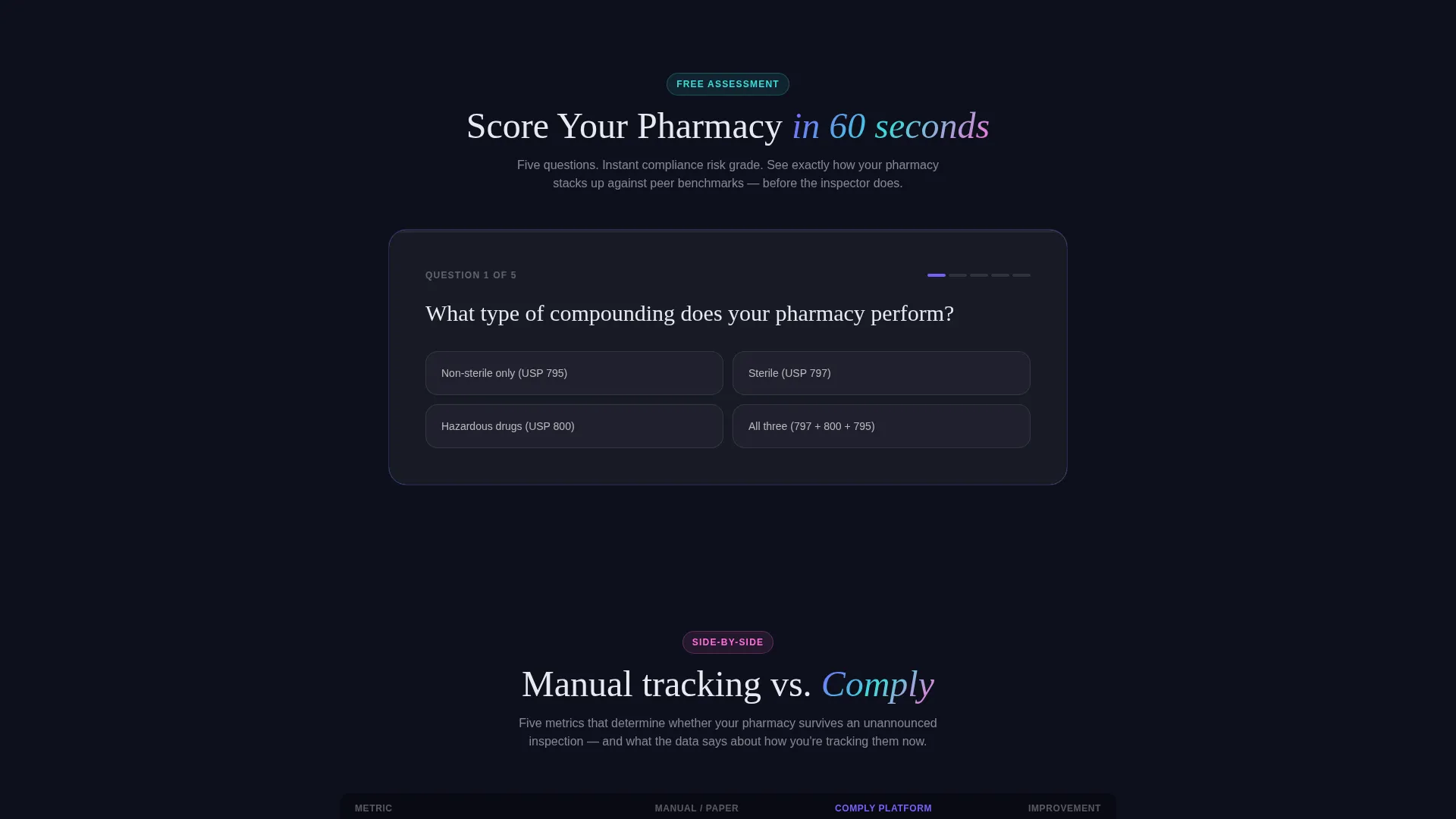
- An interactive five-question compliance assessment with instant risk grading and peer benchmarks
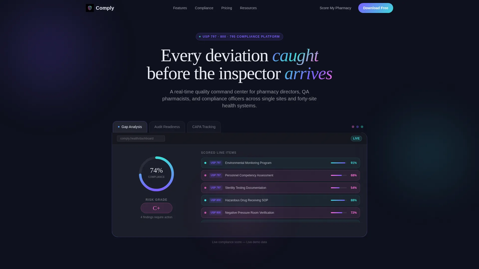
- A Feature Tab Switcher header showcasing Gap Analysis, Audit Readiness, and CAPA Tracking views
- A sticky mobile call-to-action bar and app store badges styled in frosted iridescent glass
Feature list
This template includes purpose-built components that reflect the real workflows of pharmacy compliance professionals. Each one is designed to do a specific job within the conversion flow.
Interactive Compliance Scoring Tool
A five-question mini-assessment covers compounding type, last inspection date, documentation method, site count, and accreditation status. On completion, it instantly generates a color-coded compliance risk grade alongside a peer benchmark comparison table.
Feature Tab Switcher Header
Three frosted-glass tabs sit above a live dashboard mockup. Each tab, Gap Analysis, Audit Readiness, and CAPA Tracking, transitions with a glass-panel slide animation to reveal a different tool face, keeping the header engaging without requiring the visitor to scroll.
Animated Radial Compliance Gauge
The default Gap Analysis view renders a pharmacy's compliance score as an animated radial gauge. USP 797, 800, and 795 chapters are broken into scored line items, with softly pulsing red flags marking failed criteria in real time.
CAPA Workflow Display Panel
The CAPA Tracking tab surfaces an open deviation record showing assignee, root cause field, and an elapsed time ticker. This component communicates the platform's depth to quality pharmacists who live inside corrective and preventive action workflows daily.
Comparison Table Section
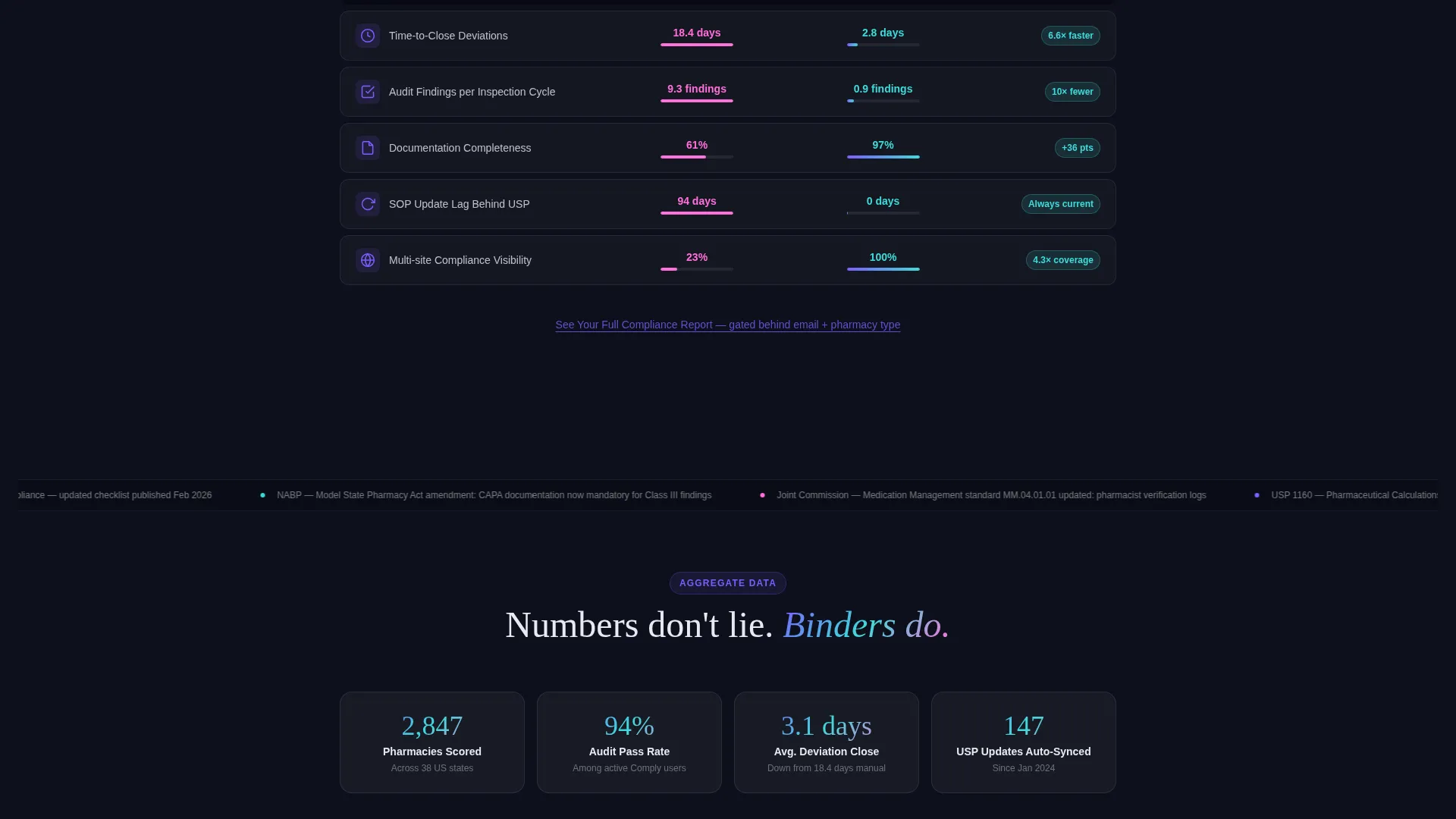
Each column in the main comparison table maps directly to a metric, time-to-close deviations, audit findings per cycle, and documentation completeness percentage. The section contrasts manual tracking against the platform using aggregate anonymized data and before-and-after figures.
Sticky Mobile Call-to-Action Bar
On mobile viewports, a persistent bottom bar keeps the primary call to action, "Download and Run Your First Audit," visible throughout the scroll. This prevents drop-off at any point in the page without interrupting the reading flow on desktop.
Page sections overview
| Section | Purpose |
|---|---|
| Feature Tab Switcher Header | Showcase Gap Analysis, Audit Readiness, and CAPA Tracking via interactive frosted-glass tabs |
| Compliance Score Tool | Let visitors self-assess across five questions and receive an instant risk grade |
| Peer Benchmark Table | Compare visitor score against anonymized peer data to establish urgency |
| Comparison Table Body | Contrast manual tracking versus platform across key compliance metrics |
| Regulatory Updates Ticker | Display a scrolling feed of regulatory changes the platform auto-incorporates |
| Primary App Download call to action | Drive the "Download and Run Your First Audit" action immediately after scoring |
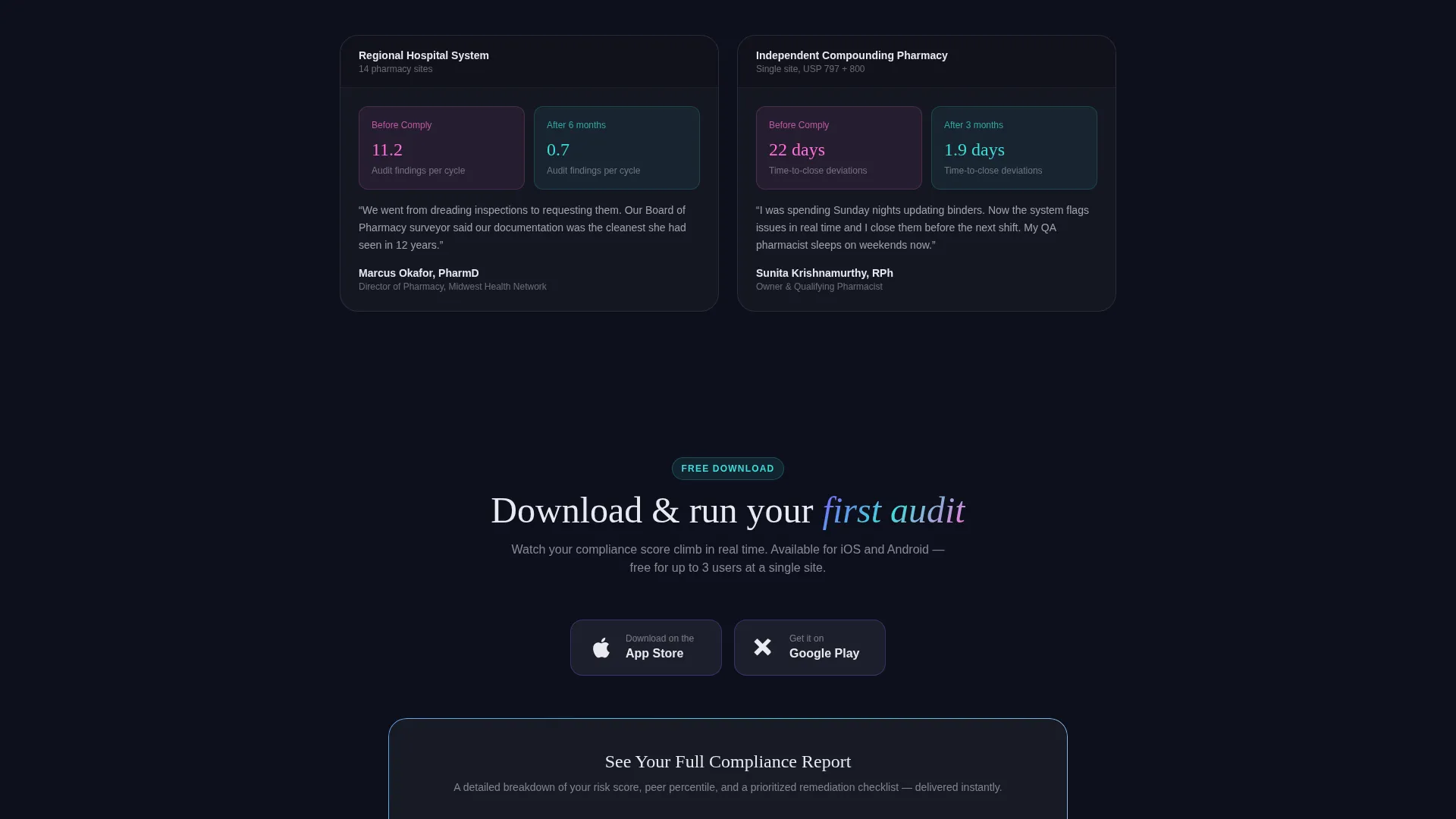
| Email-Gated Report call to action | Capture leads via "See Your Full Compliance Report" gated behind email and pharmacy type |
| App Store Badges | Render iOS and Android download links in frosted iridescent glass styling |
| Sticky Mobile Bar | Keep the primary call to action visible on mobile throughout the full scroll |
Design & branding system
The visual identity uses a Tech Glass theme layered over an AI Iridescent color system. The result feels precise and clinical without being cold. Every surface communicates control and scientific rigor.
- Deep pharma black (#0D0F1C) backgrounds with frosted-glass cards at 60% opacity floating above, cool white text, and iridescent violet (#7B5FFF) shifting to cool teal (#3EDBD9) on gradients and hover states
- Clinical highlight pink (#FF6FD8) reserved for alerts, badges, and pulsing compliance flags to draw the eye without disrupting the overall palette
- Interactive elements catch iridescent gradient shifts on cursor movement, and the animated radial gauge, tab transitions, and elapsed time ticker all reinforce the sense of a live, working system
Mobile & speed optimization
The layout is built with mobile pharmacy professionals in mind. A quality assurance pharmacist checking deviation status from a tablet at a cleanroom workstation needs the same clarity as someone on a desktop.
- The sticky bottom call-to-action bar keeps the primary download action reachable without scrolling back to the top
- App store badges are rendered in the same frosted iridescent glass style as the rest of the template, maintaining visual cohesion on small screens
- Tab switcher and glass-panel slide animations are scoped to the header area so they do not interfere with the scrolling experience on touch devices
How this template helps you convert
The conversion strategy is built on a principle of earned trust. Visitors do not encounter a hard pitch until they have already generated something personally useful.
- The compliance scoring tool creates ownership: visitors receive a specific risk grade tied to their own answers, which gives them a concrete number they want to improve, making the app download feel like the natural next step.
- The comparison table escalates evidence progressively, moving from the visitor's personal score to peer benchmarks to anonymized real-world before-and-after data, so credibility builds across the scroll rather than front-loading claims.
- The dual call-to-action structure, a primary app download and a secondary email-gated report, captures both ready-to-act visitors and those who need more evidence before committing.
Other information about this template
This template is designed specifically for the pharmacy quality management software category and fits naturally within the broader pharmacy compliance technology space. It is best suited for teams launching or promoting a dedicated compliance platform rather than a general practice management tool.
- The template style is a Comparison Table layout, making it well-suited for positioning a platform against manual or legacy processes
- The creative direction is Calculator and Tool First, meaning the interactive assessment is a structural requirement, not an optional module
- The header concept is a Feature Tab Switcher, which requires the three tab states, Gap Analysis, Audit Readiness, and CAPA Tracking, to be present in the final build
- The landing page direction targets an App Download conversion goal, and both the primary call to action and the sticky mobile bar are oriented around this outcome
- This template sits within the Technology category and Pharmacy Software subcategory, making it relevant to platforms serving hospital systems, independent compounding pharmacies, and multi-site retail pharmacy networks
Theme
Tech Glass
Creative direction
Calculator/Tool First
Color system
AI Iridescent
Style
Comparison Table
Direction
App Download
Page Sections
Interactive Five-question Risk Assessment
Feature Tab Switcher with Live Dashboard
Animated Radial Compliance Gauge
Scrolling Regulatory Updates Ticker
Dual Call-to-action Structure
Related questions
Who is this landing page template built for?
Does the interactive scoring tool require a backend to function?
Can I update the comparison table columns to match my platform's metrics?
What conversion action does this template prioritize?
Is the Tech Glass visual theme straightforward to customize?



