Advanced Software & SaaS Privacy Policy & Terms Website Template
Comply is a safety management software landing page template built for EHS (Environmental Health and Safety) teams who need to project control-room confidence. It uses a card grid layout, a Feature Tab Switcher header, and a Carbon Fiber visual system to turn a complex compliance pitch into a clear, clickable case for switching from spreadsheets to a unified risk platform.
by Rocket studio
Quick summary
Comply is a modular card-grid landing page template designed for safety management software. It opens with an interactive Feature Tab Switcher, walks visitors through a Feature Matrix comparing workflow capabilities, and closes with a self-diagnosing sign-up form. The Tech Glass visual theme and Carbon Fiber color system give it the look and feel of a live operations dashboard.
Who this template is for
This template is built for software-as-a-service companies in the safety management and compliance space. It speaks directly to buyers who carry serious operational risk on their shoulders every day.
- EHS (Environmental Health and Safety) directors at manufacturing plants running multiple shifts
- Construction project managers tracking OSHA logs across multiple active job sites
- Compliance officers at chemical facilities managing MOC (Management of Change) workflows and near-miss reporting
What problem this template solves
Safety teams are often drowning in disconnected tools. Incident reports live in email threads, audit checklists sit in shared drives, and regulatory deadlines get tracked in color-coded spreadsheets that only one person understands. No single screen tells you whether the system is healthy or on fire.
- Visitors arrive without a clear picture of how the software unifies scattered compliance workflows
- Buyers struggle to compare the product against manual processes or legacy EHS platforms they already use
- Prospects need a low-friction way to self-identify their pain points before committing to a demo or trial
What you get with this template
The template delivers a complete, conversion-focused single-page layout. Every section is designed to build trust one scroll at a time, guiding a skeptical safety professional from curiosity to confident action.
- A five-tab interactive header that lets visitors explore core safety modules before reading a single line of copy
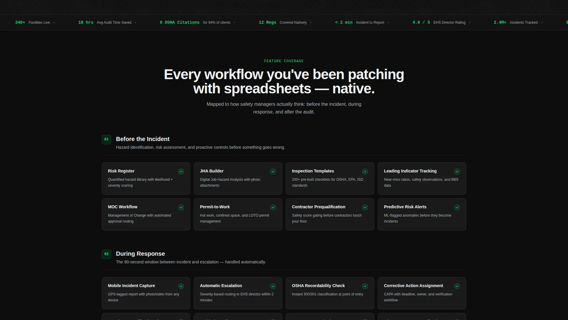
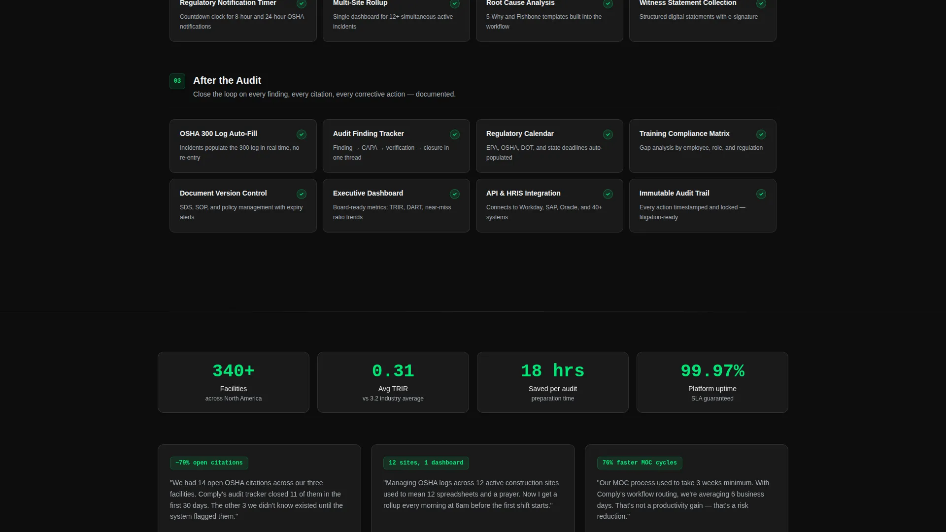
- A modular card grid structured around real buyer anxieties: "Before the Incident," "During Response," and "After the Audit"
- A three-column horizontal comparison strip and a sticky secondary call to action leading to a three-field sign-up form
Feature list
This template includes the following built-in design and structural features, each grounded directly in the source brief.
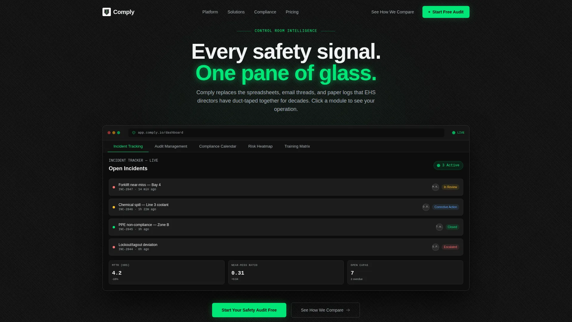
Interactive Feature Tab Switcher
The header houses five horizontal tabs labeled with core safety modules: Incident Tracking, Audit Management, Compliance Calendar, Risk Heatmap, and Training Matrix. Each tab click swaps the dashboard screenshot inside a glassmorphic browser frame using a smooth crossfade. Active tabs glow in high-voltage green; inactive tabs sit in brushed aluminum.
Modular Capability Card Grid
The main scroll area is organized as uniform dark glass tiles arranged in a feature matrix. Each card carries a feature name, a one-line description in signal white, and either a glowing green checkmark or a muted gray dash. Cards are clustered by buyer workflow stage so the grid builds a logical, progressive argument as the visitor scrolls.
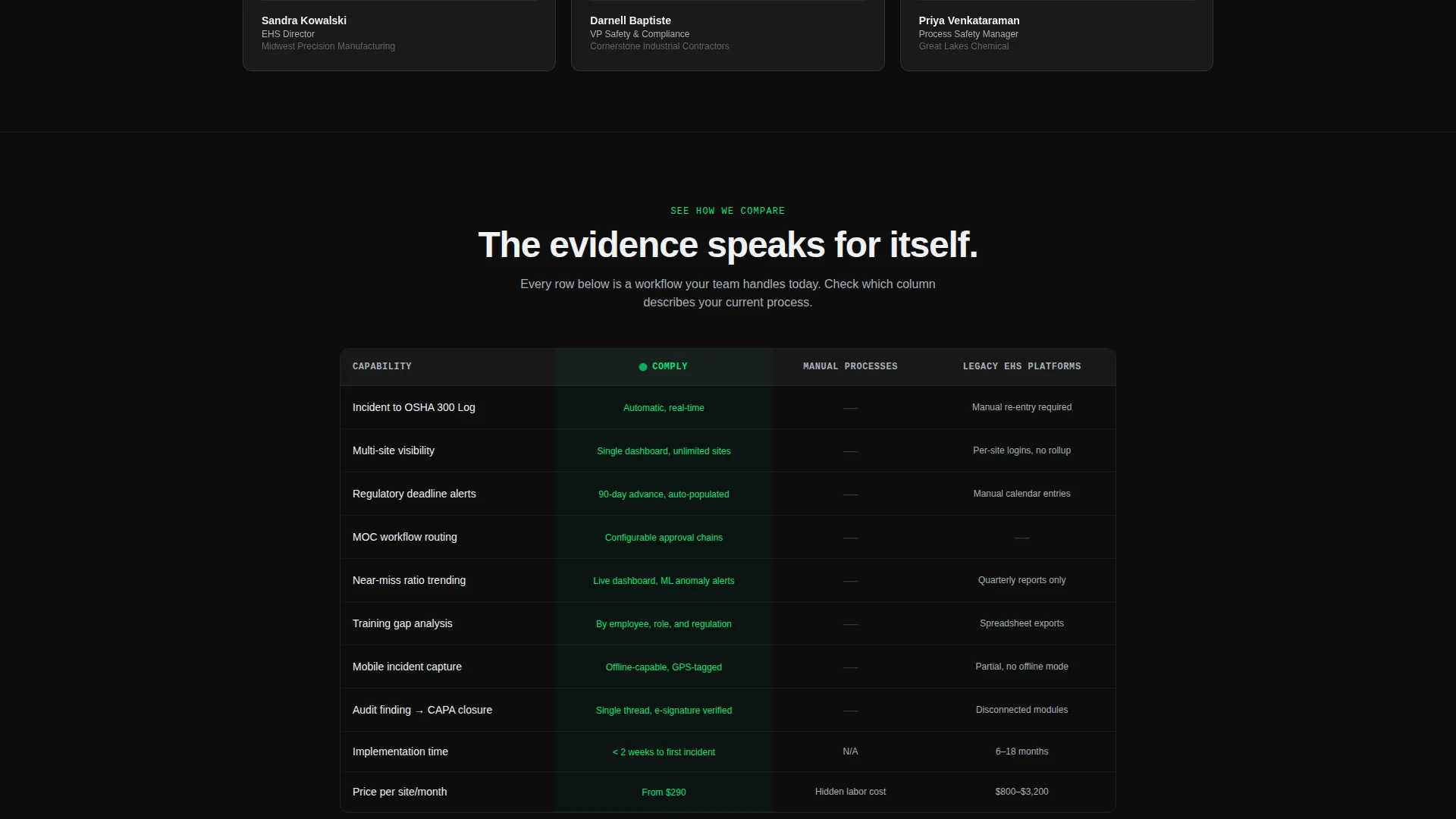
Three-Column Comparison Strip
A horizontal comparison section pins the product side-by-side against manual processes and legacy EHS platforms. The layout lets the data do the persuading without any promotional language. It anchors directly to the primary call-to-action button labeled "See How We Compare."
Self-Diagnosing Sign-Up Form
The conversion form includes three fields: work email, a company size dropdown (50 to 200, 200 to 1,000, and 1,000 or more employees), and a checkbox list of current pain points covering incident tracking, audit preparation, regulatory reporting, and training compliance. Visitors effectively qualify themselves before submitting.
Sticky Secondary Call to Action
A persistent secondary call to action reading "Start Your Safety Audit Free" stays visible as the visitor scrolls. It links directly to the sign-up form, reducing the distance between intent and action at any point on the page.
Carbon Fiber Visual Identity System
The entire page is built on a five-value color palette engineered to feel like a live control room. Deep cockpit black, woven carbon gray, brushed aluminum, signal white, and a single high-voltage green accent create a technically precise atmosphere where the green color carries meaning: the system is live and healthy.
Page sections overview
| Section | Purpose |
|---|---|
| Feature Tab Switcher | Lets visitors explore core safety modules interactively before reading body copy |
| Capability Card Grid | Stages features by workflow phase to map against real buyer anxieties |
| Comparison Strip | Positions the product against manual processes and legacy platforms side by side |
| Interactive Comparison Table | Provides detailed feature-level evidence anchored by the primary call to action |
| Sign-Up Form | Captures leads through a self-diagnosing three-field form with pain-point checkboxes |
Design & branding system
The visual identity follows a Tech Glass theme built on a Carbon Fiber color system. The palette feels engineered and purposeful, with dark surfaces that only catch light at specific angles and a single accent color that signals system health.
- Colors: deep cockpit black (#0D0D0D), woven carbon gray (#2B2B2B), brushed aluminum (#A8B0B8), signal white (#F0F2F4), and high-voltage green (#00E676) reserved exclusively for active states, toggles, and the primary call to action
- Card styling: uniform dark glass tiles with a faint 1-pixel aluminum border and glassmorphic browser frames in the header
- Green usage: strictly limited to active tab indicators, live-state toggles, checkmarks in the feature matrix, and primary call-to-action buttons
Mobile & speed optimization
The card grid layout is modular by design, which means it adapts naturally to narrower viewports without breaking the visual hierarchy. The template is structured to remain scannable and functional on smaller screens.
- Modular card tiles reflow cleanly across screen widths without losing the feature-matrix structure
- The sticky secondary call to action remains accessible throughout the scroll on both desktop and mobile viewports
- The five-tab switcher and glassmorphic frame are designed for touch interaction as well as mouse-click navigation
How this template helps you convert
The page is built around a comparison-and-versus conversion strategy. Every design and content decision is engineered to move a safety professional from awareness to action through evidence rather than pressure.
- The Feature Tab Switcher lets visitors interact with the product interface before reading a word of sales copy, building familiarity and trust at the very first scroll position.
- The modular card grid and comparison strip present a quiet, accumulating argument: by the time visitors reach the form, they have already mentally mapped their broken processes to specific green checkmarks on the page.
- The self-diagnosing sign-up form lets visitors select their own pain points, which lowers form friction and ensures the leads who submit are already aligned with the product's core use cases.
Other information about this template
This template is built specifically for the safety management software category within the broader Software-as-a-Service market. It is designed to support technology companies competing in a space where buyers are skeptical, risk-averse, and highly informed.
- The template style is Card Grid (Modular), making it easy to add, remove, or reorder capability clusters without disrupting the overall layout
- The creative direction is Feature Matrix, a structure proven effective for complex SaaS products where feature depth is a key purchase driver
- The header concept is Feature Tab Switcher, which replaces a traditional hero headline with a live product demonstration
- The landing-page direction is Comparison/Versus, meaning the entire page architecture is built to answer the question "why this over what I already use"
- The Tech Glass theme and Carbon Fiber color system are niche-specific choices that resonate with technically oriented buyers in manufacturing, construction, and chemical processing industries
Theme
Tech Glass
Creative direction
Feature Matrix
Color system
Carbon Fiber
Style
Card Grid (Modular)
Direction
Comparison/Versus
Page Sections
Interactive Feature Tab Switcher Header
Modular Capability Card Grid
Three-column Comparison Strip
Self-diagnosing Lead Capture Form
Sticky Secondary Call to Action
Carbon Fiber Visual Identity System
Related questions
What type of software is this landing page template designed for?
Can I replace the dashboard screenshots in the header tabs?
How is the comparison strip structured?
Is this template suitable for a free trial or demo conversion goal?
How customizable is the card grid layout?



