Healthcare Software Complete Professional Website Template
Comply is a dark-themed, Dashboard Pro landing page template built for healthcare warehouse management platforms. It combines a live-stats hero, an interactive comparison table, and a lead-generation form into one high-impact single page. Designed for cold-chain logistics operators, it communicates operational precision before asking for a single contact detail.
by Rocket studio
Quick summary
Comply is a single-page template built for healthcare warehouse management platforms operating in cold-chain environments. It opens with a mission-control stats header, guides visitors through an interactive comparison table, and closes with a targeted lead capture form. Every section is designed to build trust with supply chain professionals before the page ever asks for their information.
Who this template is for
This template speaks directly to operations professionals who manage regulated, temperature-sensitive inventory at scale. It is not a general-purpose healthcare template. It is purpose-built for people who understand what a freezer alarm at 3 a.m. actually costs.
- Hospital system supply chain directors managing multiple facilities
- Third-party logistics operators running FDA-audited cold-chain distribution centers
- Pharmaceutical operations managers responsible for biologics inventory and expiration compliance
What problem this template solves
Cold-chain warehouse teams often rely on manual lot tracking, paper-based counts, and reactive recall processes. These gaps create serious exposure. A single misplaced shipment can mean $200,000 in spoiled biologics. This template gives platforms a page that makes the cost of the status quo impossible to ignore.
- Visitors see exactly where their current workflow falls short, row by row in the comparison table
- The page builds the compliance and accuracy case before any form appears
- The lead form captures specific operational context, not just an email address
What you get with this template
You get a fully structured, single-page layout that moves visitors from awareness to action through a sequence of high-credibility sections. Every element is mapped to the mental model of a supply chain professional evaluating a new platform.
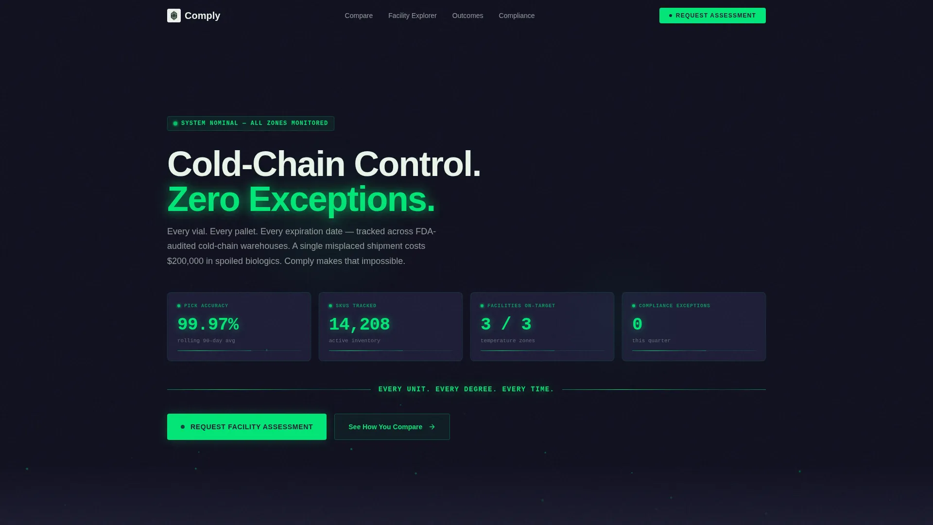
- A live stats hero section with mission-control readouts and a particle animation background
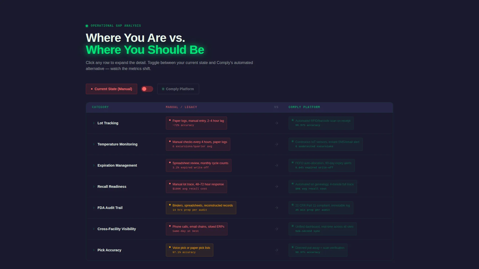
- An interactive comparison table that toggles between manual workflows and the automated platform alternative
- A dual lead generation path: a facility assessment request form and a gated compliance checklist download
Feature list
This template delivers a focused set of purpose-built components that work together to convert skeptical operations professionals into qualified leads.
Live Stats Hero Section
The header opens with large monospaced metrics frozen mid-operation: pick accuracy at 99.97%, 14,208 SKUs tracked, 3 facilities at target temperature, and 0 compliance exceptions this quarter. A particle animation drifts behind the readouts. A slow-pulsing green status bar anchors the headline "Every Unit. Every Degree. Every Time."
Interactive Comparison Table
Visitors toggle between their current manual workflow and the platform's automated alternative. Each row click shifts the visible metrics in real time, showing the gap between paper-based lot tracking and live system monitoring. The table earns visitor trust before any call to action appears.
Facility Map with Zone Hover States
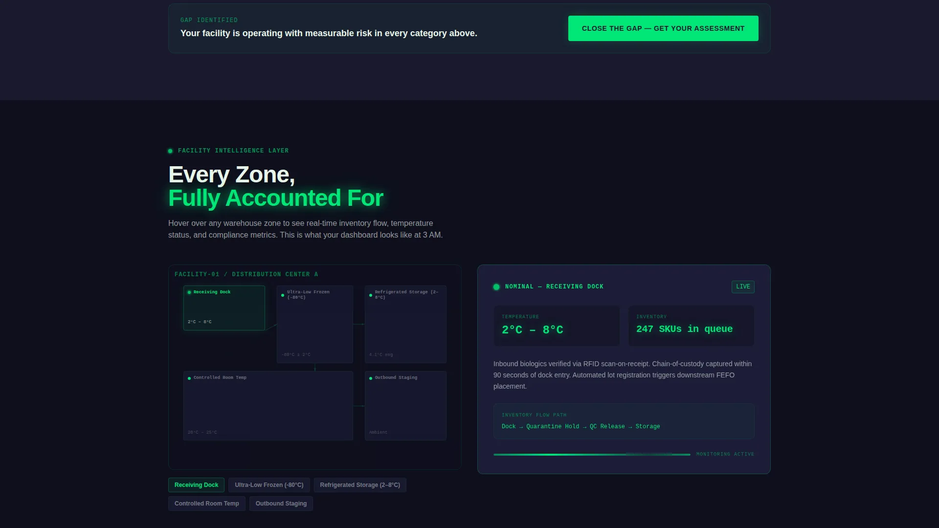
Below the comparison table, facility maps let visitors hover over warehouse zones to trace inventory movement from receiving dock to pick face to outbound staging. Each interaction reveals another layer of operational intelligence without requiring a demo call.
Dual Lead Capture Paths
The primary call to action reads "Request Your Facility Assessment." The form captures facility count, average SKU volume, current warehouse management system selection from a dropdown, and regulated product types handled. A secondary path offers a downloadable FDA 21 CFR Part 11 compliance checklist gated behind email capture.
Dashboard Pro Dark Theme
The Carbon Fiber color system uses deep carbon black, gunmetal panel gray, clinical status green, and alert amber reserved for hover states and live data pulses. The result is a visual identity that feels like the interior of a pharmaceutical cold room at midnight, precise and authoritative.
Page sections overview
| Section | Purpose |
|---|---|
| Stats Hero Header | Opens with live operational metrics and status bar headline to establish instant credibility |
| Comparison Table | Lets visitors toggle between manual and automated workflows to surface the performance gap |
| Facility Zone Maps | Shows inventory flow across warehouse zones through hover-activated interactive states |
| Assessment Request Form | Captures qualified lead data including facility count, SKU volume, and product types |
| Compliance Checklist Gate | Offers a secondary conversion path via a gated FDA 21 CFR Part 11 checklist download |
Design & branding system
The visual identity follows a Dashboard Pro theme using the Carbon Fiber color system. Every color choice carries operational meaning, mirroring the way real pharmaceutical cold rooms use indicator lights and status panels.
- Deep carbon black (#1A1A2E) and gunmetal panel gray (#30305A) form the background layer, creating a dark monitored environment feel
- Clinical status green (#00E676) highlights live data readouts, while alert amber (#FFAB00) is reserved for hover states and live data pulses
- Numbers throughout the page are large, monospaced, and slightly glowing, arranged like mission control readouts to reinforce precision at a glance
Mobile & speed optimization
The template is structured for clean presentation across screen sizes, keeping the data-dense hero readable and the comparison table functional on smaller displays.
- Monospaced metric displays and card-based comparison rows reflow cleanly for tablet and mobile viewports
- Particle animations and hover states are layered as progressive enhancements, so the core content remains accessible without them
- The lead capture forms are vertically stacked on smaller screens, keeping field labels and dropdowns easy to complete on any device
How this template helps you convert
The page is sequenced deliberately. Visitors encounter proof before they encounter a pitch, which is exactly how supply chain professionals prefer to evaluate enterprise software.
- The stats hero establishes credibility immediately, showing real operational benchmarks that resonate with the target audience before any feature description appears
- The interactive comparison table creates a personalized gap analysis in the visitor's mind, making the value of the platform concrete and specific to their current situation
- The dual conversion paths lower the barrier to entry, letting cautious buyers download a compliance checklist before committing to a full facility assessment request
Other information about this template
This template sits at the intersection of healthcare software and operational technology, making it well-suited for platforms targeting regulated industries beyond pharma, including medical device distributors and hospital network logistics teams.
- The template style is a Comparison Table layout, which is particularly effective for enterprise buyers who need to justify a platform switch to a procurement committee
- The lead generation direction is built into the page architecture itself, not bolted on as an afterthought
- The Interactive Explorer creative direction means the comparison table and facility maps are designed as engagement layers, not static content blocks
- This template is delivered as a fully structured single page, ready to customize with your platform's real metrics, product types, and facility data
Theme
Dashboard Pro
Creative direction
Interactive Explorer
Color system
Carbon Fiber
Style
Comparison Table
Direction
Lead Generation
Page Sections
Live Mission-control Stats Hero
Interactive Workflow Comparison Table
Facility Zone Hover Maps
Dual Lead Generation Paths
Carbon Fiber Dashboard Visual System
Related questions
Can I replace the hero stats with my platform's real operational data?
Is the comparison table interactive out of the box?
What does FDA 21 CFR Part 11 mean and why is it referenced in the template?
How does the dual lead capture path work?
Is this template suitable for industries outside of pharmaceutical warehousing?



