Comply - Ruthless Cannabis Landing Page Template
Comply is a dashboard-style landing page template built for cannabis AI document processing platforms. It presents live processing metrics, an interactive comparison grid, and a dual conversion path, all wrapped in a cold, monochrome steel aesthetic. The design communicates ruthless efficiency from the first scroll, targeting multi-state operators, compliance officers, and cannabis attorneys.
by Rocket studio
Quick summary
Comply is a single-page dashboard landing page template designed for cannabis AI document processing platforms. It leads with a live metrics wall, drives engagement through an interactive comparison grid, and closes with a dual conversion architecture. The visual identity is built entirely around monochrome steel tones and a single signal green reserved for success states and the primary call to action.
Who this template is for
This template was built for a very specific kind of buyer: teams and professionals who deal with high-volume cannabis compliance work and need to show prospects exactly how much faster their platform runs.
- Multi-state cannabis operators drowning in state-by-state license applications and lab result filings
- Compliance officers who manually cross-reference potency limits against lab results across multiple jurisdictions
- Cannabis attorneys billing hours reformatting seed-to-sale data for different state portals
What problem this template solves
Cannabis compliance teams spend enormous time on document work that should be automated. The gap between what a human team can process and what an AI platform can handle is massive, but it is hard to communicate without showing it in real numbers.
- Generic SaaS templates fail to convey the scale and urgency of high-volume regulatory document processing
- Prospects need to see workflow comparisons, not just read feature bullet points
- A static page cannot build the kind of evidence that earns a high-intent click from a compliance officer
What you get with this template
You get a fully structured, single-page dashboard landing page with every major section built out and ready to customize. Each section is designed to carry a specific piece of the conversion story.
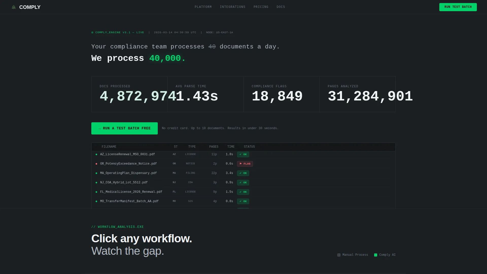
- A full-width live stats header with animated counters, a scrolling document log, and a headline that delivers the core value claim immediately
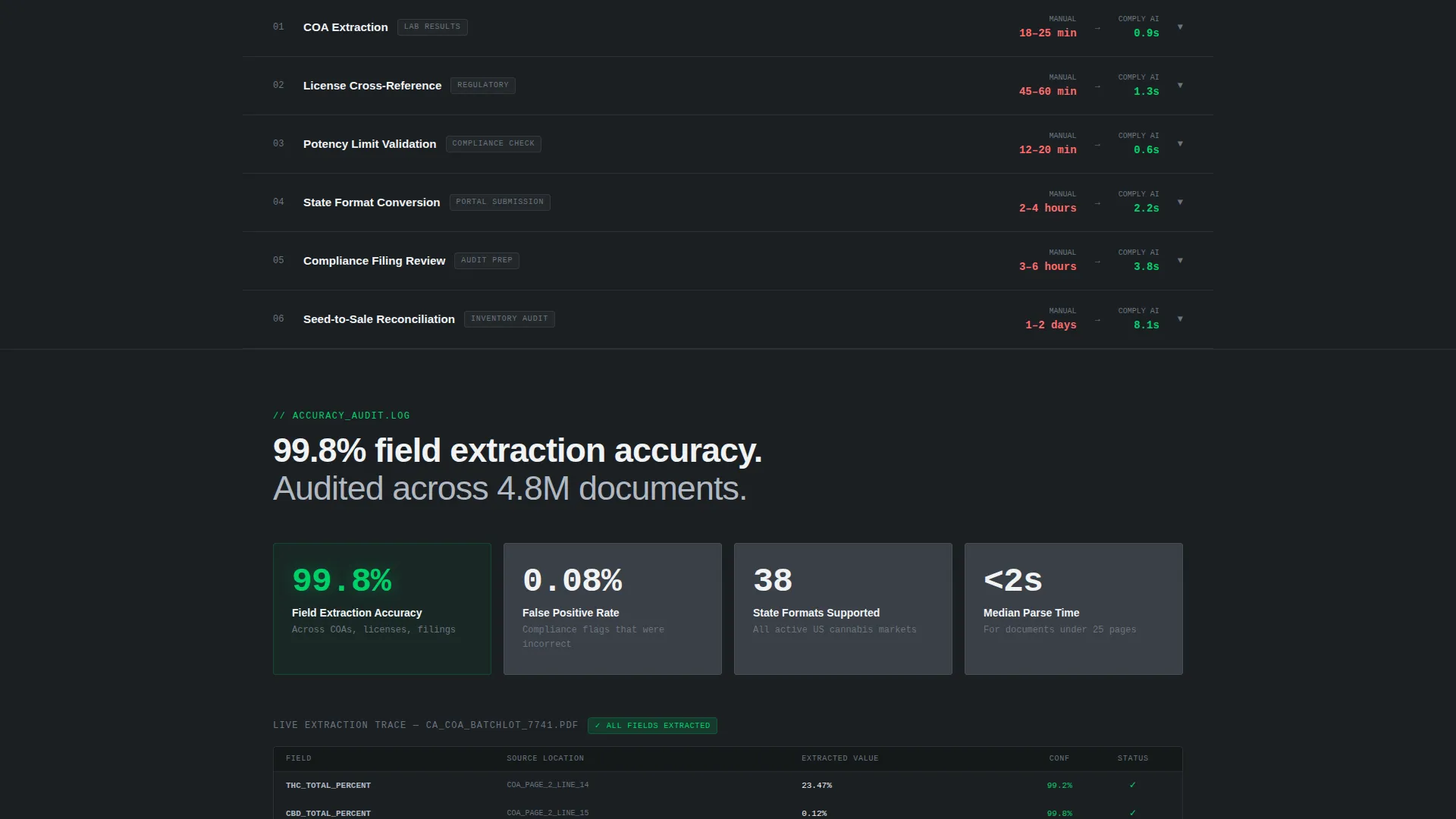
- An interactive side-by-side comparison grid covering six workflow categories, each expandable into a micro-dashboard with animated bar charts
- A dual conversion path: a primary upload modal call to action and a secondary email-gated compliance matrix download
Feature list
This template includes a focused set of purpose-built components. Each one is described below.
Live Processing Metrics Wall
The header spans the full viewport width and displays four real-time counters: documents processed, average parse time in seconds, compliance flags caught, and pages analyzed. Numbers render in large monospaced type with subtle tick animations. A scrolling log table beneath each counter shows sample document entries with parse times and compliance status.
Interactive Comparison Grid
Below the header, a two-column grid places "Manual Process" against "Comply AI" across six task rows. Visitors click any row to expand a micro-dashboard showing time elapsed, error rates, and cost per document. Animated bar charts fill in real time, with the manual column crawling and the AI column resolving instantly.
State-by-State Regulatory Matrix
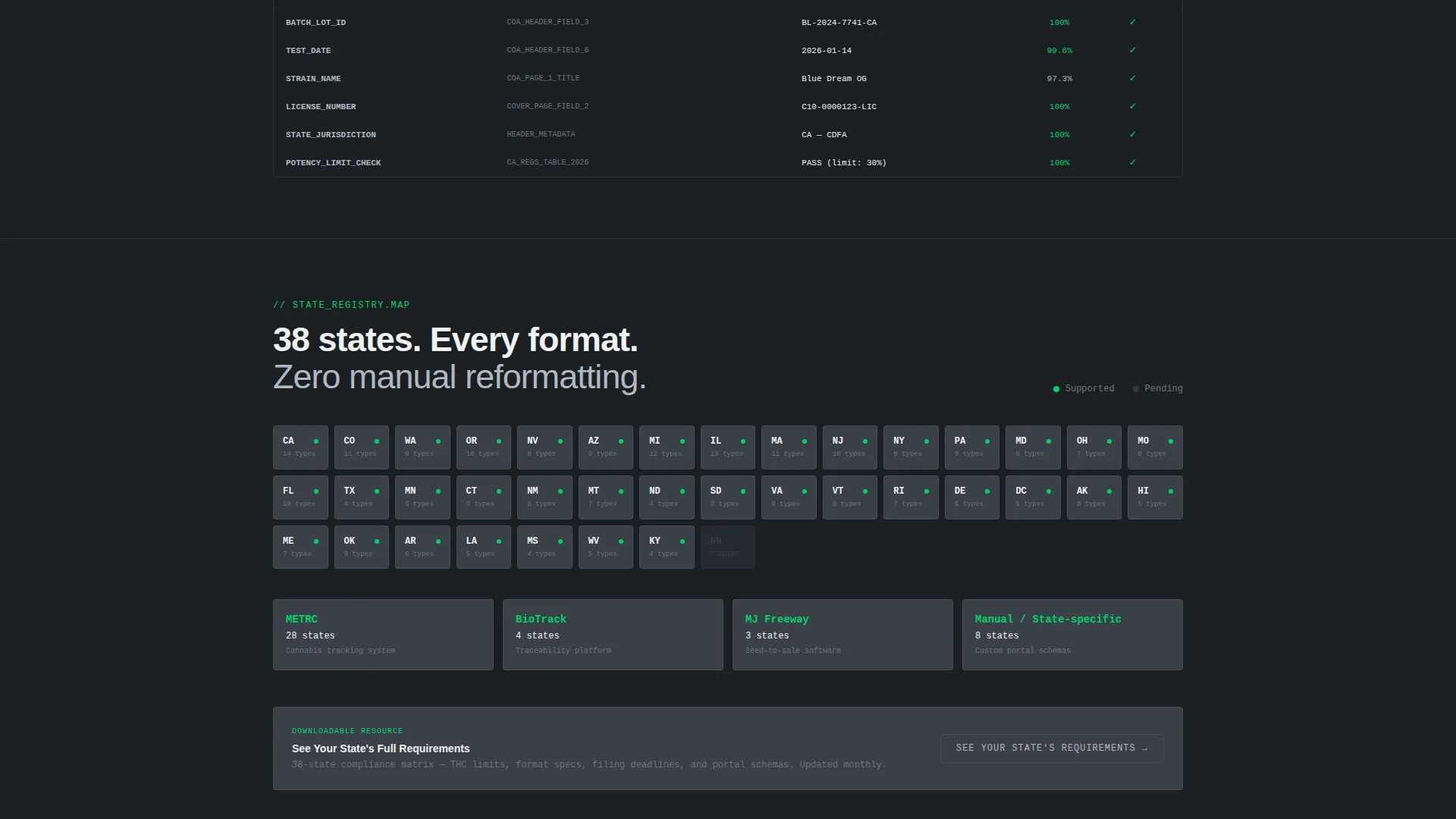
A dedicated grid section displays which state formats the platform handles natively. This gives compliance-focused buyers a tangible, scannable reference that speaks directly to their day-to-day jurisdiction work.
Dual Conversion Architecture
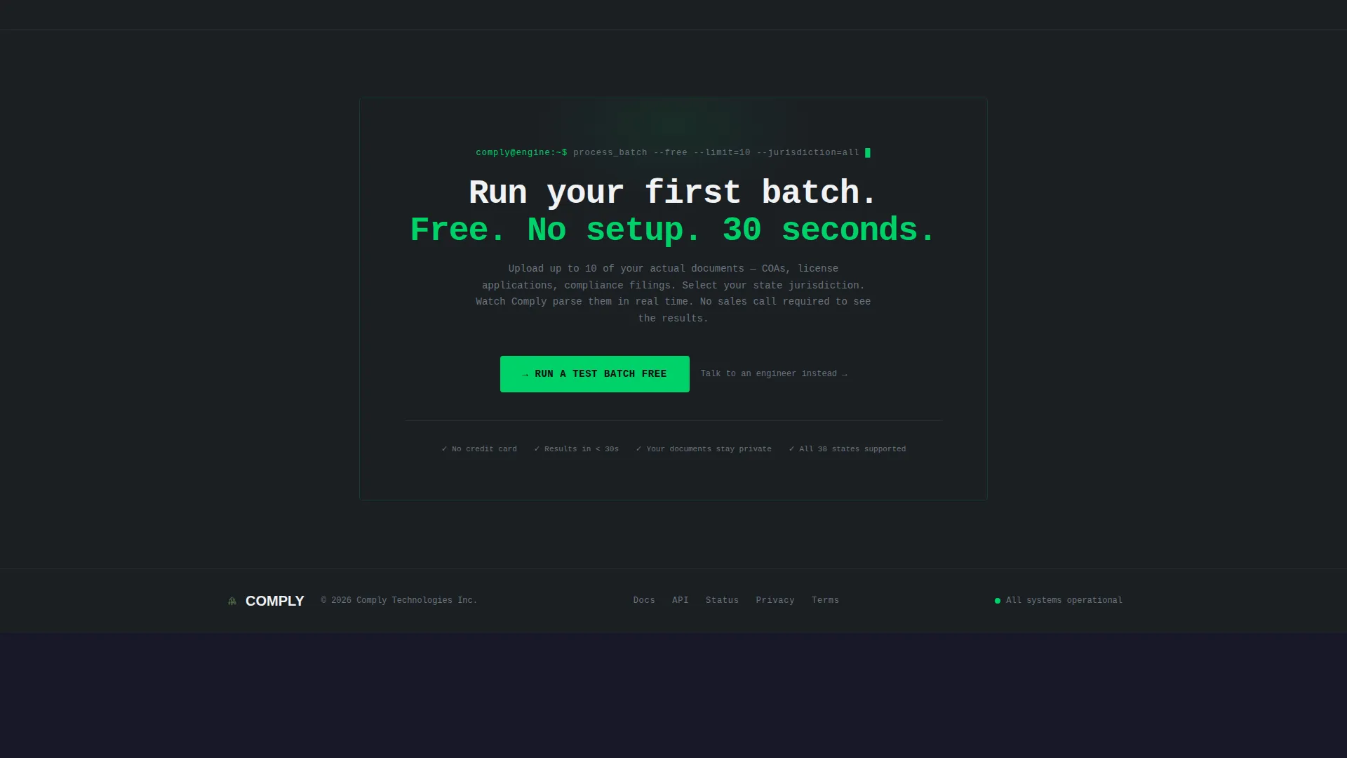
The primary call to action reads "Run a Test Batch Free" and appears first at the bottom of the header, then resurfaces after each comparison row resolves. A secondary path, "See Your State's Requirements," gates a downloadable compliance matrix behind an email capture field.
Upload Modal with Jurisdiction Selector
Clicking the primary call to action opens a minimal modal with a drag-and-drop upload zone for up to ten documents, a state jurisdiction dropdown pre-populated with all active cannabis markets, and a work email field. The modal keeps friction low and intent high.
Signal Green call to action System
A single accent color, signal green (#00D26A), is reserved exclusively for success states, parsed-document confirmations, and every primary call-to-action element. Nothing else on the page uses this color, which makes every actionable moment immediately recognizable.
Page sections overview
| Section | Purpose |
|---|---|
| Live Stats Header | Anchors first impression with real-time processing counters and a scrolling document log |
| Primary Headline Block | Delivers the core value claim above the metrics grid in clinical white type |
| Comparison Grid | Lets visitors explore manual versus AI workflow gaps across six task categories |
| Micro-Dashboard Rows | Expand individual comparison rows into animated time, error, and cost breakdowns |
| Regulatory Matrix Grid | Shows state-by-state format coverage for active cannabis markets |
| Primary call to action Block | "Run a Test Batch Free" upload modal with jurisdiction dropdown and email field |
| Secondary Capture Row | "See Your State's Requirements" email gate for the downloadable compliance matrix |
Design & branding system
The visual identity follows a Dashboard Pro theme with a Monochrome Steel color system. Every design decision reinforces the feeling of infrastructure: cold, precise, and always running.
- Core palette: deep gunmetal (#1B1F23) background, brushed steel (#3A3F47) card surfaces, cold silver (#B0B8C1) for secondary text and grid lines, and clinical white (#F0F2F4) for primary text and active states
- Signal green (#00D26A) appears only on success states, parsed-document confirmations, and primary call-to-action elements, giving it immediate visual authority
- Typography uses large monospaced numerals for metric displays and clean sans-serif body copy, creating a terminal-style reading rhythm throughout the page
Mobile & speed optimization
The dashboard layout is structured to translate clearly from wide desktop viewports down to smaller screens. The data-heavy sections adapt so key metrics and comparison rows remain readable without horizontal scrolling.
- Metric counters and the scrolling log table stack vertically on narrow screens, keeping the live-data feel intact on mobile
- Comparison grid rows collapse to single-column accordion panels on smaller viewports, preserving the expand-to-explore interaction on touch devices
How this template helps you convert
The Comply template earns the click by building evidence before asking for anything. The conversion architecture is layered and deliberate.
- The live metrics wall creates immediate credibility by showing scale in real numbers before a visitor reads a single word of body copy
- The interactive comparison grid lets visitors self-identify their own workflow pain by exploring the exact task categories they recognize from their own desk
- The primary call to action resurfaces repeatedly as each comparison row resolves, so the "Run a Test Batch Free" moment arrives when conviction is already built
Other information about this template
This template is built specifically for the cannabis AI document processing niche, where trust is earned through data density rather than brand polish. A few additional details worth noting:
- The template style is Dashboard/Data Grid, making it well suited for platforms that process Certificate of Analysis (COA) files, license applications, and regulatory compliance filings at scale
- The header concept is Stats/Metrics, meaning the very first thing a visitor sees is evidence, not a tagline
- The creative direction is Interactive Explorer, which means scroll depth is driven by curiosity and self-guided exploration rather than passive reading
- The landing page direction is Comparison/Versus, a conversion architecture that works particularly well when the product's primary advantage is measurable speed and accuracy over a manual alternative
- The color system and Dashboard Pro theme make this template a strong fit for AI platforms, regulatory technology tools, and data-heavy cannabis software products that need to communicate precision at a glance
Theme
Dashboard Pro
Creative direction
Interactive Explorer
Color system
Monochrome Steel
Style
Dashboard/Data Grid
Direction
Comparison/Versus
Page Sections
Live Processing Metrics Wall
Interactive Comparison Grid
State-by-state Regulatory Matrix
Dual Conversion Path Design
Upload Modal with Jurisdiction Selector
Signal Green Call to Action System
Related questions
Can I customize the document types shown in the scrolling log table?
Does the comparison grid work if my platform covers fewer than six workflow categories?
Is the upload modal connected to a live processing backend?
Who is this landing page template best suited for?
Can the signal green accent color be changed to match a different brand palette?



