Cannabis Management Landing Page Template
Comply is a cannabis client management landing page template built for dispensary operators and multi-state license holders. It features an interactive dashboard header, a full-tier comparison table, and a freemium signup flow. The Tech Glass visual theme and Teal Catalyst color system give the page a clinical, trustworthy feel that matches the compliance-driven world it serves.
by Rocket studio
Quick summary
Comply is a single-page template designed for cannabis compliance and client management platforms. It opens with a live-responding mini-dashboard, flows into a detailed feature comparison table, and closes with a frictionless three-field signup. The design is precise, data-forward, and built to earn trust before asking for commitment.
Who this template is for
This template is built for software founders and product teams in the regulated cannabis space. It speaks directly to the operators who will evaluate and buy the platform it promotes.
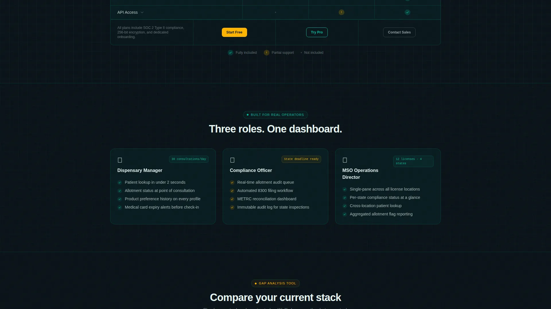
- Dispensary managers running high-volume patient consultations daily
- Compliance officers who audit patient allotments against state deadlines
- Multi-state operator (MSO) directors managing multiple licenses across several states
What problem this template solves
Cannabis operators juggle fragmented tools every day. Spreadsheets, sticky notes, and state-mandated seed-to-sale systems rarely talk to each other, and that gap creates compliance risk.
- No single view connects client profiles, purchase history, and allotment tracking
- Compliance flags are buried across disconnected tools rather than surfaced in one dashboard
- Buyers evaluating new software have no easy way to compare what they currently use against what they could gain
What you get with this template
This template delivers a complete, scroll-driven product landing page. Every section is designed to answer a real operator's question before they think to ask it.
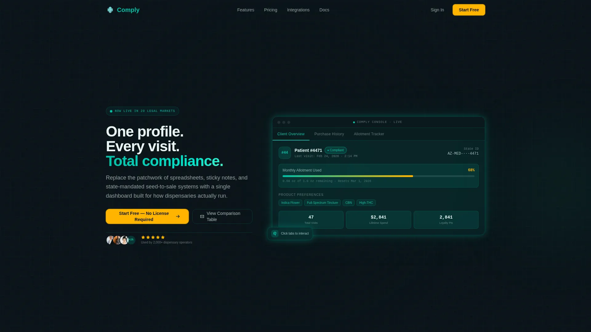
- An interactive header with a functioning patient profile card, allotment meter, and tabbed navigation
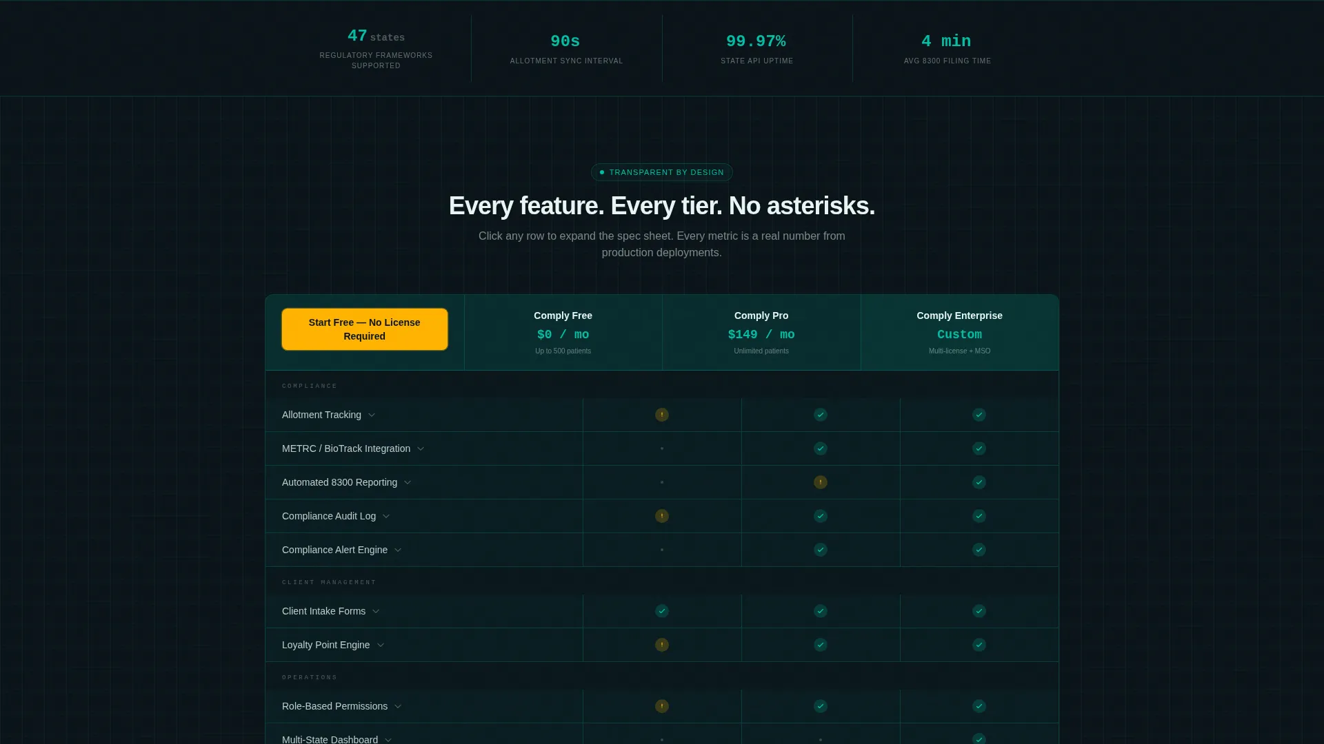
- A full-width comparison table spanning three plan tiers with clear support indicators
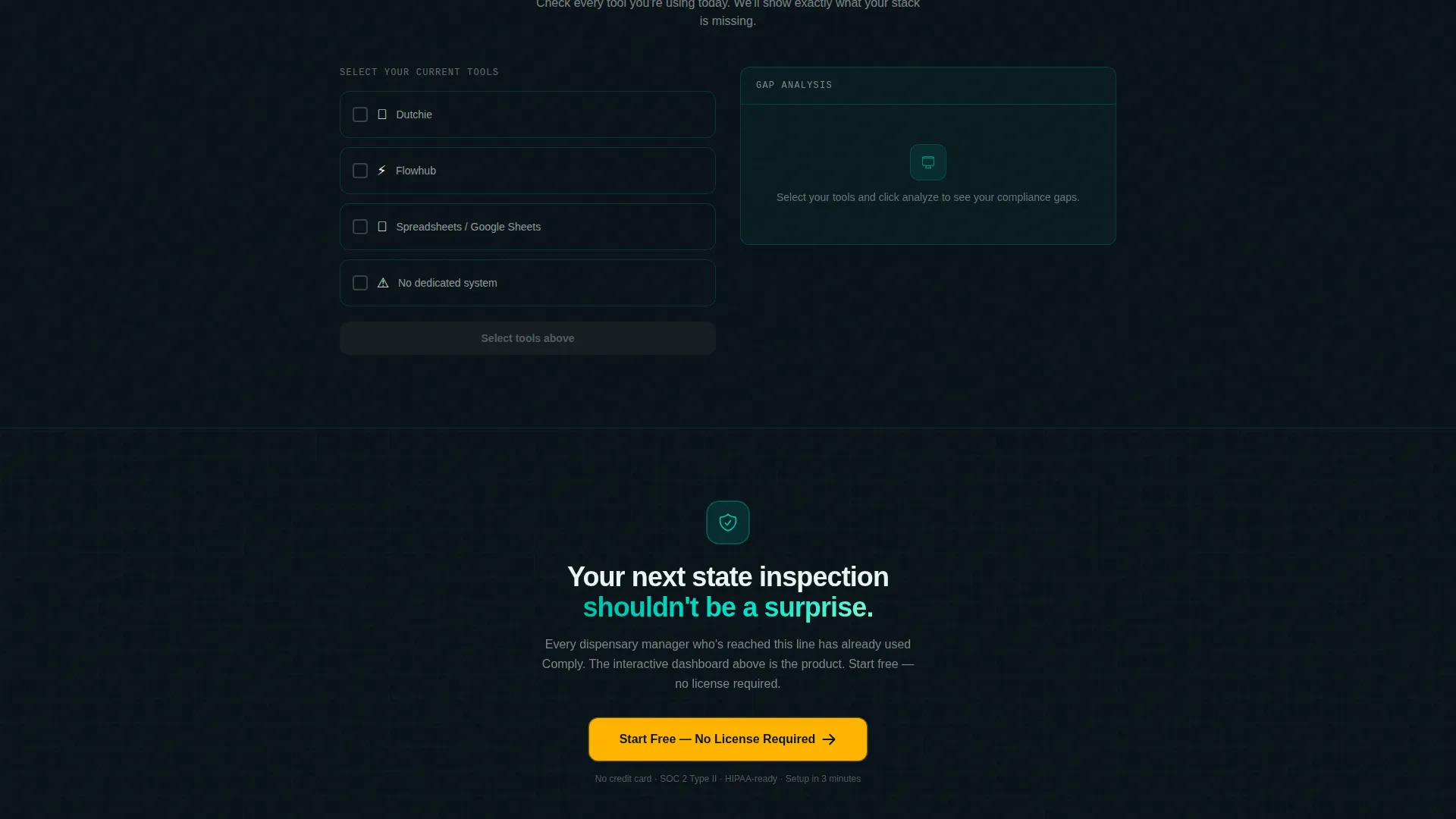
- A freemium signup form and a "Compare Your Current Stack" interactive gap-analysis tool
Feature list
This template packs several purposeful components into a single, cohesive page. Each one is built to move a skeptical operator from curiosity to confidence.
Interactive Dashboard Header
The header embeds a responsive mini-dashboard directly in the viewport. It shows a fictional patient profile card with a redacted name, an allotment meter at 68%, a timestamped last visit, product preference tags, and a glowing green compliance status badge. Visitors can hover columns to sort and click tabs to toggle between "Client Overview," "Purchase History," and "Allotment Tracker."
Full-Width Comparison Table
A structured feature comparison table spans the full page width. Rows cover capabilities such as allotment tracking, state API integration, automated tax-form reporting, client intake forms, loyalty point engines, and role-based permissions. Columns represent three plan tiers: Free, Pro, and Enterprise, using teal checkmarks, amber partial-support icons, and clearly empty cells with no ambiguity.
Spec Sheet Micro-Sections
Below the main comparison table, each feature row expands into a single-sentence explanation paired with a supporting metric. This spec sheet format rewards operators who read every line because every line answers a real question.
Freemium Signup Form
The primary call to action opens a three-field signup: business email, state of operation from a pre-populated dropdown of legal markets, and number of active patient profiles in four ranges. No credit card is required, and no license is needed to start.
Compare Your Current Stack Tool
A secondary interactive tool lets visitors check boxes for their existing software or methods. The tool returns an instant gap analysis showing what the platform covers that their current setup does not.
Pinned Amber call to action Bar
The primary call-to-action button, labeled "Start Free - No License Required," stays pinned to the bottom of the viewport as visitors scroll. It also appears at both the top and bottom of the comparison table so the next step is always visible.
Page sections overview
| Section | Purpose |
|---|---|
| Interactive Dashboard Header | Opens with a live-responding patient profile demo to pitch responsiveness as the product |
| Headline and Subheading | Frames the core value: one profile, every visit, total compliance |
| Plan Comparison Table | Compares Free, Pro, and Enterprise tiers across all key features |
| Spec Sheet Micro-Sections | Expands each table row into a one-sentence explanation with a supporting metric |
| Gap Analysis Tool | Lets visitors check their current tools and receive an instant coverage comparison |
| Freemium Signup Form | Captures business email, state, and patient volume with no credit card required |
| Pinned call to action Bar | Keeps the primary action visible at all times during scroll |
Design & branding system
The Tech Glass theme uses the Teal Catalyst color system. The palette is sterile enough to signal trust and precise enough to feel technical, like a backlit laboratory shelf in a grow facility's front office.
- Core colors: deep dispensary black (#0B1419) for nav and footer, surgical teal (#00BFA6) for card surfaces and table headers, frosted panel white (#E8F5F3) for breathing room between data-dense sections, and reactor amber (#FFB300) reserved strictly for calls to action and alert badges
- Borders are 1px teal at 20% opacity, visible like etched glass without adding visual weight
- Teal washes across card surfaces as a translucent overlay, amber pulses only where the eye must land next
Mobile & speed optimization
The layout is built to stay readable and functional on smaller screens. Data-dense sections like the comparison table are structured to reflow cleanly rather than break.
- The comparison table is designed to scroll horizontally on mobile without losing column alignment
- The pinned call to action bar remains accessible at the bottom of the mobile viewport throughout the scroll
- The interactive header tabs and the gap analysis tool are structured for touch interaction, not just mouse hover
How this template helps you convert
This template earns the click before it asks for one. By the time a dispensary manager reaches the signup form, they have already used a working version of the product inside the page.
- The interactive header lets visitors experience the platform's core value, organized client data and live compliance status, before reading a single feature bullet.
- The comparison table and spec sheet micro-sections answer every vendor evaluation question in one scroll, removing the need to request a demo just to understand scope.
- The "Compare Your Current Stack" tool personalizes the pitch by showing each visitor exactly where their current setup falls short, making the free signup feel like an obvious next step.
Other information about this template
This template is categorized under Technology, specifically within the Cannabis Software and Software-as-a-Service (SaaS) subcategory. It is purpose-built for the cannabis client management niche and is designed to serve platforms competing in a tightly regulated, compliance-first market.
- The template style is a Comparison Table layout with a Spec Sheet creative direction, meaning the scroll earns trust through data transparency rather than marketing language
- The header concept is an Interactive Preview, distinguishing this template from static screenshot-led product pages
- The conversion direction is Freemium and Trial, optimized for zero-friction signups that let the product speak before a purchase decision is made
- This template is well-suited for platforms that handle cannabis point-of-sale data, seed-to-sale tracking integrations, or patient allotment management within legal markets
Theme
Tech Glass
Creative direction
Spec Sheet
Color system
Teal Catalyst
Style
Comparison Table
Direction
Freemium/Trial
Page Sections
Interactive Patient Profile Header
Three-tier Comparison Table
Spec Sheet Micro-sections
Freemium Three-field Signup
Current Stack Gap Analysis Tool
Pinned Viewport Call to Action Button
Related questions
Does this template include a working dashboard or just a visual mockup?
What plan tiers does the comparison table cover?
Is a credit card required to use the signup form?
Who is this template best suited for?
Can the color system be updated for a different brand?



