Design System & Component Library Reviews Website Template
Pattern is a production-ready interaction library landing page template built for design systems teams and senior front-end engineers. It showcases 400-plus curated user interface interaction patterns, hover states, micro-animations, drag sequences, and toast stacks, inside a filterable data grid with live hover previews. The template is built to convert visitors by letting them interact with six unlocked patterns before they ever reach a call to action.
by Rocket studio
Quick summary
Pattern is a single landing page template built around a live, filterable interaction vault. It puts drag sequences, hover states, and micro-animations in front of engineers and design systems leads the moment they arrive. The hero types a terminal command. The grid breathes. Six patterns are unlocked immediately. By the time a visitor sees the call to action, they already trust the product.
Who this template is for
This template is built for teams who spend more time debating motion specs than shipping them. The target audience is technical and opinionated, and this landing page meets them exactly where they work.
- Senior front-end engineers tired of rebuilding date pickers, drag handles, and toast stacks from scratch every sprint
- Design systems leads who need a single source of truth for component behavior and motion specs
- Product designers who hand off interaction specs and need developers to actually implement them without a week of back-and-forth
What problem this template solves
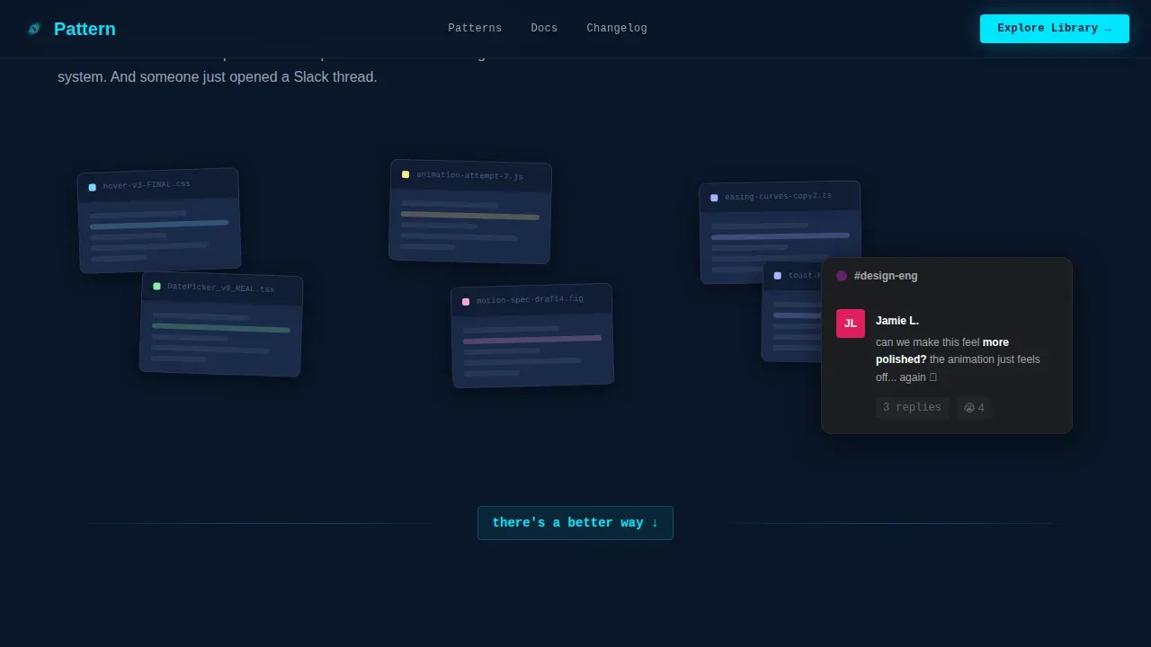
Most interaction documentation lives in three different Notion pages, a stale Figma file, and a Slack thread that ends with "can we make this feel more polished?" Teams waste sprints debating easing curves that already have a right answer. This landing page template presents that problem visually, then pivots hard into the solution.
- Inconsistent animation behavior across components, frameworks, and developers creates friction in every sprint review
- No single filterable reference for hover states, drag sequences, and feedback patterns means every engineer solves the same problem differently
- Handing off motion specs without a live demo means developers interpret timing values differently, producing inconsistent results
What you get with this template
You get a complete page template designed to showcase a production-ready interaction library with the visual authority of an IDE at midnight. Every section earns its place. Nothing is decorative.
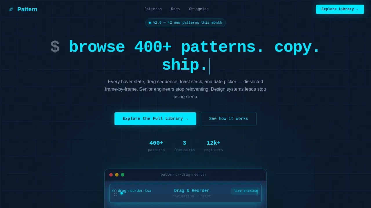
- A full hero section with a terminal typewriter headline, a live drag-reorder device frame, and a soft cyan glow trail that pulses on each release
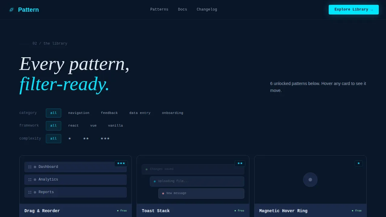
- A live-filterable data grid with category, framework, and complexity filters, hover previews on every pattern card, and six unlocked patterns that visitors can interact with directly
- A Problem-to-Solution scroll arc, a Pattern Anatomy section with frame-by-frame code dissection, a social proof metrics bar, and a footer built on the GitHub Developer Minimal pattern
Feature list
This template is a compelling landing page built from prompt-backed, production-ready components. Each feature below is drawn directly from the source brief and is present in the delivered template.
Live Terminal Hero Section
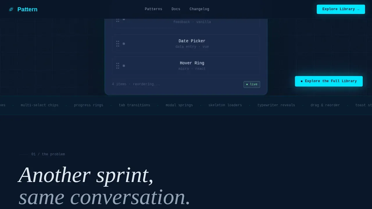
The hero section fills the full viewport with a deep navy gradient background. A single interaction pattern, a complex drag-and-reorder sequence, plays on loop inside a floating device frame. Each movement leaves a soft cyan glow trail that pulses on release. The headline types in like a terminal command rather than appearing statically. The result is immediate proof of value before a visitor reads a single word of body copy. This interactive hero section delivers the live demo that converts visitors faster than any static screenshot.
Filterable Pattern Data Grid
The core of this landing page is a live-filterable data grid. Visitors sort 400-plus patterns by category (navigation, feedback, data entry, onboarding), by framework (React, Vue, vanilla JavaScript), and by complexity rating. Each grid card previews the animation on hover with smooth animations powered by GPU-accelerated transforms. Feature cards reveal interaction previews instantly. Six patterns are fully unlocked, giving visitors a hands-on experience before they click any call to action. This features grid is the product itself, not a description of it.
Pattern Anatomy with Code Reveal
Below the grid, the template includes a Pattern Anatomy section. Each pattern is dissected frame by frame. A code snippet reveals progressively as the visitor scrolls, showing timing values, easing functions, and implementation notes side by side with the animation. Scroll triggered animations control the reveal so each detail appears exactly when it is needed. This section acts as both a sales argument and an educational resource, proving that the library is implementable in an afternoon.
Problem-to-Solution Scroll Arc
The second section opens with the pain: a chaotic grid of mismatched user interface snippets, inconsistent easing curves, and a Slack screenshot of the "can we make this feel more polished?" conversation that every design team knows too well. The page then pivots into the live grid, making the contrast unavoidable. This Problem-to-Solution arc is the creative direction that drives the entire scroll experience and makes the value proposition land without needing a wall of marketing copy.
Social Proof Metrics Bar
A metrics bar surfaces usage numbers, engineers using the library, total patterns available, supported frameworks, alongside inline testimonial quotes. This social proof section sits between the grid and the primary call to action, providing the trust signal that moves a hesitant visitor toward the "Explore the Full Library" button. The bar is visually minimal, keeping design quality high without cluttering the conversion path.
Click-Through Call to Action System
The primary call to action, "Explore the Full Library," appears as a glowing cyan button anchored bottom-right after the hero. It repeats inside the live grid as "Unlock This Pattern" on each card's overlay. There is no form on this landing page. The click carries the visitor into a free tier browse experience where signup friction is near zero. This click-through funnel structure means the template is built to convert visitors by letting the product prove itself first.
Page sections overview
| Section | Purpose |
|---|---|
| Terminal Hero | Live drag demo with typewriter headline and cyan glow trails |
| Pain Grid | Chaotic user interface snippets and Slack screenshot to surface the core problem |
| Live Pattern Grid | Filterable data grid with hover previews and six unlocked patterns |
| Pattern Anatomy | Frame-by-frame code dissection with scroll-triggered reveal |
| Social Proof Bar | Usage metrics and inline testimonial quotes before the primary call to action |
| Primary call to action Block | Glowing "Explore the Full Library" button with no form friction |
| Minimal Footer | GitHub Developer Minimal pattern footer (Pattern 8) |
Design & branding system
The visual identity follows a Midnight Blue color system that feels like the cockpit of a spacecraft at cruising altitude. Every color and typographic choice is purposeful. Nothing is added for decoration. The result is a polished landing page with modern aesthetics that communicates competence to engineers before they read a word.
- Color system: deep terminal navy (#0A1628) as the primary black background, desaturated slate (#1B2A4A) for card surfaces and grid cells, cool silver (#94A3B8) for secondary text and divider lines, and electric cyan (#00E5FF) as the glow, hover ring, and active-state accent throughout every feature section
- Typography: JetBrains Mono for code labels and user interface chrome, DM Sans for body copy, and Fraunces for display accents, creating a clear typographic hierarchy that separates interface from narrative
- Animation style: typewriter headline reveal, looping drag simulation, hover glow rings, staggered grid reveals driven by Intersection Observer, and scroll triggered animations controlling the Pattern Anatomy code reveal
Mobile & speed optimization
This template is designed desktop-first. The IDE aesthetic and data grid demand horizontal space, and the primary user is working on a wide monitor. The template is still fully responsive and adapts gracefully to smaller viewports.
- Responsive design ensures the filterable grid reflows to a single-column layout on mobile without losing filter functionality or hover preview behavior
- Responsive layouts are maintained across breakpoints using Tailwind CSS utility classes, avoiding unnecessary complexity in the stylesheet
- Animations use GPU-accelerated transforms only, keeping the development server preview and the live url experience smooth regardless of the number of visible pattern cards
How this template helps you convert
This template is built as a click-through funnel. Every section is sequenced to build confidence before asking for a click. Interactive elements hold visitor attention and drive conversion rates far above static, generic pages.
- The hero section delivers an immediate live demo, giving visitors proof of quality before they scroll, eliminating the skepticism that kills conversion on documentation and library landing pages
- The live filterable grid lets visitors interact with six unlocked patterns directly, so by the time they see the "Explore the Full Library" call to action, they have already experienced the product and trust it
- The social proof metrics bar and inline testimonials provide the final trust signal right before the primary call to action, completing the Z-pattern layout that guides the eye from value proposition to demo to conversion
Other information about this template
This template is built with Tailwind CSS as the primary styling layer. Tailwind CSS is a utility-first CSS framework that allows for rapid prototyping and iteration on landing pages without being constrained by predefined styles. Its component-based approach enables developers to assemble landing pages from pre-built sections, which keeps the codebase clean and maintainable. Tailwind CSS also supports dark mode natively, and this template uses that dark mode support fully, keeping the entire visual system within the Midnight Blue palette.
The template is built on a solid foundation of functional components, giving teams granular control over every animation, filter state, and card behavior. Using a component library approach means updates happen in one place and reflect across the entire landing page instantly. The template crafted here follows a minimalist approach: no feature bloat, no unnecessary complexity, no other tools required beyond what ships with the template.
- Code quality: all components follow consistent naming conventions, making it straightforward for teams to extend the template into complex projects without refactoring the base
- Type safety: the template supports TypeScript, and typescript support means bugs surface before deployment rather than in production
- Build tools: the template works with standard modern build tools and supports js landing environments including React and Vue; install dependencies, spin up the development server, and you are ready to iterate
- Netlify deployment: the template is configured for netlify deployment out of the box; push to your repository and get a live url in minutes with no custom server configuration
- Meta tags: open graph meta tags and standard meta tags are pre-configured for seo optimization, so the landing page is search-visible and shareable from day one without additional setup
- Shadcn landing component patterns are compatible with this template's component structure; teams already using a shadcn landing system will find seamless integration straightforward
- Launch user interface conventions are respected throughout, making it easy to extend into other launch pages or to pull individual sections into a broader launch ui system
- The template is actively maintained and ships with comprehensive documentation covering the setup process, animation configuration, and filter system customization
- Lifetime access is included with purchase, covering all future updates to the template; your lifetime access also includes any new pattern sections added to the library page over time
- This template functions as both a marketing asset and an educational resource, teaching visitors how each pattern works while simultaneously selling them on the library
Theme
Dashboard Pro
Creative direction
Problem→Solution Arc
Color system
Midnight Blue
Style
Dashboard/Data Grid
Direction
Click-Through
Page Sections
Live Terminal Hero with Glow Trails
Filterable Interaction Pattern Grid
Pattern Anatomy Code Dissection
Problem-to-solution Scroll Arc
Click-through Conversion Funnel
Social Proof Metrics and Testimonials
Related questions
What frameworks does this template support?
Can I use this template without prior animation experience?
Does the template include the full interaction pattern library content?
Is lifetime access included with purchase?
How is this different from simple landing pages or generic page templates?



