Smart AI Copywriting Landing Page Template
Scribe is a single-page landing page template built for AI-powered product description tools targeting e-commerce operators. It combines a stark comparison table, side-by-side channel output samples, and benchmark data sections to write a compelling, data-driven case for your tool. The design is monochrome steel with a freemium trial form that delivers value before asking for commitment.
by Rocket studio
Quick summary
Scribe is a conversion-focused landing page template designed for an AI product description generator. It follows an Industry Report structure, leading visitors through cost comparisons, channel-specific output samples, and benchmark data. The page is built to make e-commerce operators feel the relief of a content bottleneck dissolving the moment they scroll.
Who this template is for
This template is built for founders, product teams, and catalog managers who need to clearly explain an AI content tool to a skeptical, data-hungry audience. The target audience expects numbers before they trust claims.
- E-commerce operators running catalogs of 500 to 50,000 stock-keeping units (SKUs)
- Agency owners who manage product listings across multiple client stores and websites
- Growth-focused teams who want to write a compelling case without relying on flashy visuals
What problem this template solves
E-commerce operators spend too much time and money producing product descriptions at scale. Freelancers charge per description, in-house teams are slow, and copy-pasted manufacturer specs create duplicate content issues across websites and marketplaces.
- No clear way to show the cost-per-SKU problem with real, side-by-side numbers
- No structured page to describe channel-specific output differences across Amazon, Shopify, and TikTok Shop
- No low-friction path for visitors to generate free sample descriptions before committing
What you get with this template
You get a fully structured, single-page layout that does the heavy lifting of building trust before asking for a signup. Every section is designed to capture attention and move the operator one step closer to the trial form.
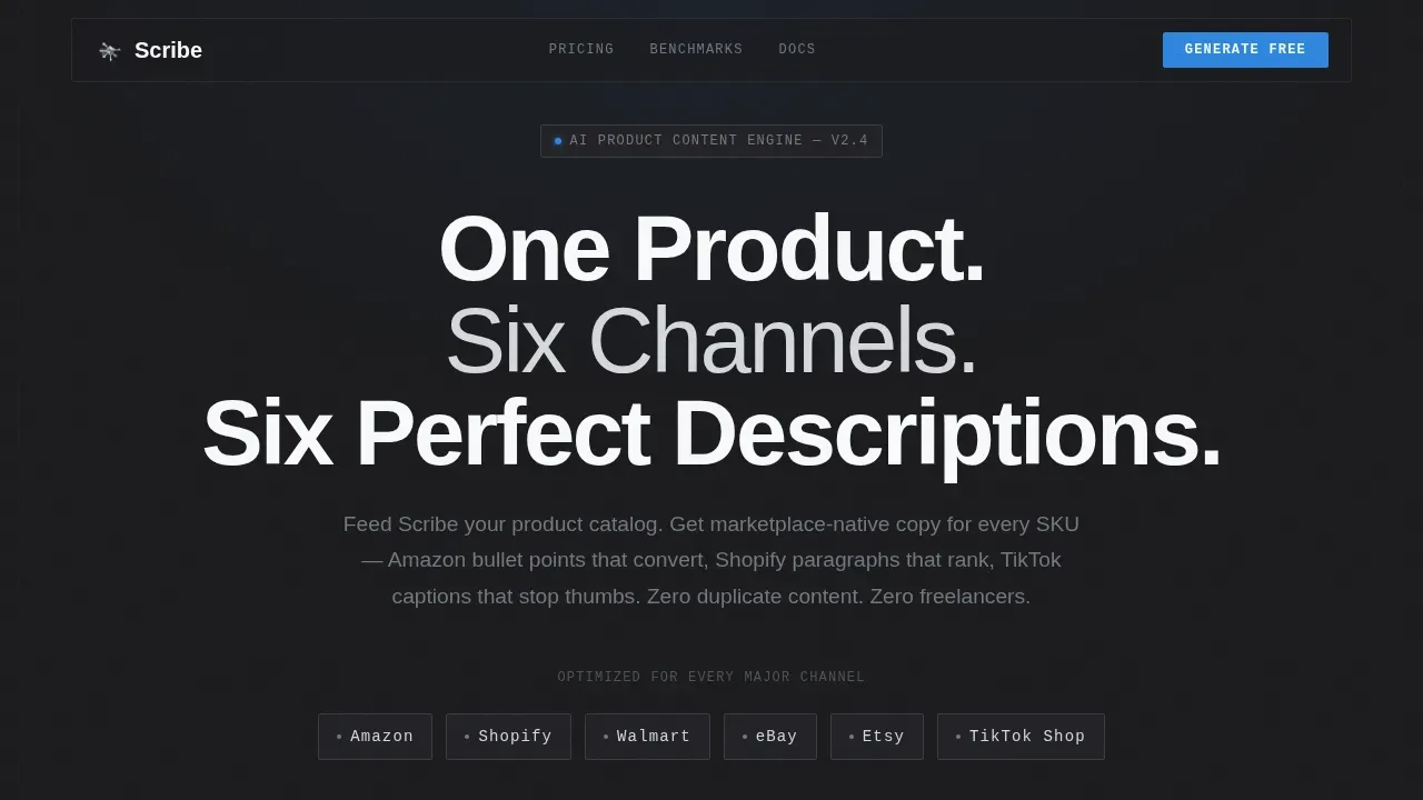
- A hero section with a marketplace logo bar, a live description counter, and a stark headline
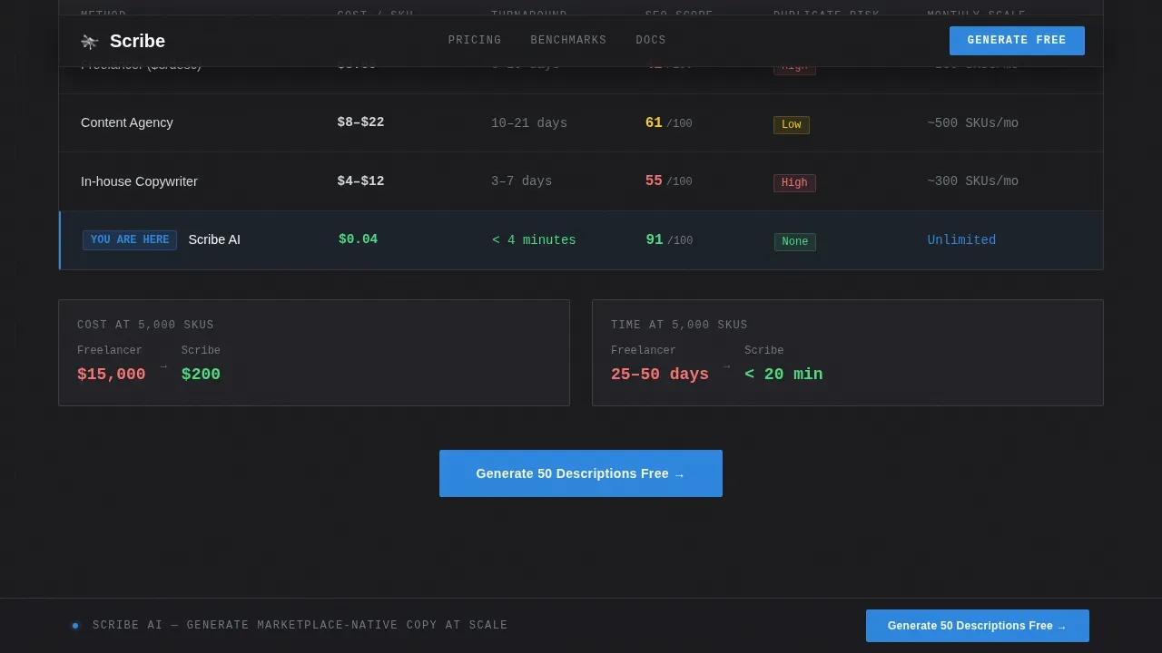
- A cost comparison table covering freelancer, agency, in-house, and AI options side by side
- Output sample panels showing how tone and structure shift per channel, plus a benchmark data section and a sticky trial call to action
Feature list
This page is built around five distinct content layers. Each one deepens the evidence and answers a specific question the visitor arrived with.
Cost Comparison Table
The comparison table sits at the core of the page. It displays cost, turnaround time, search engine optimization (SEO) score, and duplicate content risk across four content production methods. Operators can see the numbers in seconds and draw their own conclusion.
Channel Output Sample Panels
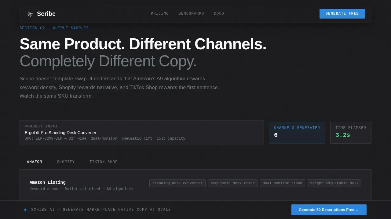
Side-by-side panels show the same product described for Amazon bullet points, a Shopify paragraph, and a TikTok Shop caption. This lets visitors watch the tool's logic in action and understand how the description generator adapts tone and structure per channel.
Benchmark Data Section
A dedicated section presents conversion lift, indexing speed, and return-rate data. These notes give the page its industry-report credibility and fuel the operator's confidence before they click through to the trial.
Freemium Trial Form
The trial form asks only for a store URL and primary marketplace. Before requesting an email, it automatically generates three sample product descriptions from live data. This approach delivers clear value and keeps the form low-friction.
Sticky Call-to-Action Bar
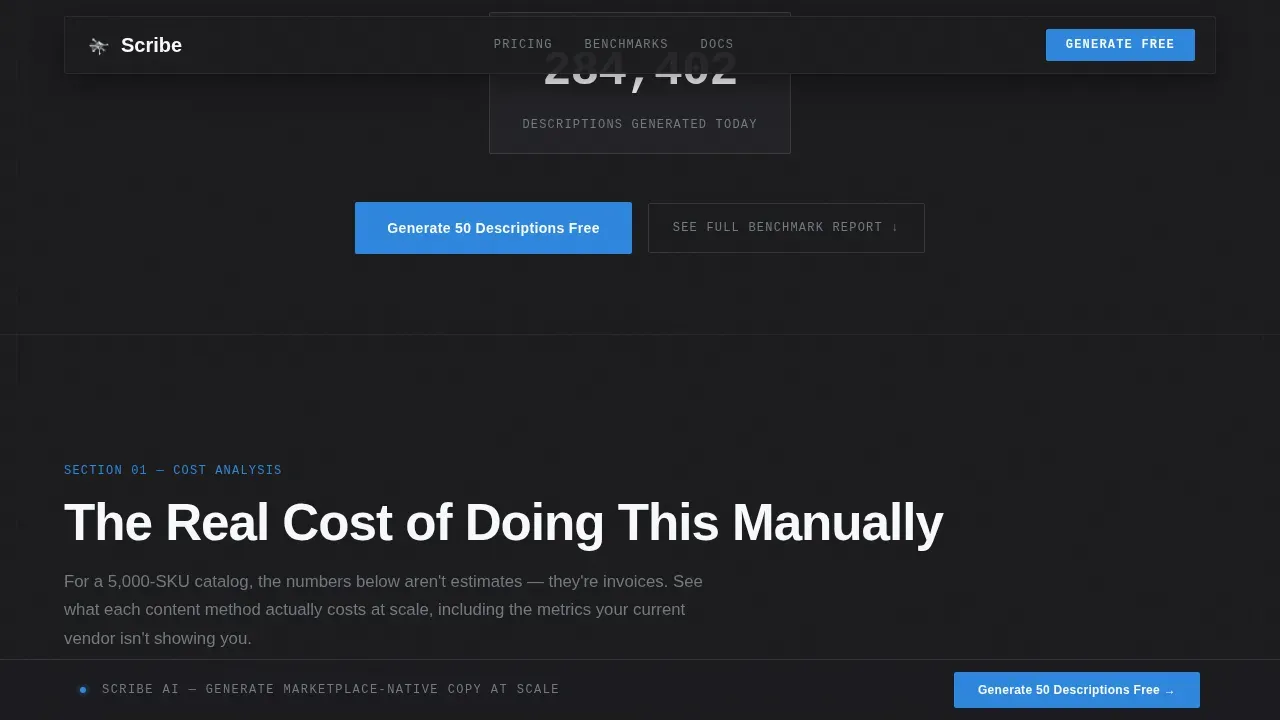
A signal-blue "Generate 50 Descriptions Free" bar stays pinned to the bottom of the viewport throughout the scroll. It ensures the primary prompt is always one click away without interrupting the reading flow.
Page sections overview
| Section | Purpose |
|---|---|
| Marketplace Logo Bar | Establish channel credibility instantly |
| Hero Headline Area | Communicate the core value in seconds |
| Live Description Counter | Provide real-time social proof |
| Cost Comparison Table | Show cost-per-SKU data clearly |
| Channel Output Samples | Demonstrate per-channel description logic |
| Benchmark Data Section | Add conversion and indexing evidence |
| Trial Call to Action | Capture email after value is delivered |
| Sticky Bottom Bar | Keep the free trial always visible |
| Footer Row | Provide legal and navigation links |
Design & branding system
The visual identity follows a Directory and Discovery theme rendered in a monochrome steel palette. The result feels like a polished dashboard at 2 a.m., where information density and quiet confidence do all the work.
- Colors: forge black (#1B1B1E) background, brushed chromium (#71797E) for secondary text, light alloy (#D5D8DC) for dividers, cold white (#F8F9FA) for body copy, and signal blue (#2E86DE) exclusively for calls to action
- Typography: DM Sans for headings and body text; JetBrains Mono for data, numbers, and code-style elements
- Motion: blur entrance animations, staggered section reveals, a marquee logo row, and a live counter for the description tally
Mobile & speed optimization
The template is desktop-first, reflecting how e-commerce operators typically work within dashboard environments. It also includes responsive support so the page remains clear and functional on any device.
- Tables and output sample panels reflow cleanly for smaller screen sizes
- Buttons are touch-friendly and fonts remain readable across every device
- Server components handle static sections; client components manage the live counter, animations, and the trial form
How this template helps you convert
The page follows a Problem-Agitation-Solution structure proven to guide professional buyers toward action without pressure.
- The comparison table surfaces the cost-per-SKU problem with specific numbers, making the pain clear and measurable before any solution is presented.
- The output samples and benchmark data sections build evidence layer by layer, so by the time the visitor reaches the trial form they have already seen the tool work.
Other information about this template
This template draws on established best practices for AI tool landing pages and applies them specifically to the e-commerce AI content generation niche. A few additional notes for teams evaluating or adapting it:
- The Scribe AI product description generator landing page template is structured to support both freemium trial conversion and a secondary email-capture path via a downloadable benchmark report
- AI scribe functionality shown in the output panels can guide the reader's learning about channel-specific copy patterns, making the case without tutorials or long-form guides
- The design intentionally skips hero illustrations; the live counter and comparison table are the creative proof
- Sales agents, catalog managers, and e-commerce CEOs are all represented in the target audience definition, meaning the copy must stay professional but never overly technical
- The secondary call to action "See Full Benchmark Report" gates a PDF for visitors who want more knowledge before trialing, reducing the risk of losing data-hungry prospects who are not yet ready to test
- The page's consistency across sections, from the monochrome palette to the JetBrains Mono data font, reinforces brand trust without a single word of decoration
Theme
Directory & Discovery
Creative direction
Industry Report
Color system
Monochrome Steel
Style
Comparison Table
Direction
Freemium/Trial
Page Sections
Cost Comparison Table with Real Data
Channel-specific Output Sample Panels
Benchmark Data Evidence Section
Freemium Trial Form with Pre-email Value
Sticky Signal-blue Call-to-action Bar
Animated Marketplace Logo Bar and Live Counter
Related questions
Who is the primary target audience for this landing page template?
How does the freemium trial form work?
Can the page demonstrate output for multiple marketplaces?
What social proof elements does the template include?
Is this template suitable for both desktop and mobile visitors?



