Pharmaceutical Digital Presence Professional Website Template
Formulary is a pharmaceutical knowledge base landing page template built for clinical teams who need fast, trustworthy drug information. It features a searchable card grid layout, flip-card problem-solution sections, side-by-side drug comparison cards, and a persistent comparison call-to-action bar. The design uses a deep clinical navy palette engineered for extended screen use.
by Rocket studio
Quick summary
Formulary is a single-page pharmaceutical knowledge base template designed for clinical professionals. It combines a modular card grid layout with a problem-to-solution scroll arc, drug comparison cards, and an oversized search field. The design palette mimics the focused glow of a clinical pharmacy screen, keeping information clear and fatigue-free across long sessions.
Who this template is for
This template is built for healthcare institutions and digital teams that need to present complex drug information in a structured, credible format. It suits organizations that want their reference platform to feel as precise as the clinical decisions it supports.
- Hospital pharmacists who cross-reference contraindications and dosing protocols under time pressure
- Medical residents and clinicians choosing between drug options for complex patients
- Pharmacy directors benchmarking formulary decisions against established national guidelines
What problem this template solves
Clinical professionals often rely on outdated printed references or fragmented digital tools that were not built around the real questions clinicians ask. The result is wasted time, missed interactions, and reduced confidence in high-stakes decisions.
- Outdated or scattered drug references that slow down critical lookups
- No clear side-by-side comparison structure for evaluating two drug options at once
- Trust gaps when a platform fails to signal institutional credibility from the first screen
What you get with this template
You get a fully structured pharmaceutical landing page template that organizes drug monographs, interaction matrices, and dosing protocols into a scannable, card-based layout. Every section is designed to reduce cognitive load and guide the visitor from a clinical question to a confident answer.
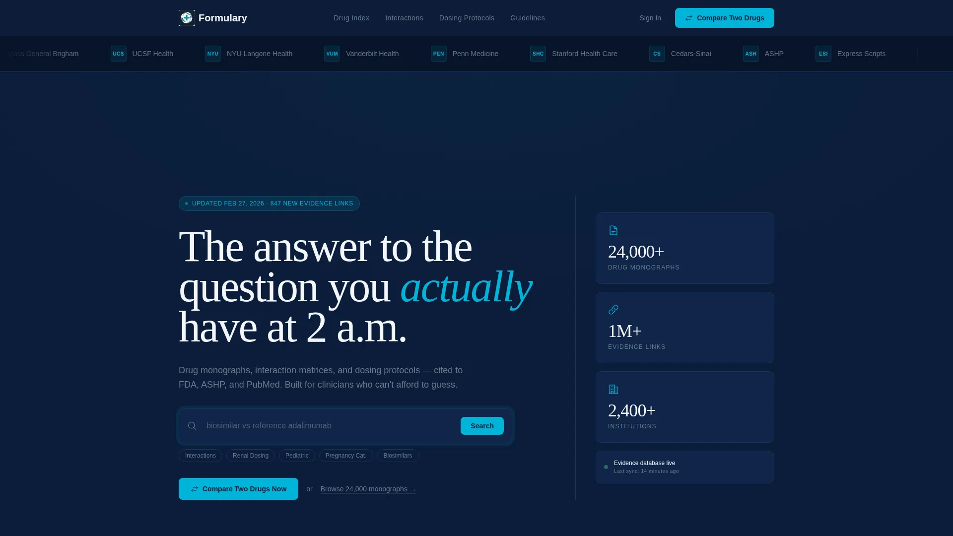
- An oversized animated search field with cycling clinical placeholder queries
- Flip-card problem-solution rows and side-by-side drug comparison card blocks
- A persistent bottom comparison bar and a free-trial comparison conversion path
Feature list
This template includes purposefully designed components drawn directly from the source brief. Each feature supports a specific clinical workflow or trust-building moment in the visitor journey.
Animated Search Field with Cycling Queries
The hero search field pulses gently and rotates through real clinical placeholder queries such as renal dosing lookups and drug interaction checks. It immediately signals to visitors what kind of answers the platform holds.
Flip-Card Problem-Solution Row
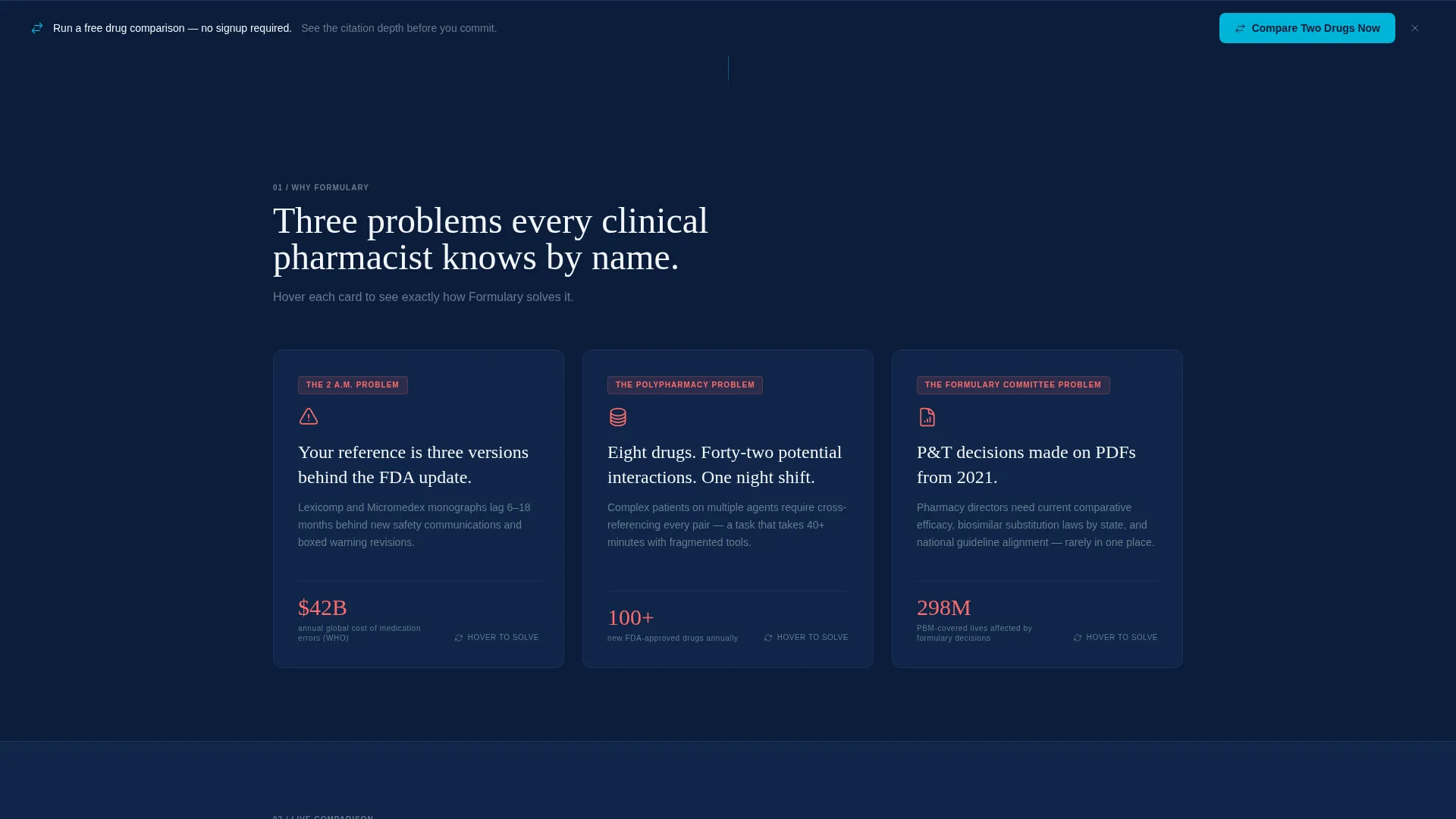
Three opening cards each present a common clinical pain point on the front face. On hover, each card flips to reveal the platform's specific solution, creating an interactive and engaging problem-to-answer reveal.
Side-by-Side Drug Comparison Cards
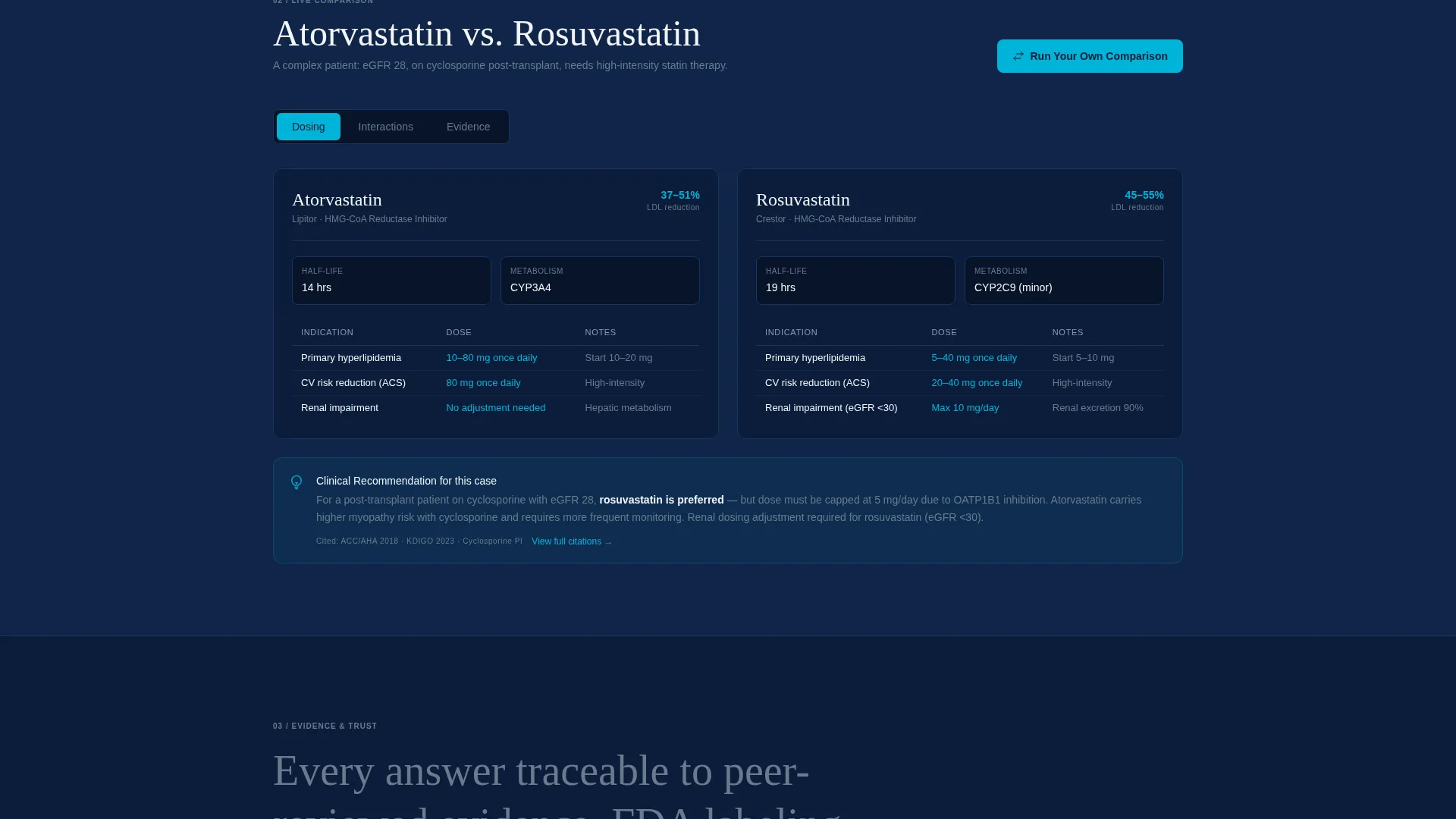
A dedicated card row renders two drug profiles in parallel columns, letting clinicians visually scan differences in dosing, contraindications, and evidence quality without switching screens or tabs.
Evidence Cards with Filterable Trial Data
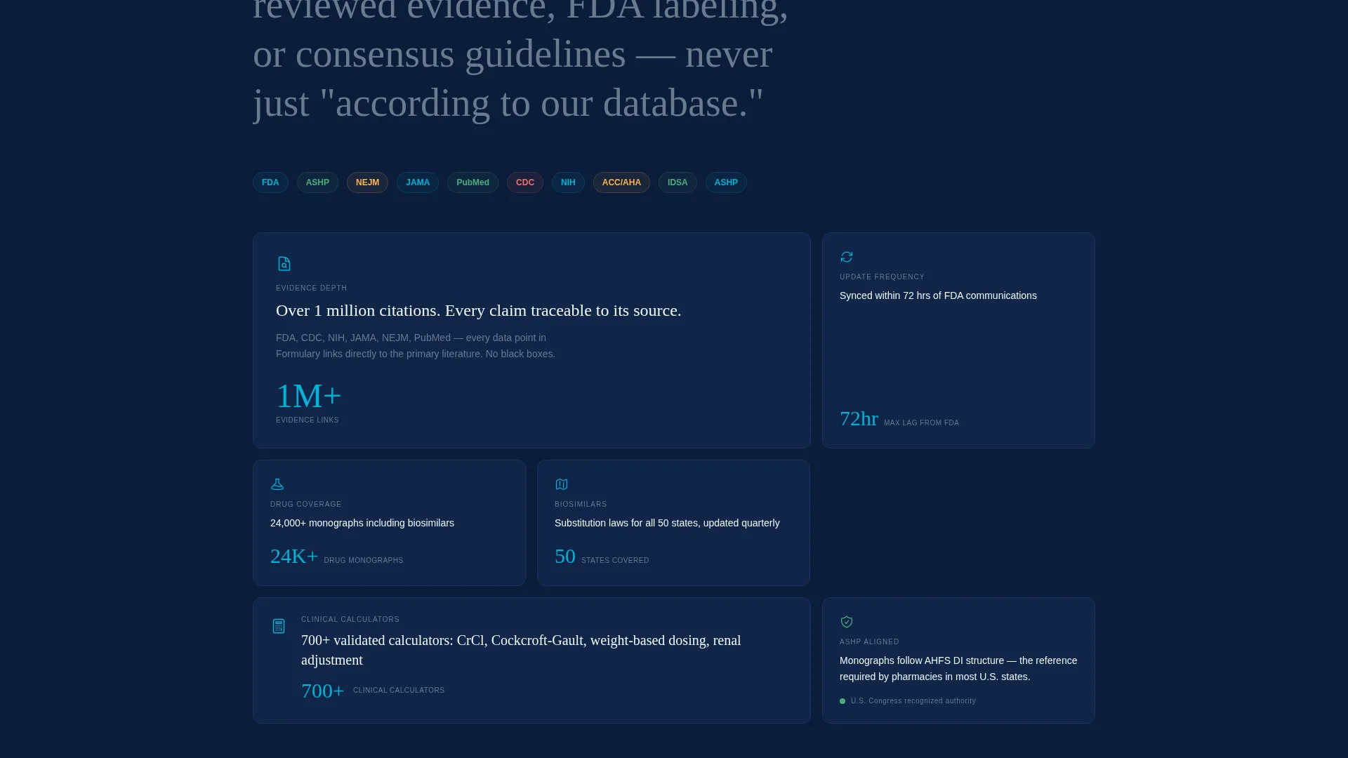
Deeper in the scroll, evidence cards display clinical trial data that visitors can filter by category or complexity. This section escalates from routine lookups to complex polypharmacy scenarios, proving platform depth.
Institutional Logo Bar
A horizontally scrolling ribbon of hospital system logos, pharmacy benefit manager partner seals, and institutional marks plays on loop at the top of the page, establishing broad institutional trust before the visitor reads a single word.
Persistent Comparison Call-to-Action Bar
A sticky bottom bar stays visible as the visitor scrolls, always displaying the primary call-to-action to compare two drugs. It keeps the conversion path accessible at any point in the reading experience.
Page sections overview
| Section | Purpose |
|---|---|
| Institutional Logo Bar | Builds trust with scrolling hospital and partner seals |
| Hero Search Field | Anchors the page around a live clinical query experience |
| Pain Point Cards | Introduces three clinical problems via flip-card interaction |
| Drug Comparison Cards | Displays side-by-side drug profiles for fast evaluation |
| Evidence Filter Cards | Shows filterable trial data for complex clinical scenarios |
| Competitor Swap Selector | Lets visitors compare the platform against current references |
| Free Comparison call to action | Invites one free drug comparison before requiring signup |
| Persistent Bottom Bar | Keeps the primary comparison action visible on every scroll |
Design & branding system
The visual identity follows a Directory and Discovery theme using a Midnight Blue color system. Every color choice is grounded in clinical readability, reducing eye strain during extended sessions in low-light environments.
- Deep clinical navy (#0B1D3A) as the primary background, pharmaceutical white (#F4F6FA) for card surfaces, and muted steel (#6B7A8D) for secondary text and dividers
- Alert teal (#00B4D8) applied to interactive elements, search fields, and hover states to draw the eye without disrupting the calm visual tone
- The overall palette evokes the glow of a clinical pharmacy order-entry screen: authoritative, calm, and built for hours of reading
Mobile & speed optimization
The modular card grid structure adapts naturally to narrower viewports, keeping drug comparison cards and flip interactions usable on tablets and mobile devices carried by clinicians on rounds.
- Card grid columns reflow into single-column stacks on smaller screens without losing section hierarchy
- The persistent bottom comparison bar remains accessible on mobile, preserving the primary conversion path regardless of screen size
How this template helps you convert
The page is engineered around a Comparison and Versus conversion strategy. Every section moves the visitor one step closer to running a live drug comparison, which is the platform's core value demonstration.
- The free drug comparison offer lets visitors experience platform depth before they commit to signing up, removing the main barrier to first engagement.
- The persistent bottom bar and the hero search area both carry the primary call-to-action, so the conversion prompt is always visible no matter how far a visitor has scrolled.
Other information about this template
This template is categorized under Technology, with a subcategory focus on Pharmaceutical Digital Presence and a niche of Pharmaceutical Knowledge Base. It is designed as a single-page modular layout rather than a multi-page site, which keeps the user experience focused and fast to deploy.
- The competitor swap dropdown selector references current drug reference tools, positioning the platform directly against established alternatives in the clinical reference market
- The scroll arc moves intentionally from simple routine lookups to complex polypharmacy questions, demonstrating that the platform scales with clinical complexity
- Template style is Card Grid (Modular), theme is Directory and Discovery, and the header concept is a Logo Bar with a slow-loop institutional trust ribbon
Theme
Directory & Discovery
Creative direction
Problem→Solution Arc
Color system
Midnight Blue
Style
Card Grid (Modular)
Direction
Comparison/Versus
Page Sections
Animated Clinical Search Field
Flip-card Problem-solution Rows
Side-by-side Drug Comparison Cards
Filterable Evidence Cards
Institutional Logo Trust Bar
Persistent Comparison Bottom Bar
Related questions
Who is this landing page template designed for?
Can I customize the drug categories and card content?
What makes the conversion flow different from a standard template?
Does the template include live search functionality?
How does the header trust bar work?



