AI-Powered Valuation Landing Page Template
A split-screen landing page built for a real estate AI price optimization platform. It opens with a live pricing dashboard screenshot, drops visitors into an interactive address calculator, then walks them through a side-by-side comparison of manual CMA workflows versus AI-driven valuation. The design uses a dark Data Command palette that feels precise, confident, and built for professionals who stake their commission on pricing decisions.
by Rocket studio
Quick summary
This is a single-page, split-screen landing page template designed for a real estate AI price optimization platform. It opens with a product screenshot header, moves visitors into a working address calculator, then delivers a sharp Comparison/Versus narrative that contrasts traditional CMA workflows with AI-powered valuation. The visual identity follows a dark Data Command theme built for serious, data-driven real estate professionals.
Who this template is for
This template is built for teams offering AI-powered real estate valuation tools. It speaks directly to high-volume real estate professionals who need pricing confidence fast.
- Top-producing agents managing twenty or more active listings who cannot afford pricing mistakes in shifting markets
- House flippers and renovation investors who calculate budgets backward from after-repair value and need point-estimate accuracy
- Platforms and product teams looking to launch or promote a real estate AI price optimization tool with a high-converting, professional landing page
What problem this template solves
Pricing a property in a volatile market is one of the highest-stakes decisions in real estate. Agents relying on manual comparable sales analysis face slow turnarounds, adjustment bias, and stale data. This template gives a valuation platform a page structure that makes the problem vivid and the solution immediately testable.
- Manual CMA workflows are slow, subjective, and prone to human error that costs agents real money
- Visitors need to see the platform work before they trust it, and most landing pages ask for belief before delivering proof
- The page solves both problems: it surfaces the AI advantage visually and lets visitors run their own address through the calculator before committing
What you get with this template
You get a fully structured, single-page layout ready to present an AI valuation platform at its most compelling. Every section is designed around a specific conversion moment.
- A 50/50 split-screen header pairing a live product dashboard screenshot with a headline and working mini-calculator
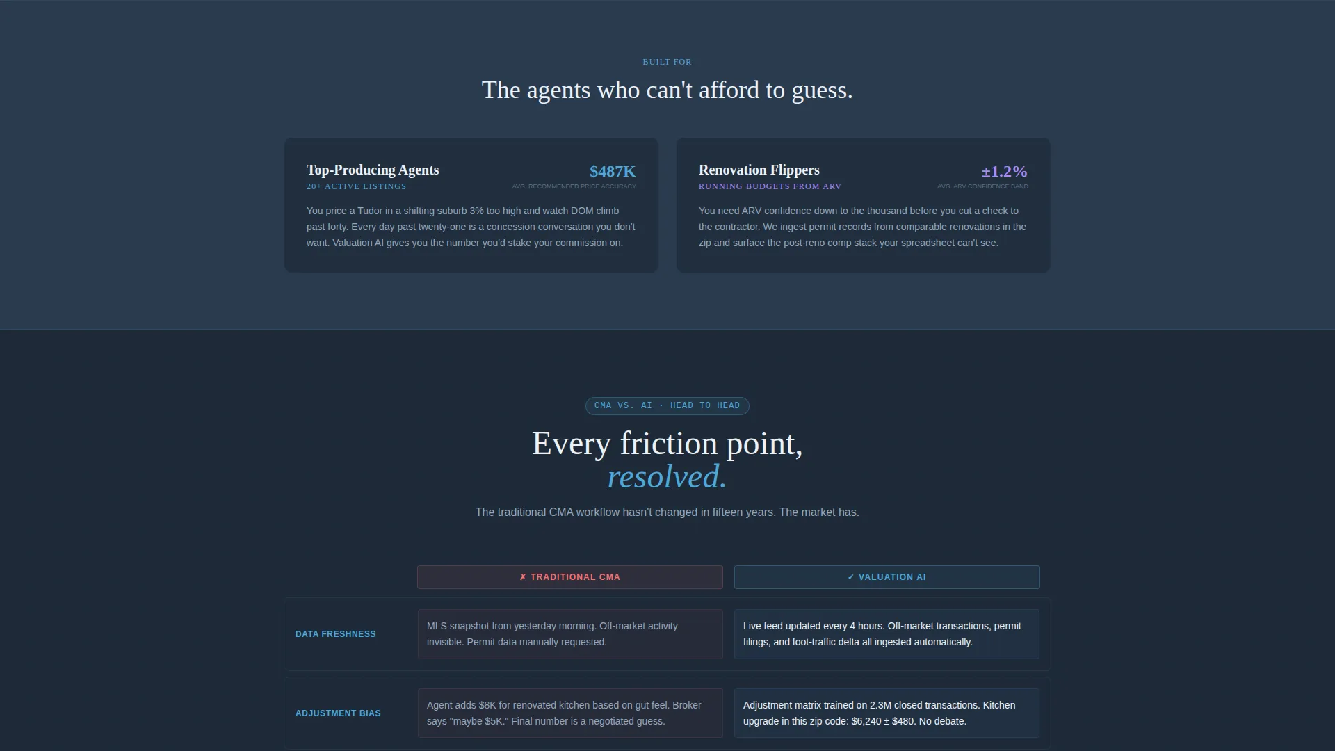
- A detailed Comparison/Versus scroll section that maps traditional CMA friction points against AI pipeline steps row by row
- A sticky primary call-to-action bar and a secondary lead-capture path requesting a Multiple Listing Service number and email for a retrospective analysis
Feature list
This template includes structured layout blocks, a purpose-built visual identity, and conversion-focused components grounded in the source brief.
Split-Screen Dashboard Header
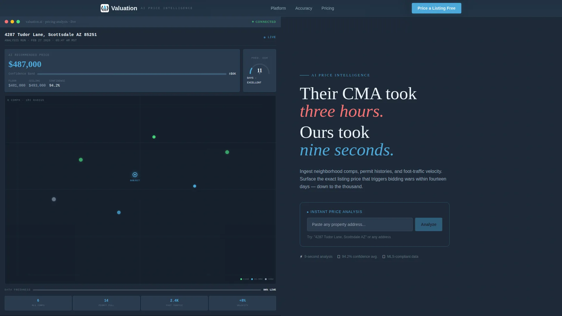
The header divides into two equal panels. The left panel displays a live product screenshot mid-analysis: a specific property address, an AI-recommended price of $487,000 with a confidence band, a comp map with six color-coded pins sorted by recency, and a predicted days-on-market gauge reading eleven. The right panel holds the headline and calculator.
Interactive Address Calculator Block
A working mini-calculator sits in the right header panel. Visitors paste any address and watch a price estimate populate in real time. This interaction earns the scroll and builds immediate trust by making the platform's value tangible before the visitor reads a single comparison row.
Comparison/Versus Scroll Section
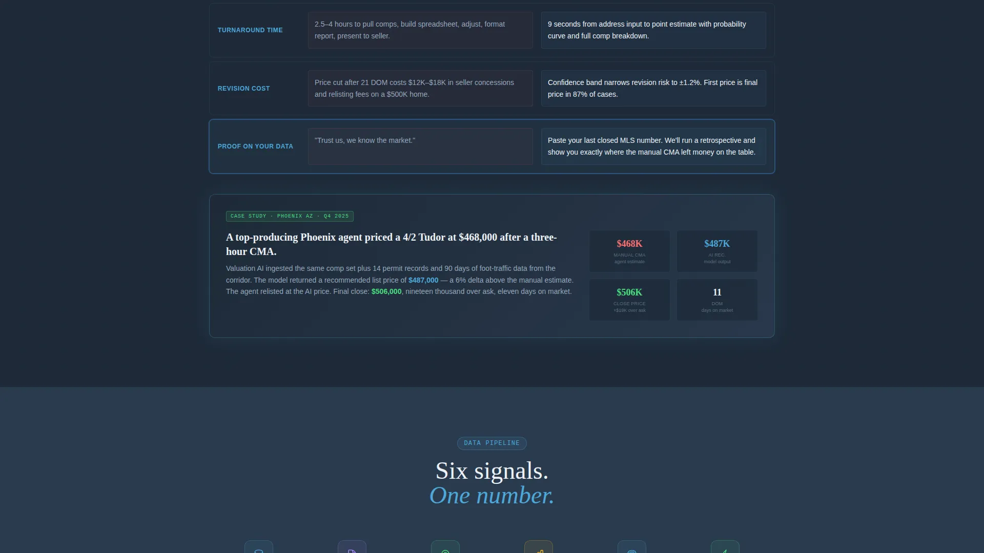
The page's main narrative is a two-column comparison table. The left column maps the traditional CMA workflow step by step: pulling comps manually, adjusting in a spreadsheet, getting a broker gut-check, and presenting a range. The right column maps the AI pipeline against each friction point, ending in a case study row showing a Phoenix agent whose manual price sat 6% below the AI recommendation that closed at $19,000 over asking price.
Sticky Primary Call-to-Action Bar
After the first calculator interaction, a sticky bar appears anchored to the page with the primary call to action: "Price Your Next Listing Free." It stays visible as the visitor scrolls deeper into the comparison narrative, keeping the conversion path accessible at every point.
Secondary Lead-Capture Path
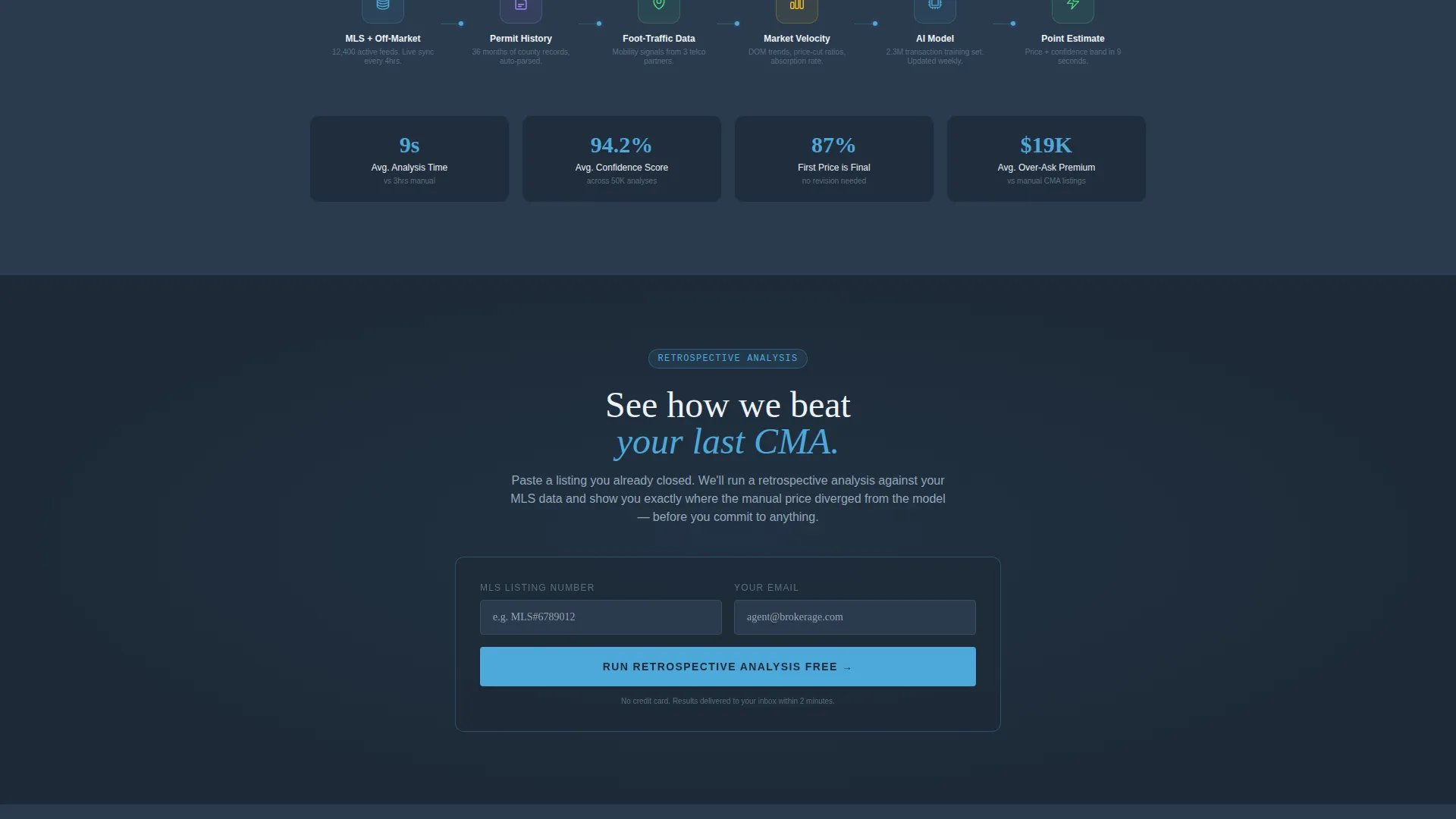
A second conversion route invites visitors to see how the platform performs against their last comparable sales analysis. A short form requests a Multiple Listing Service number and email address, then runs a retrospective analysis on a listing the agent already closed. This proves accuracy on the visitor's own data before they commit to anything.
Data Command Visual Identity
The full color system is built around deep charcoal slate (#1E2A38), mid-tone graphite (#3B4A5C), open-sky blue (#4DA8DA) for active data points and interactive elements, and pale horizon white (#EDF2F7) for card surfaces. The aesthetic evokes a control tower at first light: dark instrument panels giving way to a clear, readable sky.
Page sections overview
| Section | Purpose |
|---|---|
| Split-screen header | Pairs dashboard screenshot with headline and live address calculator |
| Calculator interaction block | Lets visitors generate a price estimate before scrolling further |
| Comparison/Versus section | Contrasts manual CMA steps with AI pipeline row by row |
| Friction point rows | Highlights data freshness, adjustment bias, turnaround time, and revision cost |
| Phoenix case study row | Anchors the comparison with a real closing outcome |
| Sticky call to action bar | Keeps the primary conversion action visible after first calculator use |
| Secondary lead form | Captures MLS number and email for a retrospective accuracy proof |
Design & branding system
The visual language is built around the Data Command theme, which combines dark instrument-panel tones with clear, sky-toned highlights. Every color choice reinforces precision and professional confidence.
- Color palette: deep charcoal slate (#1E2A38) for backgrounds, mid-tone graphite (#3B4A5C) for panels, open-sky blue (#4DA8DA) for interactive elements and active data points, and pale horizon white (#EDF2F7) for card surfaces and whitespace
- The dashboard screenshot in the left header panel uses color-coded comp map pins sorted by recency, a confidence band around the AI price estimate, and a days-on-market gauge to make data states instantly readable
- The overall aesthetic is designed to feel like a Bloomberg-style terminal at dawn: high information density without visual noise, every signal readable at a glance
Mobile & speed optimization
The split-screen layout is built with a single-page structure, which keeps the asset footprint focused and the scroll path linear. On smaller screens, the 50/50 panels are designed to stack cleanly so the calculator and dashboard remain accessible without horizontal scrolling.
- The single-page format avoids heavy multi-page navigation overhead, keeping the visitor flow fast and direct
- Interactive elements like the address calculator and sticky call to action bar are positioned for thumb-friendly access on mobile screens
- Card surfaces using pale horizon white (#EDF2F7) provide visual breathing room that keeps dense data sections readable on all screen sizes
How this template helps you convert
The conversion architecture is deliberate. Every design and content decision pushes visitors toward action at a specific moment in their scroll path.
- The calculator interaction comes first. Visitors see their own price estimate before they read a single sales argument, which builds personal relevance and trust before any commitment is asked.
- The Comparison/Versus scroll section deepens belief by mapping every traditional CMA friction point against a faster, more accurate AI alternative, culminating in a concrete case study with a real closing outcome.
- The dual call-to-action structure captures visitors at different readiness levels: the sticky bar converts the convinced, and the retrospective form converts the skeptical by offering proof on their own historical data.
Other information about this template
This template is built specifically for the real estate AI price optimization niche within the broader AI for Real Estate category. It is categorized under Technology and is designed to present platforms that ingest neighborhood comparable sales data, permit histories, and market velocity signals.
- The template style is a 50/50 split screen, the creative direction is Calculator/Tool First, the header concept is a Product Screenshot, and the landing page direction is Comparison/Versus
- The theme is Data Command using the Slate and Sky color system, making it visually distinct from generic real estate marketing templates
- It is suited for teams building or marketing tools in the AI-powered home valuation, automated valuation model, or real estate pricing intelligence space
Theme
Data Command
Creative direction
Calculator/Tool First
Color system
Slate & Sky
Style
Split Screen (50/50)
Direction
Comparison/Versus
Page Sections
Split-screen Dashboard Header
Interactive Address Calculator
Comparison/versus Scroll Section
Sticky Primary Call-to-action Bar
Secondary Retrospective Lead Form
Data Command Visual Identity
Related questions
Who is the ideal user for this landing page template?
Does the template include the actual AI calculator functionality?
Can I customize the color palette and branding?
Is this template suited for a single product or a suite of tools?
How does the retrospective lead form reduce buyer skepticism?



